Pasta Mix Reishunger White Red Orange Rustic
DownloadTopics
Details
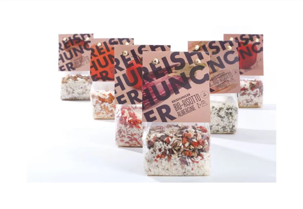
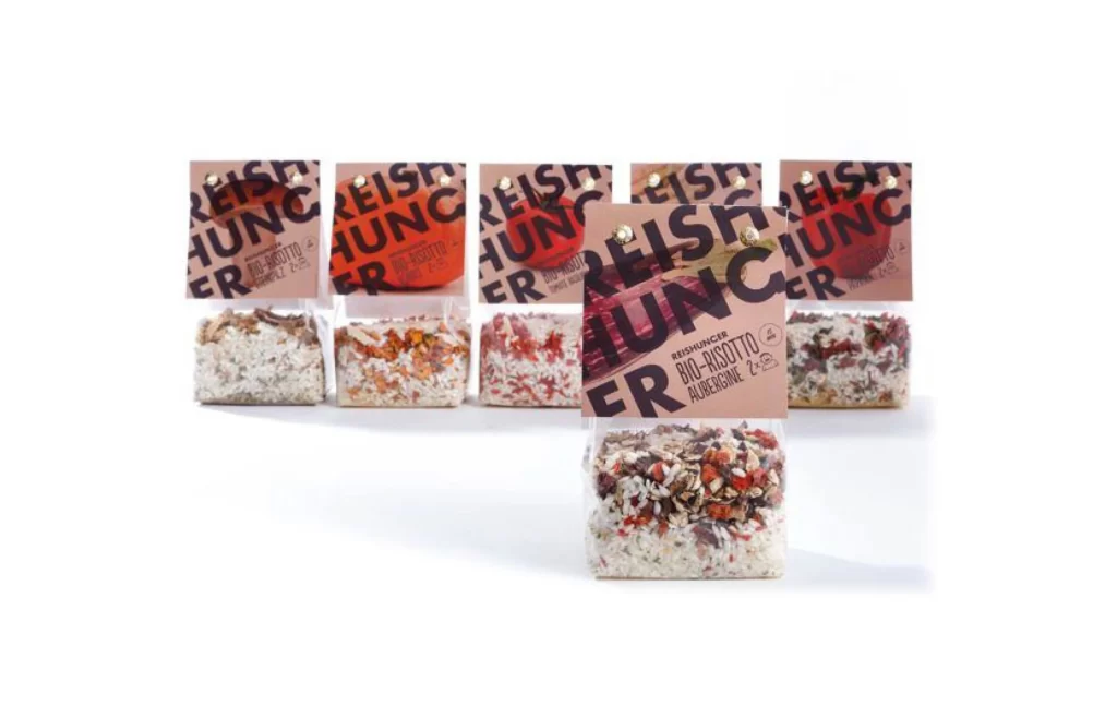
Five transparent plastic pouches of Reishunger Bio-Risotto stand in a shallow arc, with the Aubergine variant pulled forward into sharp focus. Each bag displays a bold, fragmented typographic treatment of the brand name in black and coral-orange, layered over photographic close-ups of the respective ingredients—deep purple eggplant, bright red tomato, or earthy mushroom tones. The contents visible through the clear film reveal distinct color palettes: creamy white rice flecked with crimson vegetable bits, warm orange spice blends, and dark forest-green herb mixtures, all sealed beneath brown kraft-paper headers punctuated by metallic rivets.
Visual hierarchy here relies on the aggressive cropping of the logotype, where oversized letterforms bleed across the upper third of each package to create a rhythmic, almost brutalist pattern when the products are grouped. The material contrast between the matte paper tops and the glossy lower film draws attention to both the brand identity and the organic texture of the dried ingredients within. Designers studying this composition will note how the limited color palette of black, terracotta, and natural browns unifies disparate flavor profiles into a cohesive retail family.
Packaging art directors developing premium dry-goods lines could mine this arrangement for ideas on balancing informational density with aesthetic impact, particularly the way photography integrates with typography rather than sitting passively behind it. Food photographers might reference the lighting setup that eliminates glare on the plastic while preserving the granular detail of the rice and vegetable inclusions. Anyone needing to analyze the specific print production techniques or color separation of these labels can access the full-resolution source file at no cost through our asset library.