Scrub Bar White Black Minimalist Packaging Design
Topics
Details
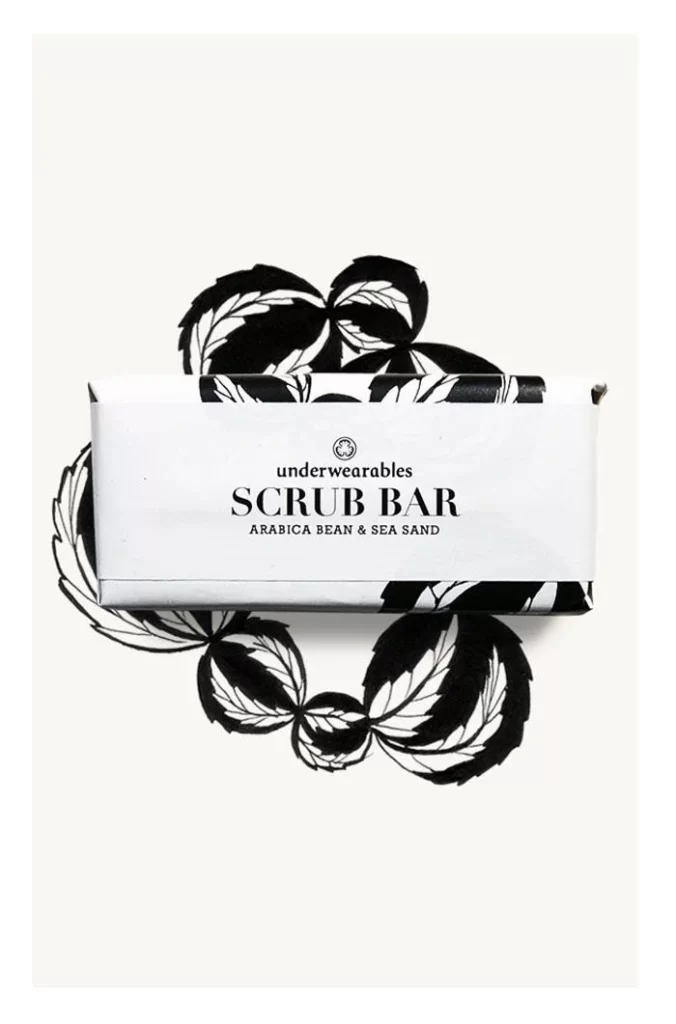
A rectangular scrub bar package sits horizontally in the center of the frame, wrapped in white paper featuring bold black botanical illustrations that extend beyond the edges of the box. The central label displays the brand name 'underwearables' in lowercase sans-serif type, followed by 'SCRUB BAR' in prominent uppercase serif lettering, with the scent description 'ARABICA BEAN & SEA SAND' printed in smaller capitals beneath. Soft, diffused lighting eliminates harsh shadows while a pale cream backdrop provides subtle contrast to the high-contrast black and white graphic elements.
The visual tension between the organic, hand-drawn leaf motifs and the rigid geometric form of the packaging creates a compelling aesthetic balance. Monochromatic restraint allows the intricate line work and negative space within the botanical patterns to dominate the viewer's attention without color distraction. Typography hierarchy clearly separates brand identity from product function while the illustrated elements wrapping around the physical object suggest three-dimensionality and tactile quality.
Brand identity designers studying minimalist cosmetic packaging could analyze how illustration integrates with structural design without overwhelming essential product information. Print production specialists might reference the ink coverage ratios and registration requirements for achieving such crisp black graphics on uncoated paper substrates. Art directors developing natural or organic product lines could examine how botanical imagery conveys ingredient authenticity through stylized rather than photographic representation.