Fur Kp Body Scrub 6fl Oz Body Scrub Packaging
Topics
Details
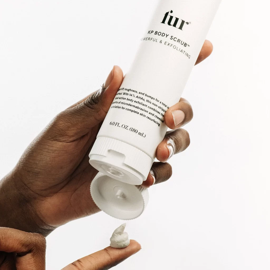
A pair of hands with deep skin tones grips an inverted white cylindrical tube of Fur KP Body Scrub, with the flip-top cap open and a dollop of thick, pale grey cream resting on an extended fingertip below. Black sans-serif typography on the container displays the brand name 'fur', the product title 'KP BODY SCRUB™', descriptive text about exfoliation benefits including 14% AHAs, and the volume measurement '6.0 FL. OZ. (180 mL)'. Soft, even studio lighting illuminates the scene against a white background.
Minimalist aesthetics define this packaging concept, relying on high-contrast typography rather than decorative graphics to communicate luxury. The tactile interaction between the user’s hands and the smooth plastic surface emphasizes the physical nature of the skincare ritual. Subtle details like the ribbed cap texture and the specific viscosity of the dispensed product add layers of realism to the overall composition.
Product photographers can study the hand positioning and angle to replicate effective application shots for beauty campaigns. Packaging designers might analyze the typographic hierarchy and negative space usage for future cosmetic branding projects. Art directors seeking references for monochromatic beauty layouts will find the lighting ratios and color balance particularly instructive.