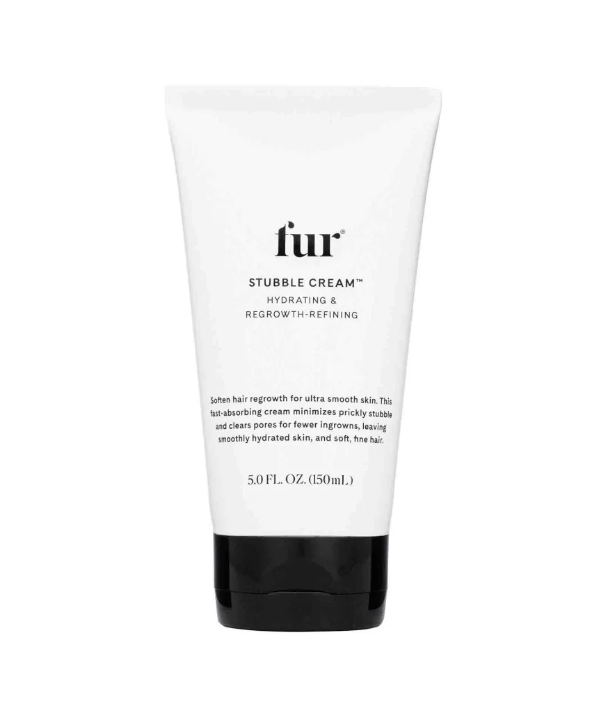
Fur Stubble Cream 507 Fl Oz Shave Cream Packaging
Topics
Details
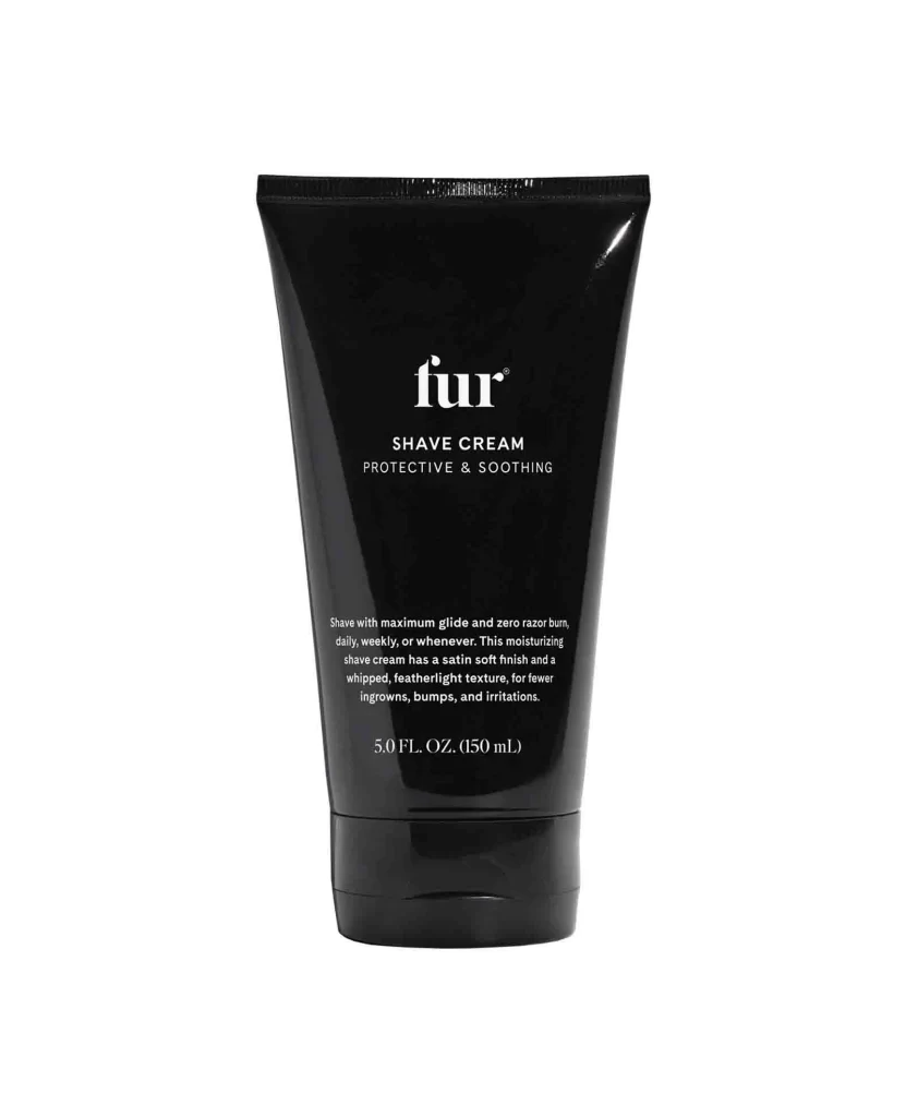
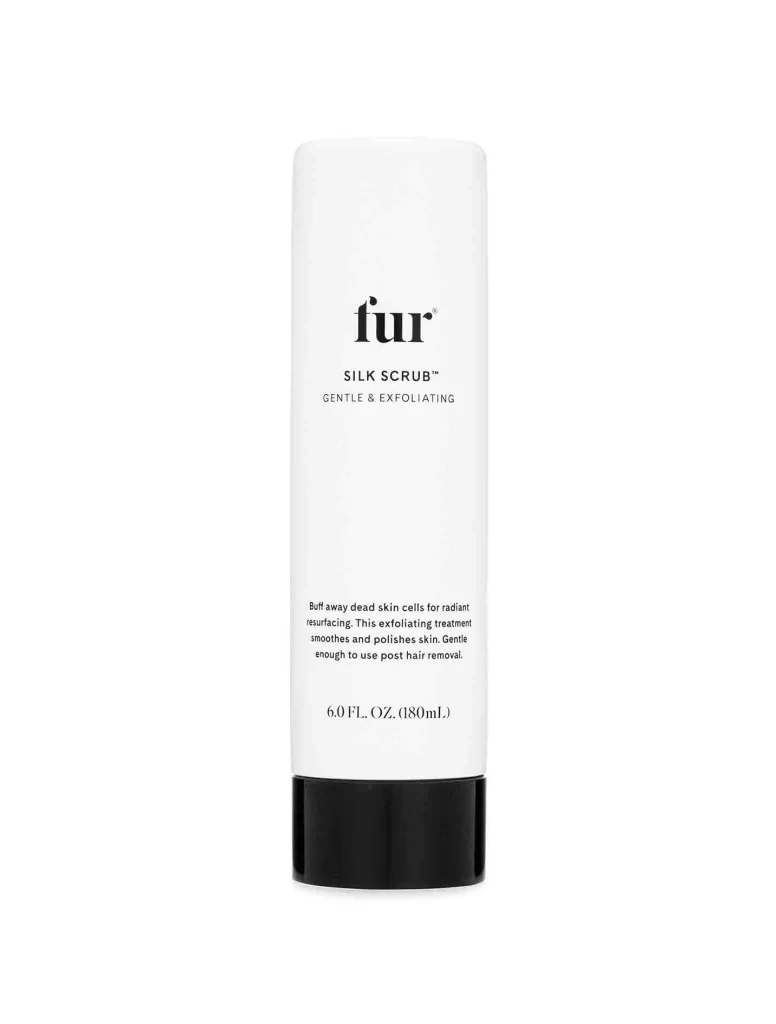
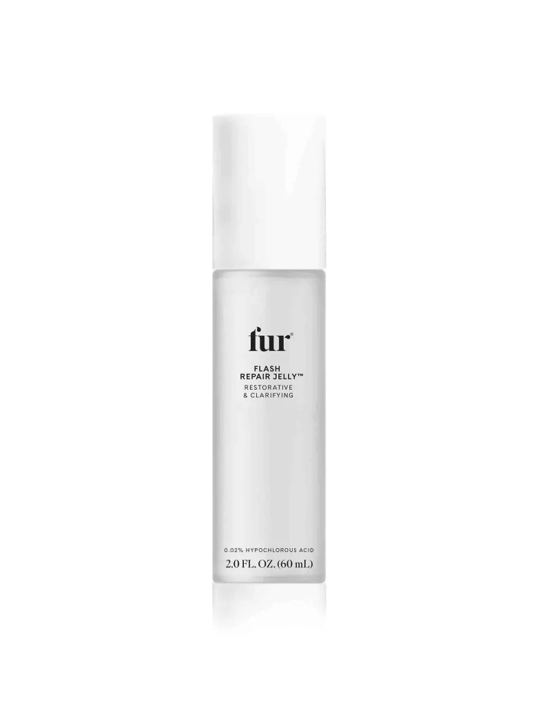
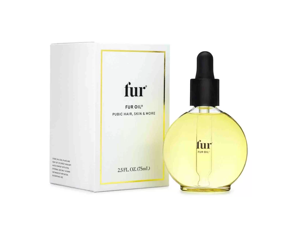
A matte white tube tapers gently toward its top opening, anchored by a substantial glossy black cap at the base. The brand name 'fur' appears in bold lowercase serif lettering above 'STUBBLE CREAM™' and the subheading 'HYDRATING & REGROWTH-REFINING', with descriptive copy and the volume measurement '5.0 FL. OZ. (150mL)' printed below. The packaging sits on a white surface, emphasizing its clean typographic hierarchy and monochromatic color scheme.
Visual distinction emerges from the stark contrast between the tactile-looking white body and the reflective black base, creating a grounded aesthetic that feels both clinical and luxurious. The typographic hierarchy is particularly noteworthy; mixing a traditional serif for the brand identity with modern sans-serif elements for technical information establishes a sophisticated balance between heritage and contemporary skincare science. Furthermore, the generous negative space surrounding the text elements prevents visual clutter, ensuring that the packaging communicates clarity and premium positioning through restraint rather than ornamentation.
Brand strategists analyzing luxury beauty markets would examine this composition to understand how minimalism conveys efficacy without aggressive marketing tactics. Packaging engineers might reference the specific proportions of the cap-to-tube ratio when developing new dispensing systems for high-viscosity creams. Additionally, art directors working on editorial layouts could utilize this specific arrangement of monochromatic elements to plan photography shoots that emphasize texture and form over color palettes.