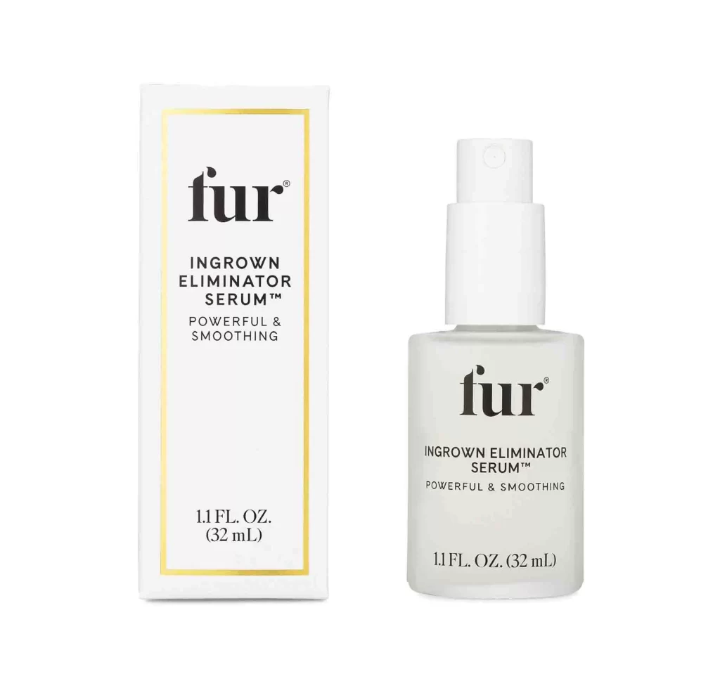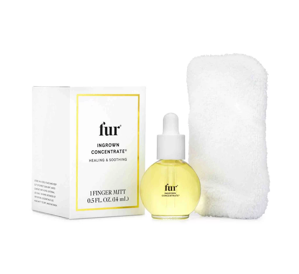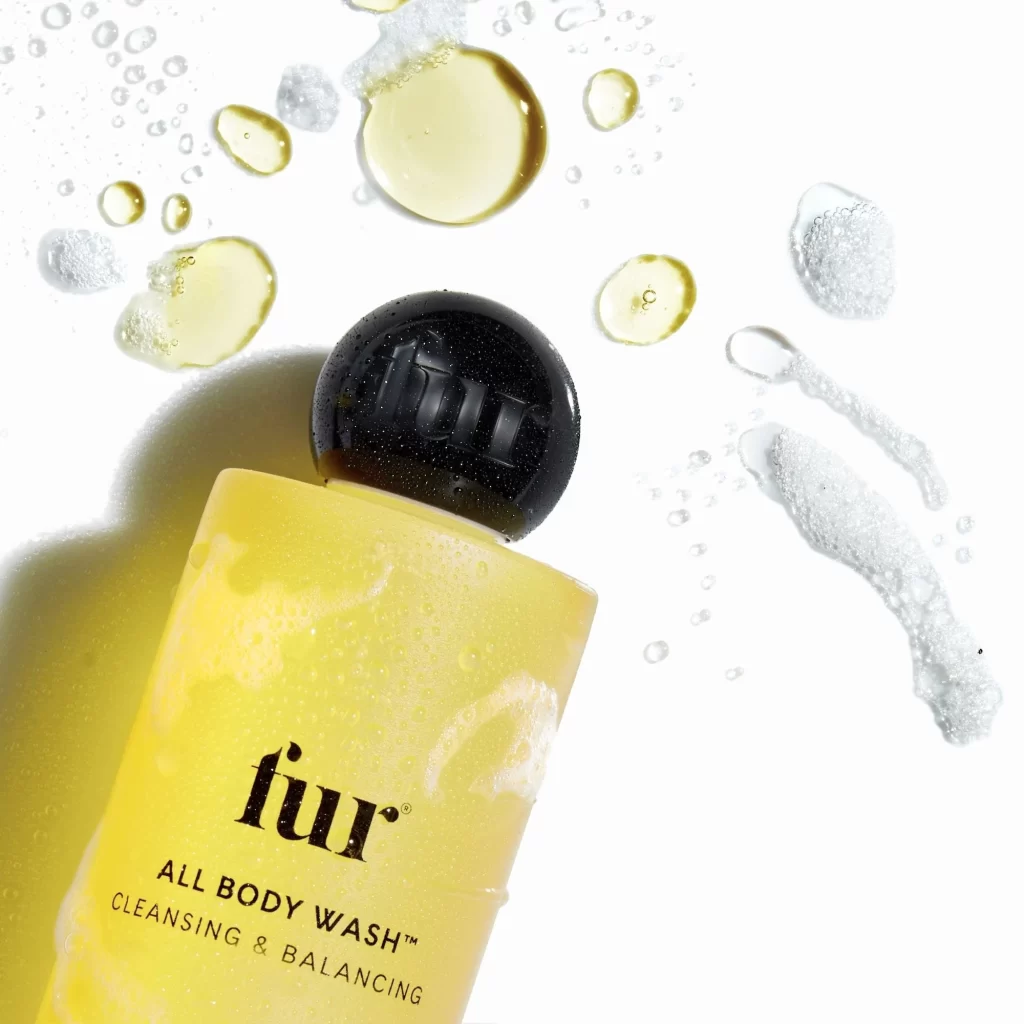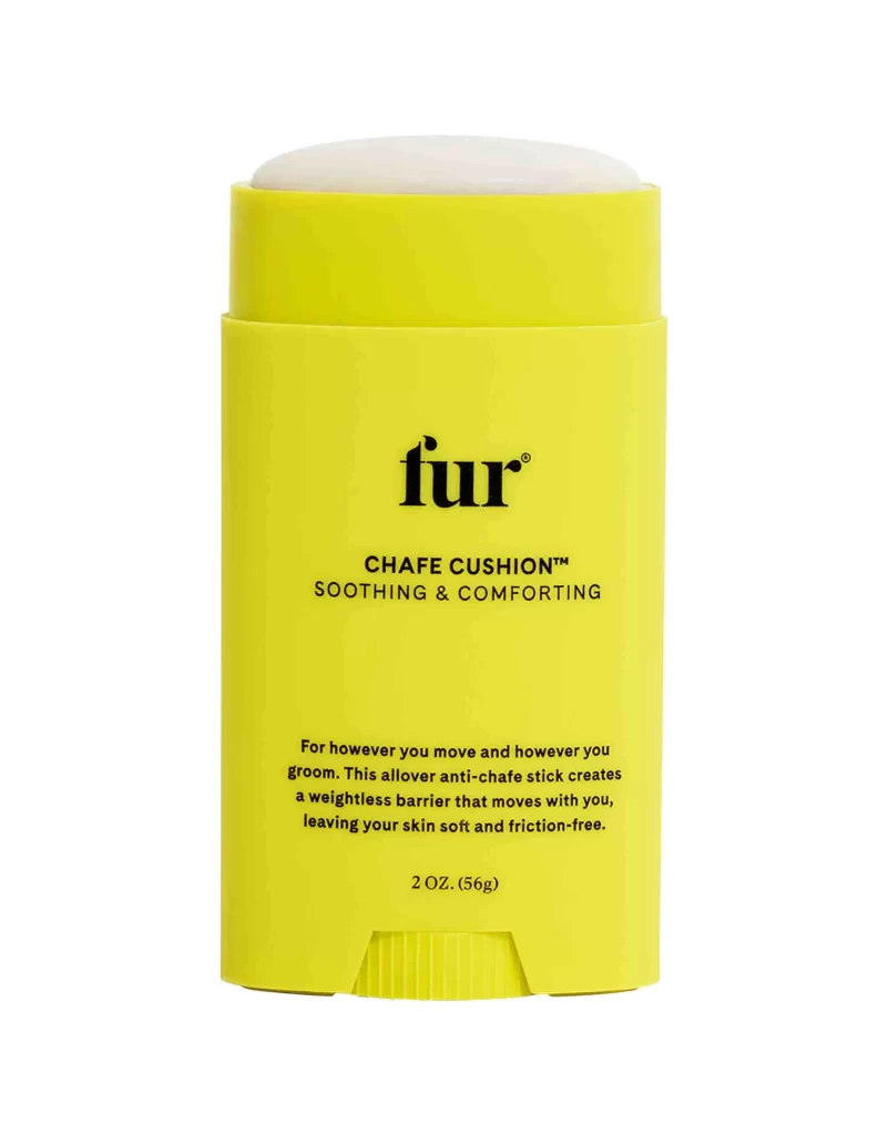
Fur Chafe Cushion 2oz Shave Cream Packaging
Topics
Details
A vibrant canary-yellow cylindrical container stands upright on a white surface, showcasing its matte plastic finish and clean geometric lines. The product features a two-tiered design with a slightly recessed upper cap revealing a pale, dome-shaped applicator tip, while the lower body displays bold black typography including the lowercase 'fur' brand name, 'CHAFE CUSHION™', and 'SOOTHING & COMFORTING' in all caps.
What immediately catches the eye is the audacious choice of a saturated primary yellow hue, which creates an energetic visual punch that stands apart from typical neutral-toned skincare packaging. The minimalist typographic hierarchy balances playful branding with functional clarity, while the tactile ribbing at the bottom adds subtle industrial interest without overwhelming the overall simplicity. This particular iteration demonstrates how monochromatic color blocking combined with strategic negative space can transform utilitarian personal care items into statement objects that feel both medical-grade reliable and approachably cheerful.
Product photographers studying color theory applications will find this example invaluable for understanding how high-contrast backgrounds amplify saturated packaging tones. Industrial designers working on stick-form containers could analyze the ergonomic proportions and cap integration details shown here. Marketing teams developing unisex grooming lines might reference how the gender-neutral palette and straightforward copywriting convey universal comfort. Additionally, 3D artists creating cosmetic mockups could study the material rendering qualities of matte plastics under diffused lighting conditions.