Fur Shave Cream 5 Fl Oz Shave Cream Packaging
Topics
Details
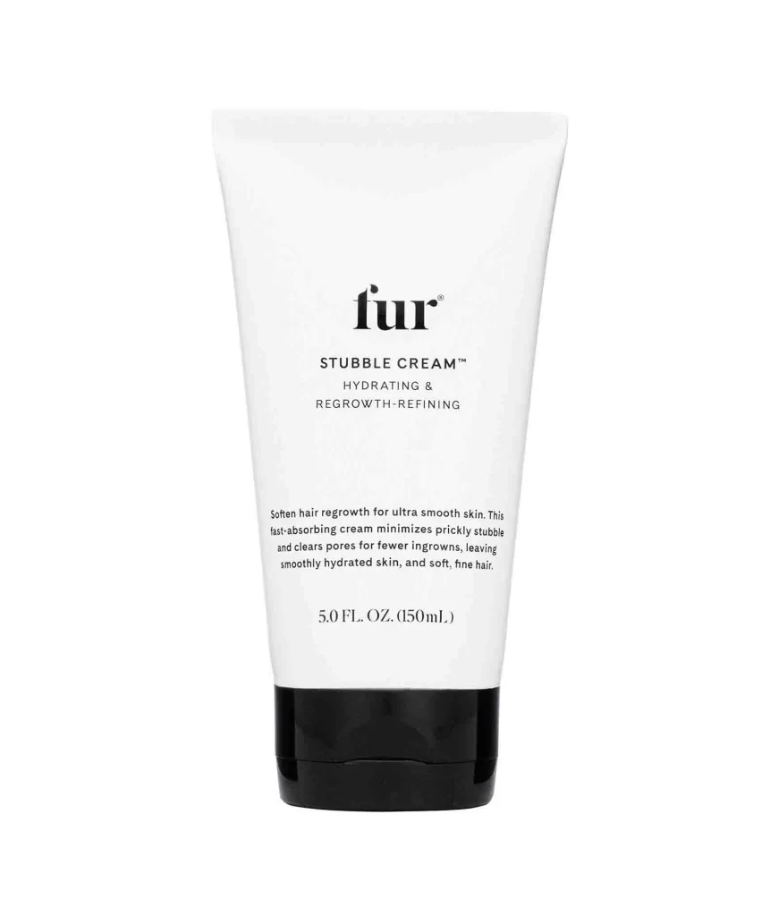
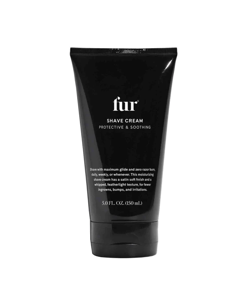
A sleek black tube with a cylindrical body that tapers slightly toward a crimped top seal stands on a white background. Crisp white typography displays the brand name 'fur' in lowercase, followed by 'SHAVE CREAM' and the subheading 'PROTECTIVE & SOOTHING' in smaller capital letters. Below this header, descriptive text outlines the product's moisturizing benefits and satin soft finish, with the volume measurement '5.0 FL. OZ. (150 mL)' printed near the base.
Minimalist aesthetics define this cosmetic container through its high-contrast monochrome palette and generous use of negative space around the text elements. The typeface selection balances modern sans-serif branding with elegant serif body copy, creating a clear visual hierarchy that guides the eye from product identity to functional benefits. Such restrained design language communicates premium positioning while ensuring legibility for essential usage information and ingredient promises.
Packaging designers studying luxury skincare branding would examine this example to understand how matte finishes interact with reflective lighting on curved surfaces. Marketing teams developing copy strategies for grooming products could analyze the tone and structure of the descriptive text to inform their own messaging frameworks. Industrial designers tasked with creating tube geometries might reference the proportions and cap integration visible in this composition to refine their own structural concepts.