Fur Flash Repair Jelly 2fl Oz Ingrown Treatment Packaging
Topics
Details
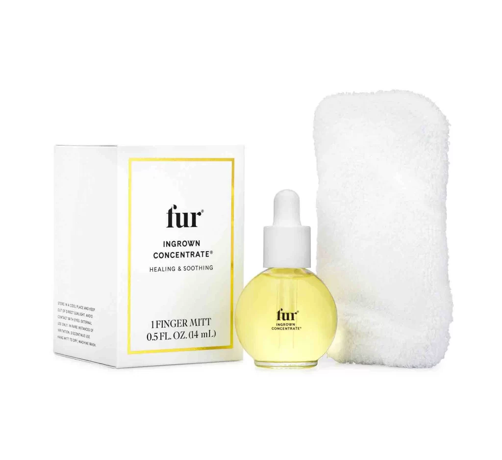
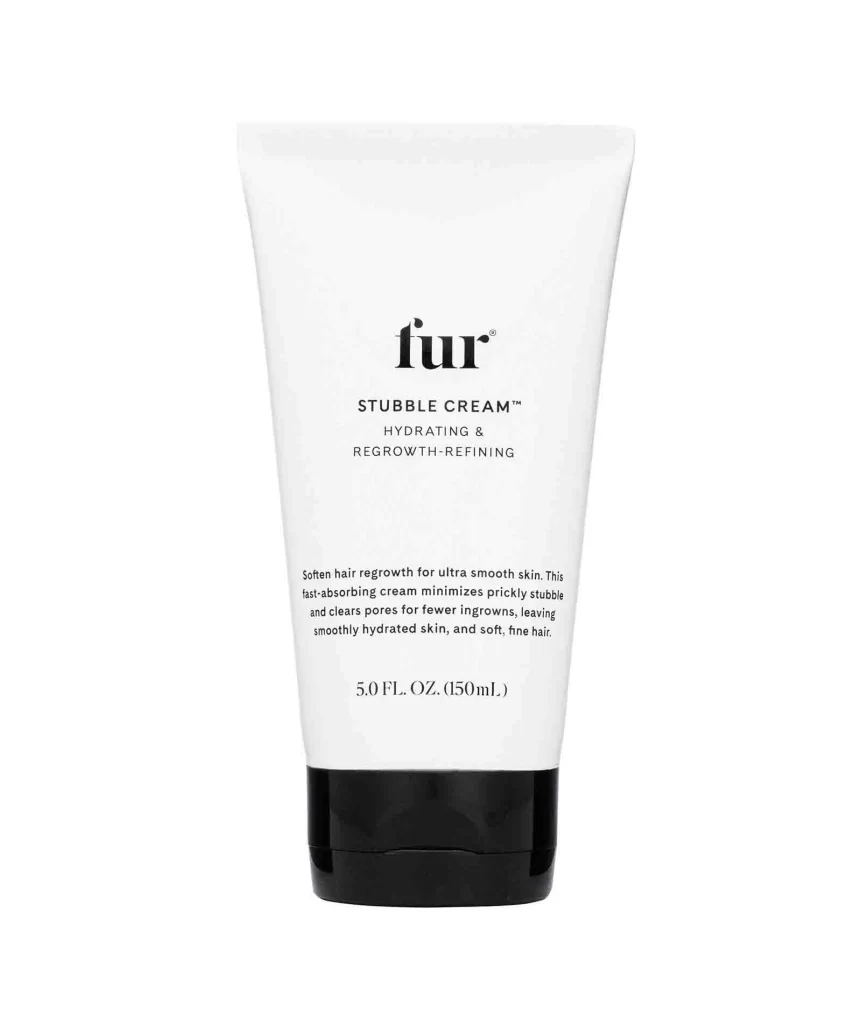
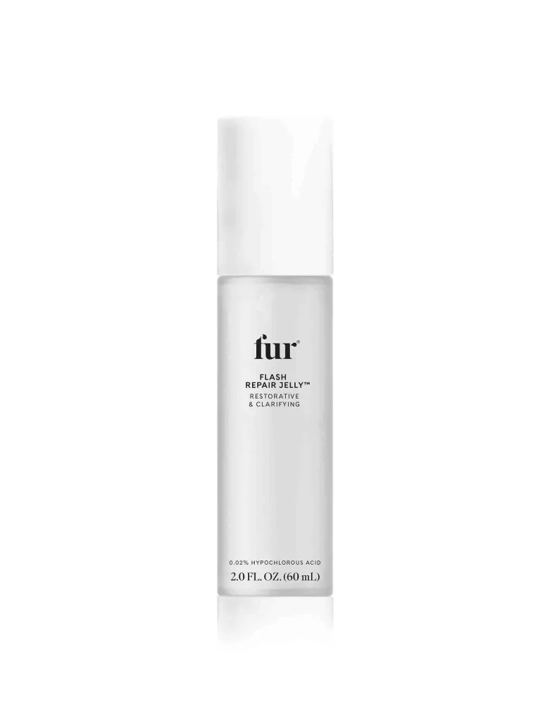
A cylindrical frosted glass bottle stands in perfect vertical alignment, capped by an opaque white rectangular lid that mirrors the container's width. The vessel's surface diffuses light softly, revealing black serif typography that hierarchically displays the brand name 'fur' above the product designation 'FLASH REPAIR JELLY™' and the descriptors 'RESTORATIVE & CLARIFYING' in smaller capital letters. Near the base, fine print indicates the 0.02% hypochlorous acid formulation and 2.0 FL. OZ. (60 mL) volume against a clean white background.
Minimalist restraint defines this packaging iteration, where the absence of color beyond monochrome creates a clinical yet luxurious aesthetic suited to dermatological formulations. The interplay between the translucent body and the solid cap establishes a visual rhythm of opacity versus translucency, while the centered text layout reinforces a sense of pharmaceutical authority and modernist simplicity. Such deliberate sparseness allows the material quality of the frosted glass to become the primary tactile signifier.
Brand strategists analyzing premium skincare positioning would examine this artifact to understand how typographic weight and spatial distribution convey efficacy without visual clutter. Packaging engineers might reference the proportions when developing similar airless pump systems or frosted cosmetic containers requiring specific labeling real estate. Visual merchandisers could also study the lighting interaction on the matte surface to inform photography guidelines for e-commerce product listings.