Fur Oil 25 Fl Oz Skincare Image 04 Packaging
Topics
Details
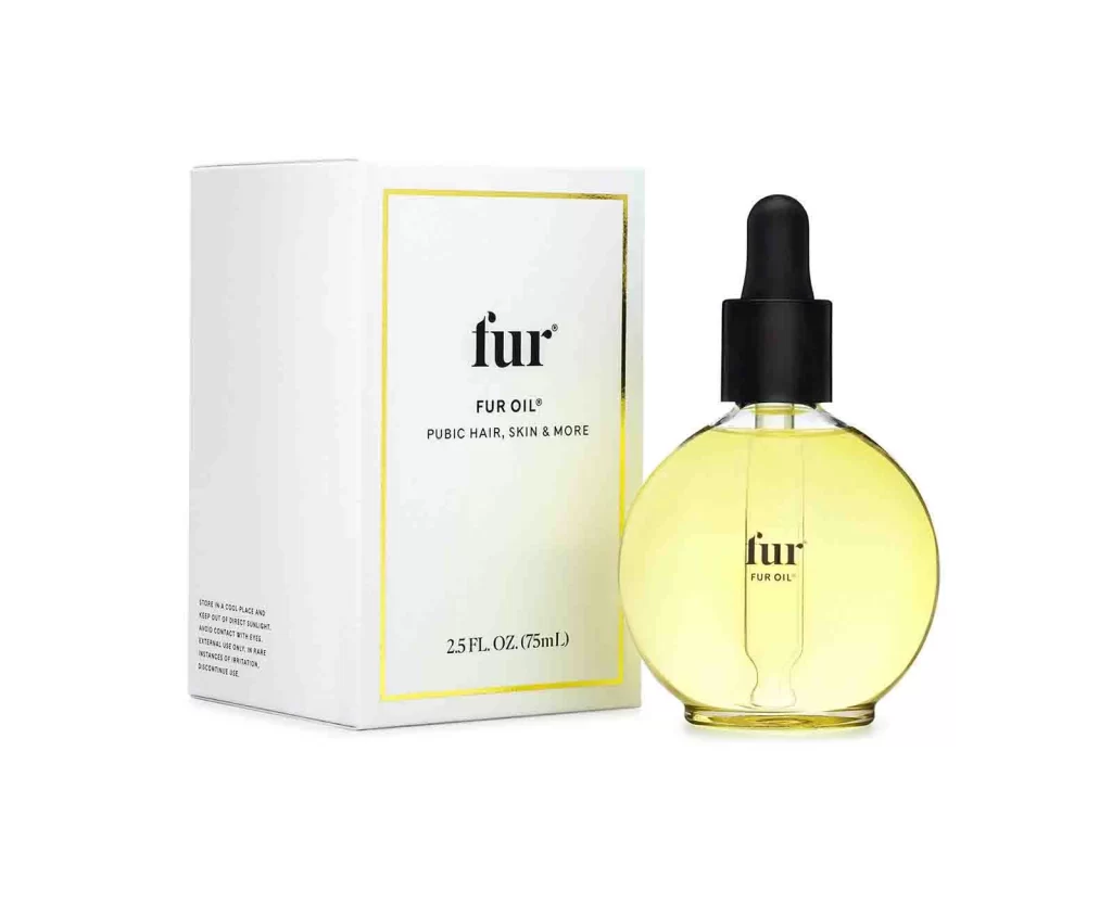
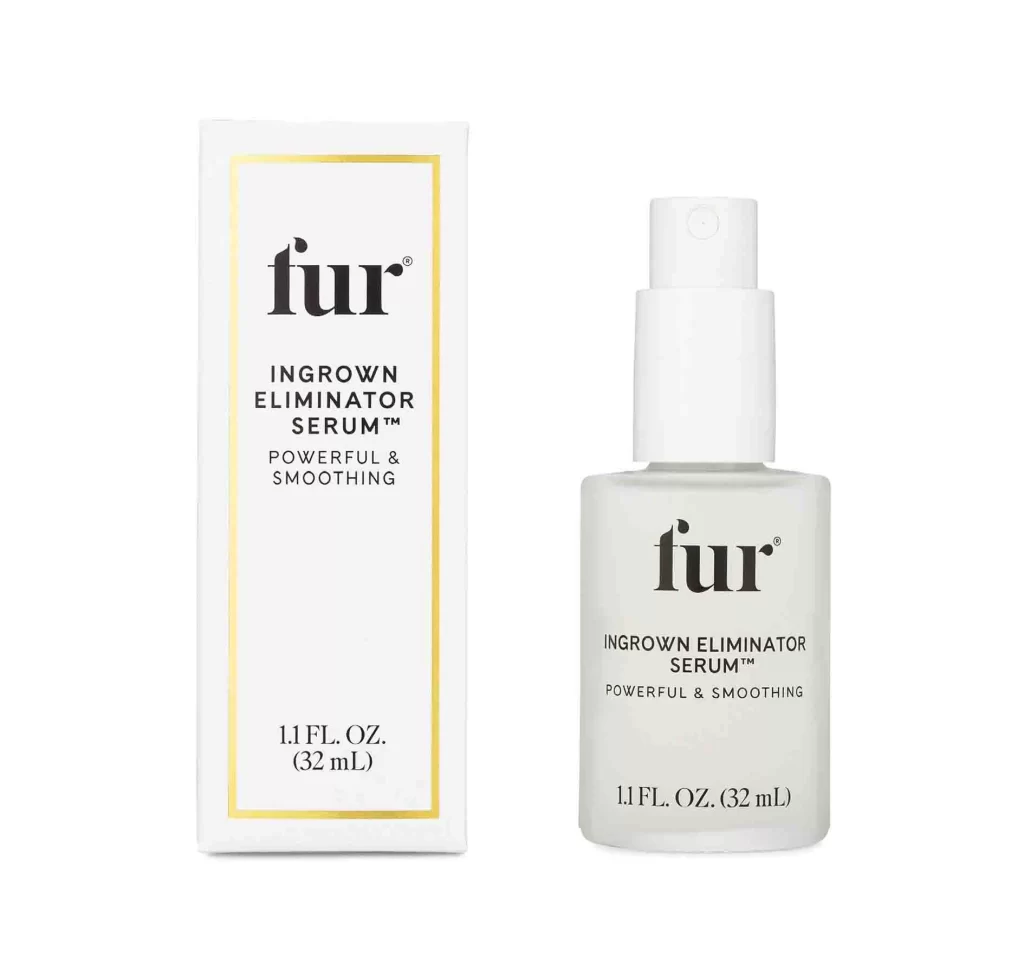
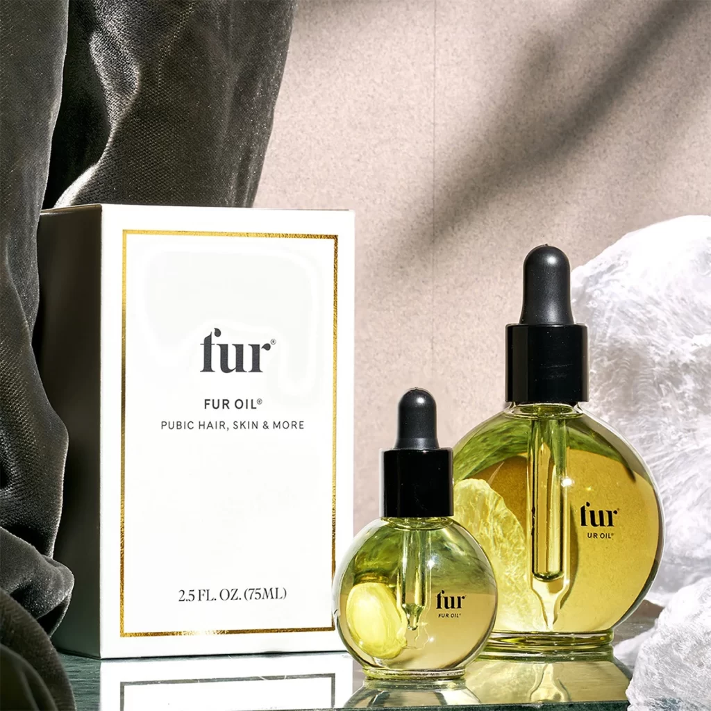
Soft, diffused light washes over a minimalist arrangement featuring two spherical glass dropper bottles filled with golden-yellow oil. The larger bottle sits beside a smaller companion version, both topped with matte black rubber bulbs and matching collars that contrast sharply against the translucent liquid inside. Behind them stands a crisp white box bordered with a thin gold line, displaying the brand name 'fur' in bold lowercase letters above 'FUR OIL®' and the descriptor 'PUBIC HAIR, SKIN & MORE.' A charcoal velvet fabric drapes loosely on the left side of the frame while crumpled white textile adds texture on the right, all set against a neutral beige backdrop that creates gentle shadows across the scene.
What makes this composition particularly compelling is the interplay between the round, almost jewel-like bottle silhouettes and the rigid rectangular geometry of the packaging box. The color palette relies on sophisticated restraint—warm amber tones of the product liquid pop against the stark white and black typography, while metallic gold accents elevate the overall luxury feel without overwhelming the clean aesthetic. Notice how the varying scales between the two bottles create visual rhythm and suggest product line depth, making this an excellent study in brand consistency across different container sizes.
Product photographers studying still-life beauty compositions will find valuable lessons here in how fabric textures can frame skincare items without distracting from the main subject. Brand designers working on premium wellness or cosmetic identities might examine how the serif and sans-serif typeface pairing conveys both approachability and sophistication. Art directors planning e-commerce shoots could reference this setup to understand how subtle background layering—combining soft textiles with solid surfaces—adds dimensional interest to otherwise simple product presentations.