ESTiRE Body Scrub Jar
DownloadTopics
Details
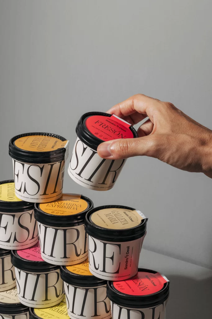
Cylindrical white containers emblazoned with bold black serif lettering stack in a casual pyramid, their black lids punctuated by vibrant circular labels in shades of coral red, mustard yellow, and pale cream. A hand enters from the right to lift the topmost jar—its crimson lid marked 'FRESON' in clean typography—while soft directional light casts gentle shadows across the matte gray surface beneath. The minimalist arrangement highlights the contrast between the crisp packaging graphics and the saturated color accents that distinguish each variety.
What sets this packaging apart is the bold, architectural use of typography as the primary visual element, turning the product name into a graphic texture that dominates the jar’s surface. The color-coded lids offer a subtle yet effective way to differentiate variants without cluttering the minimalist aesthetic, while the hand interacting with the product adds a sense of scale and human touch to the composition. Designers looking to study modern cosmetic branding will appreciate that the full-resolution file is available for free download to examine these typographic details closely.
Photographers planning e-commerce shoots for skincare lines could use this setup to experiment with stacking compositions and hand-in-frame styling techniques. Art directors developing identity systems for luxury body care brands might reference how the large-scale lettering creates immediate visual recognition even from a distance. Packaging students analyzing current market trends would find this example particularly useful for understanding how minimal color palettes can still convey variety across a product range.