Shiseido Ultimune Three Bottles Gradient Advertisement
Topics
Details
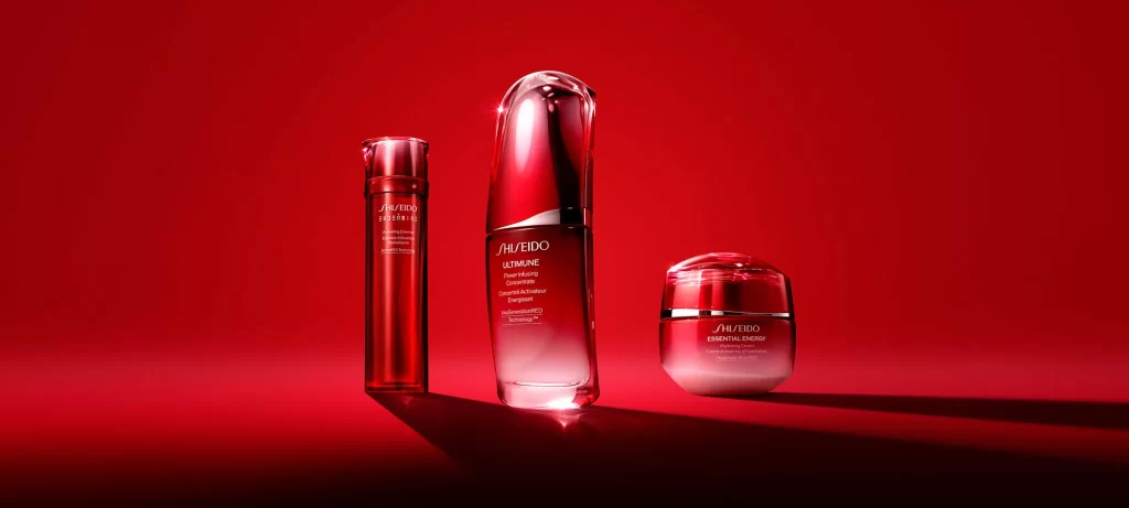
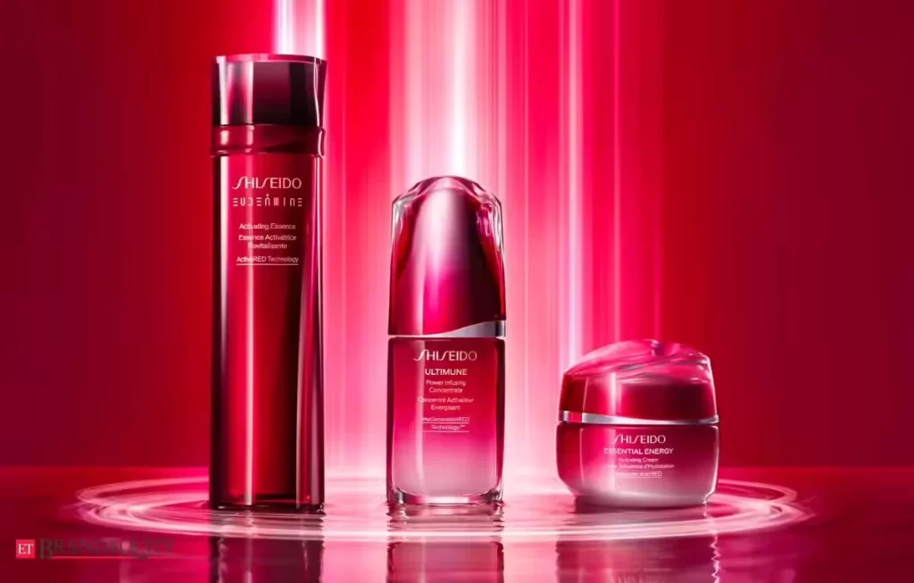
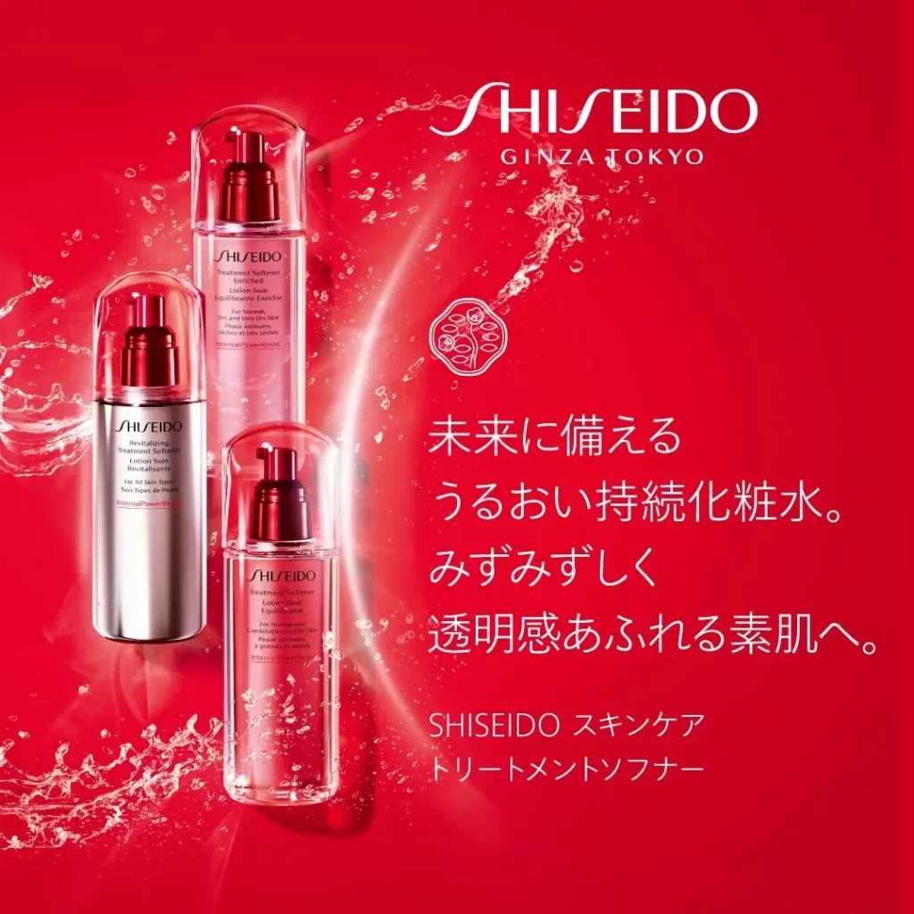
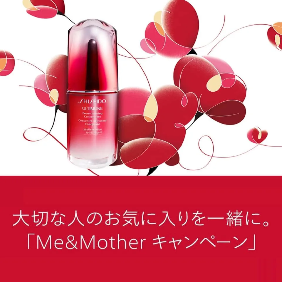
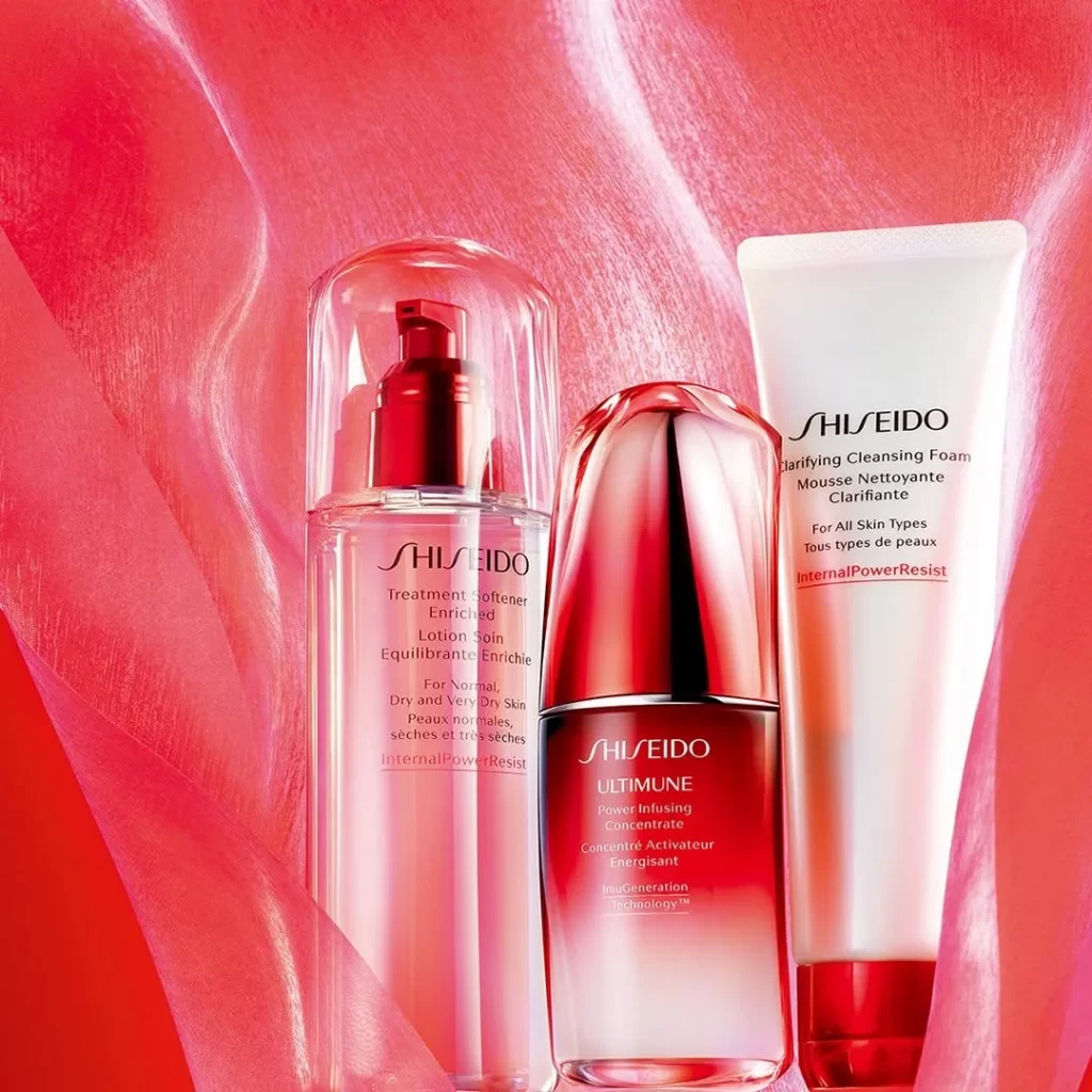
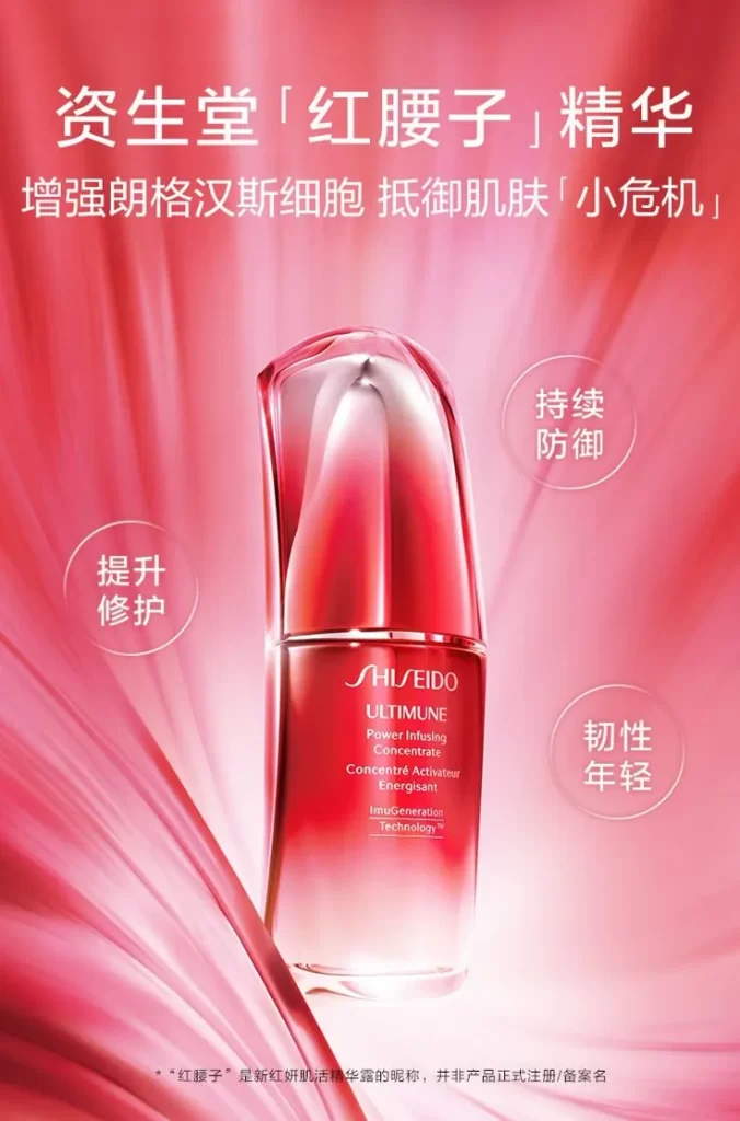
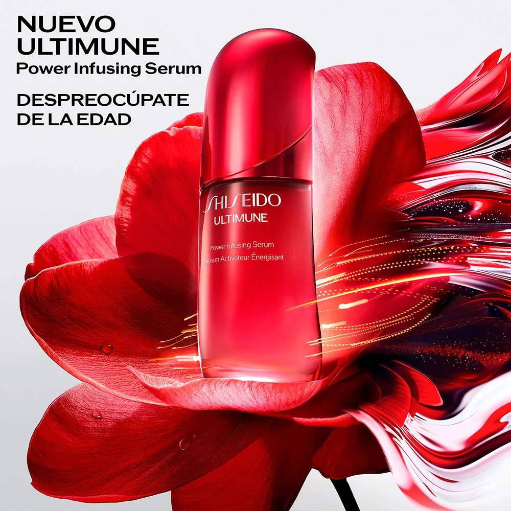
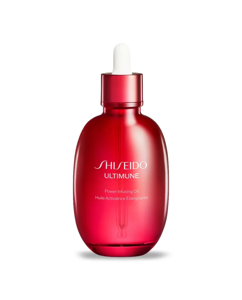
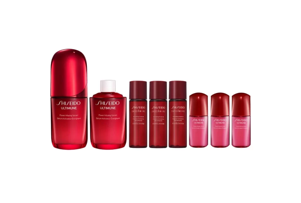
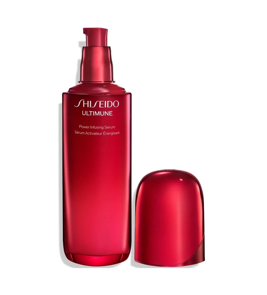
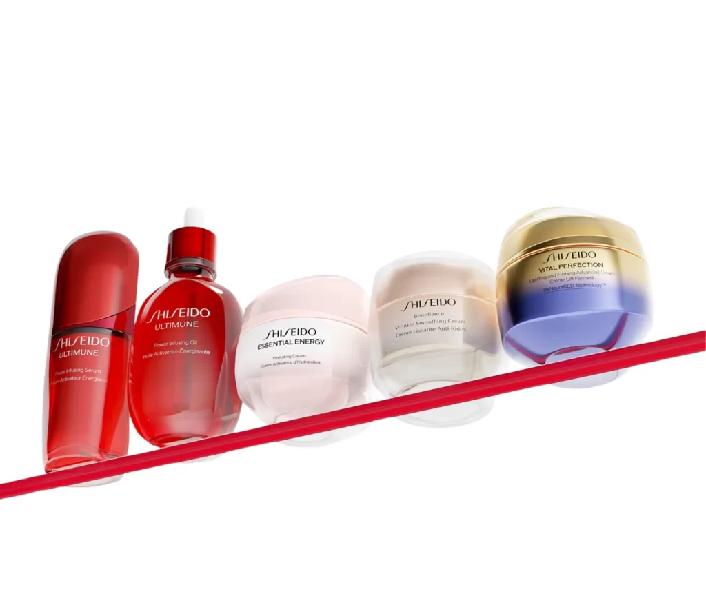
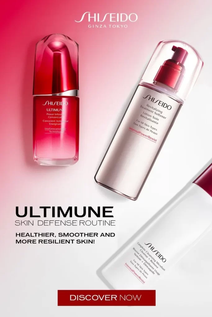
The Shiseido Ultimune advertisement showcases a striking diagonal staggered layout of three bottles against a pink-to-white gradient background. The iconic red-ombre dropper bottle serves as the primary focal point, drawing the eye downward. Bold text reads ULTIMUNE SKIN DEFENSE ROUTINE, HEALTHIER, SMOOTHER AND MORE RESILIENT SKIN! DISCOVER NOW. The styled backdrop enhances the visual appeal of the premium skincare collection.
This design masterfully uses the diagonal staggered layout to guide viewer flow naturally. The pink-to-white gradient creates softness, contrasting the sharp red-ombre dropper bottle. InternalPowerResist technology branding is visible on secondary packaging. The campaign effectively communicates resilience and vitality. Typography choices reinforce the message, while the styled background ensures the products remain the undisputed heroes of this sophisticated visual composition.
Designers seeking inspiration for luxury cosmetic campaigns will find this reference invaluable. It demonstrates how to balance multiple products within one frame using diagonal dynamics. The gradient technique offers a modern alternative to flat backgrounds. Creative professionals analyzing high-end beauty advertising can study how color psychology and strategic text placement elevate brand perception. This resource perfectly blends elegance with impactful marketing communication.