Van Leeuwen Lovely Day For A Guinness Ice Cream Tubs
Topics
Details
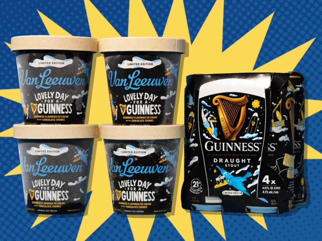
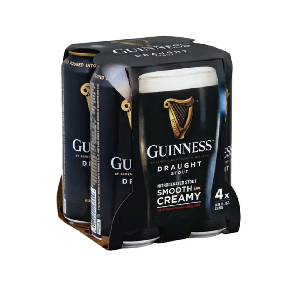
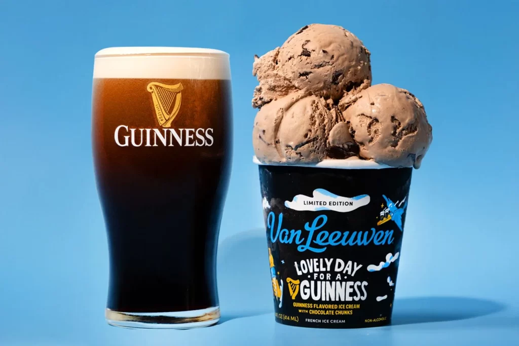
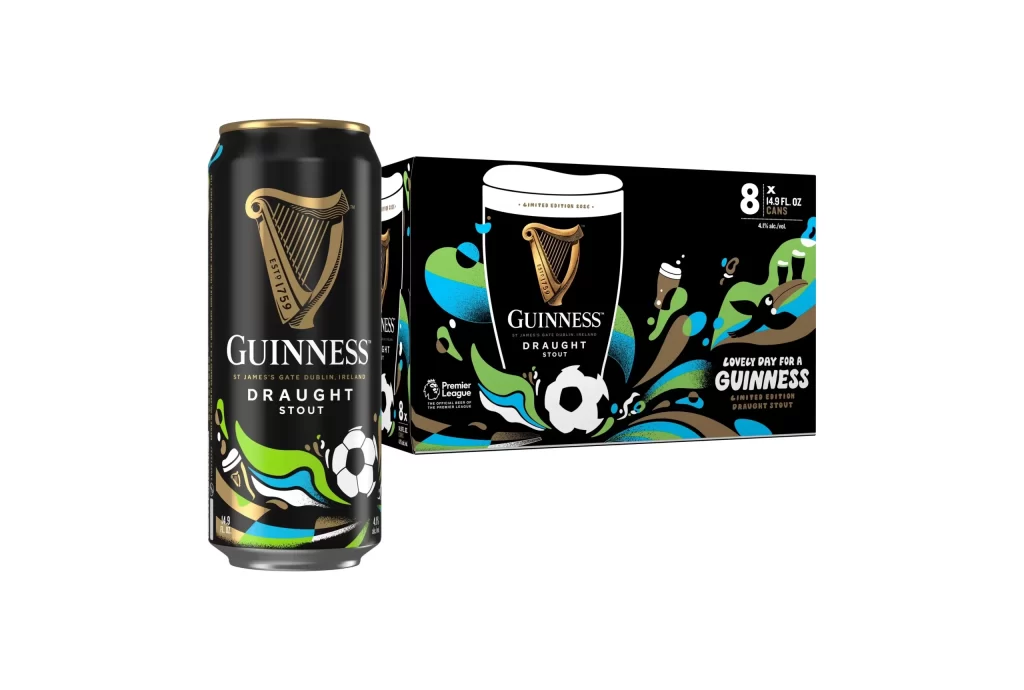
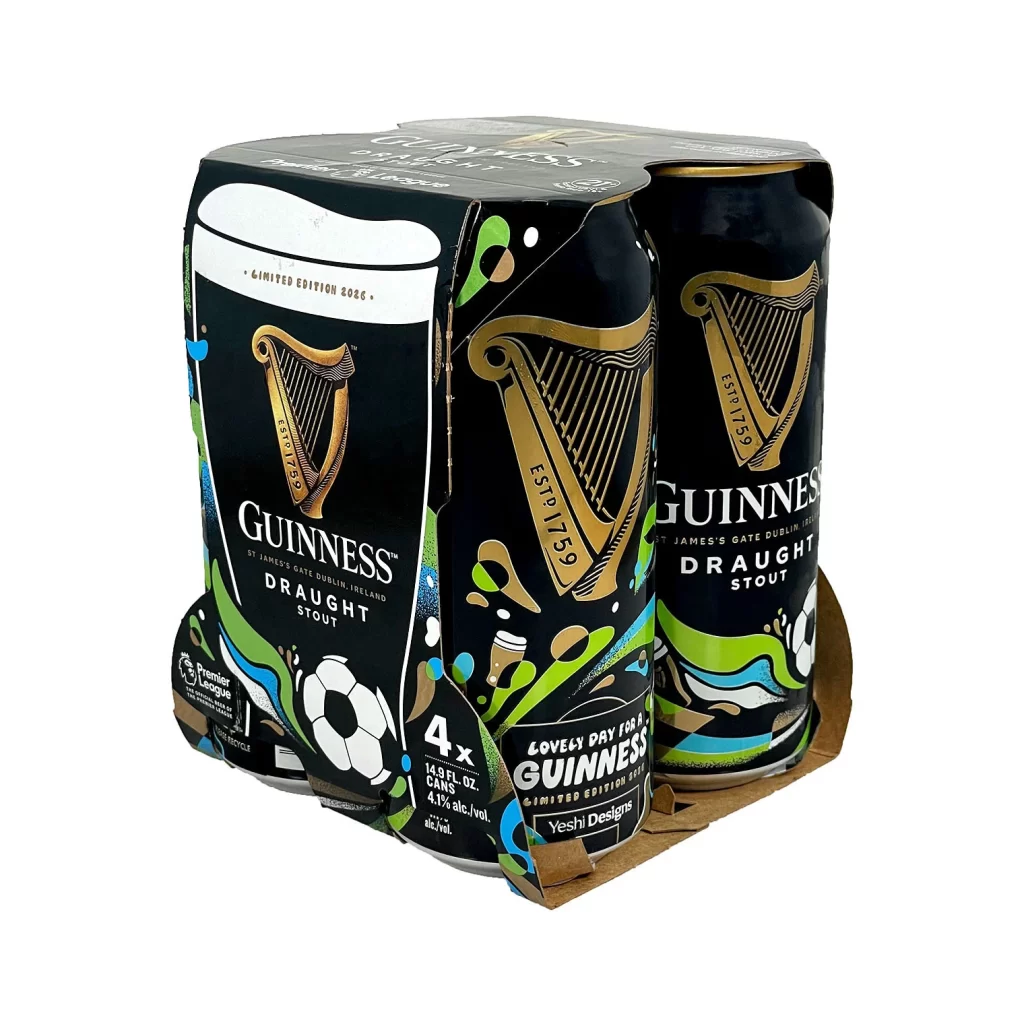
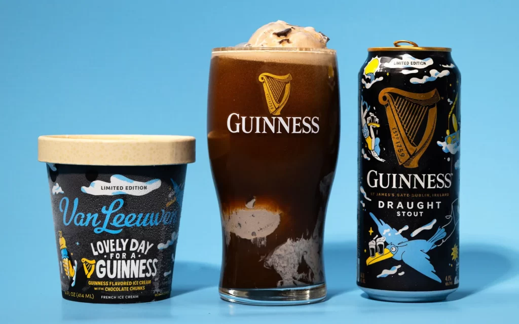
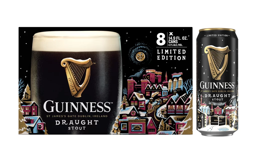
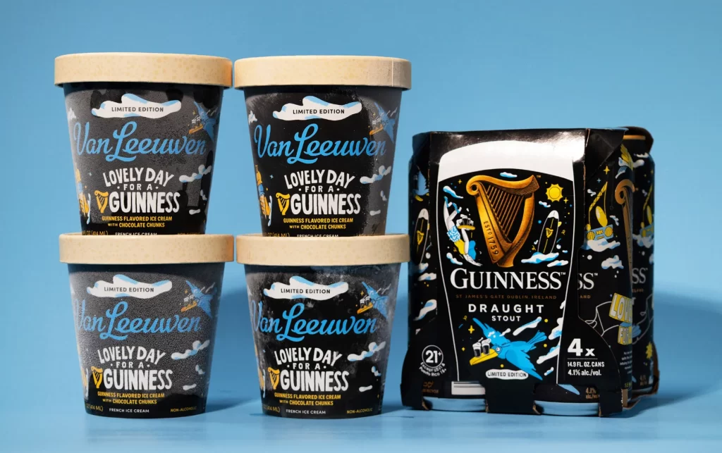
The image displays a lineup of four Van Leeuwen x Guinness ice cream tubs arranged in a two by two stack, featuring beige lids. Beside the tubs sits a four pack of Guinness Draught Stout limited edition cans. Both products showcase the Lovely Day for a Guinness branding. The scene is set against a light blue background, highlighting the rich chocolate chunks visible in the Guinness flavored ice cream.
The collaboration branding seamlessly merges artisanal charm with classic heritage. The packaging design utilizes a muted beige and dark stout palette, creating striking contrast against the light blue background. Lovely Day for a Guinness lettering evokes a retro aesthetic, while the clean typography on the limited edition cans ties the whole collection together. This visual strategy effectively communicates premium quality and playful nostalgia.
Graphic designers and branding strategists will find this reference invaluable for studying limited edition collaborations. Food packaging creators can draw inspiration from the color blocking and layout. Marketing professionals analyzing beverage and dessert partnerships will also benefit. Anyone seeking to understand how to visually balance two distinct brand identities within a single cohesive promotional campaign should save this example.