Guinness Draught Stout Can Packaging
Topics
Details
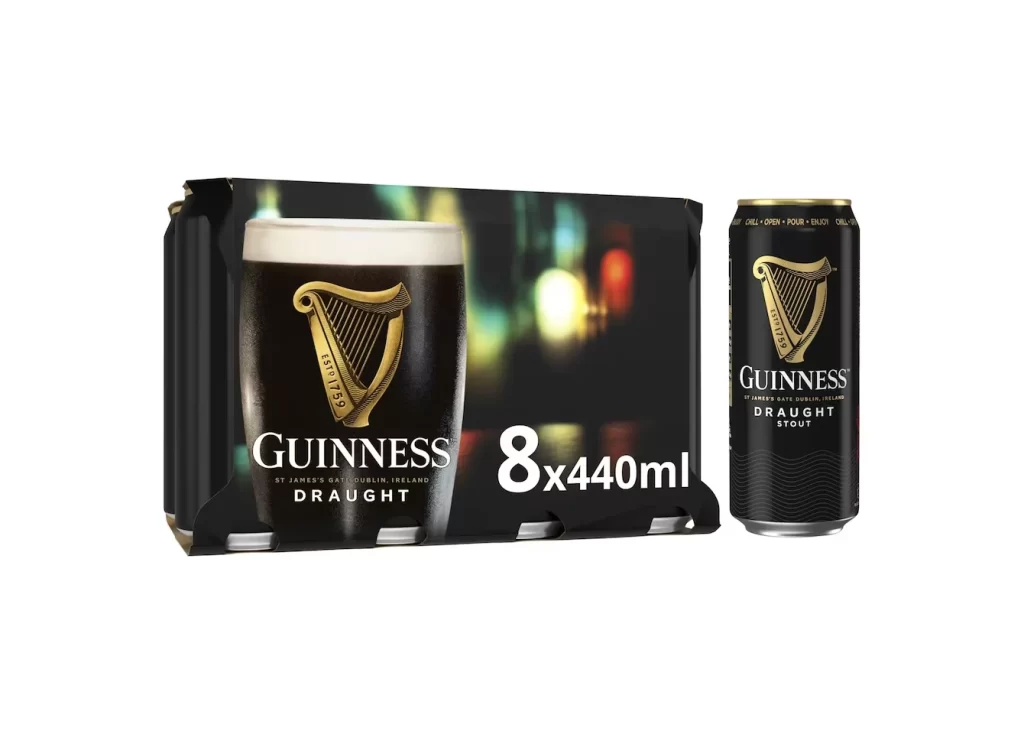
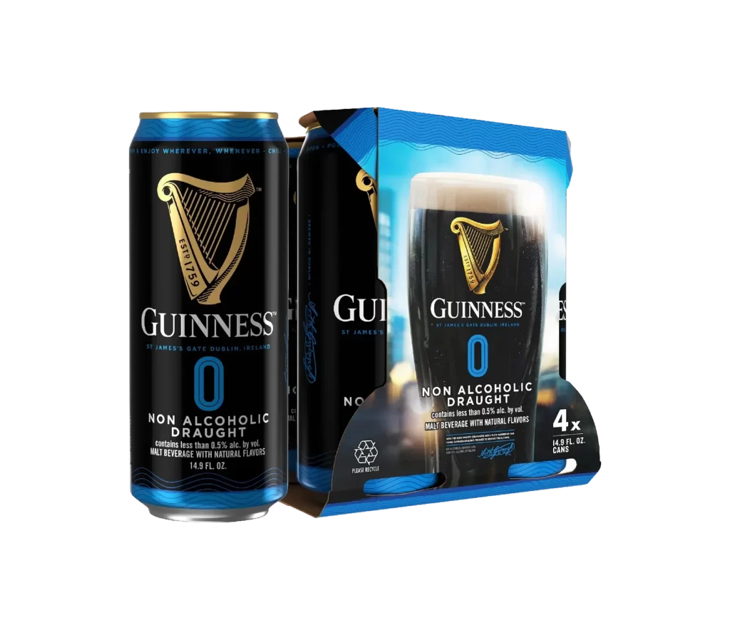
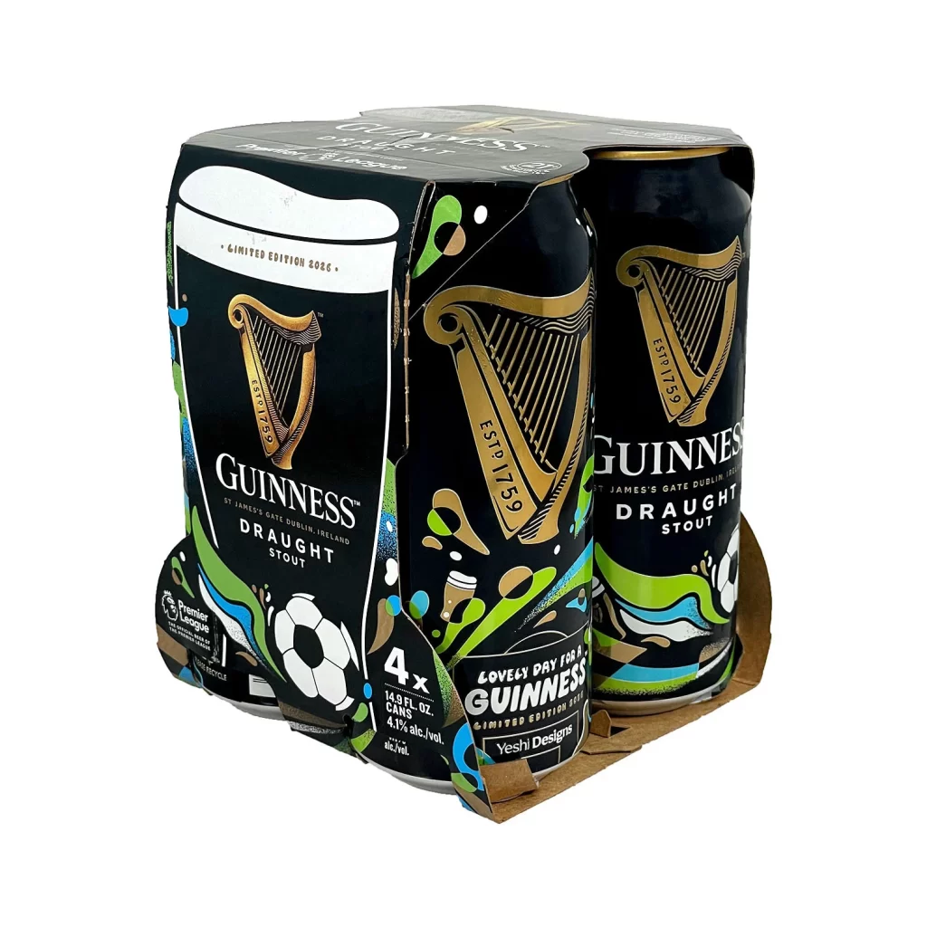
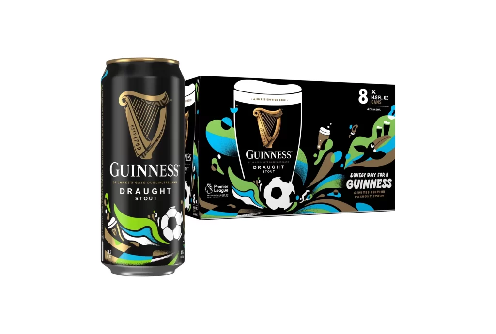
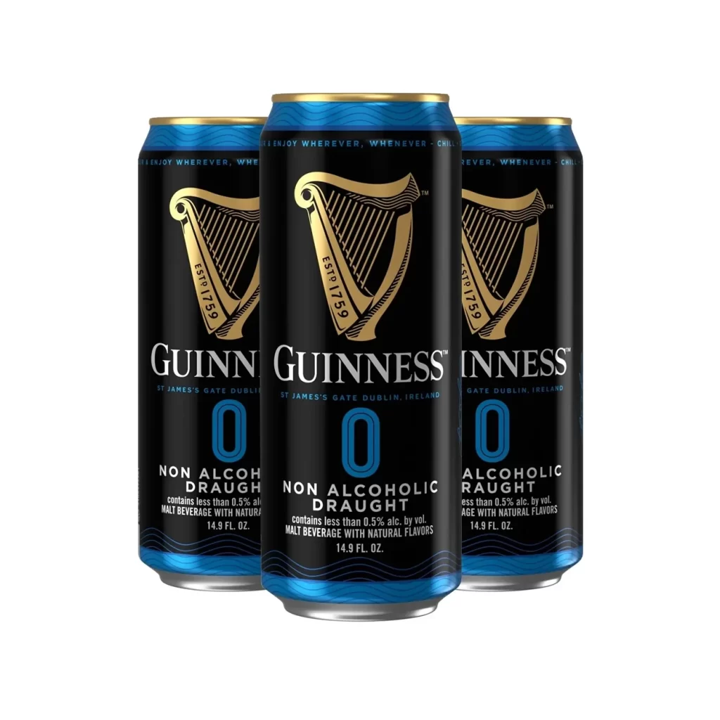
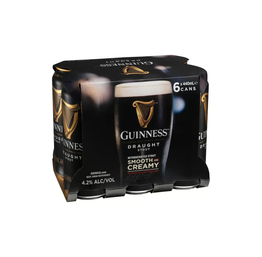
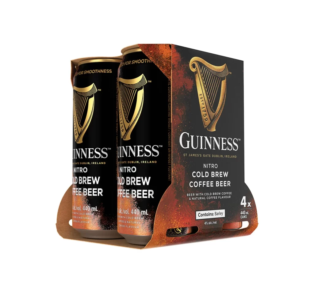
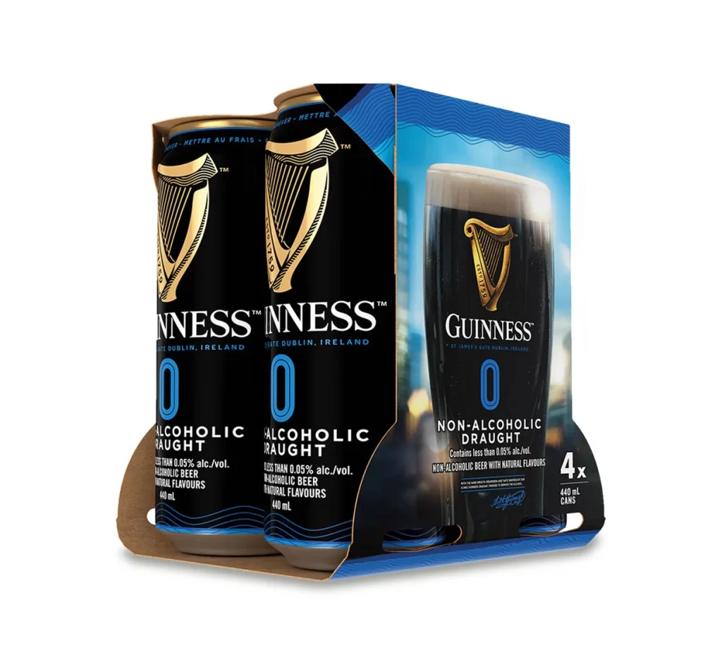
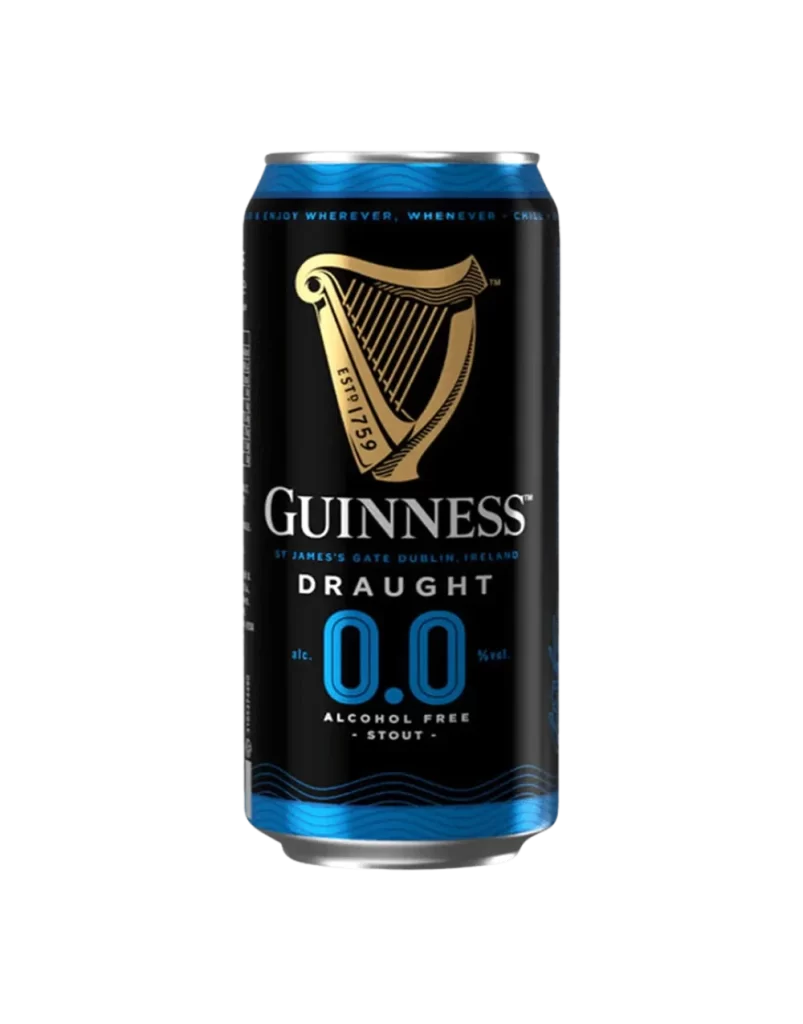
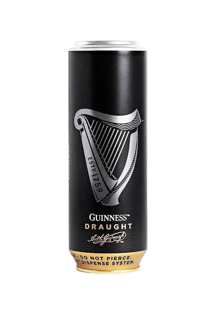
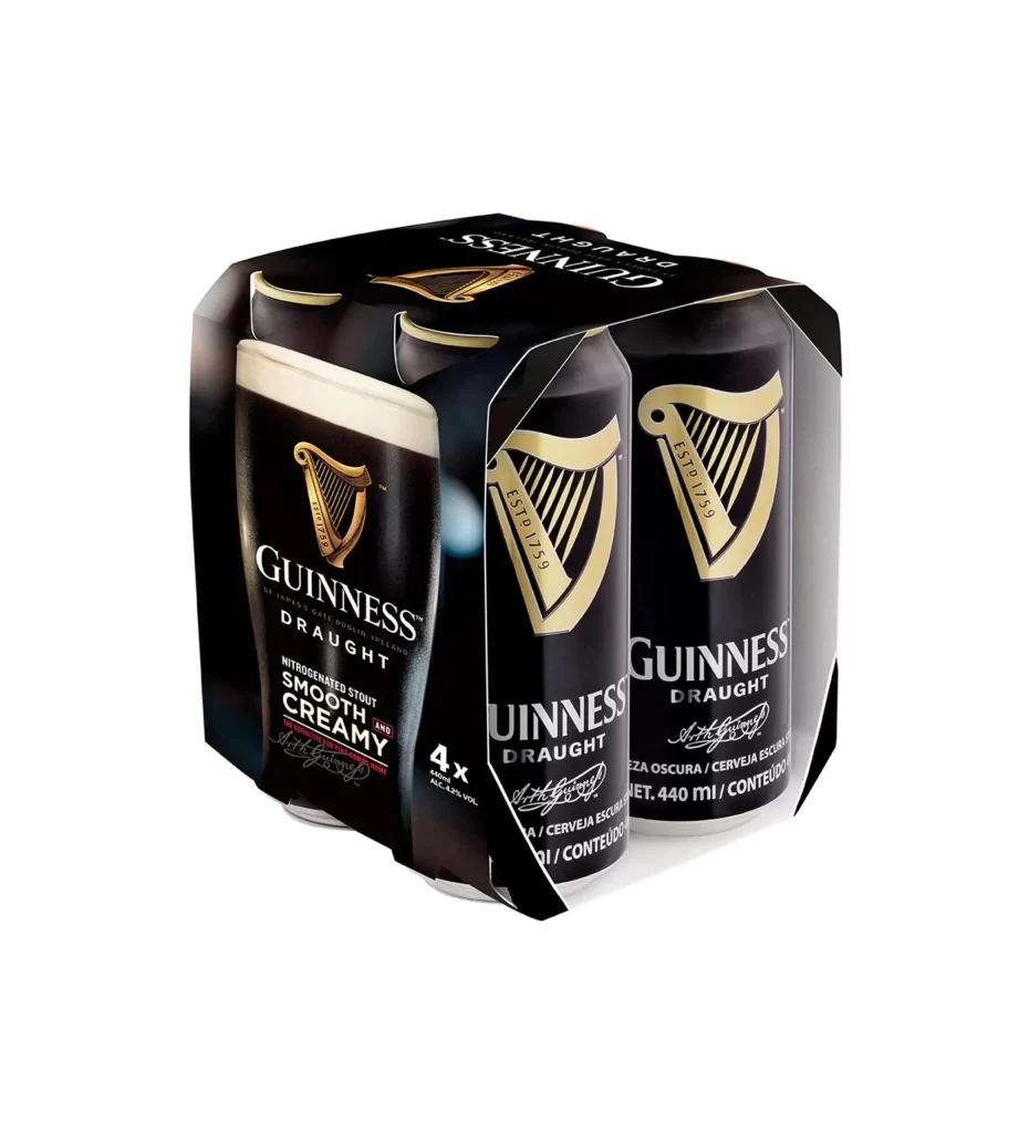
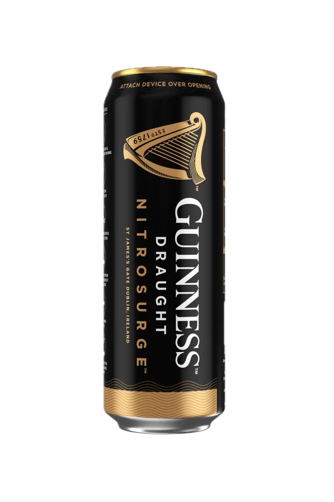
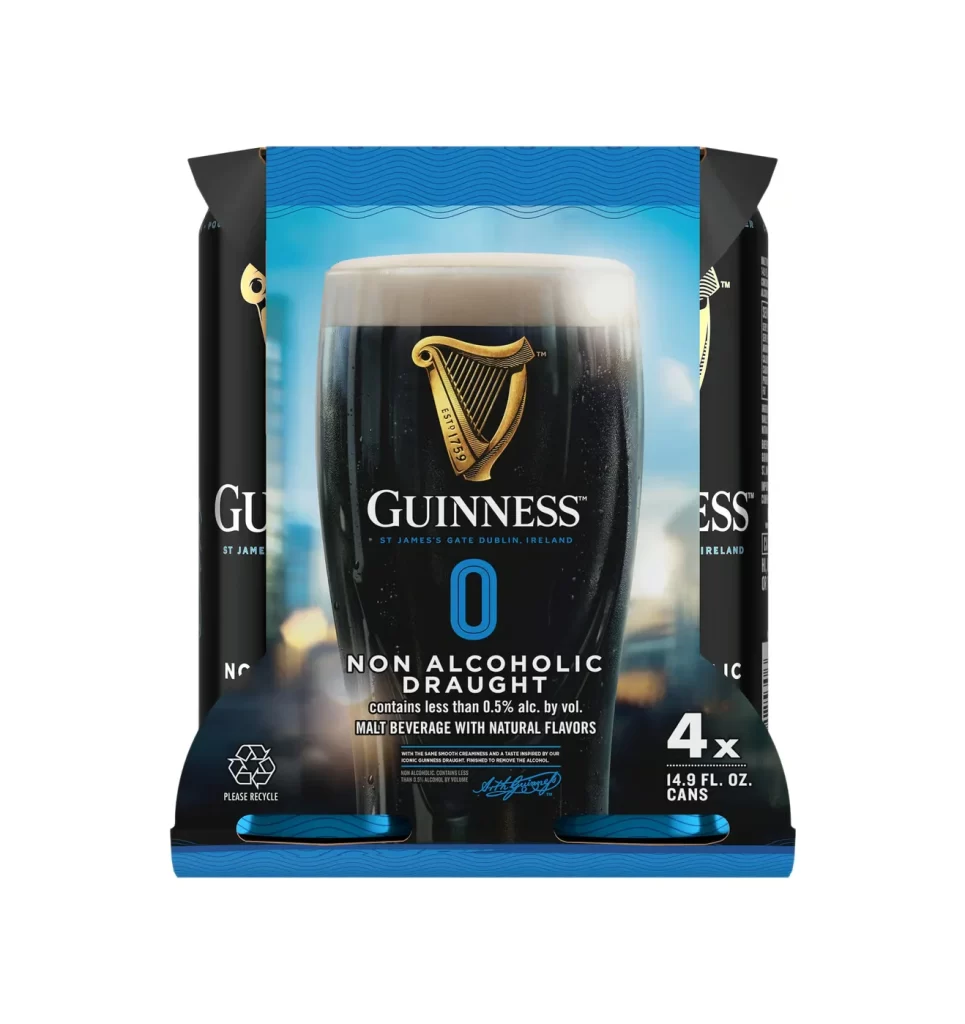
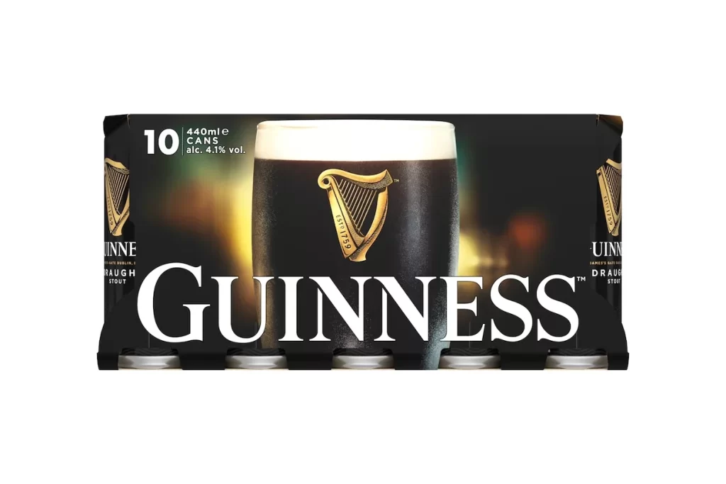
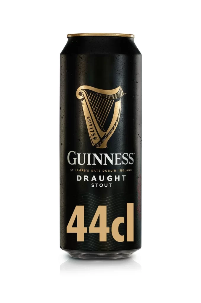
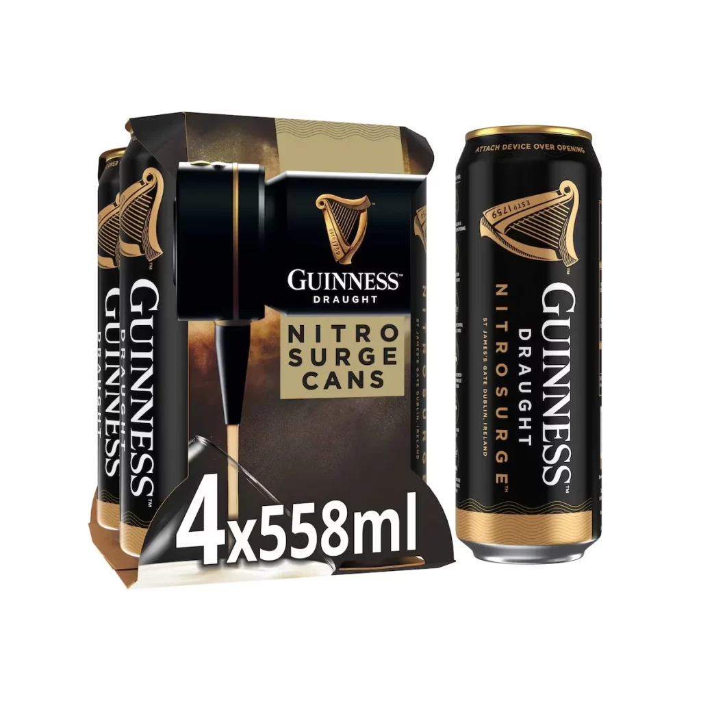
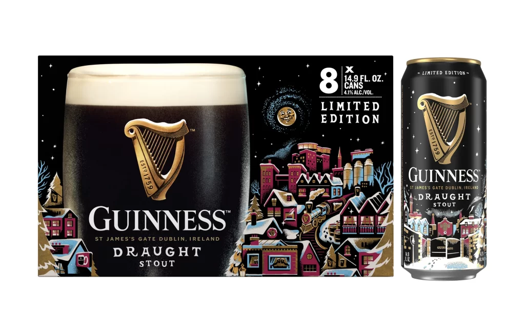
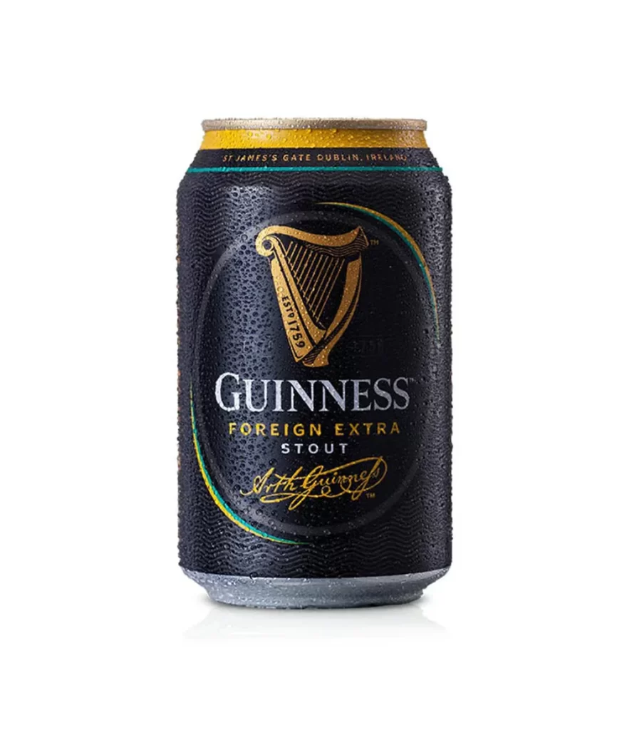
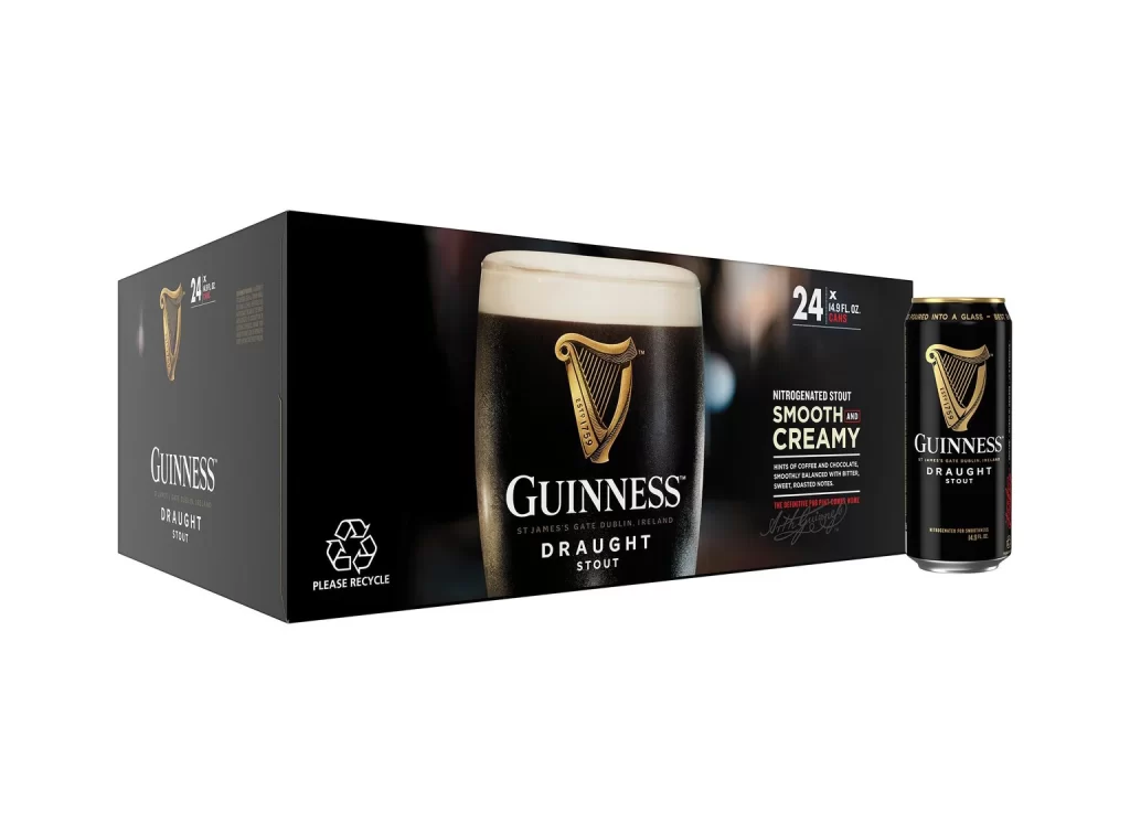
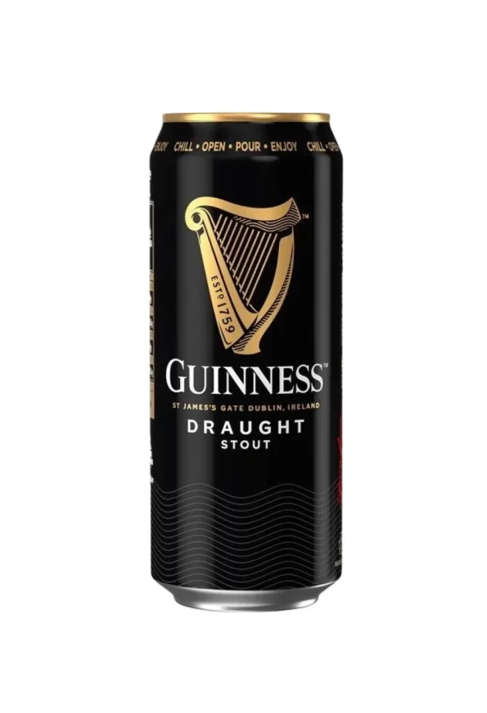
The image displays a single black Guinness Draught stout aluminum can set against a clean studio white background. The packaging features a prominent gold harp logo paired with the ESTD 1759 marking. A bold white GUINNESS wordmark sits at the center, while gold text reading St James's Gate Dublin Ireland rests below. The top edge includes the distinct CHILL OPEN POUR ENJOY rim text.
Analyzing the can design reveals a masterful color hierarchy, using the stark black base to make the gold and white elements pop. The iconic harp emblem serves as a classic focal point, anchoring the brand heritage. Typography plays a crucial role, as the bold white wordmark ensures instant recognition, while the smaller gold details add premium elegance without cluttering the overall layout.
This visual asset is an essential reference for graphic designers, packaging students, and beverage brand managers. Creators studying minimalist beer can layouts or iconic beverage typography will find immense value in the clear studio lighting. It perfectly demonstrates how to balance bold text, traditional emblems, and metallic accents, making it ideal for anyone developing modern aluminum can mockups.