Deschutes Black Butte Porter Can Black Background Packaging
Topics
Details
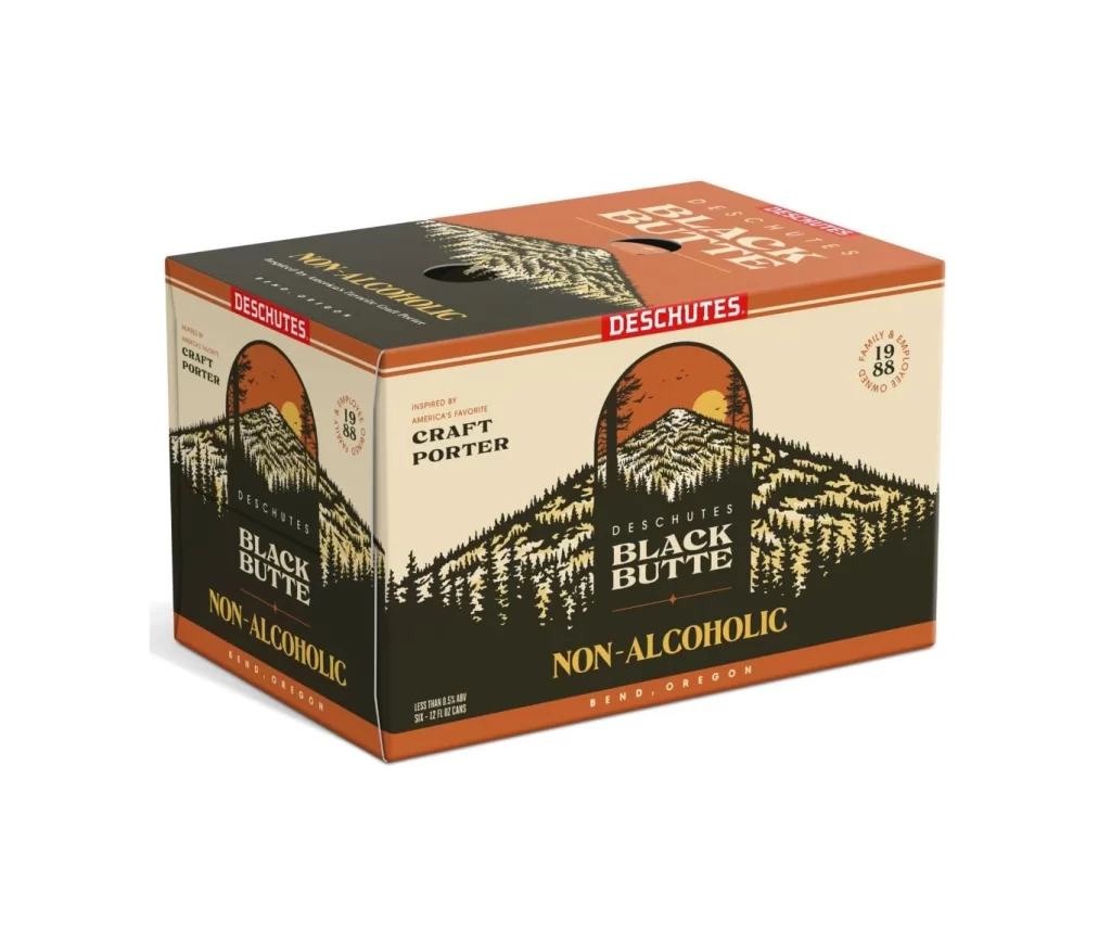
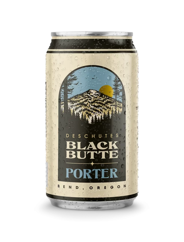
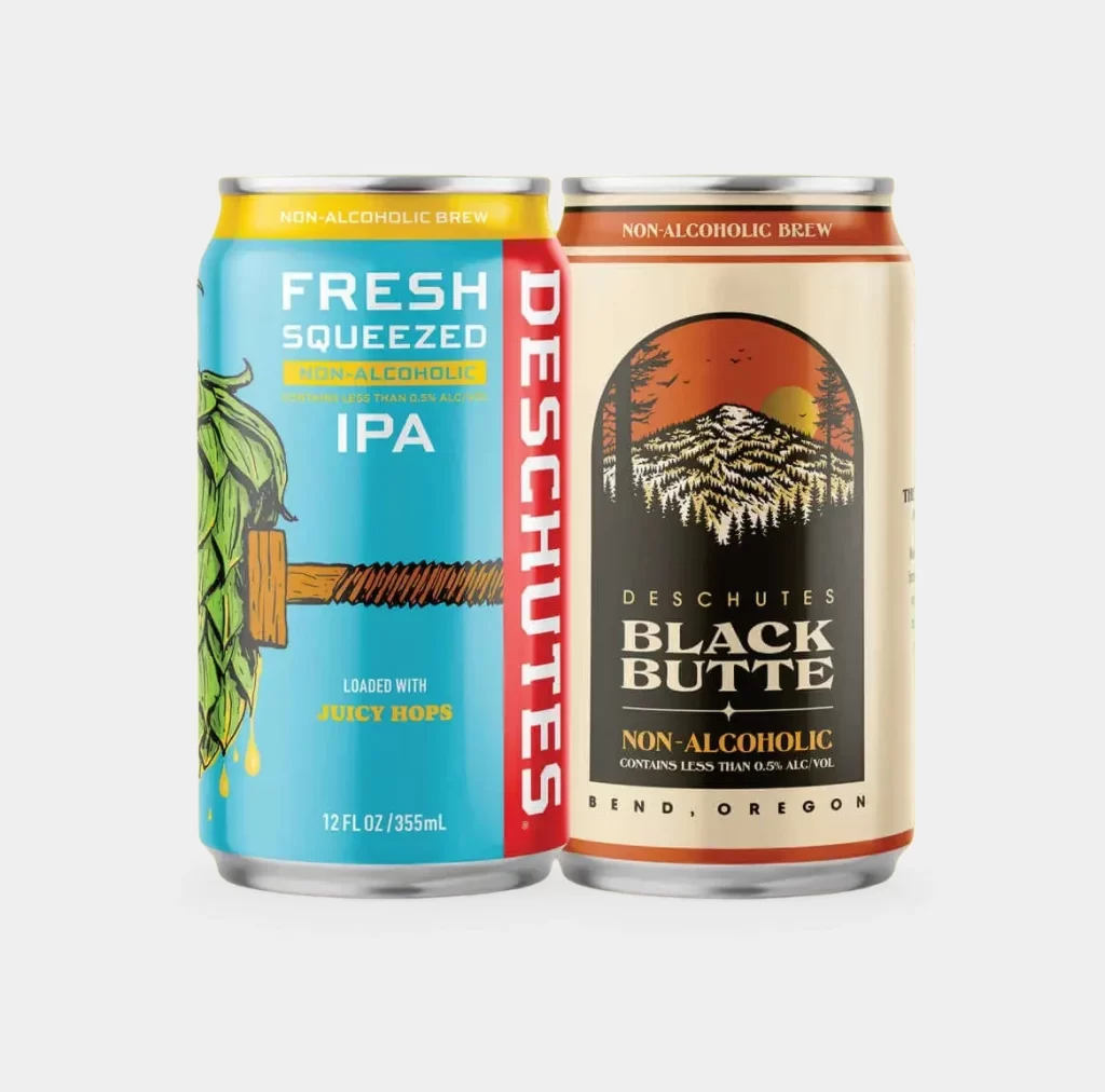
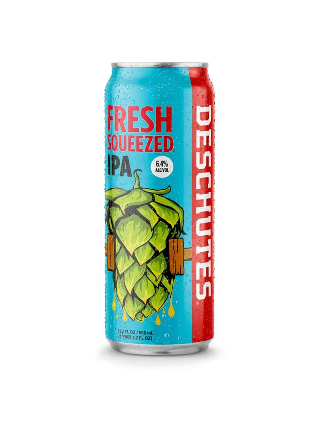
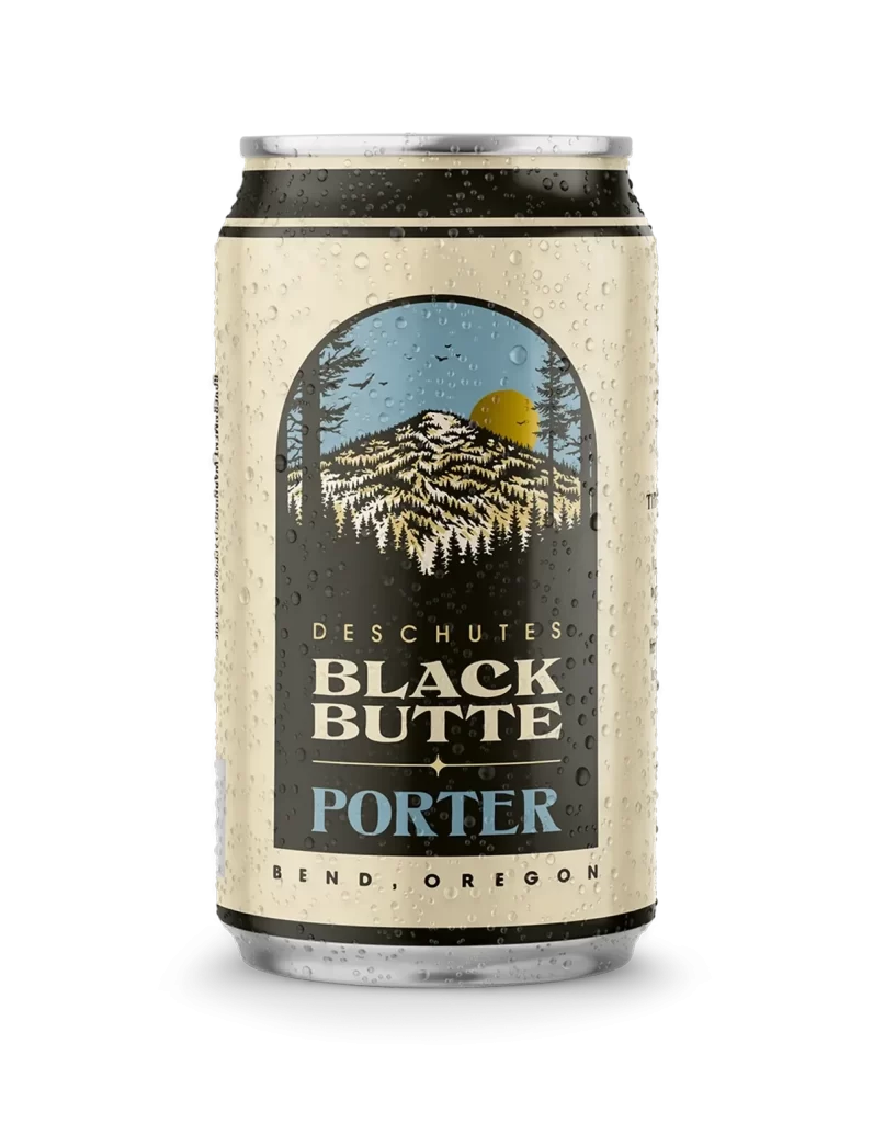
A chilled aluminum can of Deschutes Black Butte Porter stands centered against a solid black background, with condensation droplets visible across its cream-colored surface. The label features a distinctive arched illustration of a snow-capped mountain flanked by evergreen trees beneath a yellow sun and pale blue sky. Bold typography displays the brand name 'Deschutes' above the prominent 'Black Butte' title, with 'Porter' rendered in contrasting light blue lettering below.
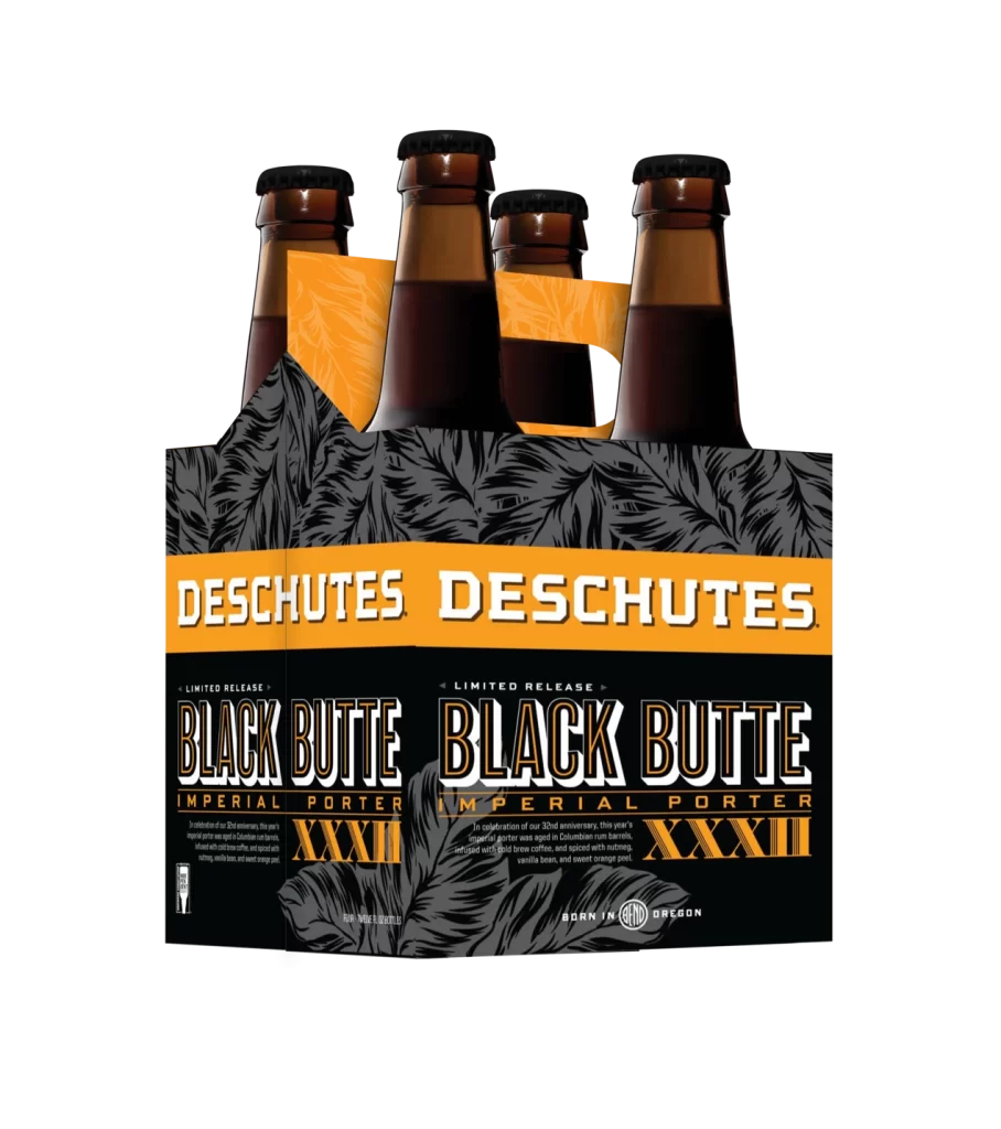
Originating from Bend, Oregon, this porter represents one of the flagship offerings from Deschutes Brewery, a craft beer pioneer in the Pacific Northwest. The beer style itself is characterized by its dark roasted malt profile, typically delivering notes of chocolate, coffee, and caramel with a smooth, moderate body. Such packaging design effectively communicates the beverage's Pacific Northwest heritage through its natural mountain imagery.
Packaging designers can appreciate how the arched window composition creates visual hierarchy while the limited color palette of cream, black, gold, and blue maintains brand consistency. The integration of local geography into label artwork demonstrates how regional identity can strengthen consumer connection without overwhelming essential product information. Strategic use of typography weight and color variation ensures readability while establishing clear visual distinction between brewery name, product name, and style classification.