Deschutes The Essentials Variety Pack Bottles Packaging
Topics
Details
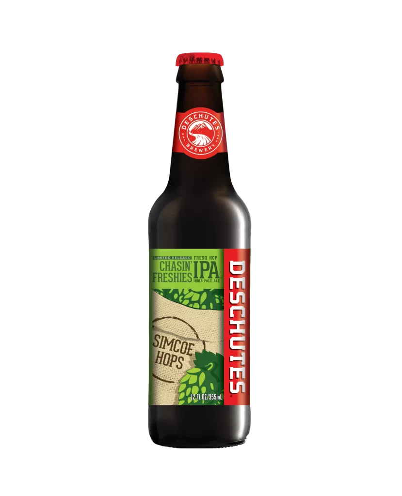
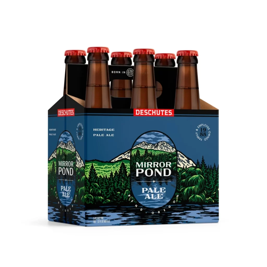
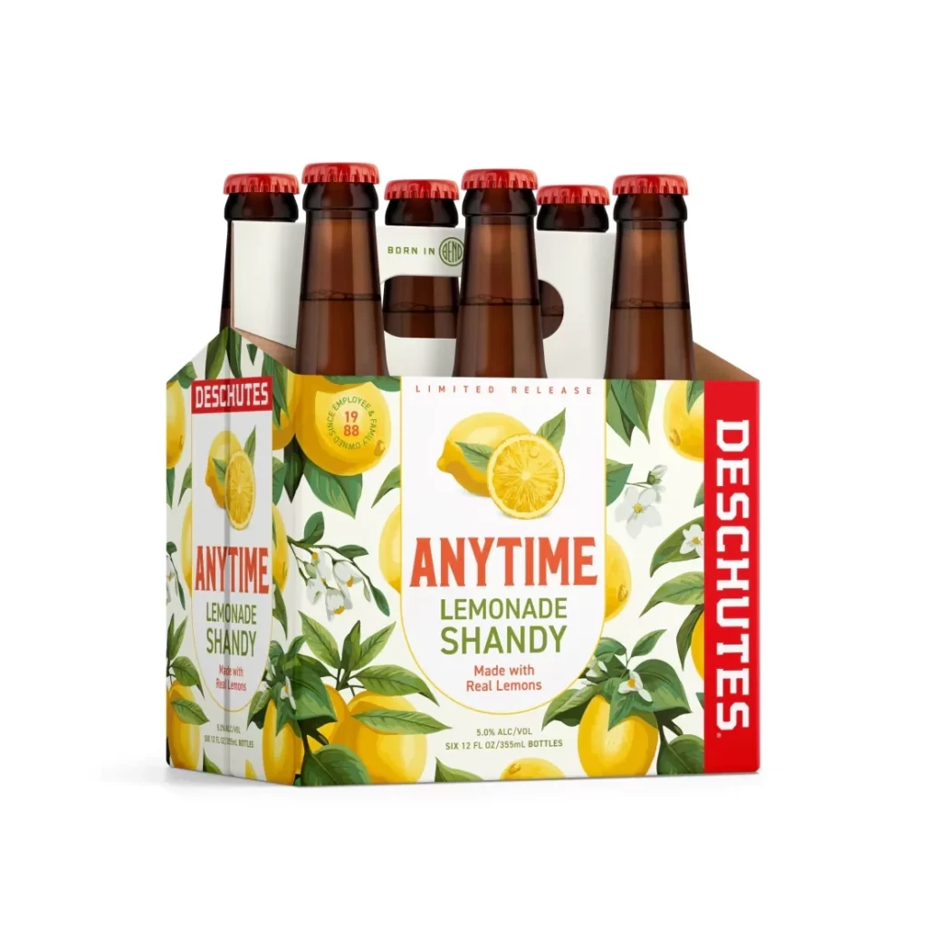
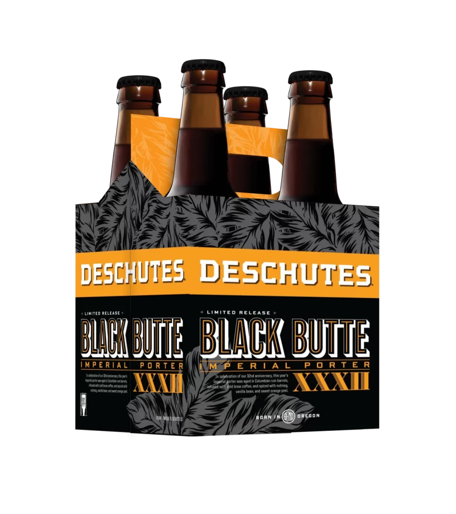
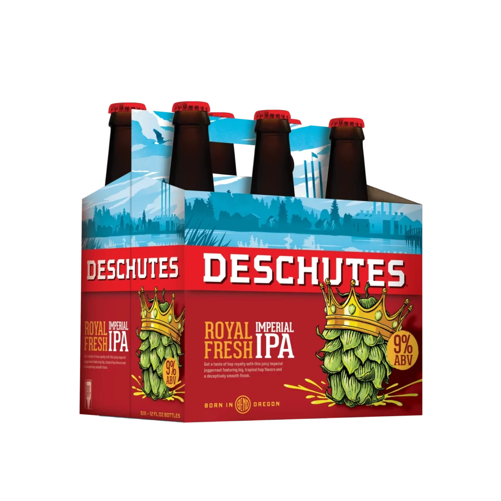
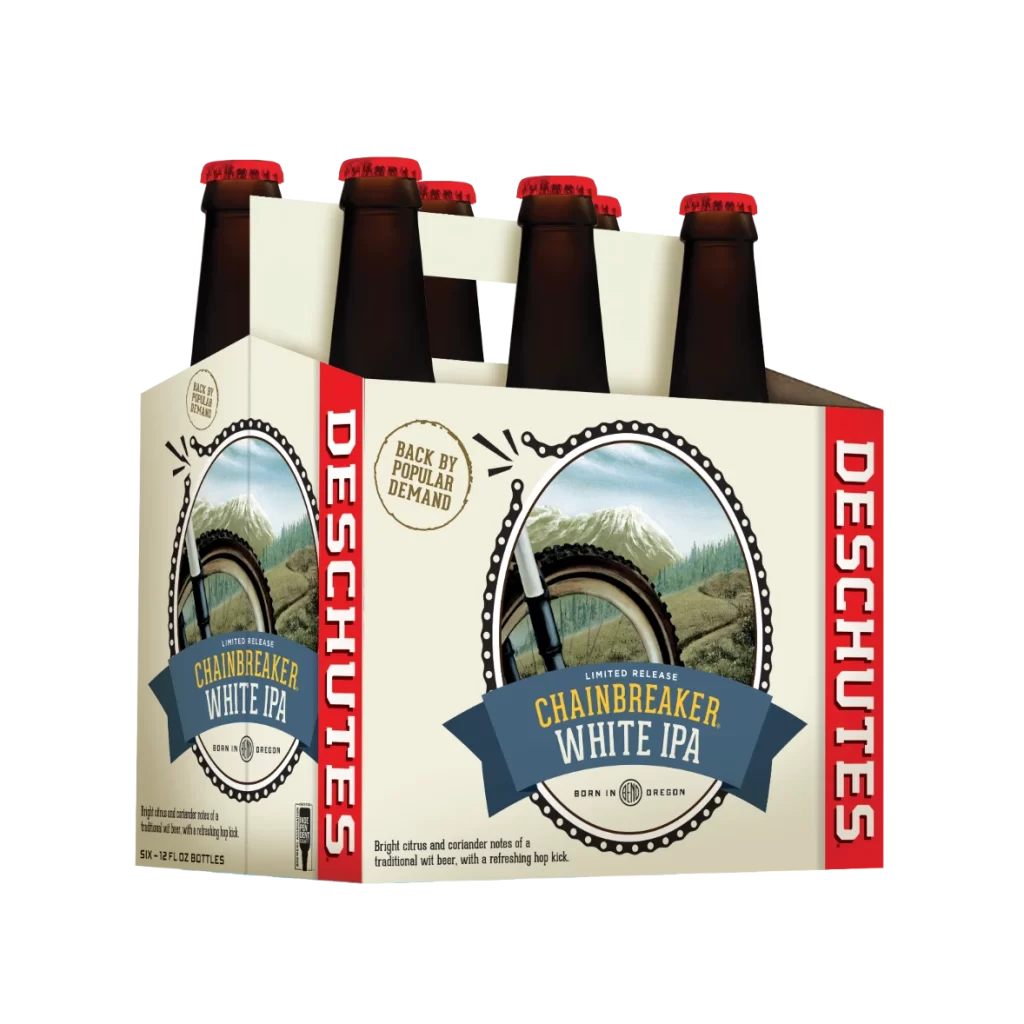
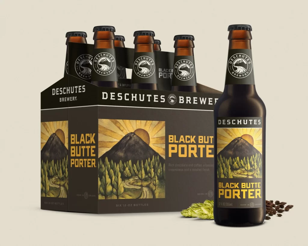
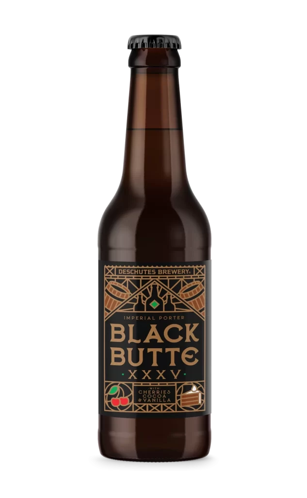
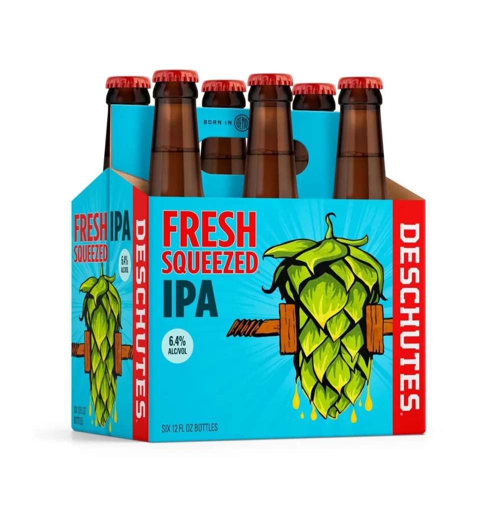
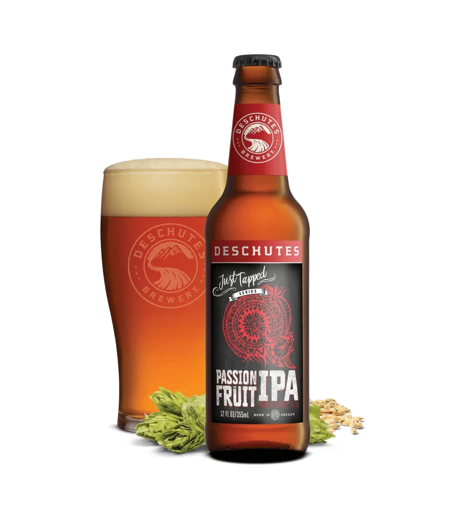
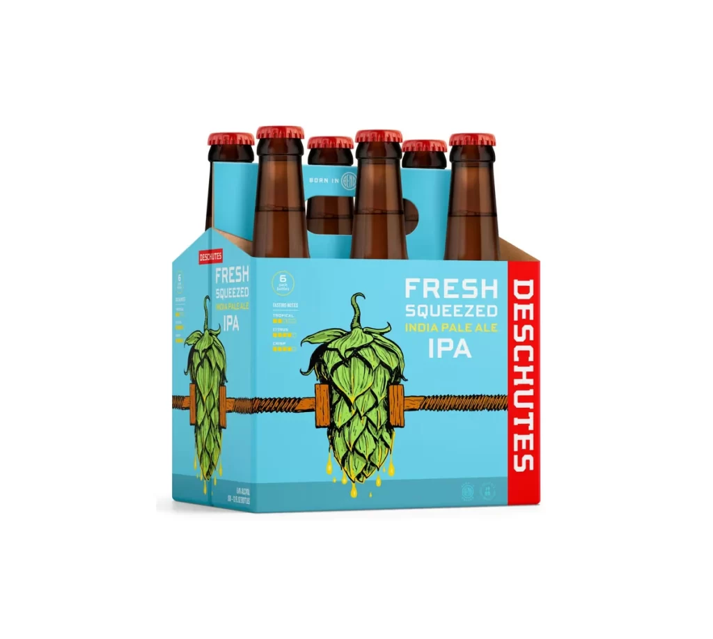
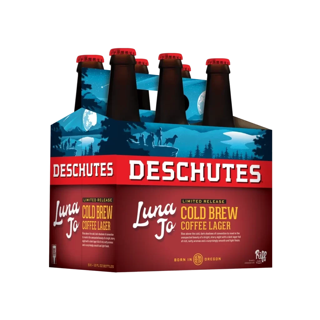
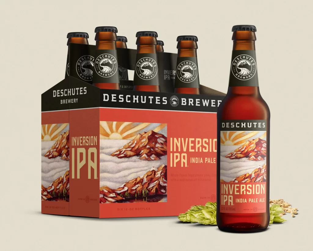
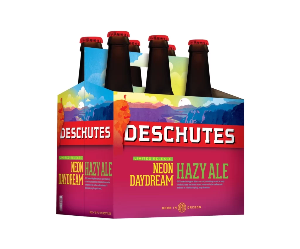
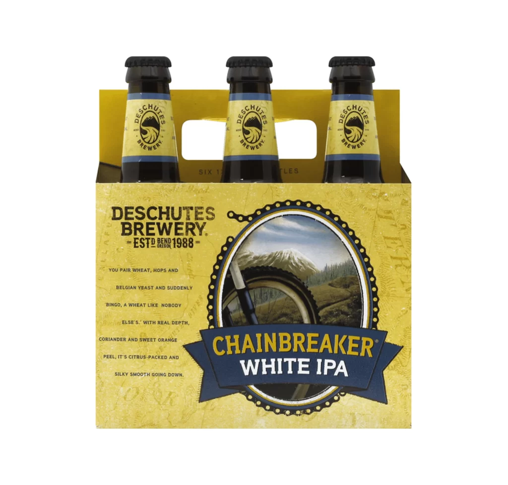
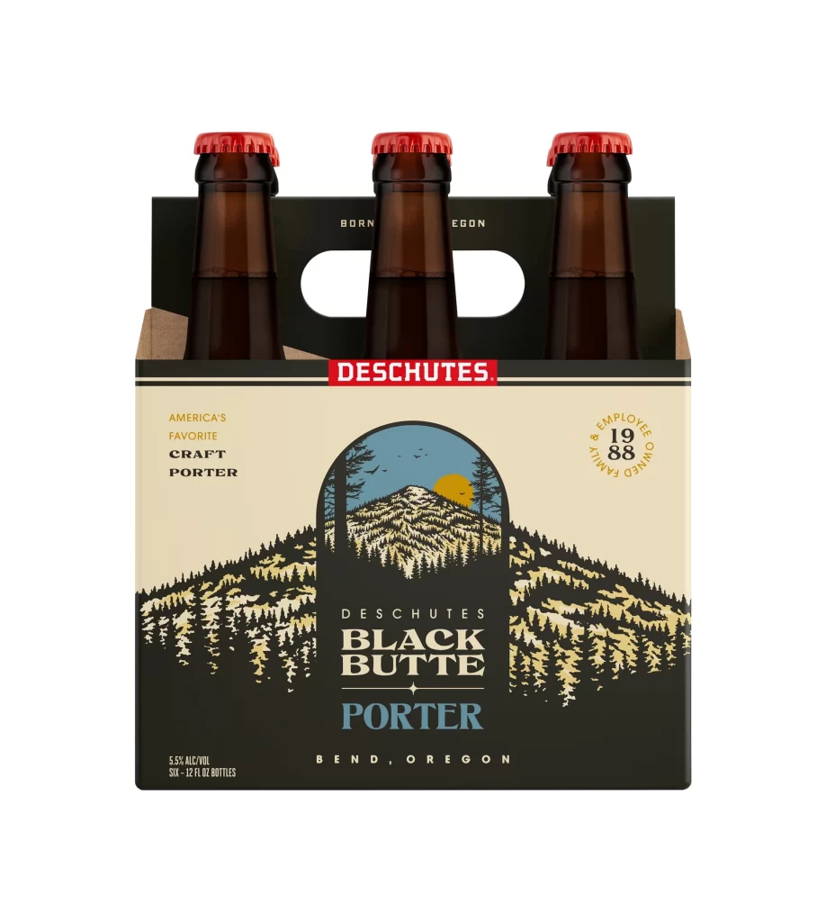
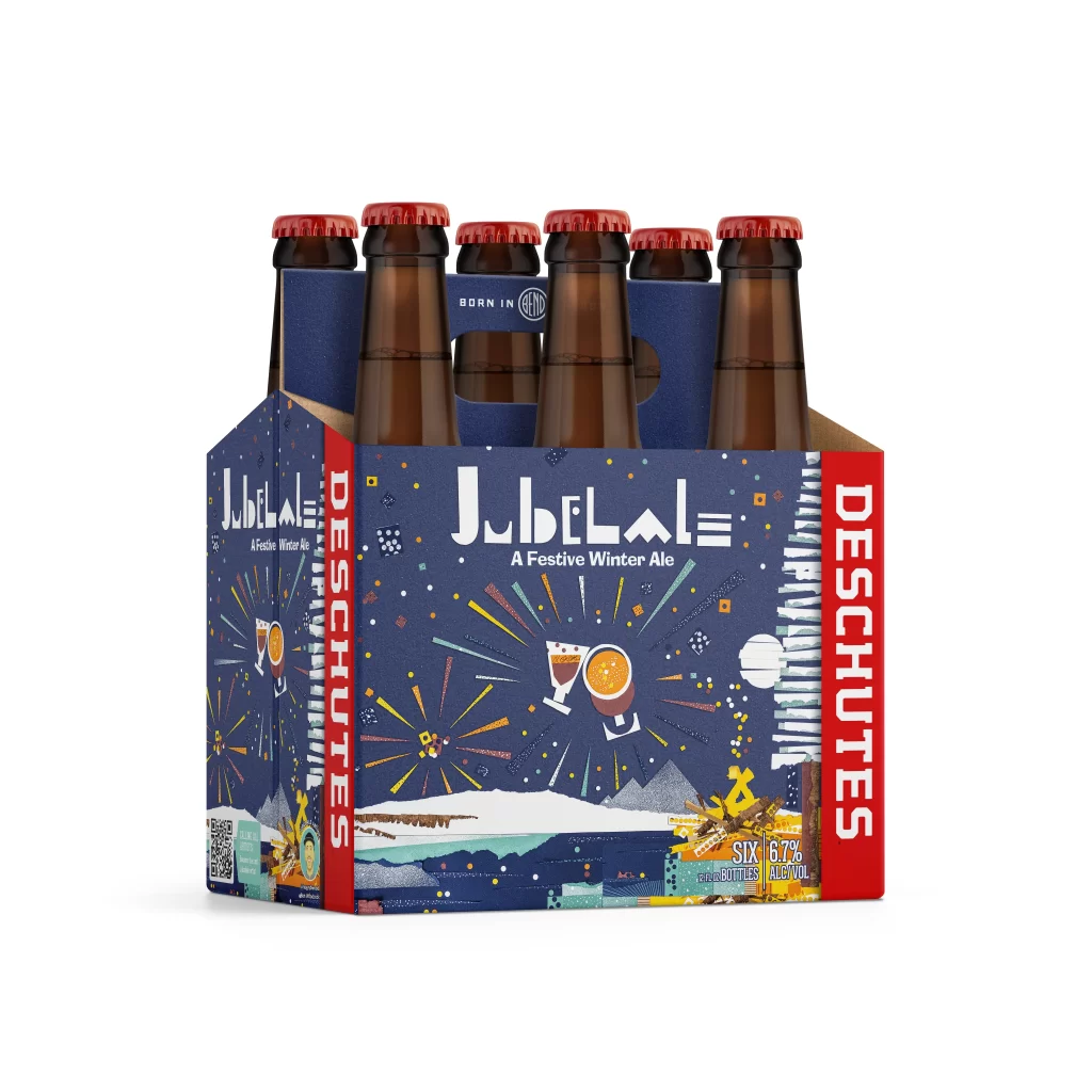
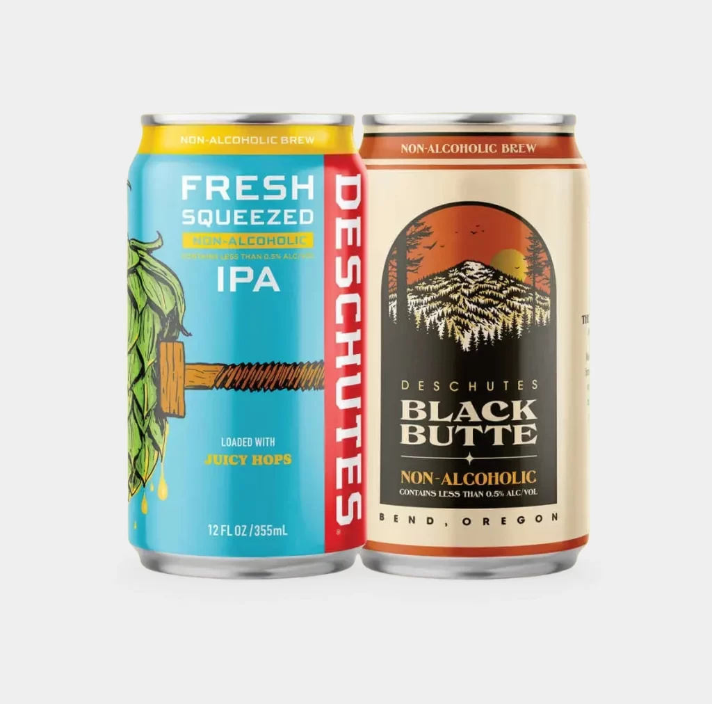
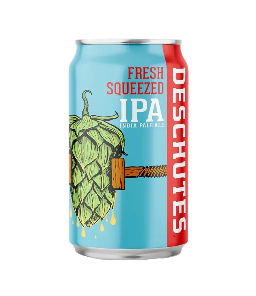
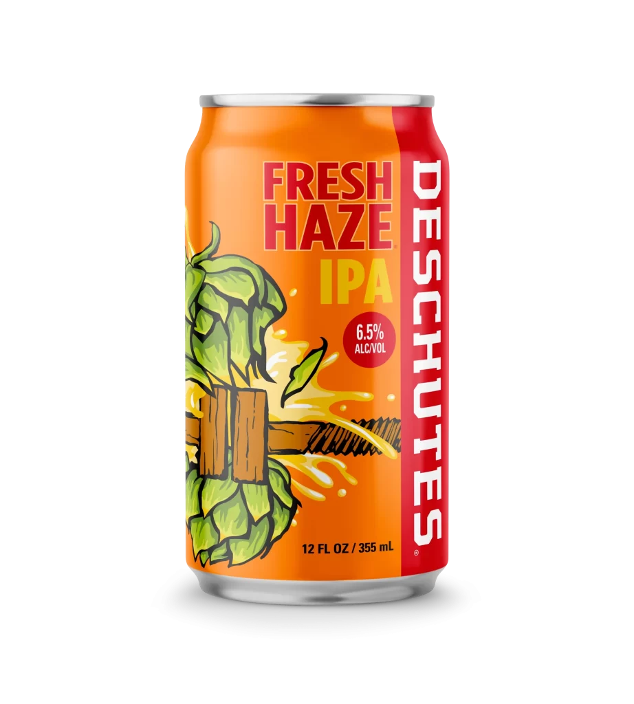
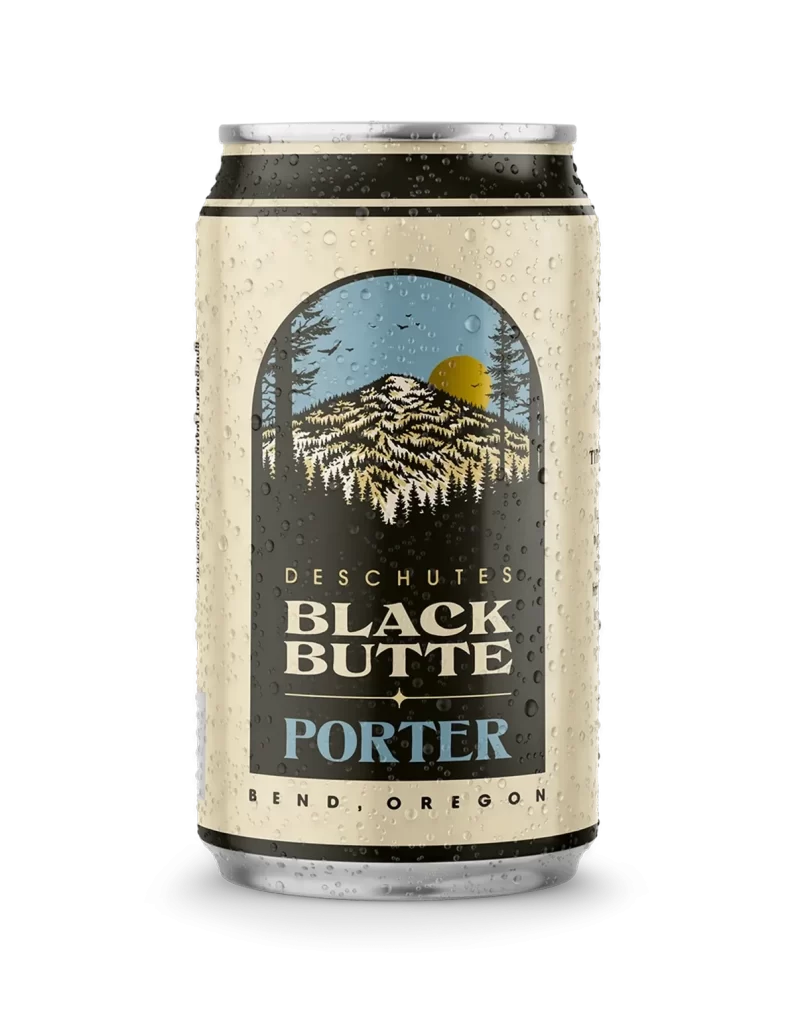
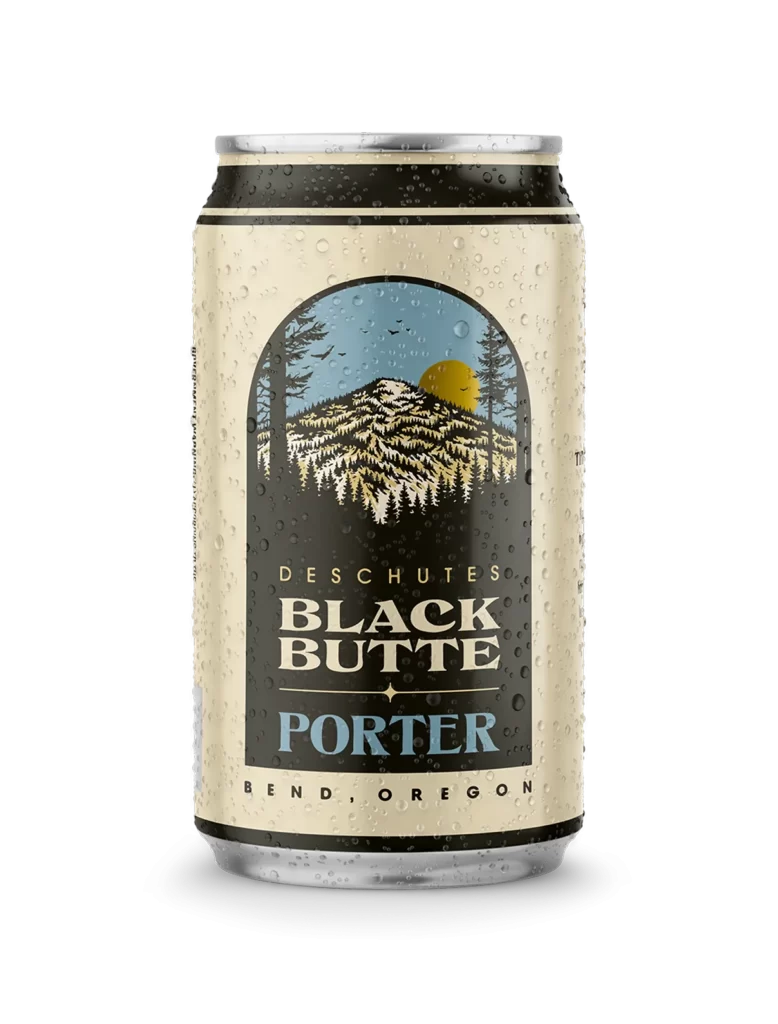
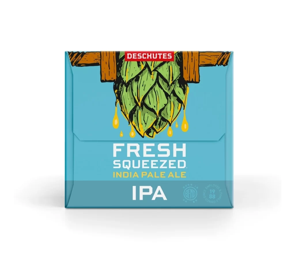
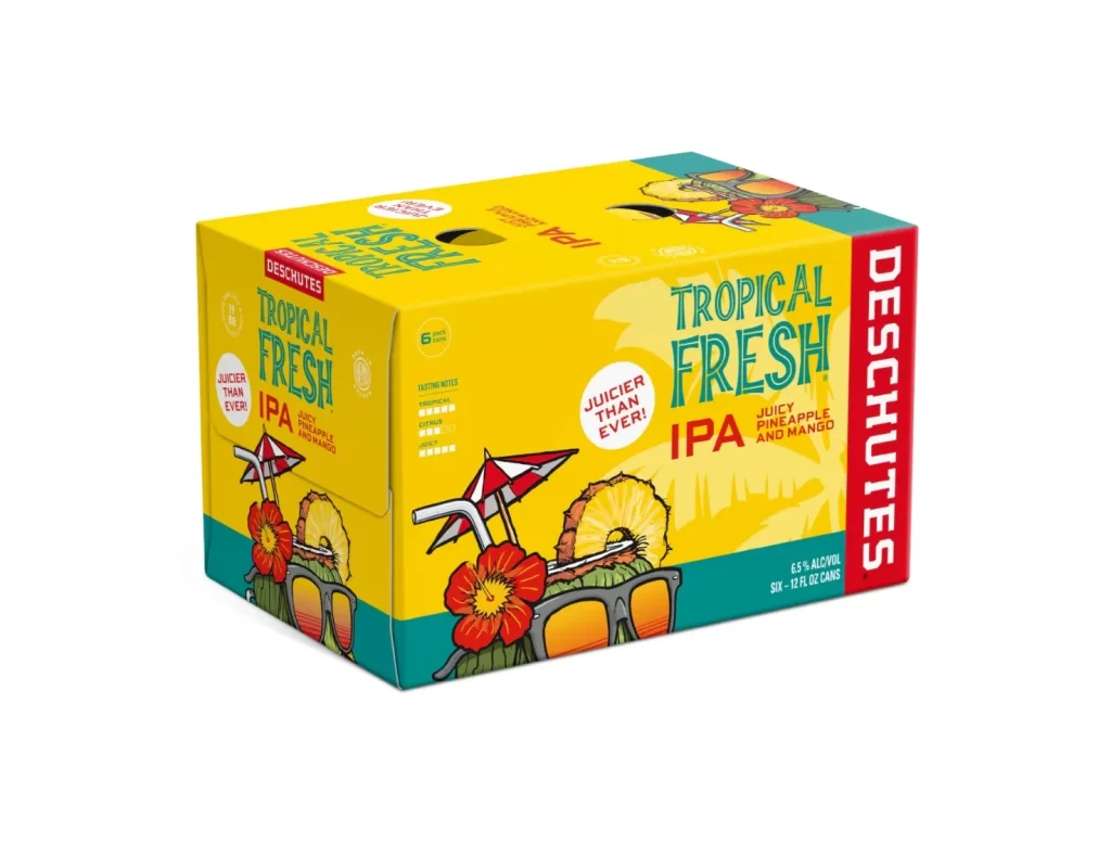
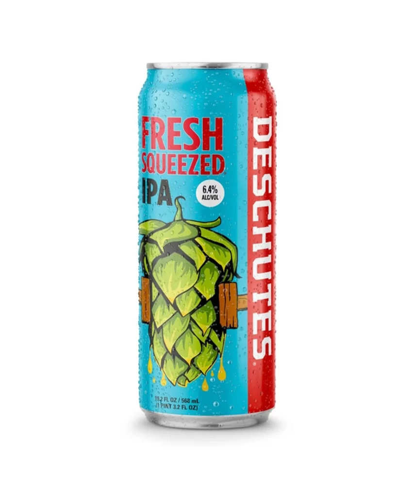
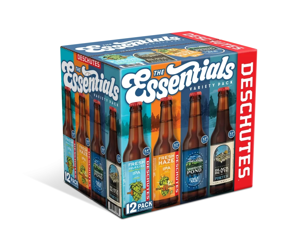
The image displays a twelve-pack of Deschutes 'The Essentials' variety pack, featuring brown glass bottles with red caps arranged in a cardboard carrier. The packaging showcases three distinct beer labels: Fresh Squeezed IPA with green hop artwork, Fresh Haze IPA with an orange background and hop cone illustration, and Mirror Pond Pale Ale alongside Black Butte Porter featuring mountain landscapes. The carrier itself uses a blue color palette on the front panel with bold white script for the product name, while the side panels display a vibrant red vertical banner with the Deschutes brand name in white lettering.
Deschutes Brewery, based in Bend, Oregon, curates this selection to represent their core range of craft beer styles, balancing hop-forward IPAs with maltier options. The inclusion of both Fresh Squeezed IPA (6.4% ABV) and Fresh Haze IPA (5.2% ABV) demonstrates the brewery's commitment to exploring different IPA profiles, from West Coast clarity to hazy East Coast iterations. Rounding out the pack with Mirror Pond Pale Ale and Black Butte Porter ensures drinkers experience the full spectrum of Deschutes' brewing capabilities, from crisp and citrusy to dark and roasty.
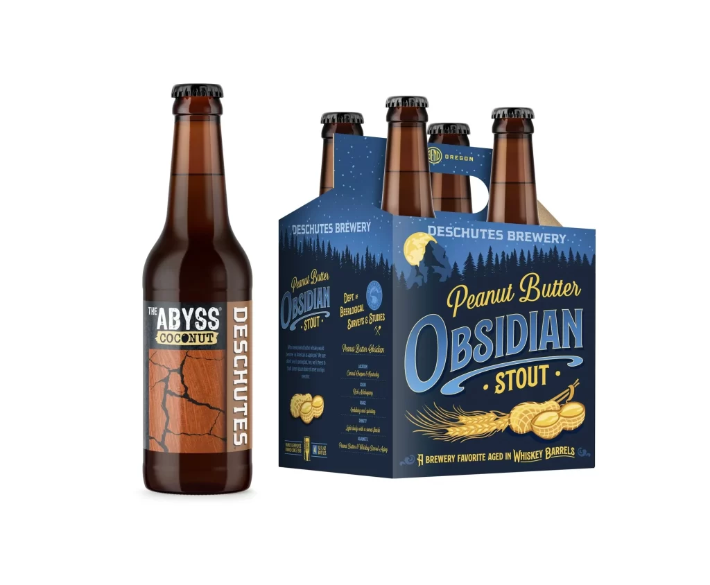
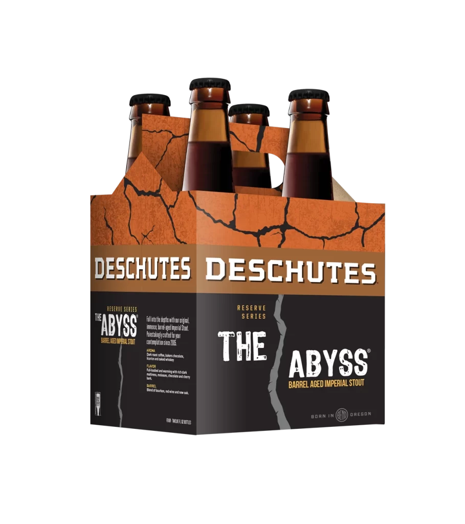
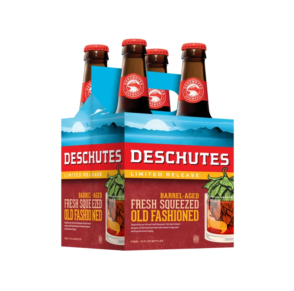
Packaging designers can study how this variety pack employs consistent brand elements—such as the distinctive bottle shape and cap color—while allowing individual label designs to shine through unique color coding and imagery. The strategic use of contrasting side panels in red creates strong shelf presence and reinforces brand recognition without competing with the front-facing product information. Label artwork effectively communicates flavor expectations through visual cues like hops for IPAs and mountain scenery for the Pacific Northwest-inspired porter, demonstrating how illustration can enhance consumer understanding of beer styles.