Deschutes Rip City Lager Six Pack Cans Packaging
Topics
Details
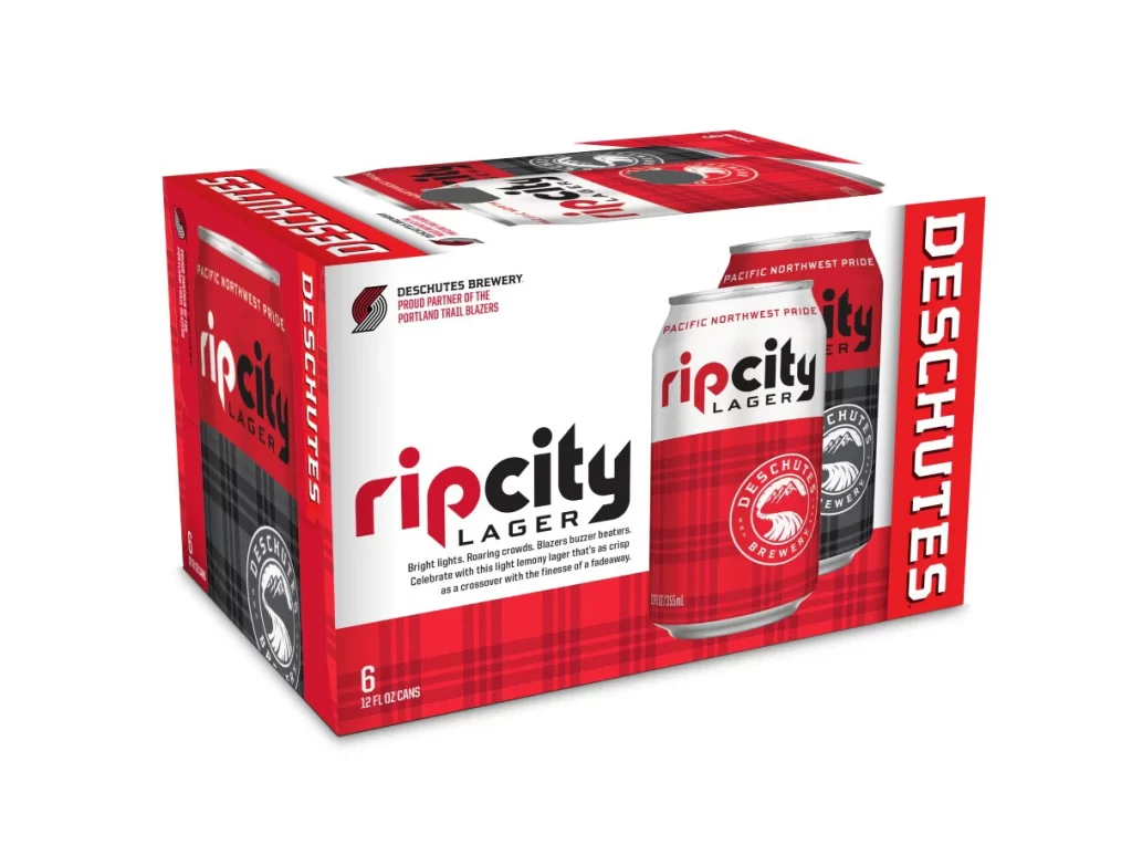
The image displays a six-pack of Deschutes Rip City Lager set against a clean, pure white background. The packaging features a bold red and white color scheme with a distinct plaid pattern on the lower half. Two cans are prominently visible in the foreground, showcasing the 'rip city' typography and the Deschutes Brewery circular logo.
Produced by Deschutes Brewery, a proud partner of the Portland Trail Blazers, this light lager is designed to capture the spirit of the Pacific Northwest. The branding emphasizes local pride with the tagline 'Pacific Northwest Pride' and describes the beer as a crisp crossover suitable for celebrating bright lights and roaring crowds.
Designers can appreciate the effective use of high-contrast colors and geometric patterns to create shelf presence. The integration of sports team affiliation into the visual identity demonstrates how regional partnerships can enhance brand storytelling. Such packaging successfully balances corporate branding with specific lifestyle marketing to appeal to a dedicated fanbase.