Deschutes King Crispy Six Pack Cans Packaging
Topics
Details
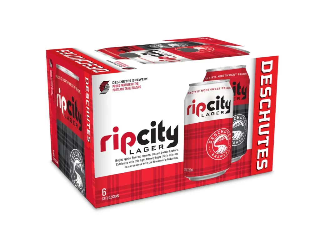
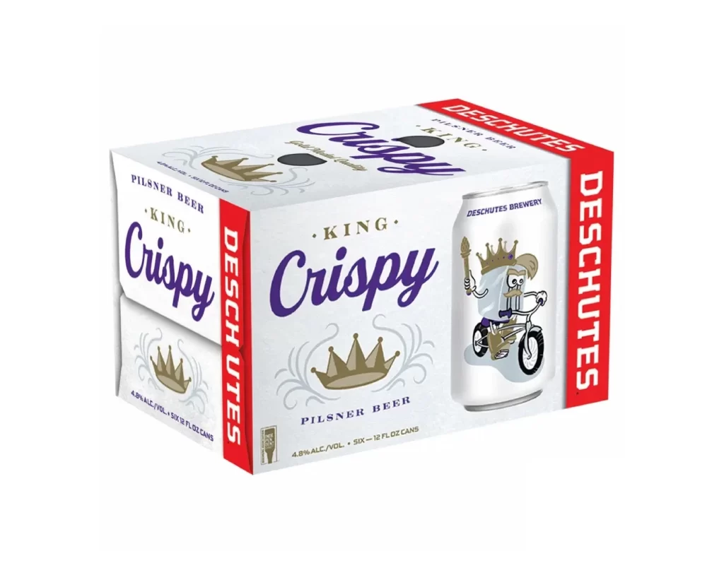
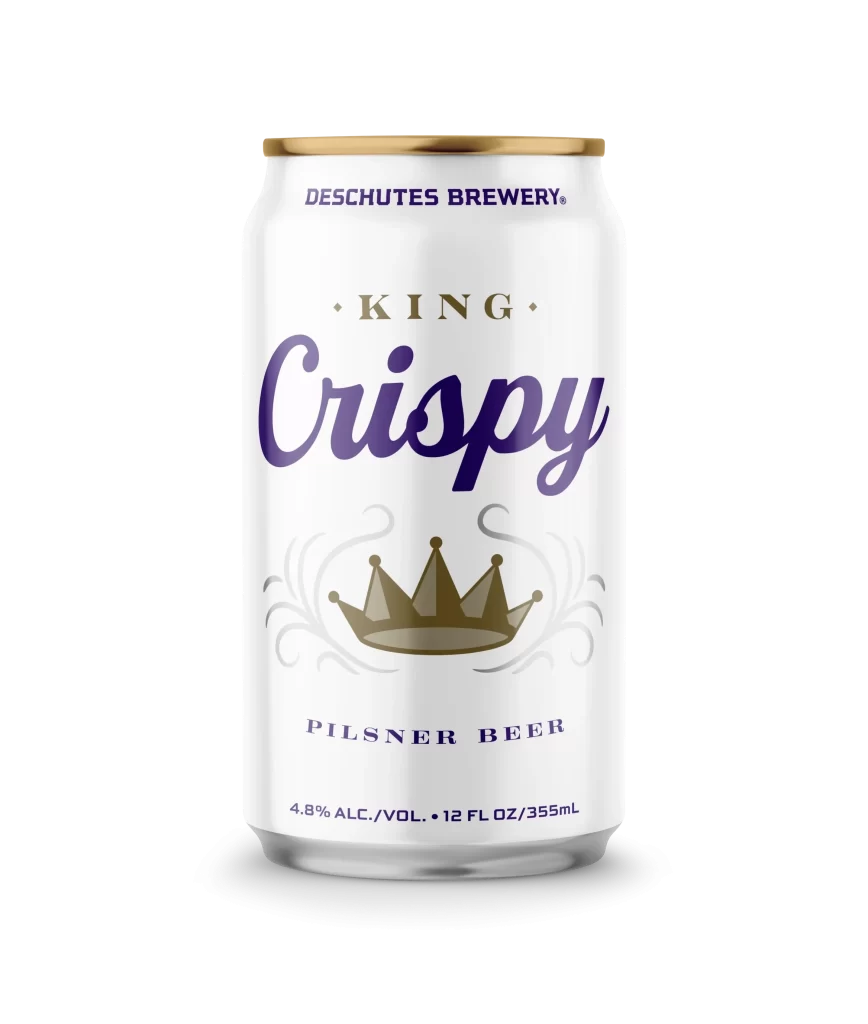
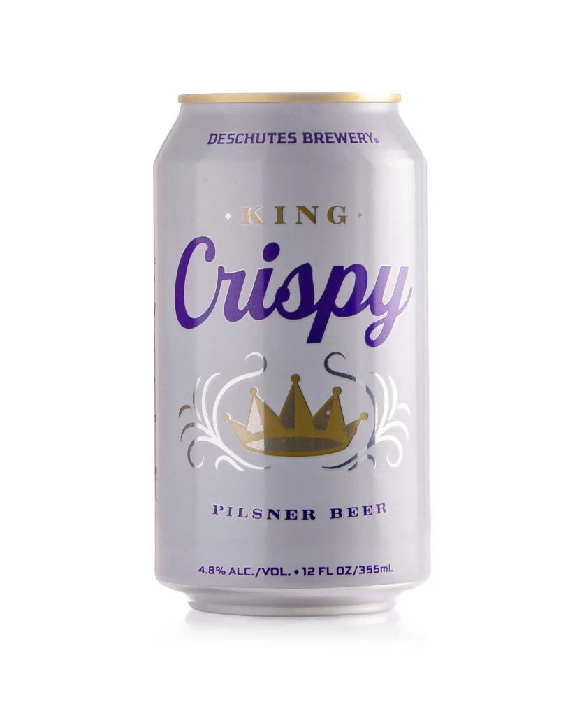
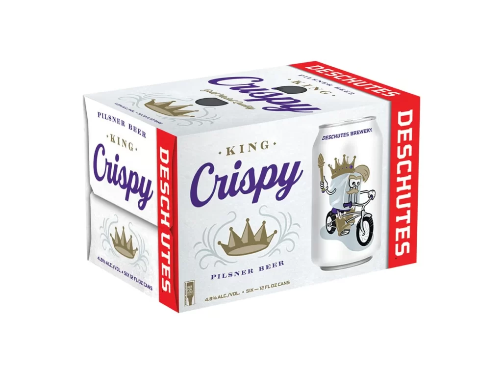
The image displays a six-pack of King Crispy Pilsner beer by Deschutes Brewery, featuring a clean white cardboard carrier with bold red side panels. The front label showcases the product name in large purple script, flanked by a gold crown icon and the text 'Pilsner Beer' in a smaller serif font. A graphic of an individual can on the right side reveals whimsical artwork depicting a crowned character riding a bicycle while holding a torch.
Deschutes Brewery, based in Bend, Oregon, presents this Pilsner as a crisp, refreshing option with an alcohol content of 4.8% by volume. The packaging design utilizes a playful 'King' theme, reinforced by the royal crown imagery and the regal character illustration. This branding approach aims to convey a sense of light-hearted royalty suitable for a easy-drinking lager style.
Designers can appreciate the effective use of negative space and the high-contrast color palette of white, red, and deep purple. The integration of hand-drawn style illustrations with classic typography creates a memorable visual identity that stands out on retail shelves. Such packaging demonstrates how character-driven art can enhance brand personality without overwhelming essential product information.