Deschutes Fresh Squeezed IPA Three Quarter View Packaging
Topics
Details
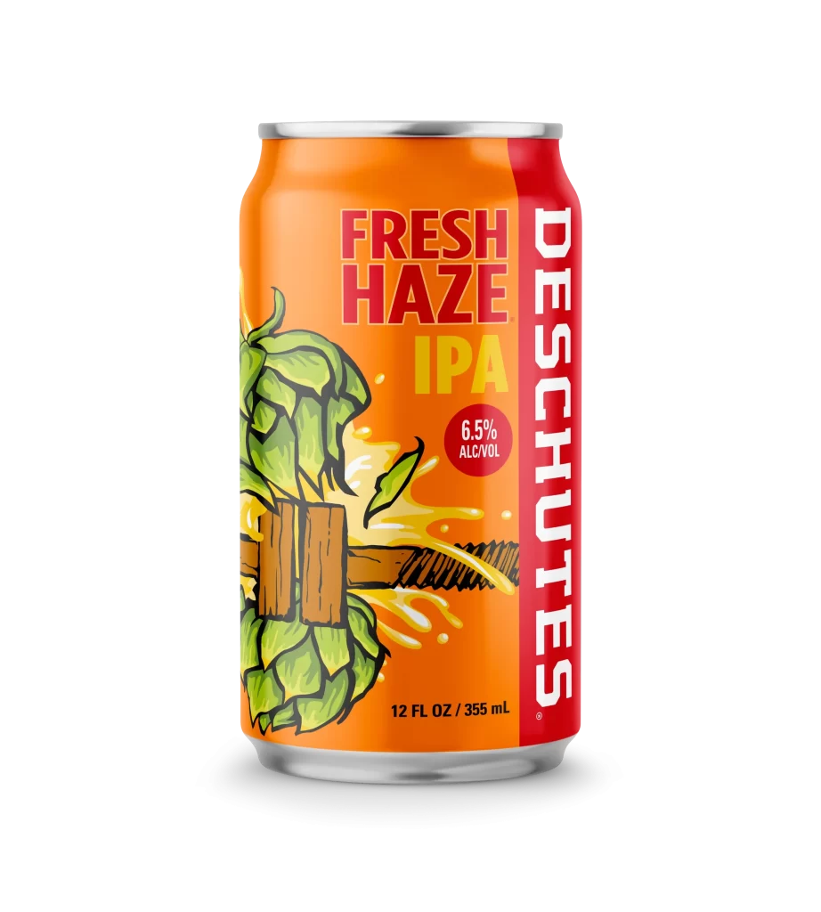
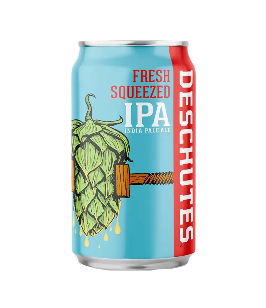
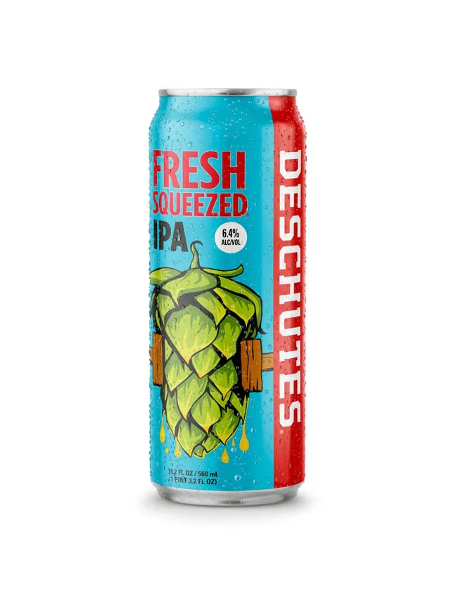
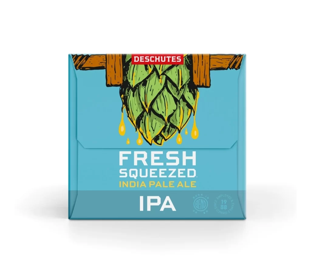
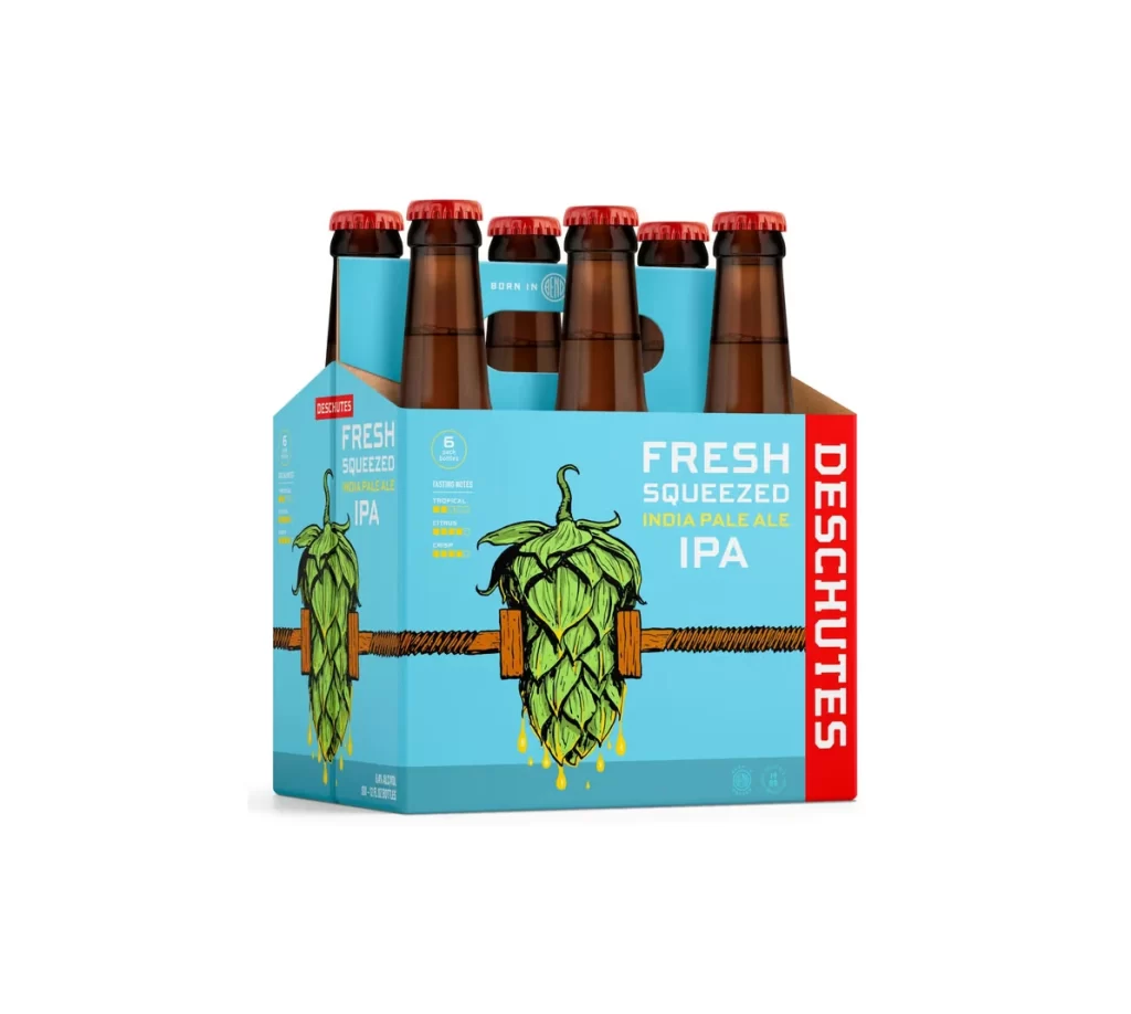
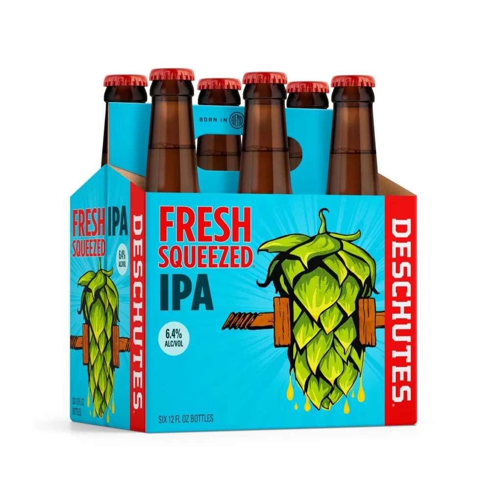
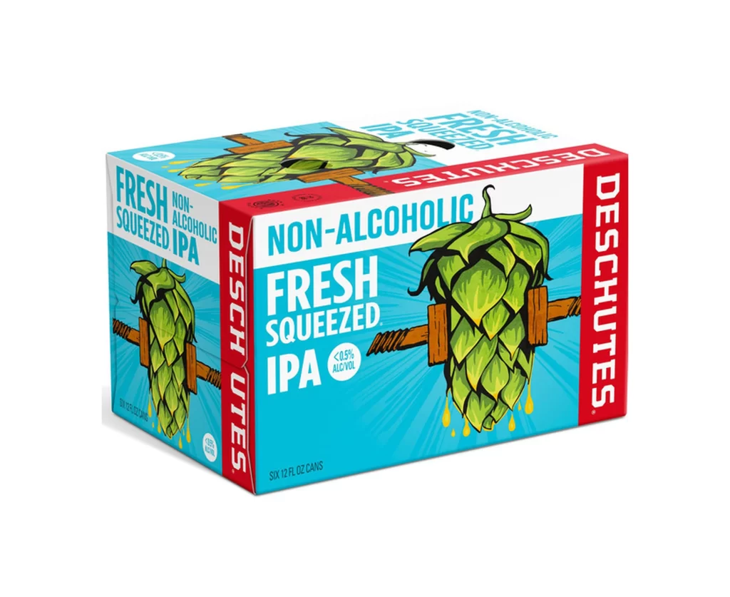
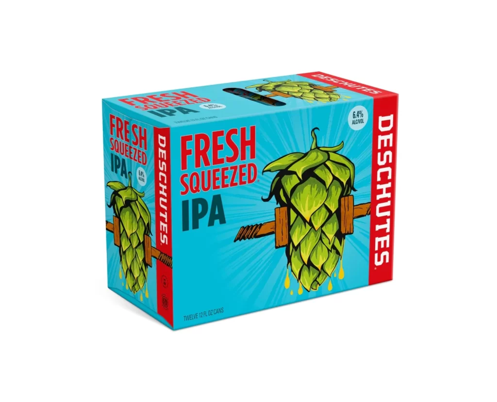
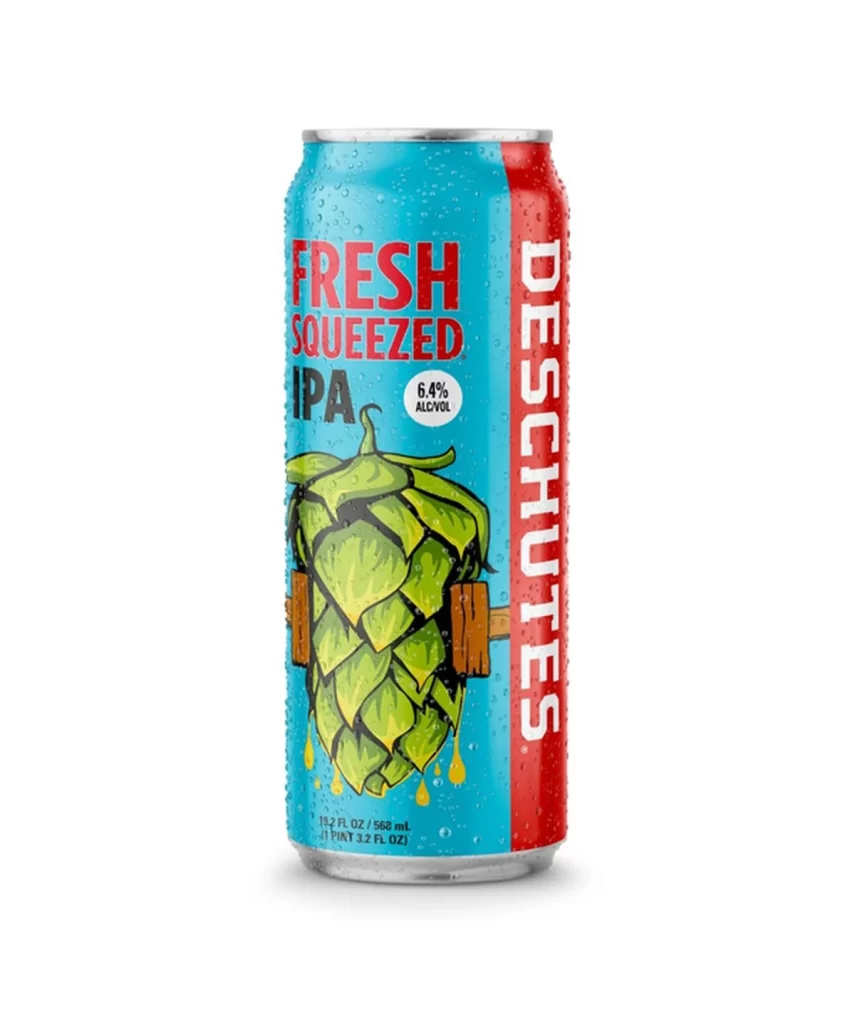
A single 12-ounce aluminum can of Deschutes Fresh Squeezed IPA stands centered against a pure white background. The container features a vibrant cyan blue body with a bold red vertical stripe on the right side. Central artwork depicts a large green hop cone being compressed by wooden press blocks, with golden liquid dripping from the bottom.
Deschutes Brewery, based in Bend, Oregon, produces this IPA which carries a 6.4% alcohol by volume content. The 'Fresh Squeezed' name and hop press imagery emphasize the beer's focus on juicy, citrus-forward hop characteristics typical of the style. This visual metaphor effectively communicates the product's fresh, aromatic flavor profile to consumers.
Packaging designers can learn from the strong color blocking between cyan and red that creates immediate shelf presence. The playful yet thematic illustration demonstrates how literal interpretations of product names can enhance brand storytelling. Typography hierarchy successfully balances the large product name with essential technical details like volume and alcohol percentage.