Deschutes Fresh Squeezed IPA Six Pack Cans
Topics
Details
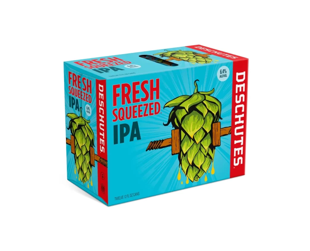
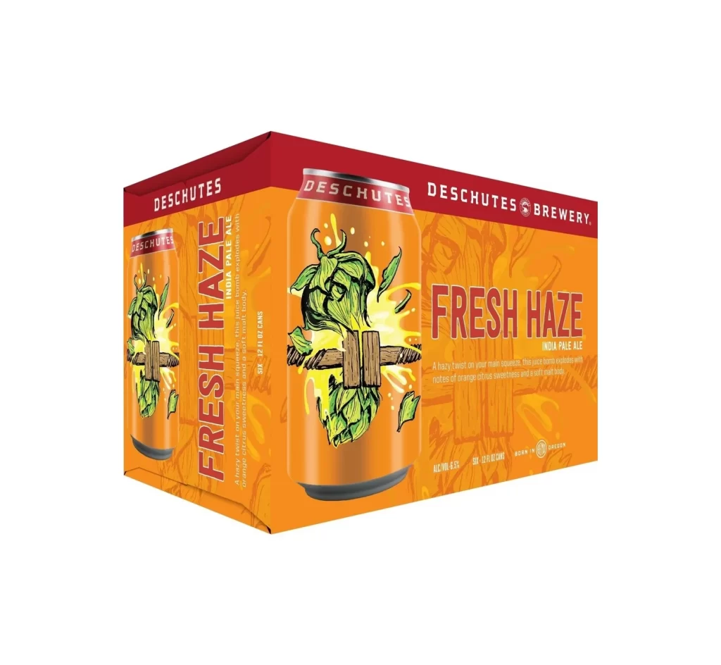
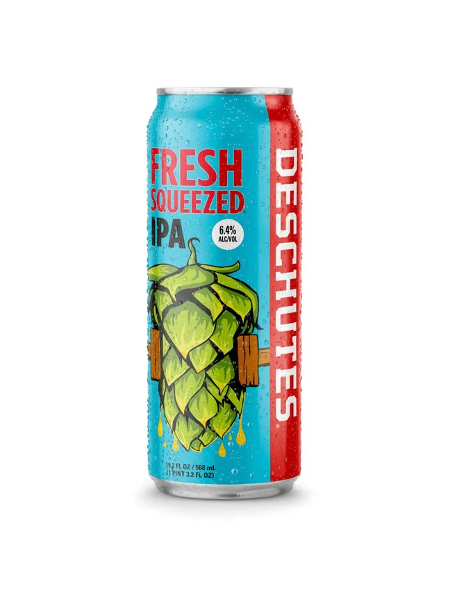
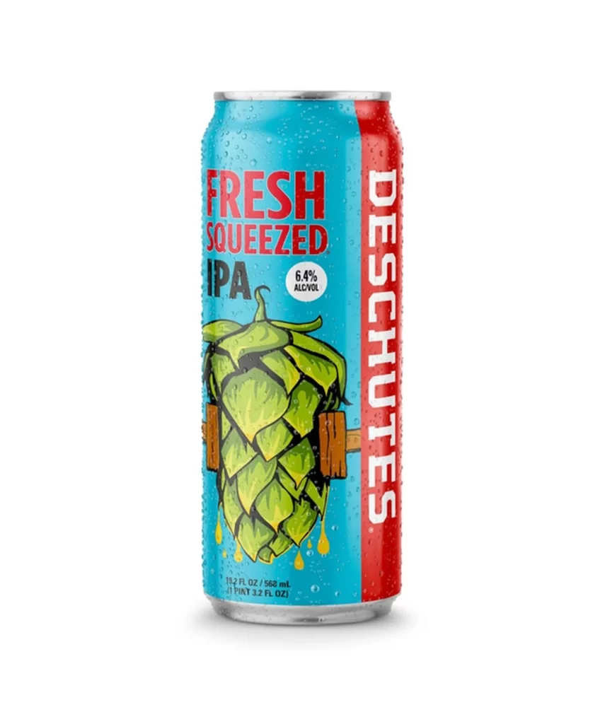
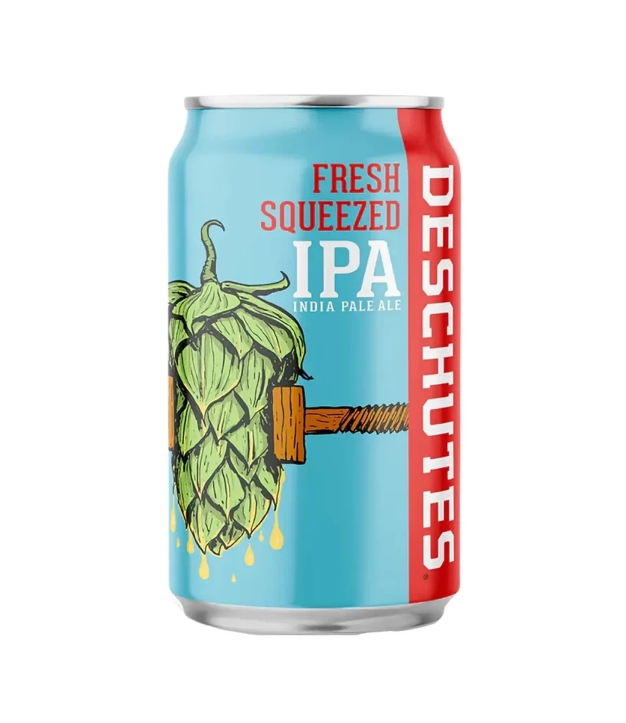
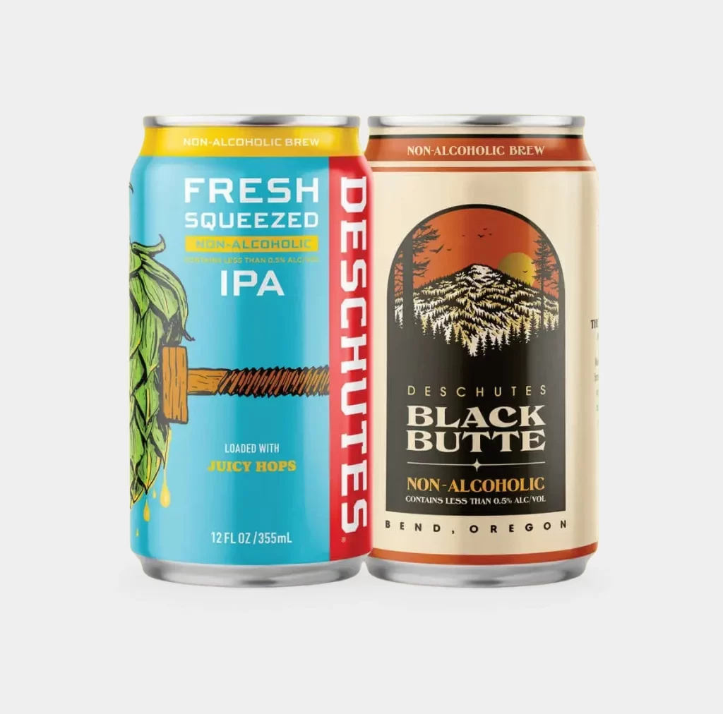
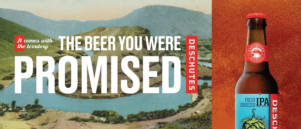
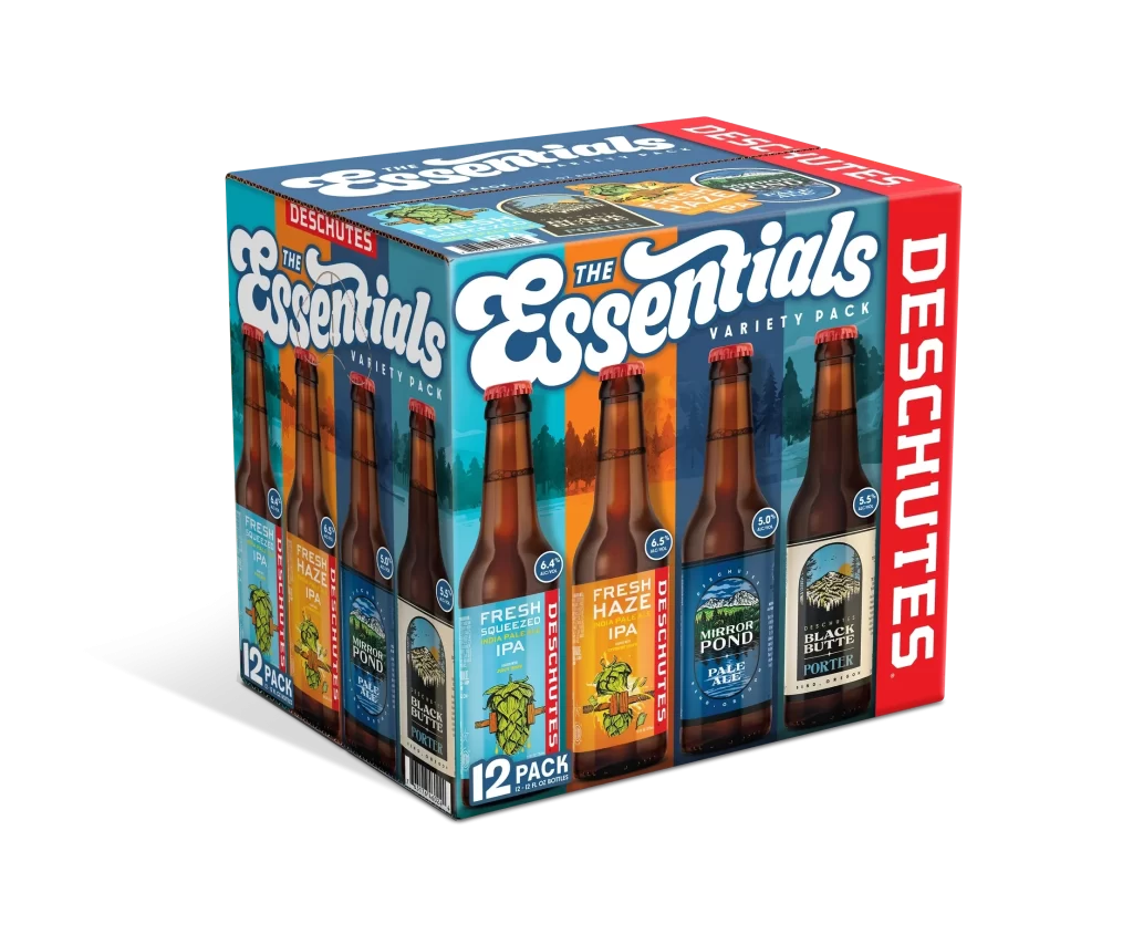
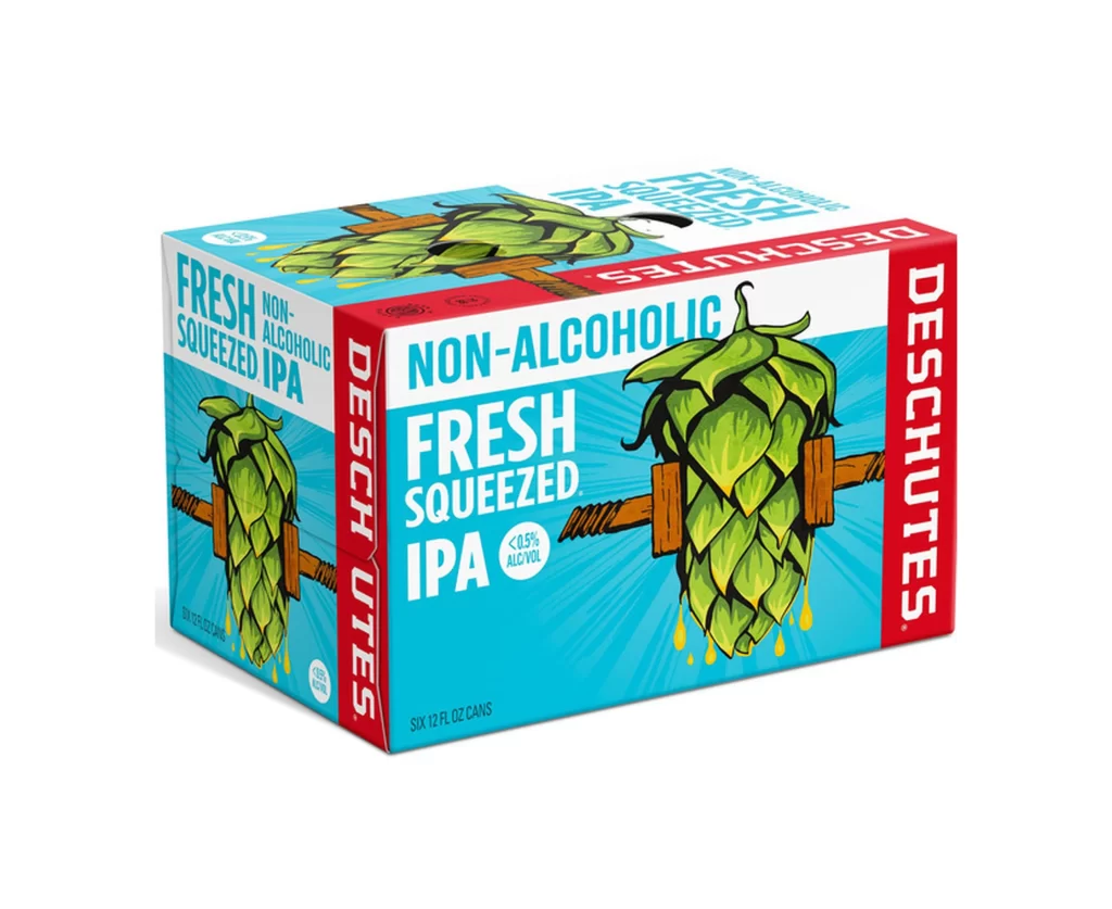
The image displays a six-pack of Deschutes Fresh Squeezed IPA, featuring a vibrant turquoise background with bold red and white branding. A large, stylized illustration of a green hop cone being squeezed by wooden clamps dominates the front label, with yellow liquid droplets falling below. The packaging clearly identifies the beverage as non-alcoholic with less than 0.5% ABV, containing six 12-fluid-ounce cans.
Deschutes Brewery, based in Bend, Oregon, is well-known for its craft beer innovations, and this release targets the growing market for flavorful non-alcoholic options. As an IPA, the 'Fresh Squeezed' name suggests a focus on bright, citrusy hop characteristics typical of the style. By maintaining the visual identity of their alcoholic counterparts, the brand ensures instant recognition for consumers seeking a zero-proof alternative.
Graphic designers can appreciate how the use of high-contrast colors—specifically the cyan and red palette—creates immediate shelf presence and energy. The playful, literal interpretation of the product name through the hop-squeezing artwork effectively communicates freshness and flavor intensity without relying on photography. Such packaging demonstrates how illustrative elements can successfully convey complex flavor profiles in the non-alcoholic beverage sector.