Deschutes Hard Lemonade Label
Topics
Details
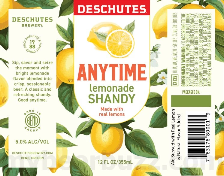
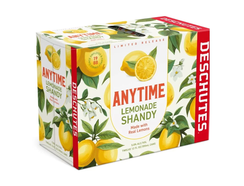
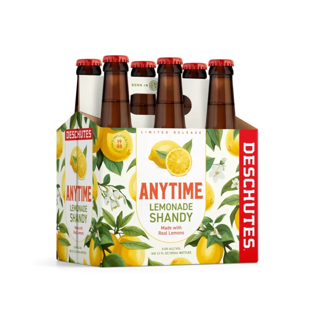
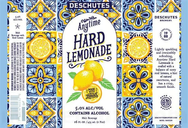
The label artwork for Deschutes Anytime Hard Lemonade features a central white shield containing the product name in bold, dark blue typography. Vibrant yellow lemons with green leaves are illustrated at the bottom of this central panel, set against an intricate background pattern of blue and yellow floral tiles reminiscent of Mediterranean or Spanish design. The overall composition is symmetrical, framing the core branding elements within a decorative border that extends across the flat surface of the container.
Produced by Deschutes Brewery based in Bend, Oregon, this malt beverage is categorized as a shandy style drink designed to be light and refreshing. The packaging highlights a 5.0% alcohol by volume content and emphasizes the use of real lemons to achieve a zesty flavor profile balanced with subtle sweetness. Deschutes positions this offering as a versatile option suitable for any occasion, leveraging their established reputation as a craft brewery founded in 1988.
Designers can observe how the use of high-contrast colors—specifically the bright yellows against deep navy blues—creates immediate visual impact on retail shelves. The integration of realistic fruit illustrations with geometric tile patterns demonstrates an effective method for blending organic product cues with structured graphic elements. Furthermore, the clear hierarchy of information ensures that essential details like alcohol percentage and volume are easily legible while maintaining an aesthetic that feels both artisanal and approachable.