Deschutes Harpoon EHOP Amber Ale Label
Topics
Details
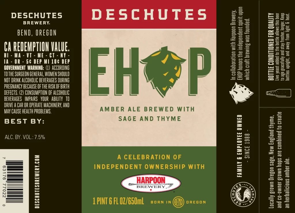
The label artwork for the Deschutes Harpoon EHOP Amber Ale features a distinct three-tiered color scheme of red, cream, and green. Central to the design is the large green text 'EHOP' with a stylized hop cone replacing the 'O', set against a cream background. The packaging specifies a 650mL bottle containing an amber ale brewed with sage and thyme, with a prominent alcohol content of 7.5% by volume displayed on the left panel.
Produced by Deschutes Brewery in Bend, Oregon, this beer represents a collaboration with Harpoon Brewery to celebrate independent ownership. The amber ale style is enhanced by the unique addition of locally grown Oregon sage and thyme, creating a herbal profile. Both breweries emphasize their status as family and employee-owned entities, a theme reinforced by the 'Celebration of Independent Ownership' tagline at the bottom.
Label designers can appreciate the effective use of typography and iconography to convey brand heritage and product specifics. The integration of the hop illustration into the wordmark creates a memorable visual identity that immediately communicates the product's nature. Furthermore, the layout successfully balances mandatory legal information with creative storytelling elements, making it a strong example of functional yet artistic packaging design.