Deschutes Rip City Lager Label
Topics
Details
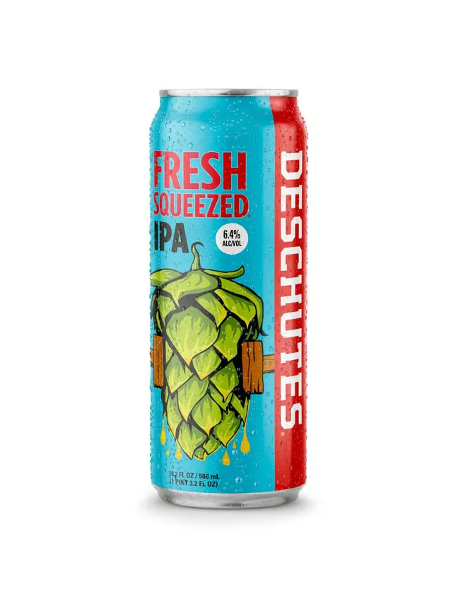
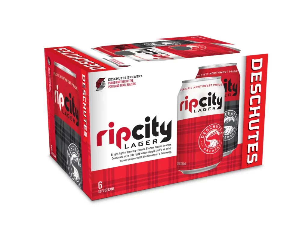
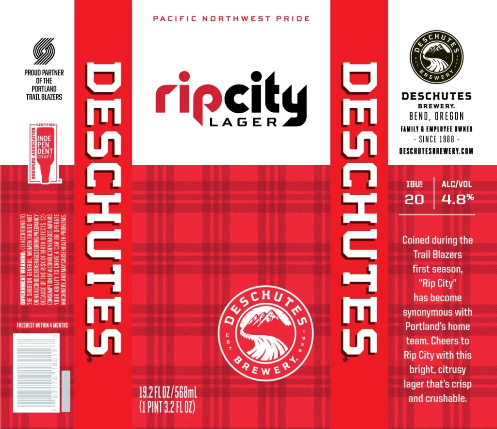
The label features a bold red and white plaid background with 'DESCHUTES' running vertically along both sides. Centered at the top, 'rip city LAGER' appears in a mix of red lowercase and black uppercase typography beneath the phrase 'PACIFIC NORTHWEST PRIDE'. The design includes the Deschutes Brewery circular logo with a mountain and river motif, alongside technical details showing 4.8% ABV, 20 IBUs, and a 19.2 fl oz volume.
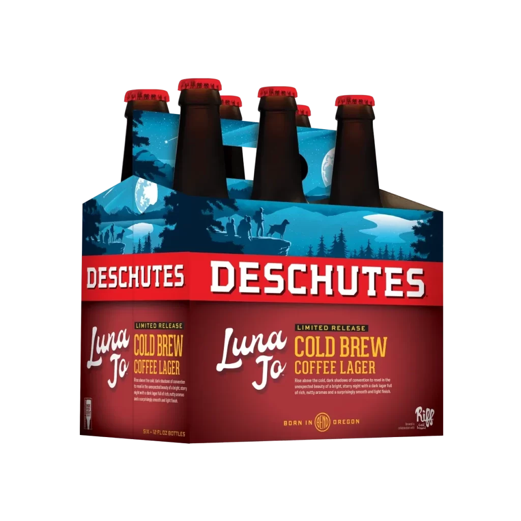
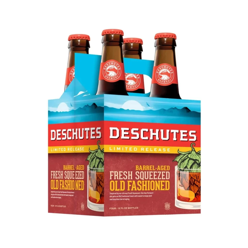
Produced by Deschutes Brewery of Bend, Oregon—a family and employee-owned operation since 1988—this lager celebrates Portland's Trail Blazers basketball team. The 'Rip City' nickname originated during the team's first season and has become synonymous with Portland's home team identity. This bright, citrusy lager is described as crisp and crushable, embodying the Pacific Northwest's craft beer culture.
Packaging designers can learn from the effective use of regional sports branding to create strong local consumer connections. The vertical text layout maximizes brand recognition while maintaining visual balance with the central product name. Color psychology is leveraged through the aggressive red palette to evoke energy and team spirit without overwhelming the essential product information.