Deschutes Black Butte Non Alcoholic Cans Packaging
Topics
Details
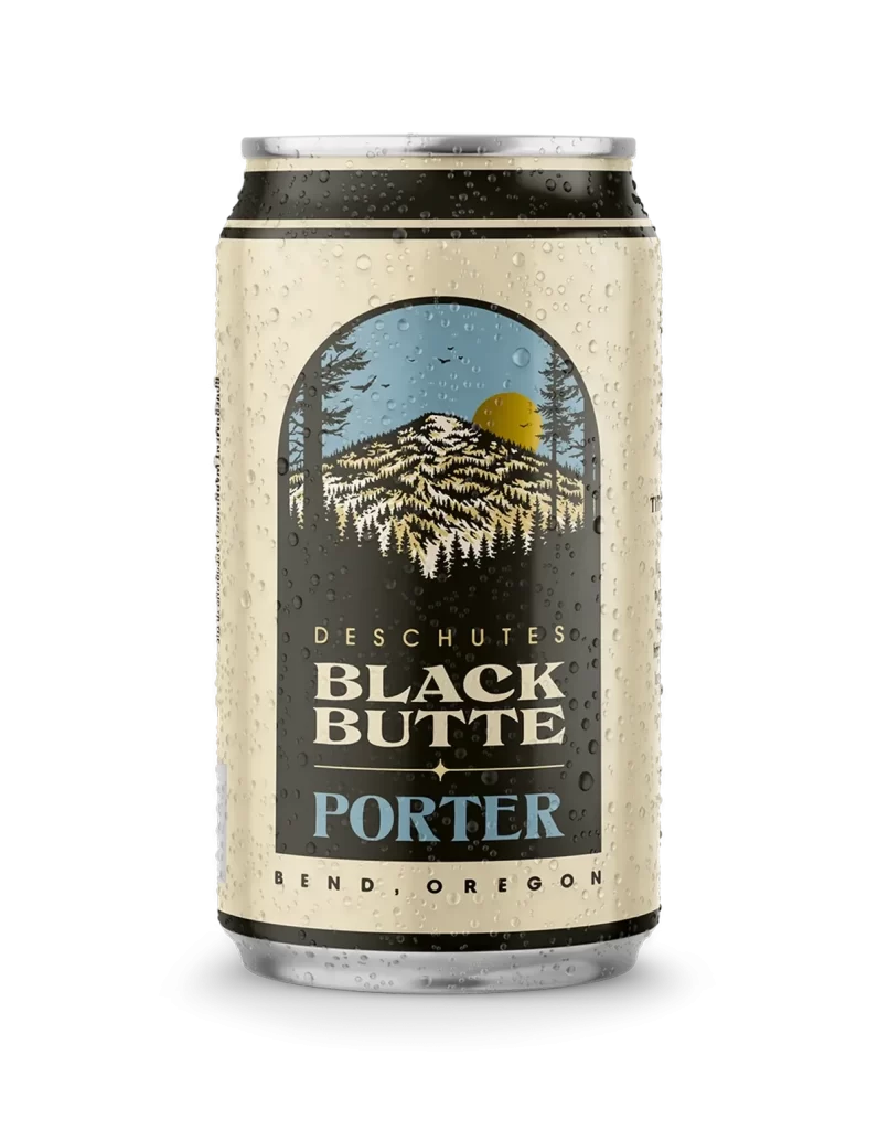
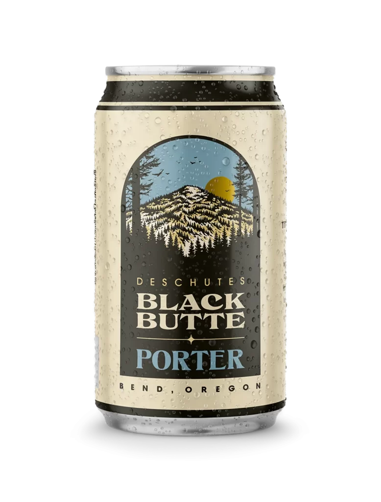
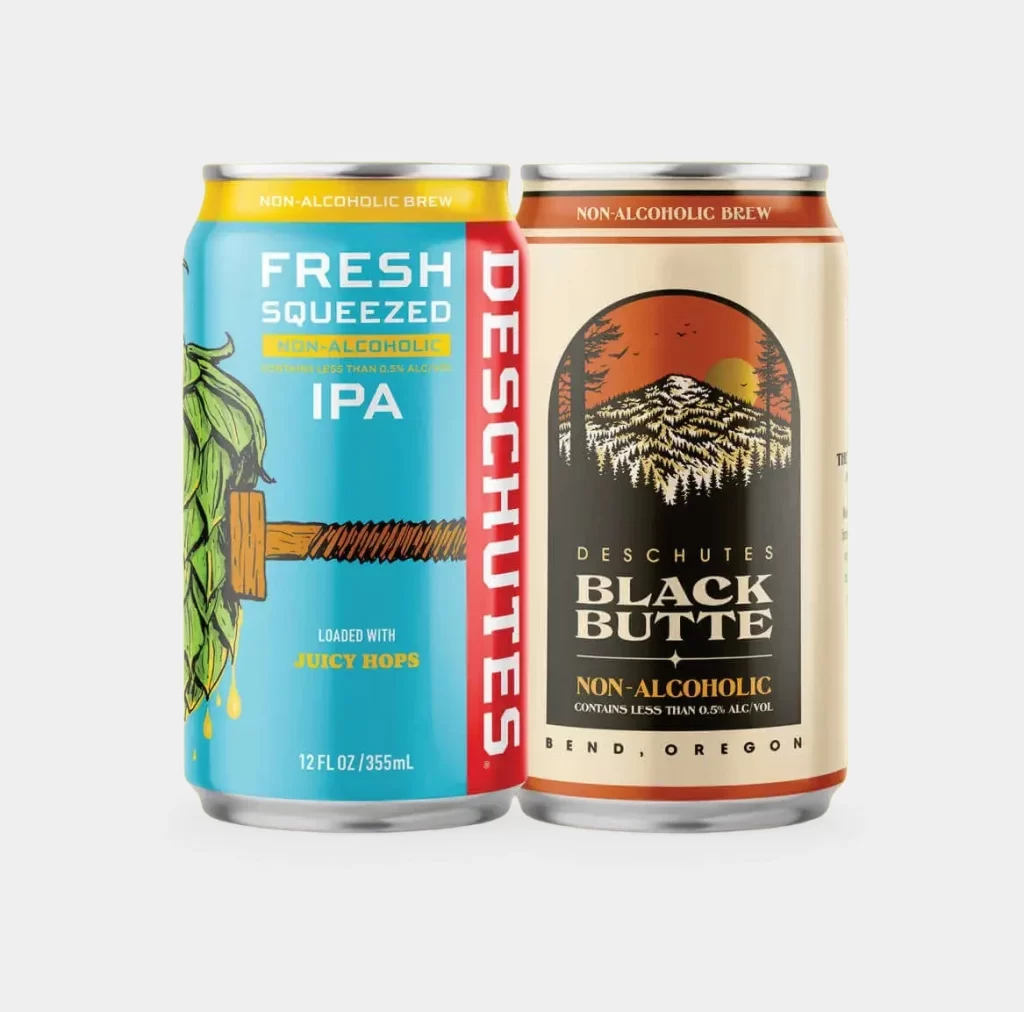
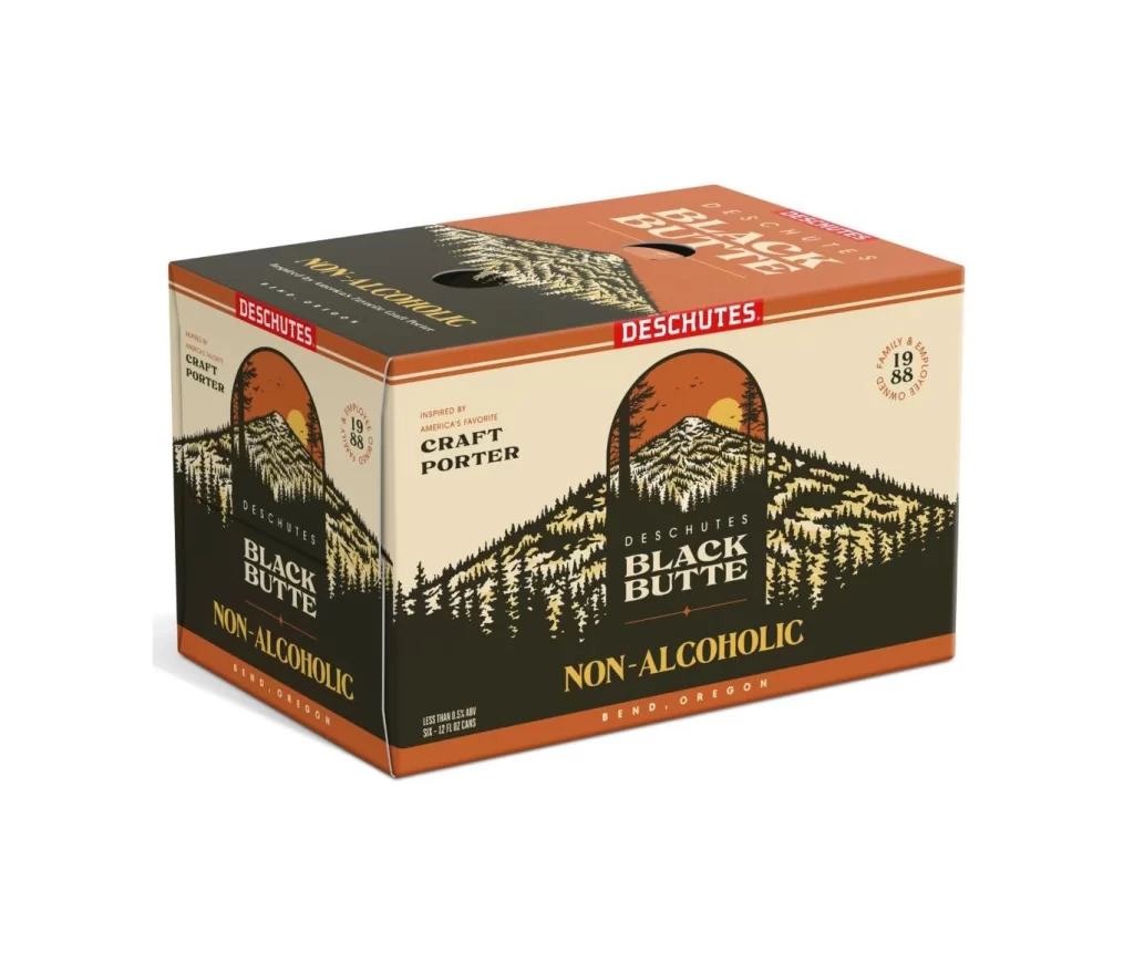
The image displays a twelve-pack of Deschutes Black Butte Non-Alcoholic Porter cans set against a pure white background. The packaging features a prominent label with a stylized mountain range, a setting sun, and a dense forest of evergreen trees. Bold typography identifies the product name and its non-alcoholic nature, while the brand's signature red logo sits at the top of the box.
Originating from Bend, Oregon, this offering represents a significant expansion into the non-alcoholic market for the well-established craft brewery. As a porter, the beer traditionally offers deep, roasted malt flavors, which are now being presented in a format suitable for those avoiding alcohol. The packaging proudly notes that it is inspired by America's favorite craft porter, maintaining the heritage of the original recipe.
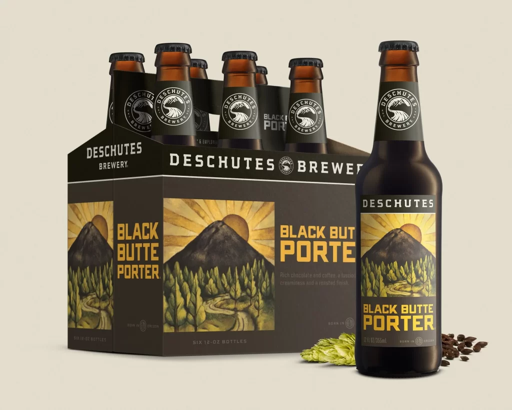
Designers can appreciate how the artwork effectively communicates the brand's Pacific Northwest roots through its iconic landscape imagery. The color palette of black, cream, and burnt orange creates a premium feel while clearly distinguishing the non-alcoholic variant. Such visual storytelling is essential for building consumer trust when introducing new product categories within an existing brand family.