Deschutes Fresh Squeezed IPA Can Packaging
Topics
Details
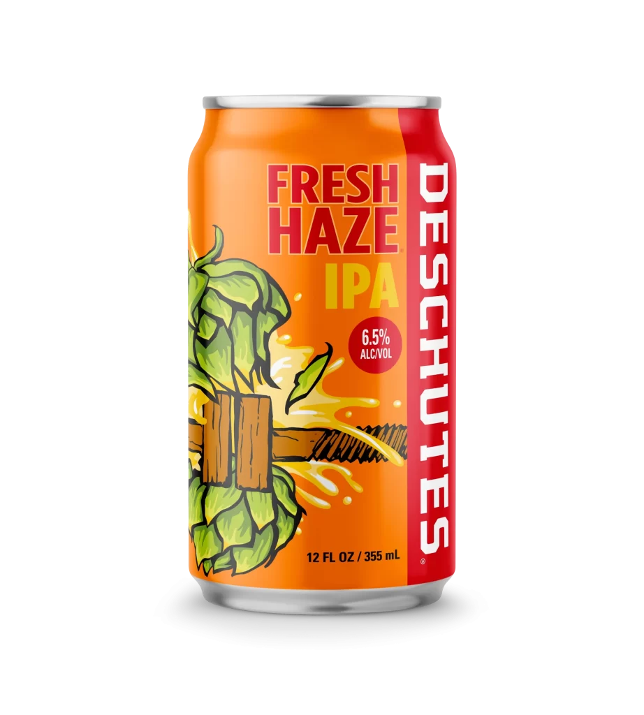
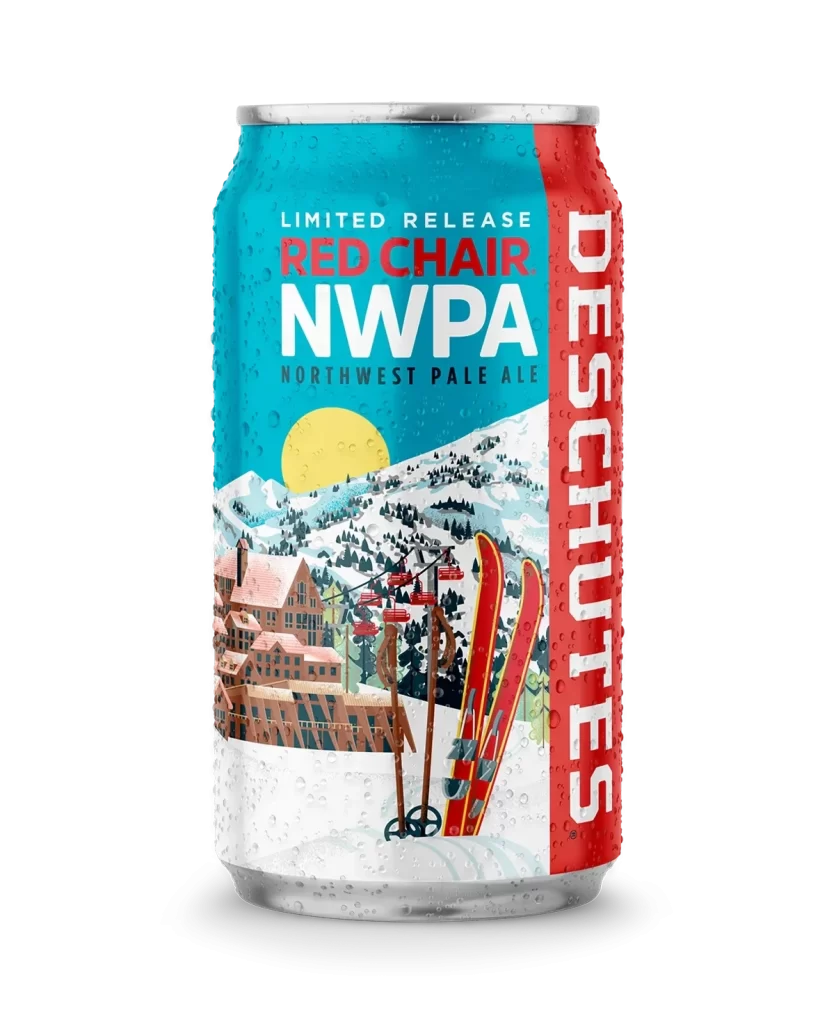
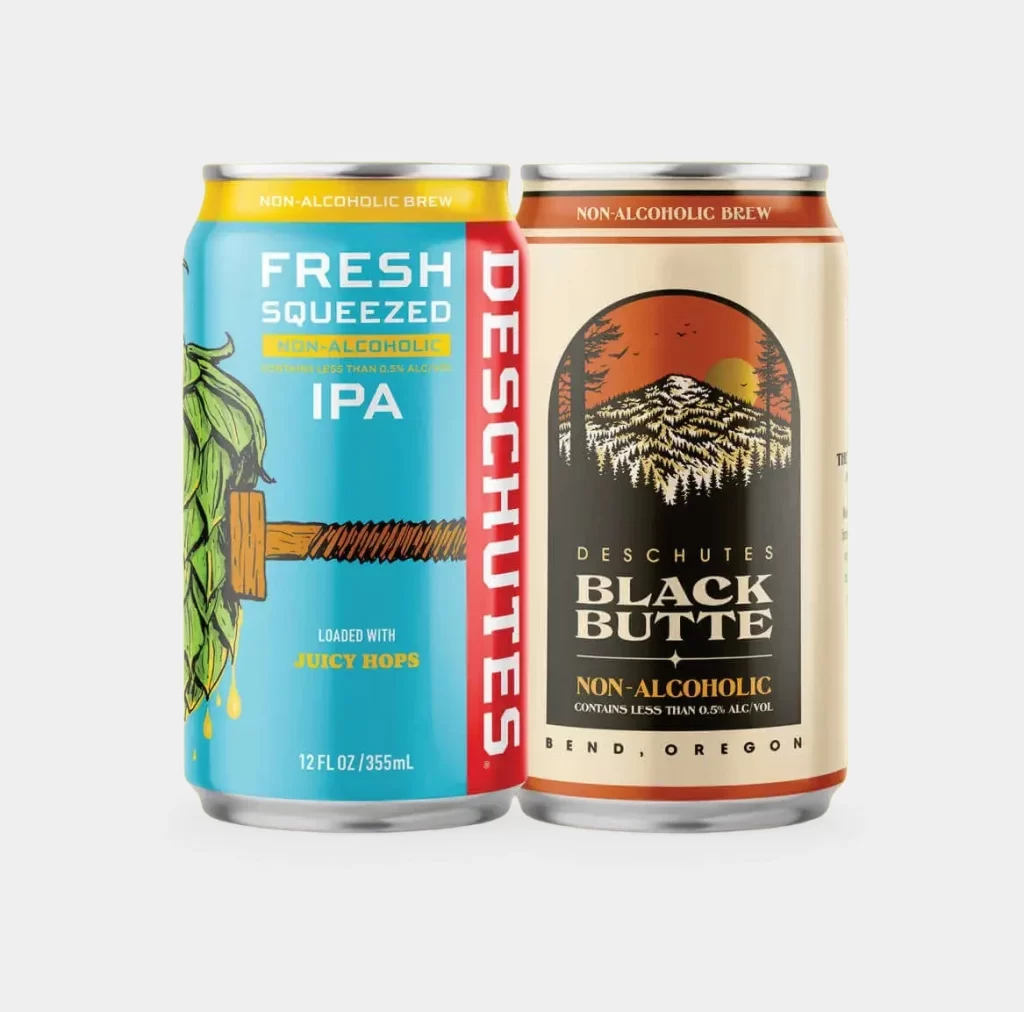
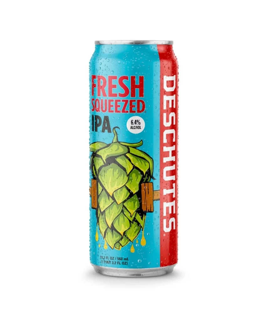
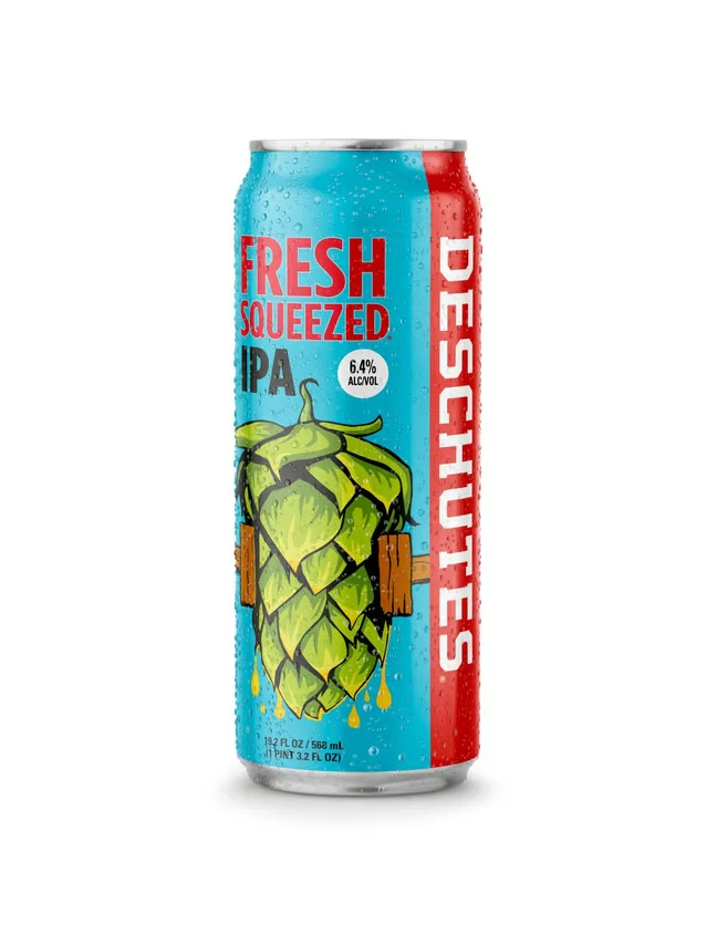
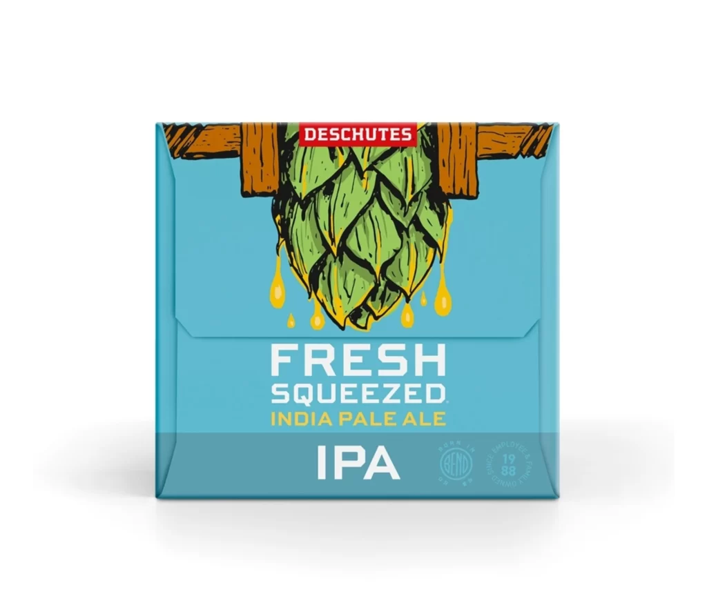
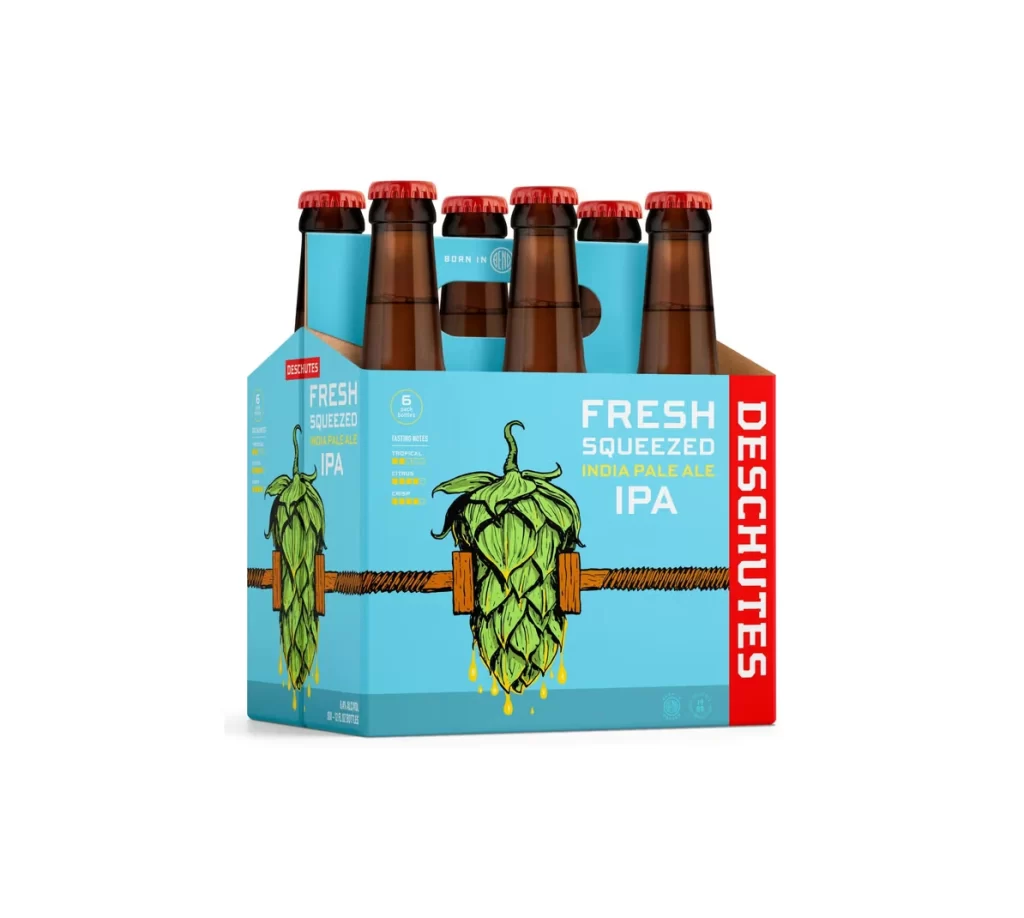
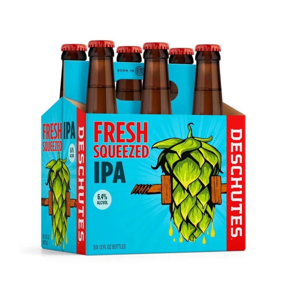
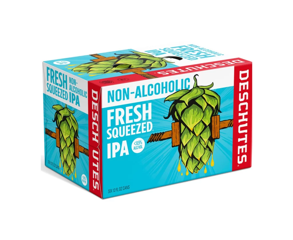
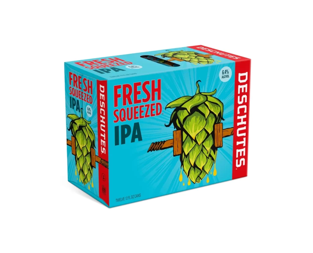
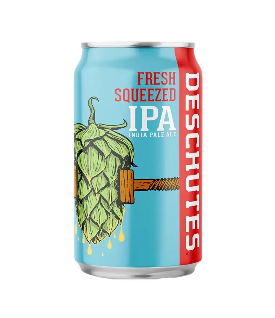
The image displays a standard aluminum can of Deschutes Fresh Squeezed IPA set against a pure white background. The packaging features a vibrant light blue body with a bold red vertical stripe on the right side bearing the brand name. Central to the design is a whimsical illustration of a green hop cone being crushed by a wooden mallet, with golden liquid droplets falling below.
Deschutes Brewery, based in Bend, Oregon, is well-known for its craft beer innovation, and this India Pale Ale represents their focus on hop-forward flavors. The 'Fresh Squeezed' name and the squeezing artwork visually communicate the beer's citrusy and juicy profile, which is characteristic of modern West Coast IPAs. This specific product highlights the brewery's ability to blend traditional brewing techniques with playful, modern branding.
For packaging designers, this can serves as an excellent example of using literal visual metaphors to convey flavor profiles effectively. The high-contrast color palette of blue and red ensures strong shelf presence while the detailed line art adds a handcrafted feel that appeals to craft enthusiasts. It demonstrates how integrating the product's key ingredient directly into the graphic narrative can create a memorable and informative consumer experience.