Deschutes Symphonic Chronic IPA Can Packaging
Topics
Details
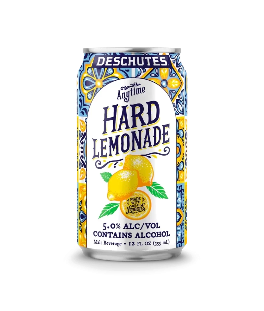
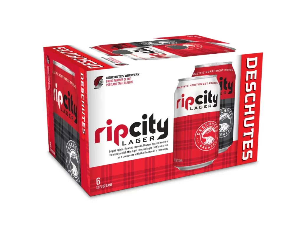
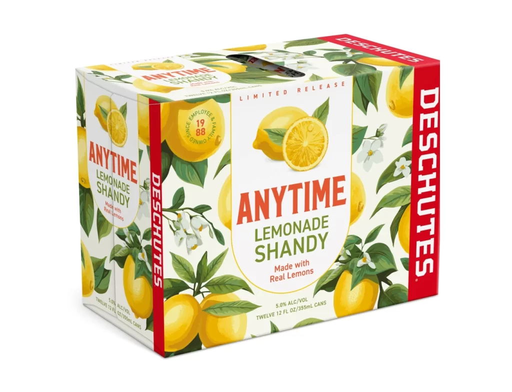
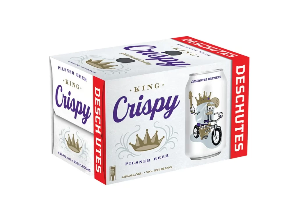
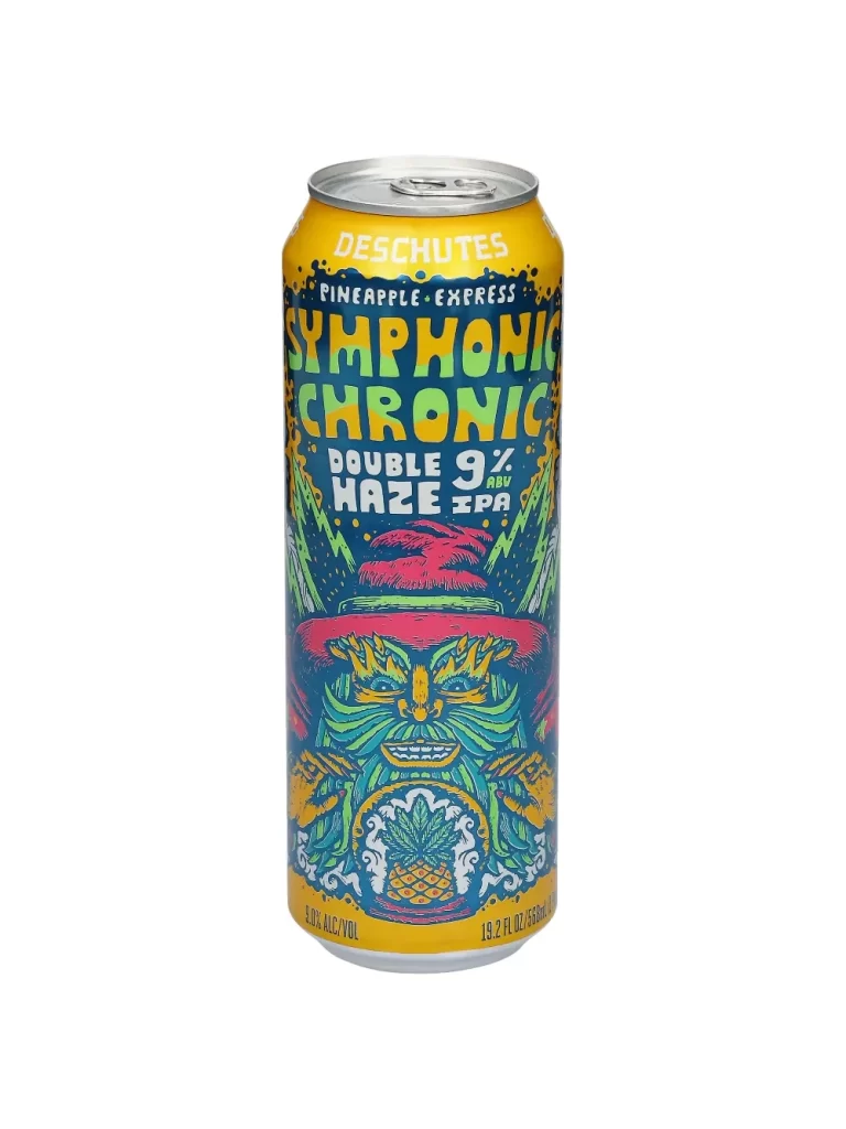
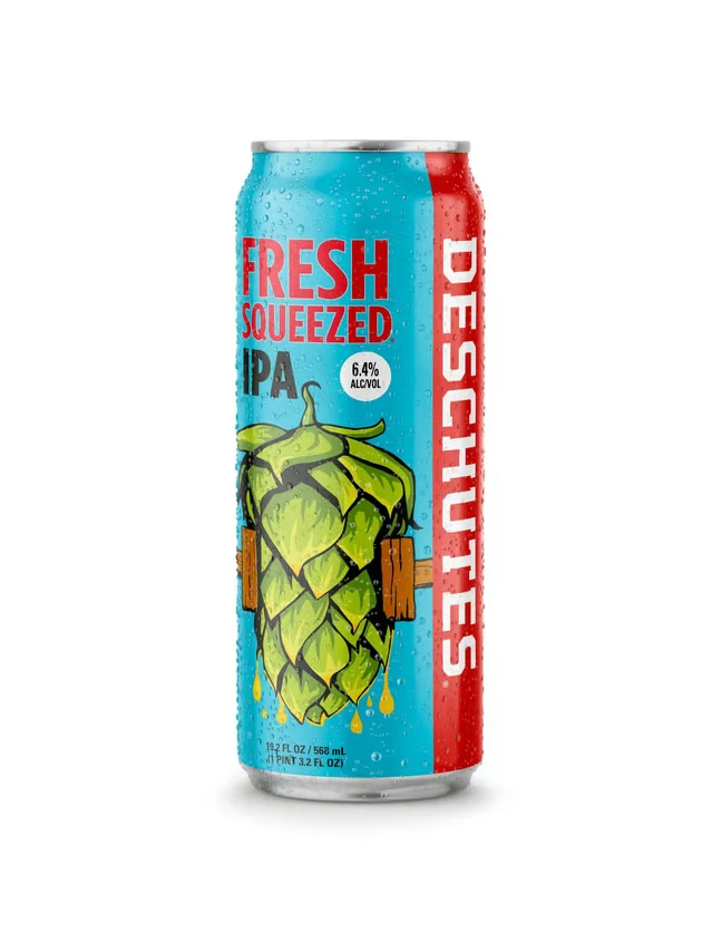
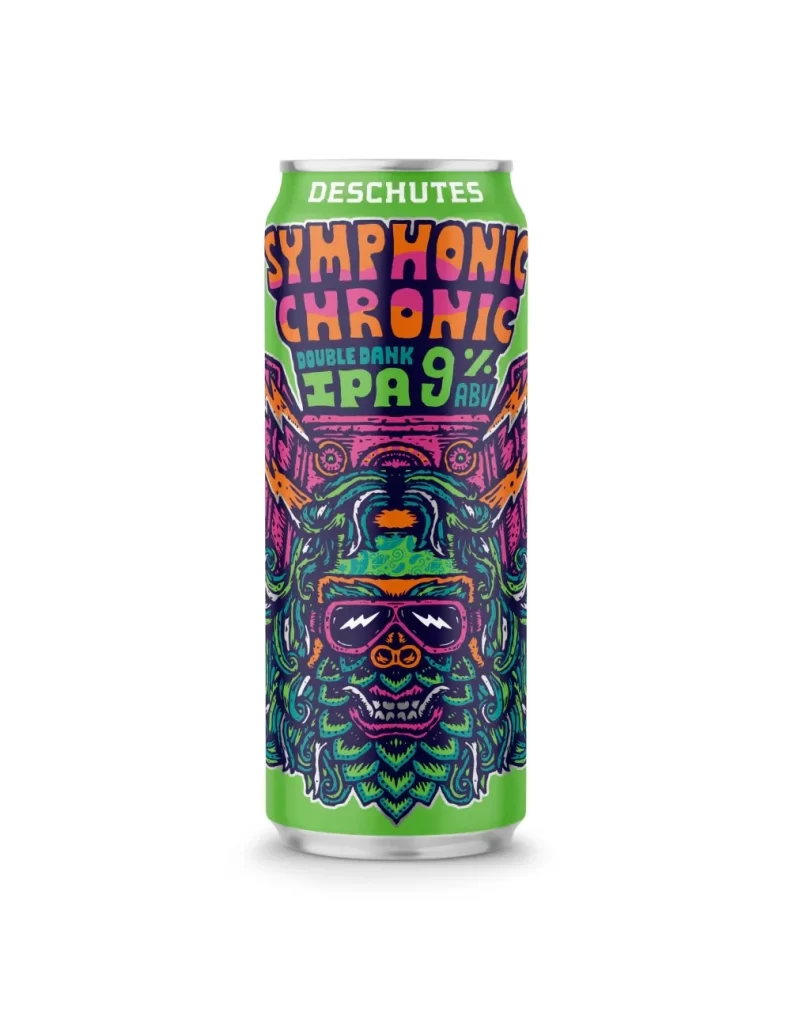
The image displays a single aluminum can of Deschutes Symphonic Chronic Double Bank IPA set against a pure white background. The packaging features a vibrant, psychedelic illustration of a stylized face wearing sunglasses and surrounded by intricate, swirling patterns in neon green, pink, and purple. Prominent text on the label identifies the brewery at the top and the beer name in large, bold lettering, with the alcohol content clearly marked as 9% ABV.
Produced by the renowned Deschutes Brewery based in Bend, Oregon, this offering is categorized as a Double Bank IPA, indicating a high-gravity, hop-forward brew. The 'Symphonic Chronic' moniker suggests a complex flavor profile designed to appeal to craft beer enthusiasts looking for intensity. Such a high alcohol percentage implies a robust body and significant bitterness typical of imperial or double IPA styles.
For packaging professionals, this design exemplifies how bold, illustrative art can create strong shelf presence and brand personality. The use of high-contrast colors and detailed linework draws the consumer's eye immediately to the product's unique identity. It serves as an excellent case study in balancing legible typography with artistic expression to convey both product information and brand ethos effectively.