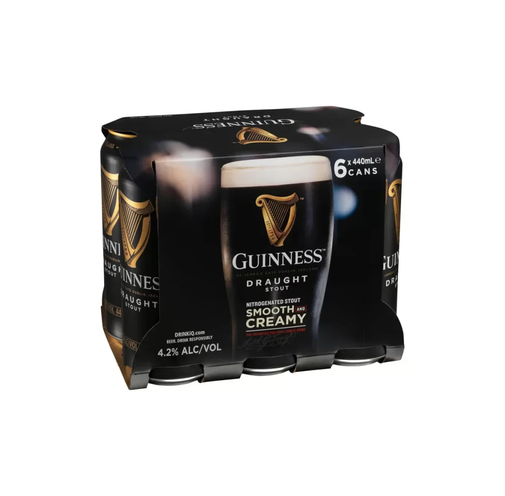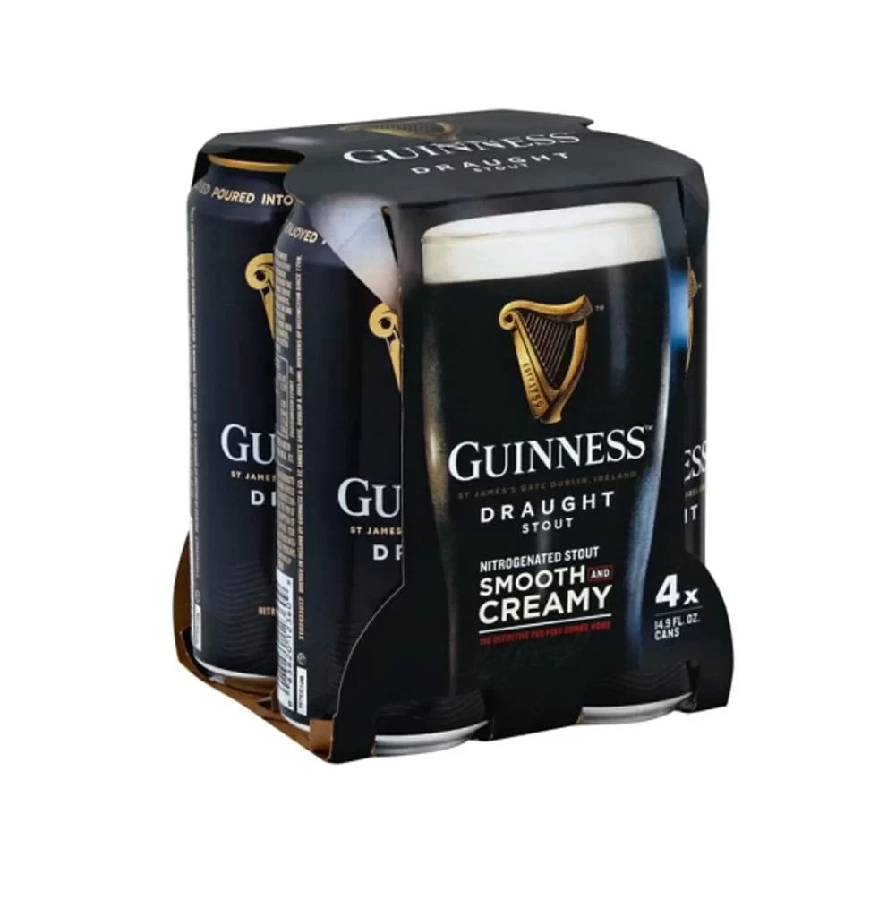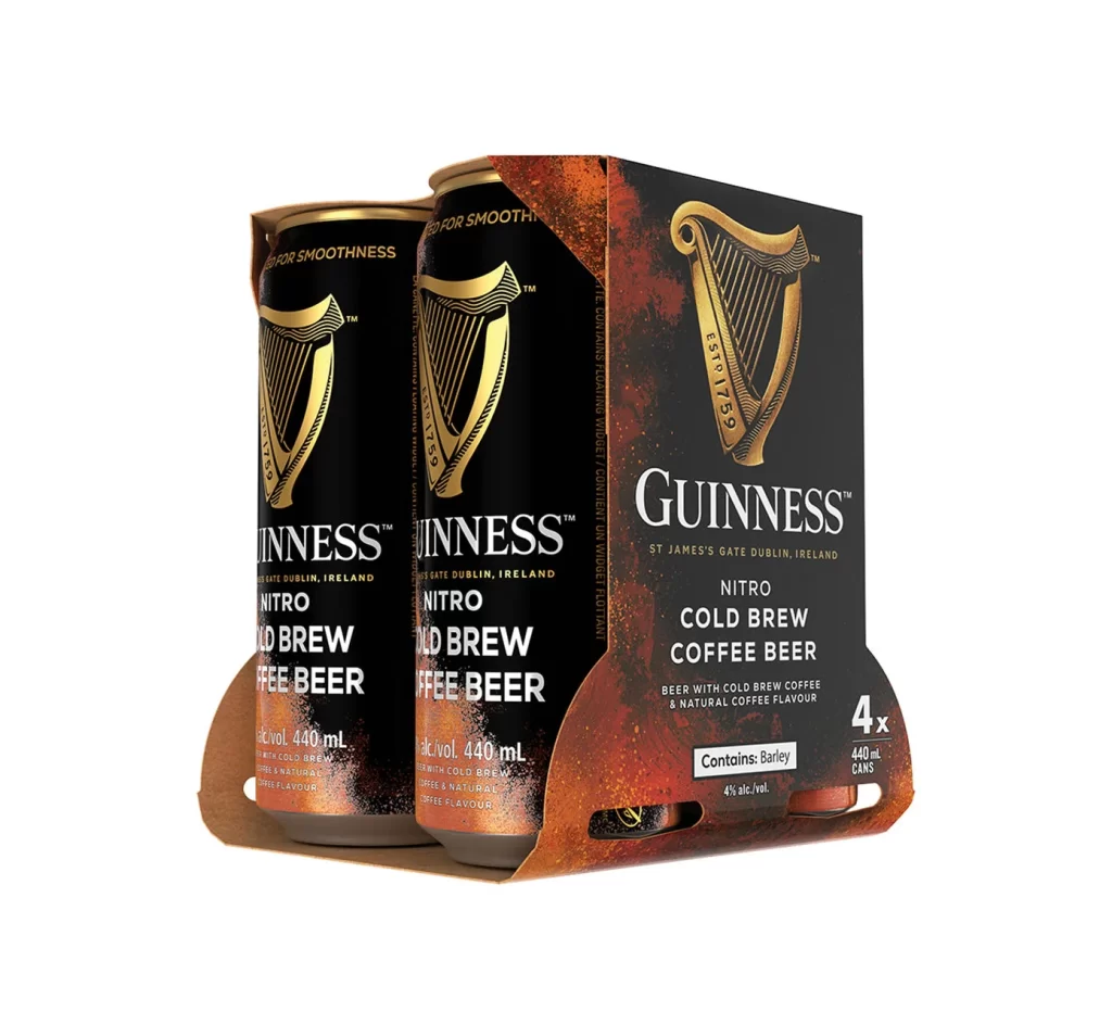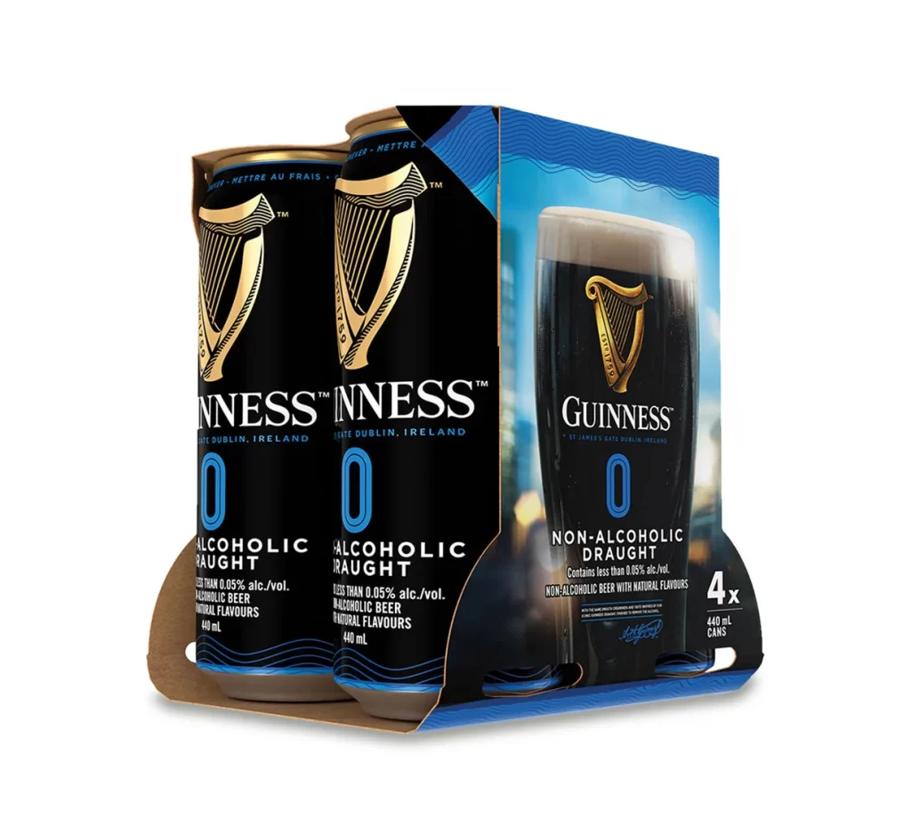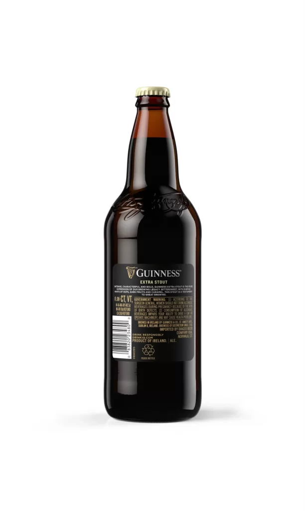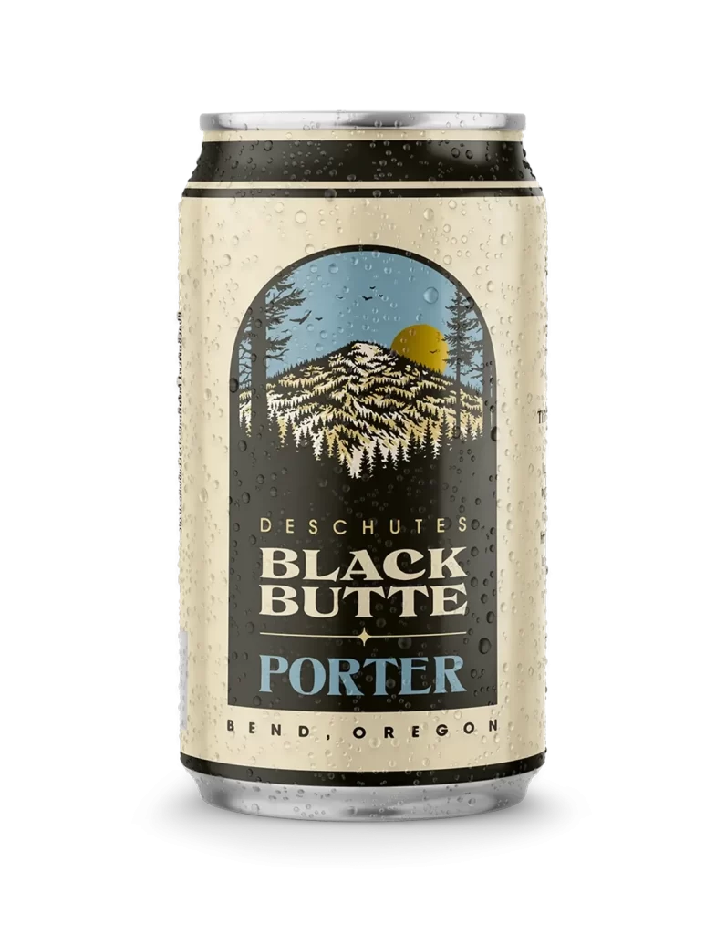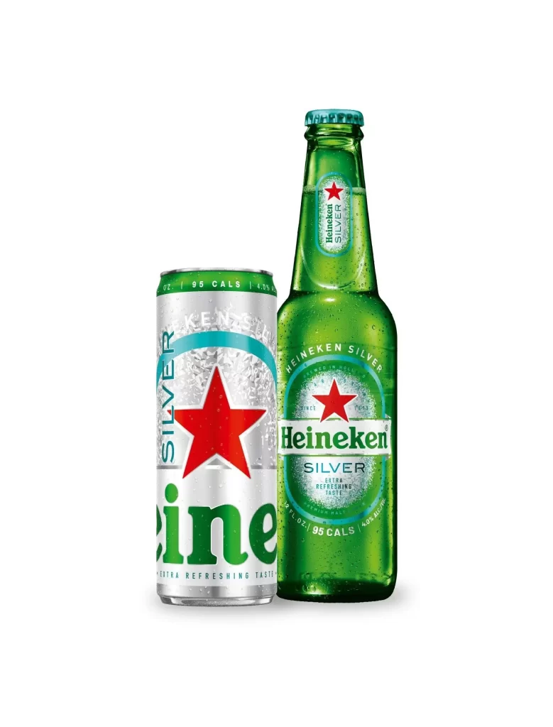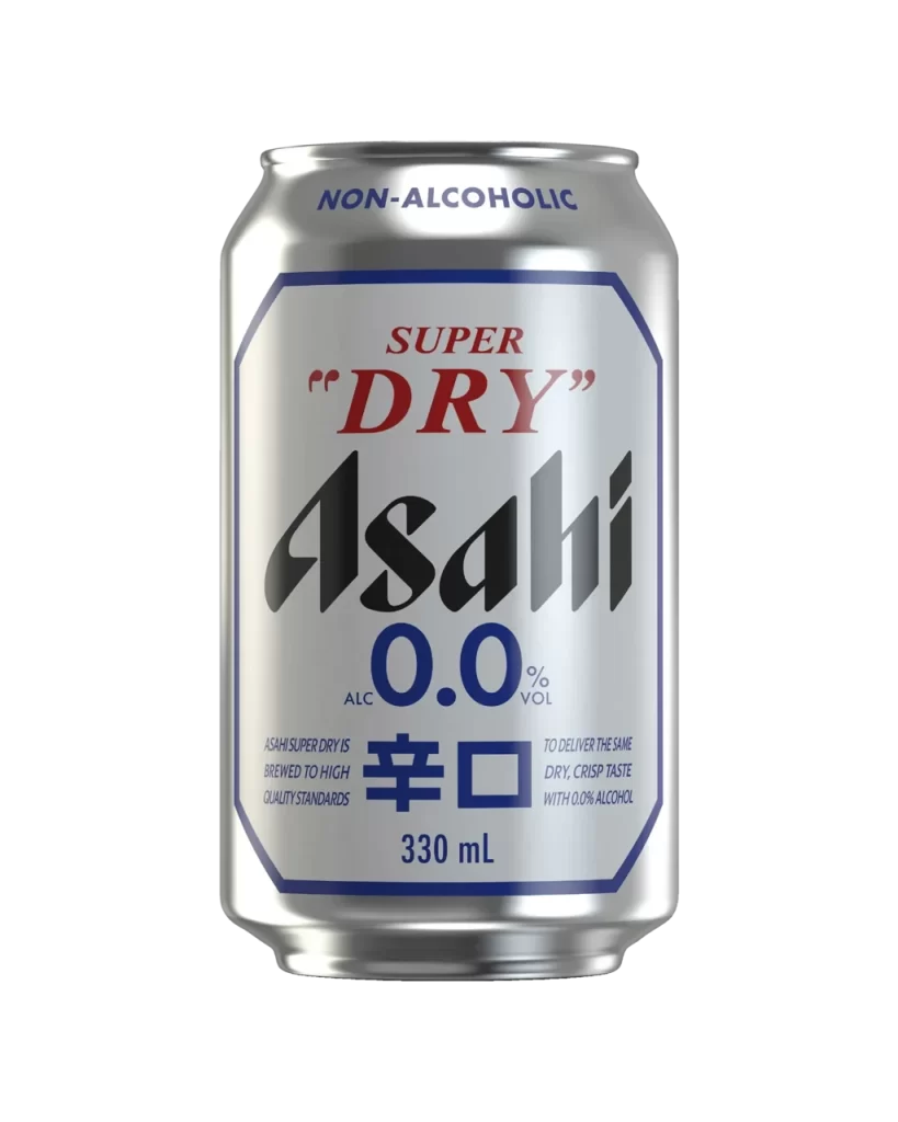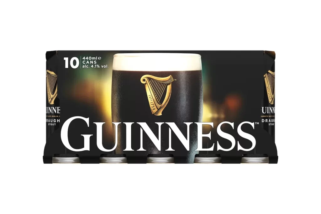
Guinness Draught Stout Ten Pack Cans Packaging
Topics
Details
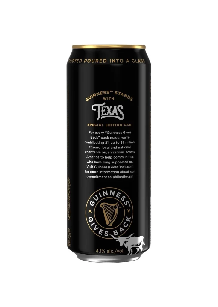
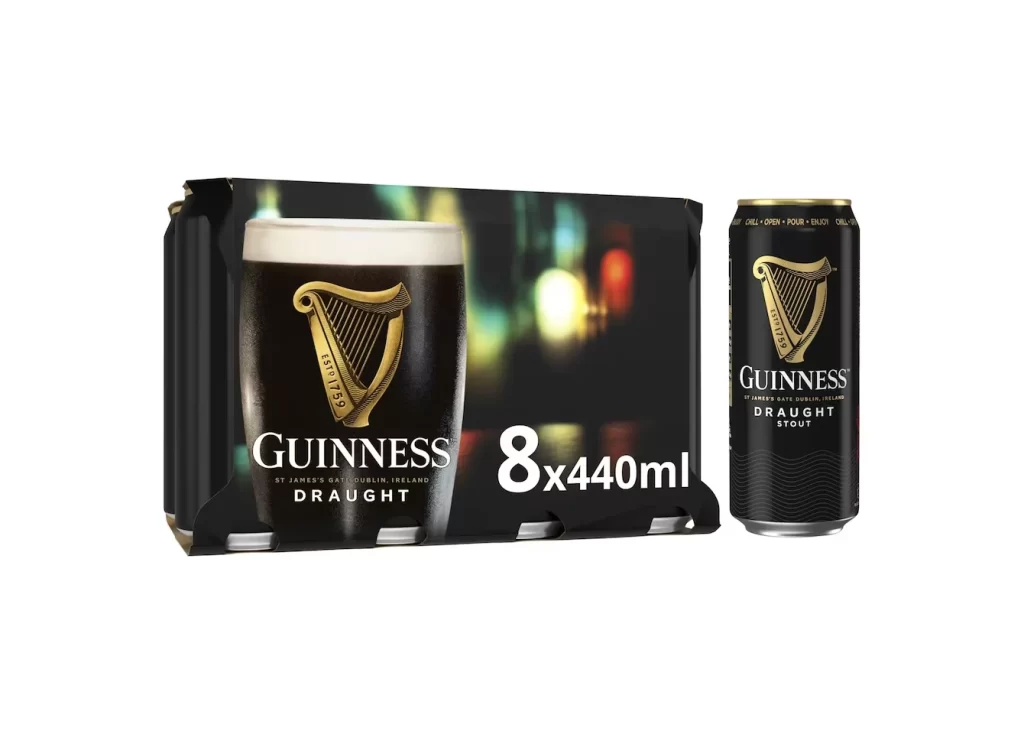
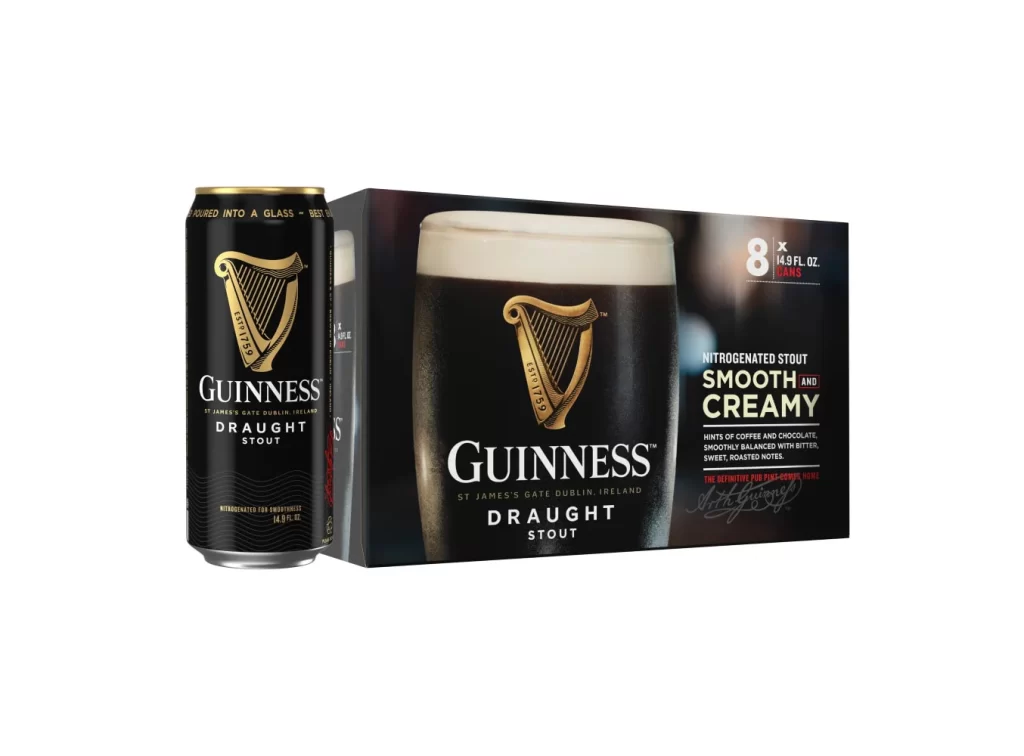
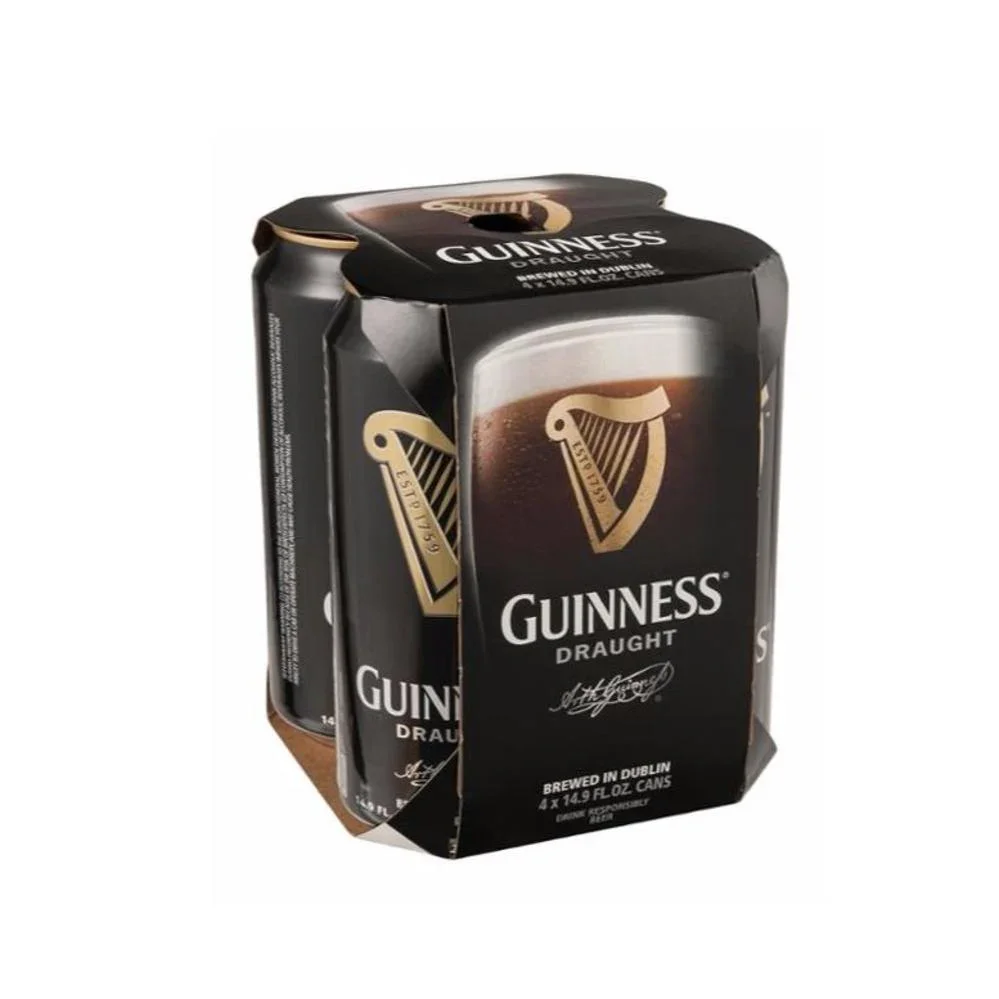
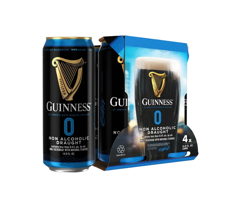
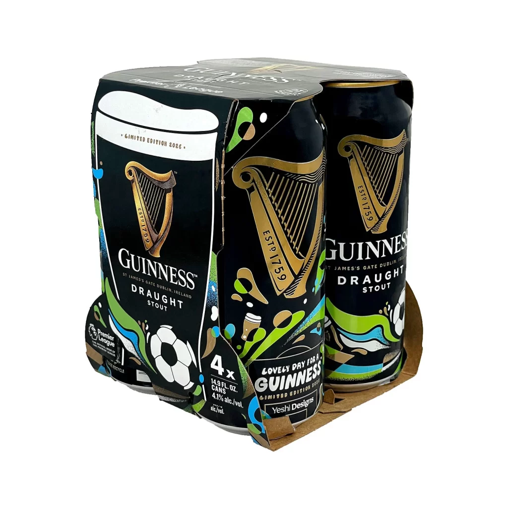
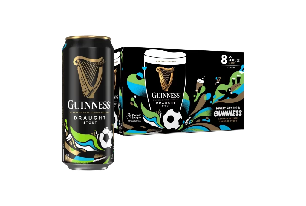
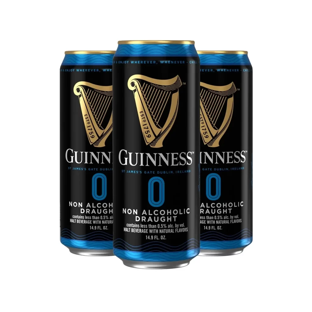
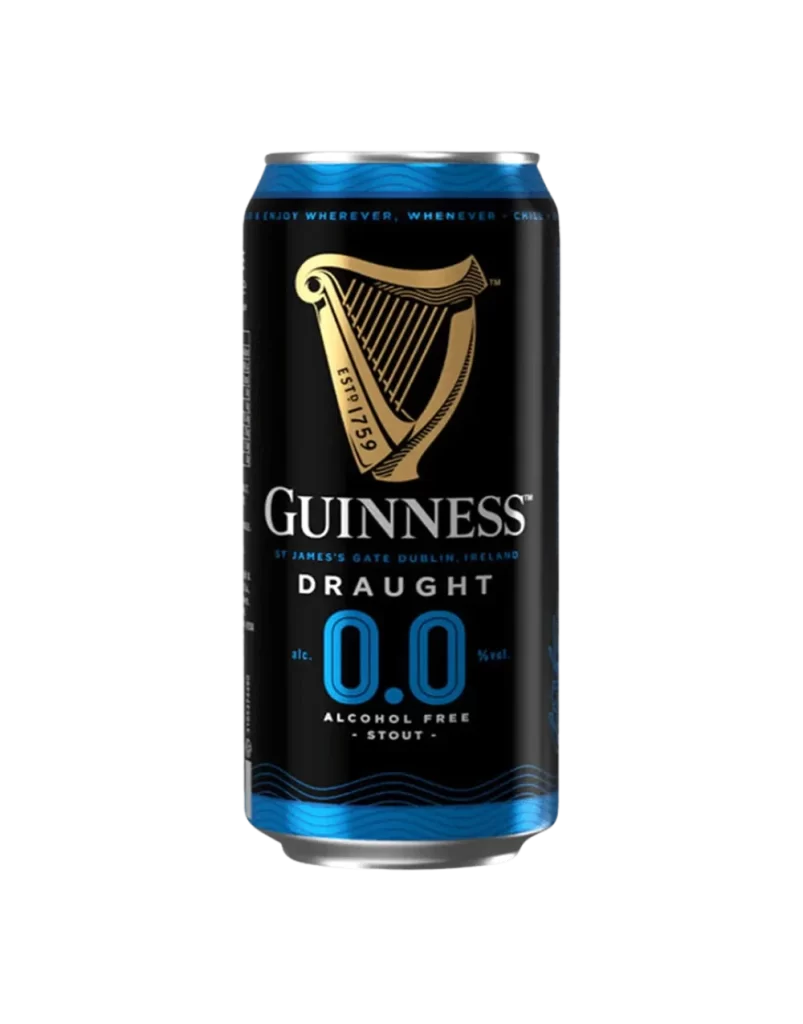
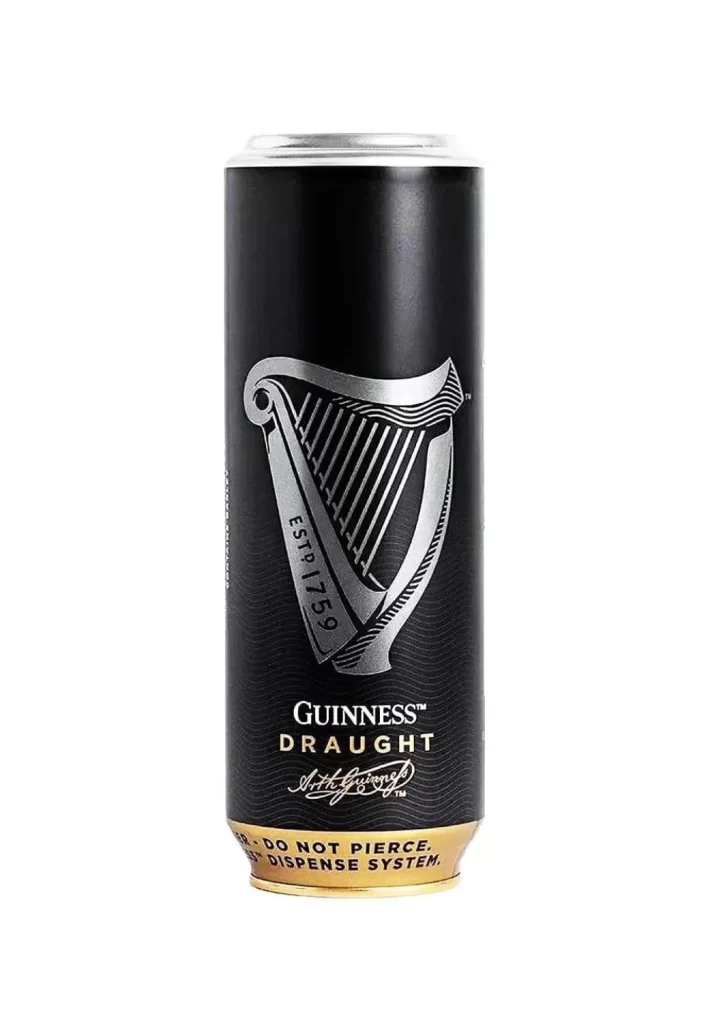
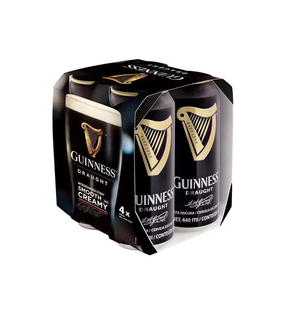
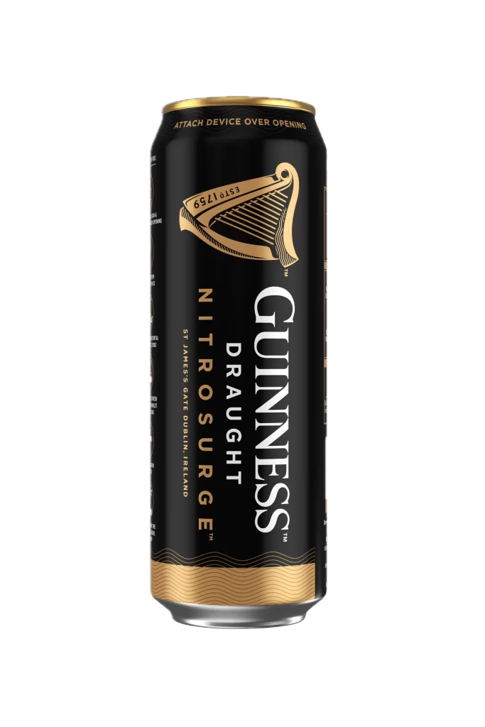
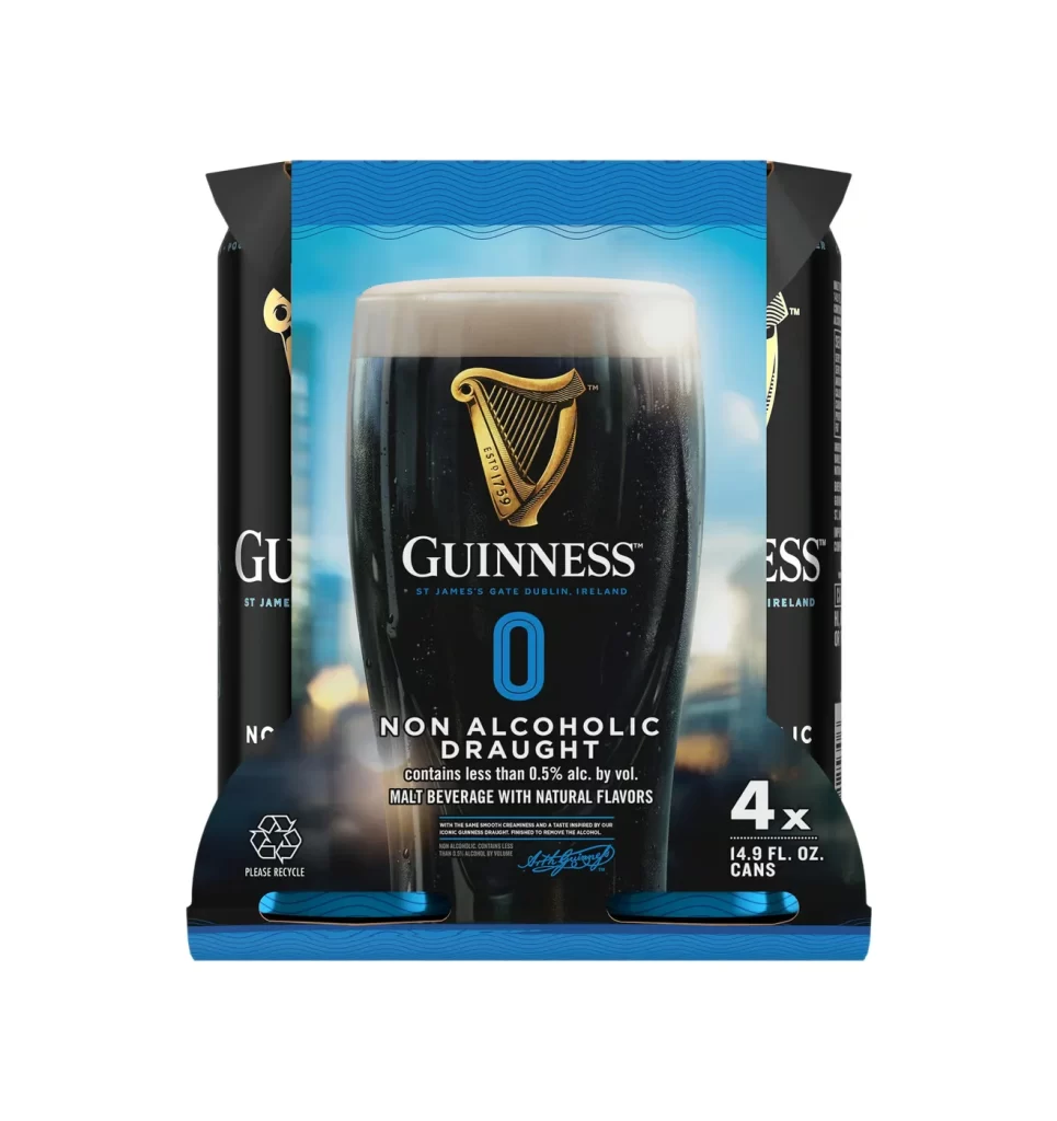
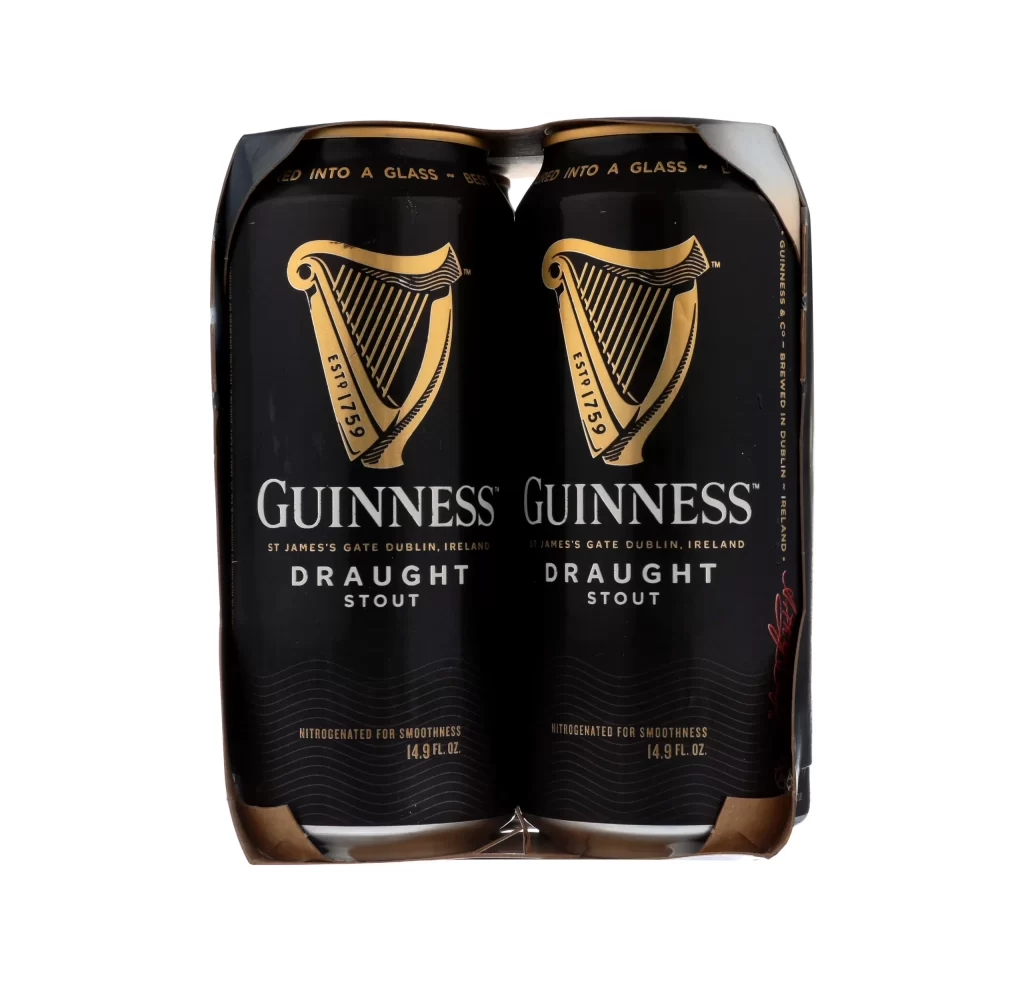
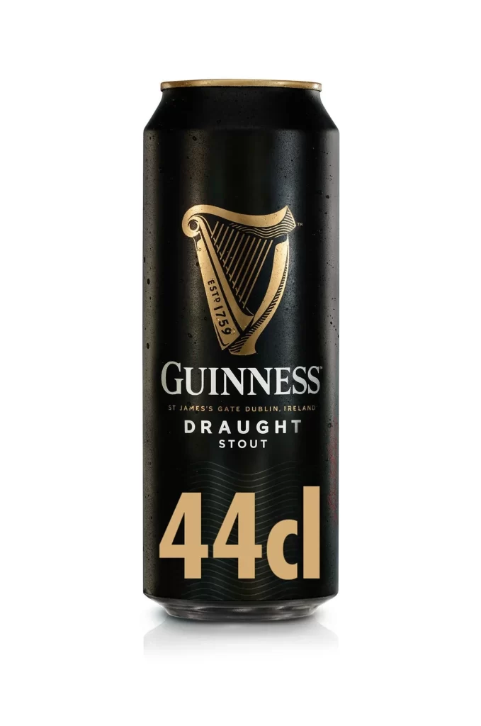
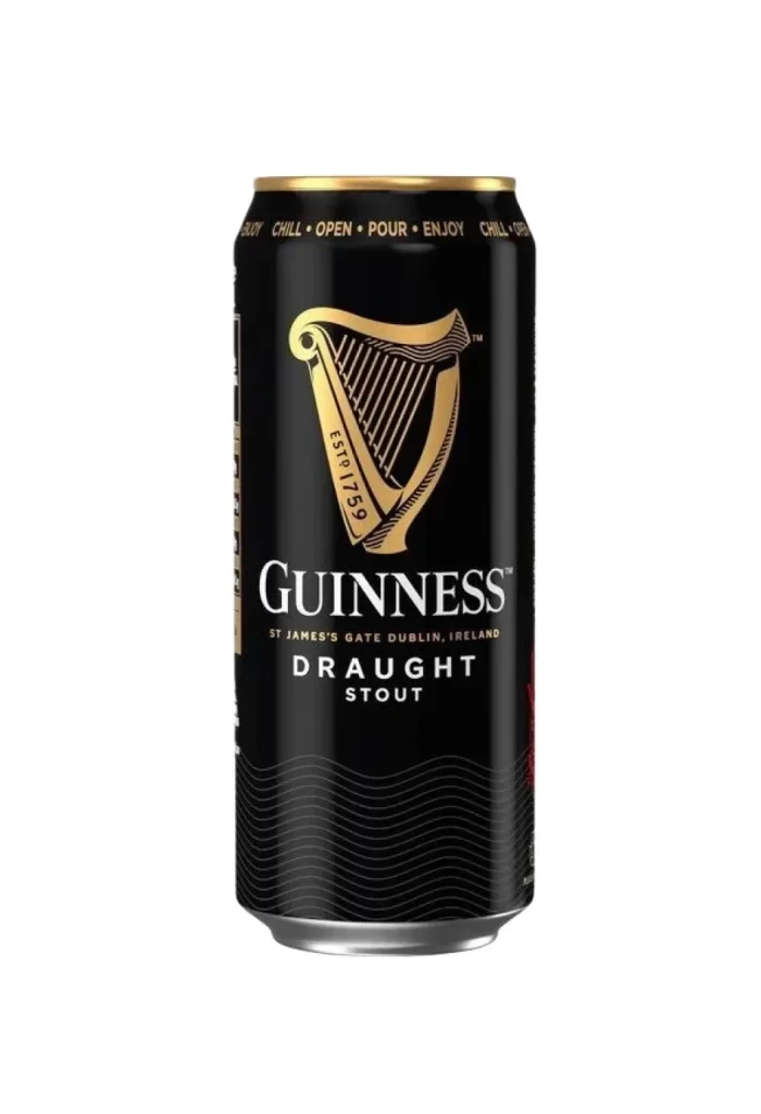
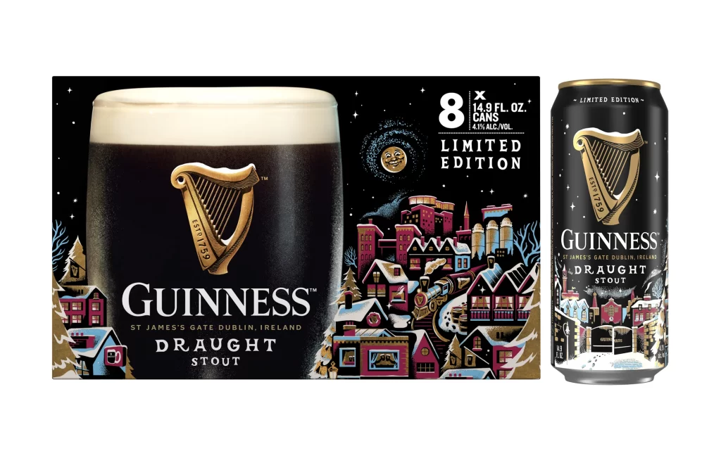
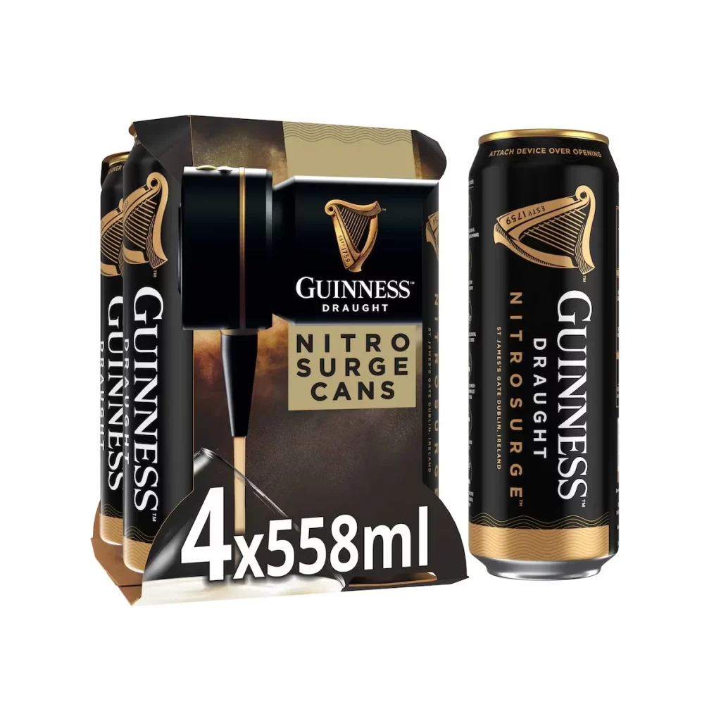
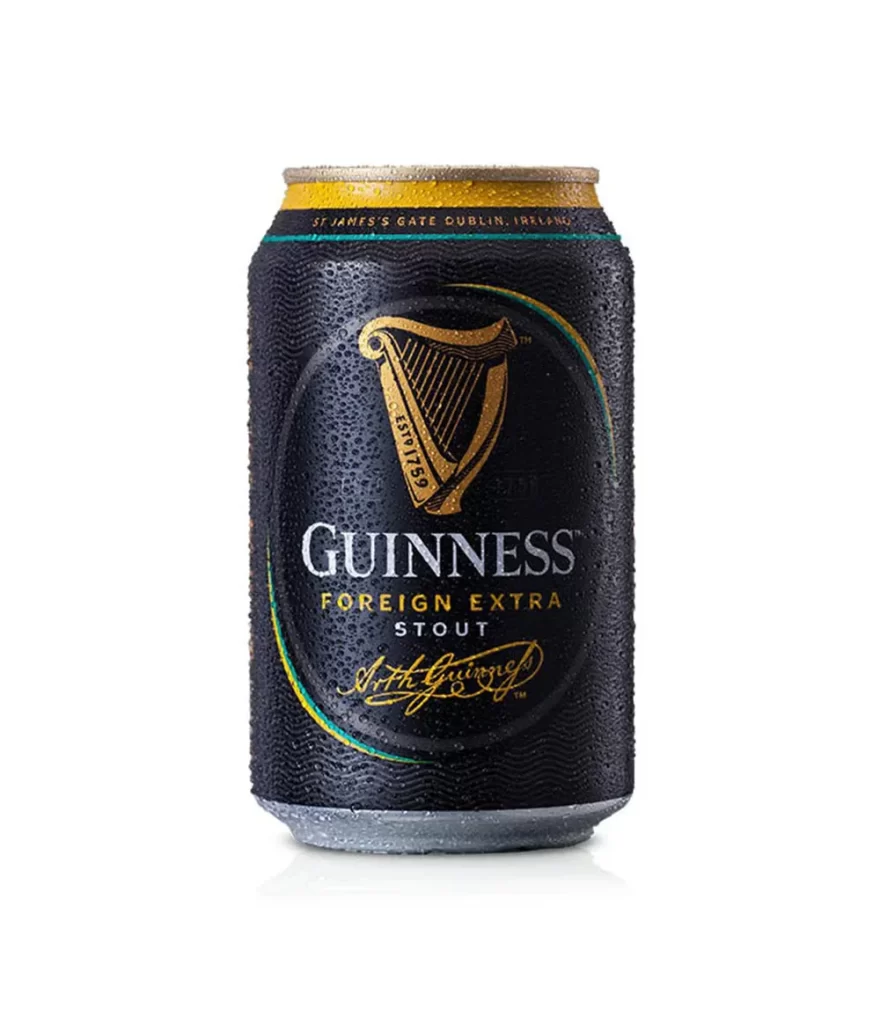
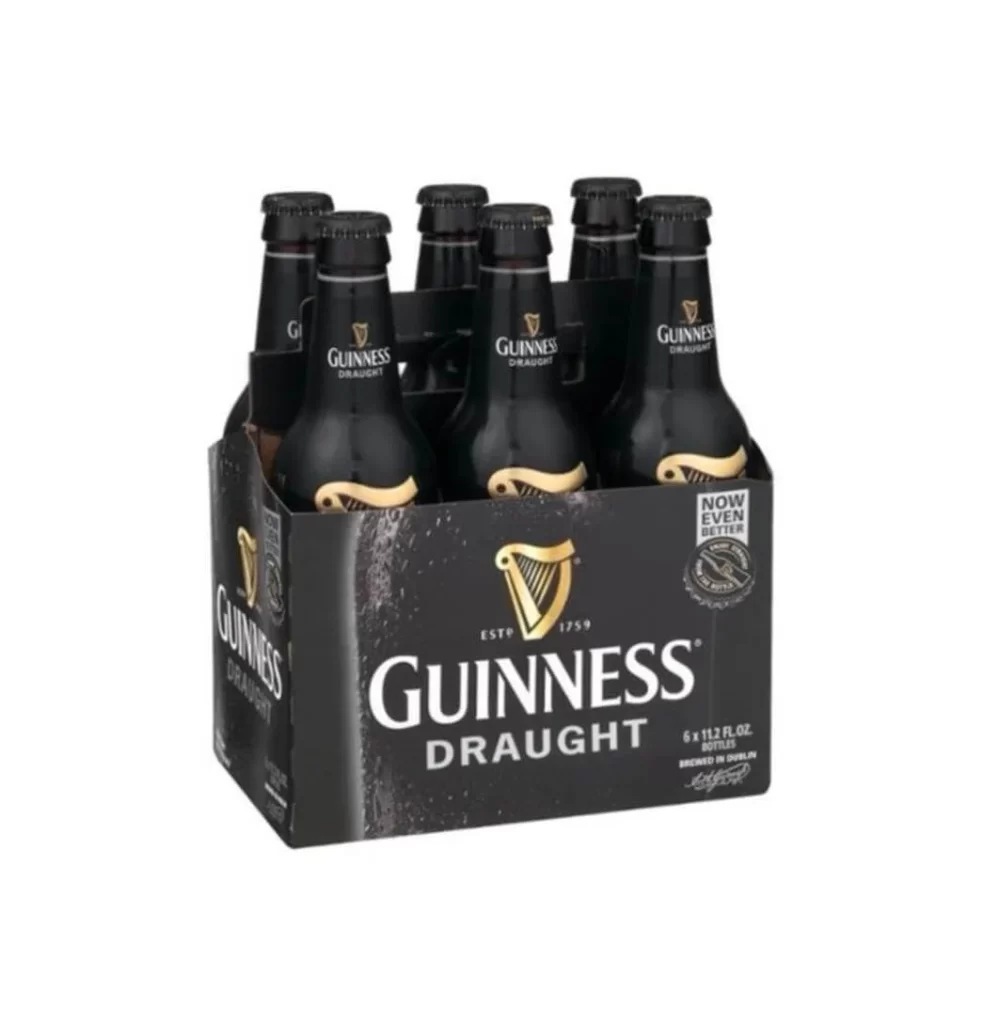
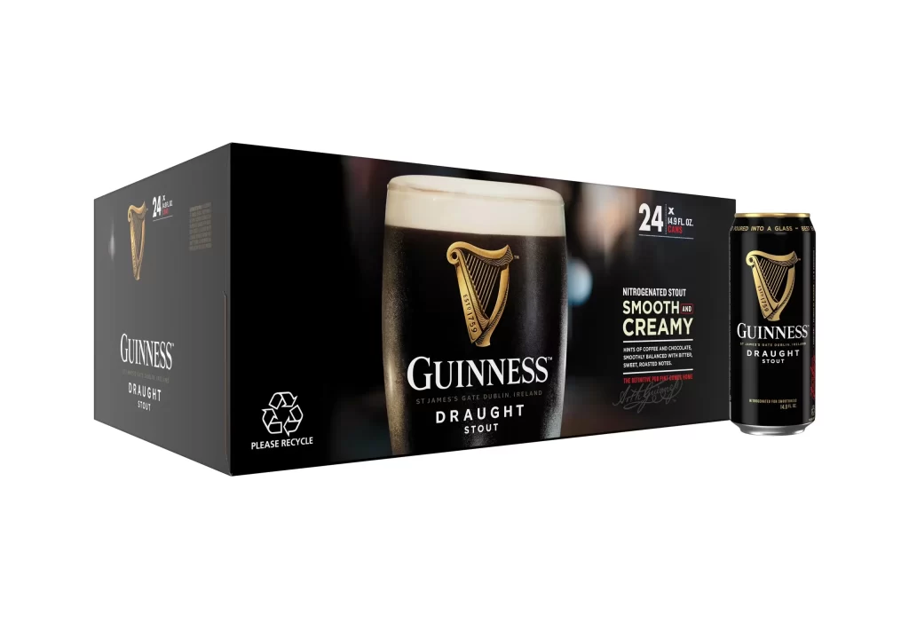
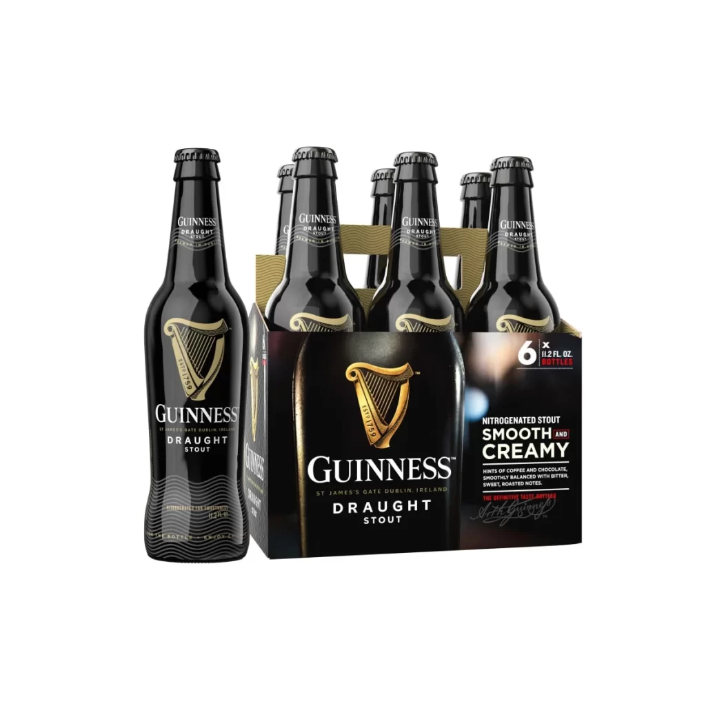
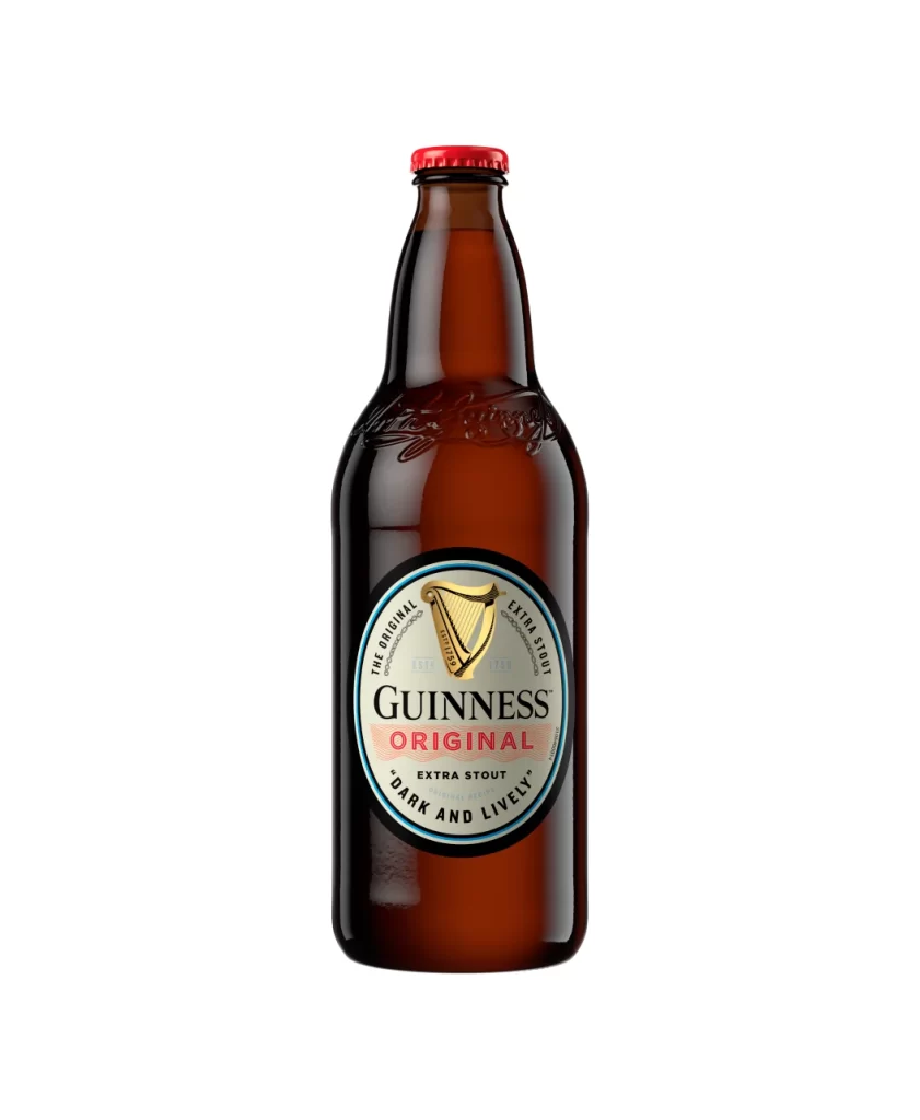
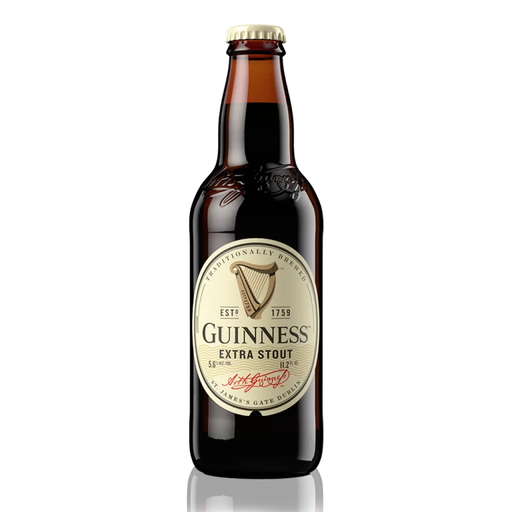
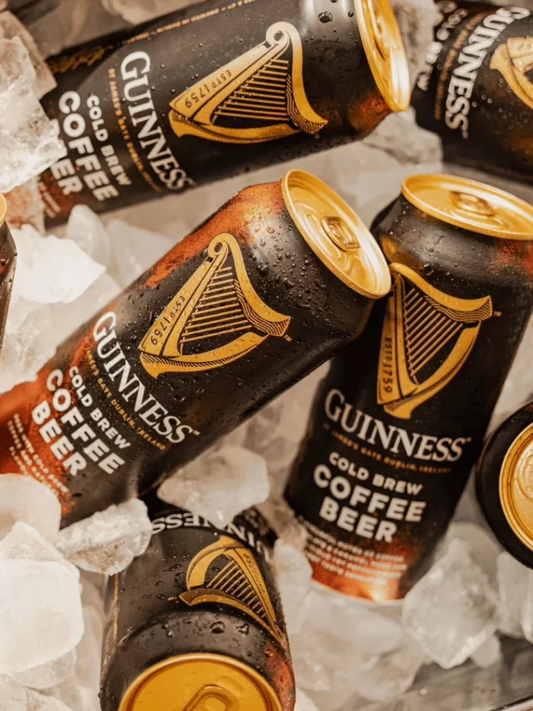
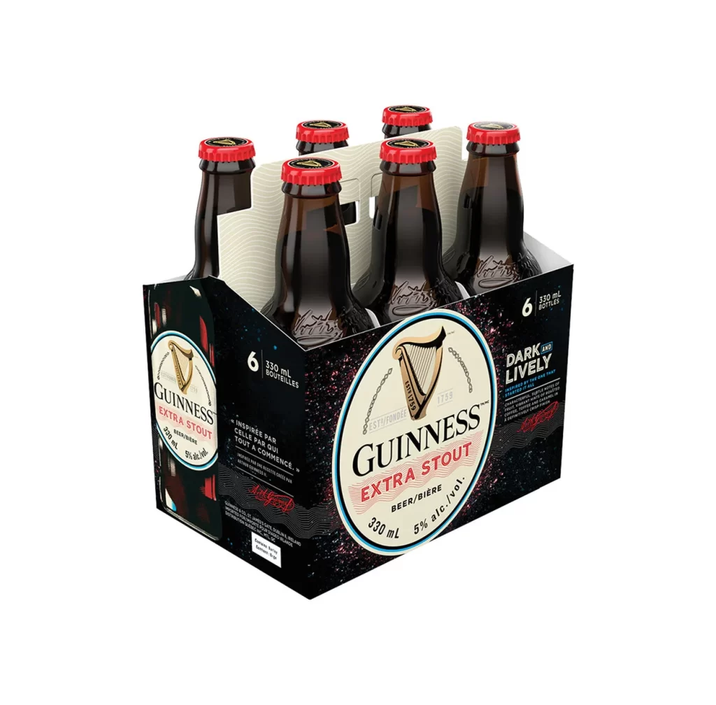
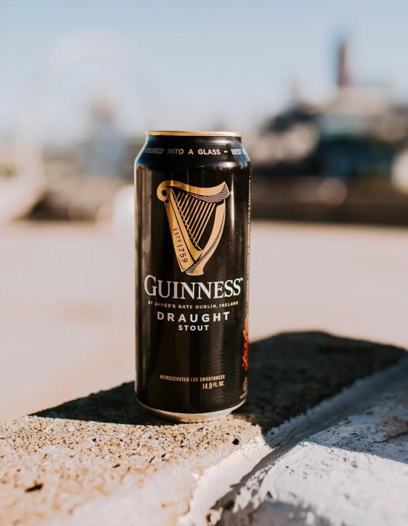
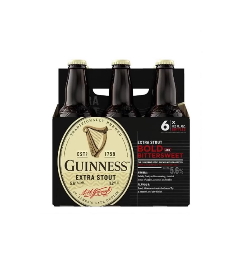
The image presents an overhead arrangement of ten gold can tops. A warm amber studio glow illuminates the circular shapes, creating a rich contrast against the dark backdrop. The precise alignment highlights the iconic harp logos and nitrogen widgets visible through the sleek metallic finish.
This packaging design leverages symmetry and warm lighting to evoke premium quality. The radial placement of the stout cans guides the eye inward, reinforcing brand heritage. By focusing solely on the gold lids, the visual strips away distractions, allowing the amber glow to symbolize the poured beverage.
Graphic designers and packaging students need this reference for studying spatial composition. Marketing professionals can also use it to analyze how lighting and color palette elevate a product. Anyone creating beverage campaigns will find inspiration in its balance of repetition and warmth.