Guinness Draught Stout Twenty Four Pack Cans Packaging
Topics
Details
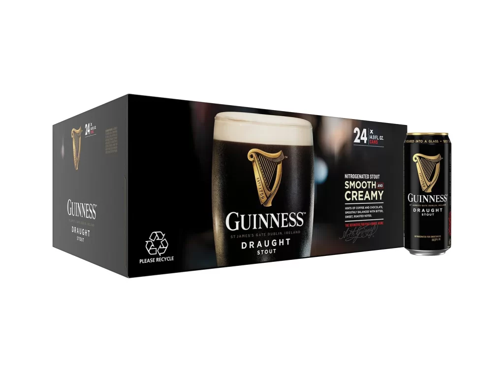
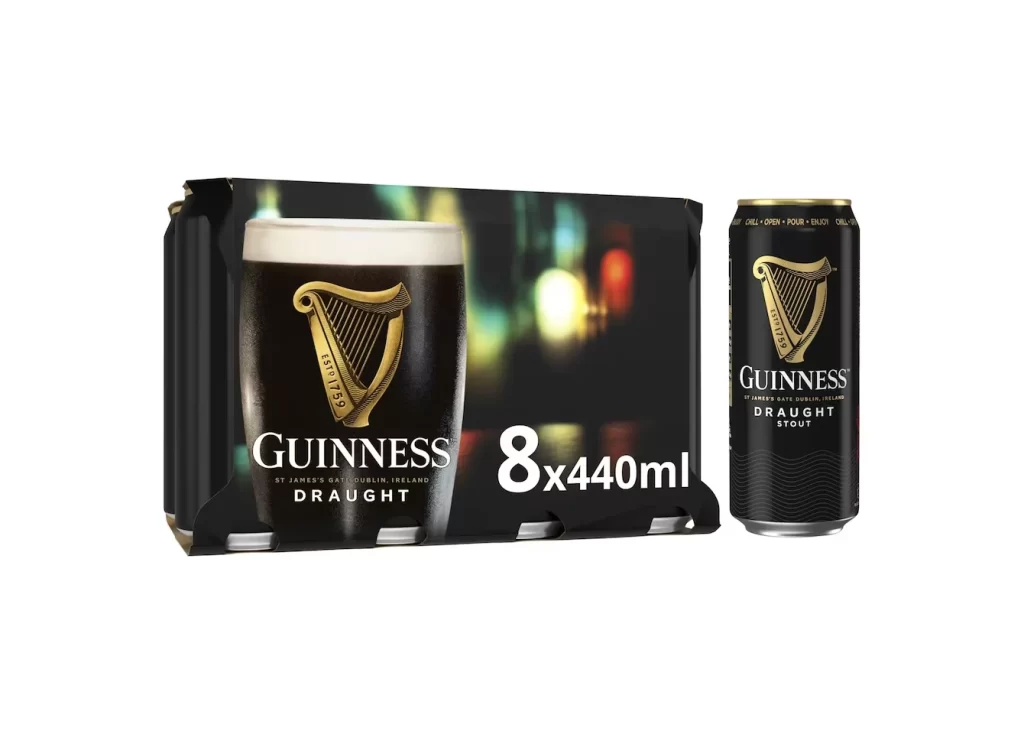
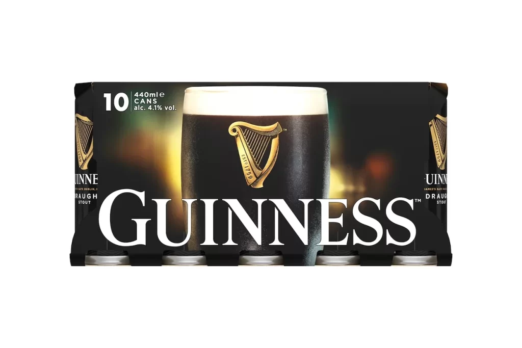
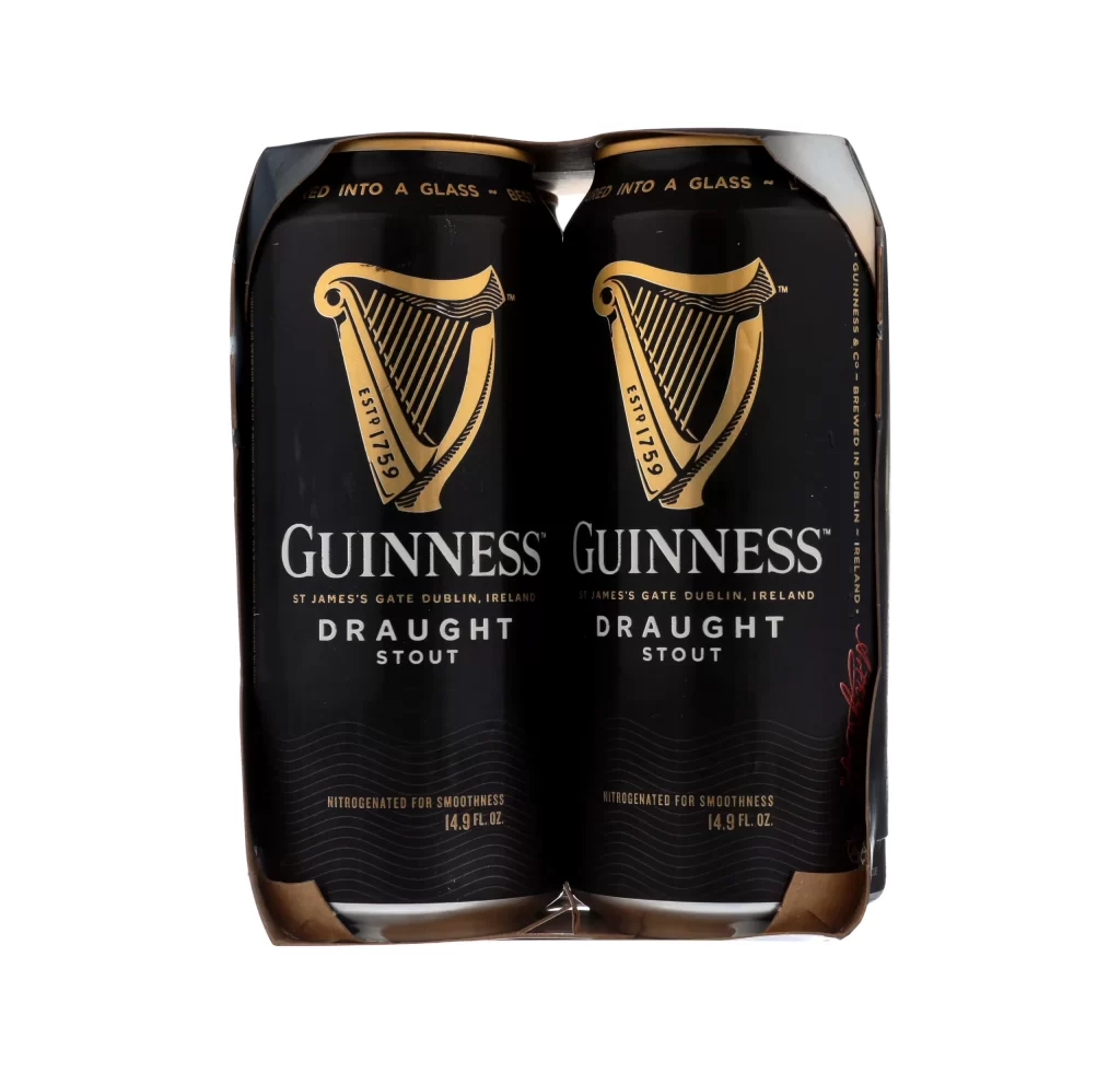
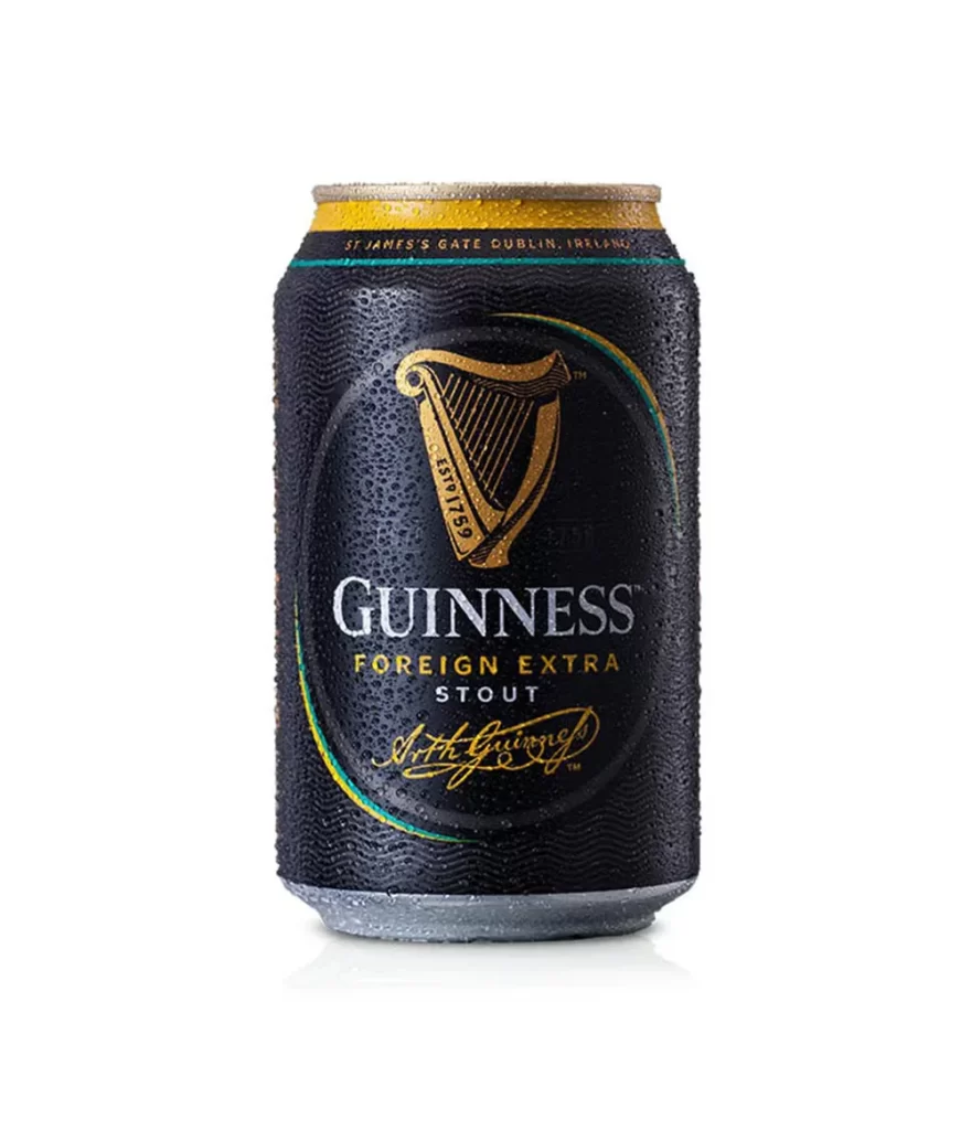
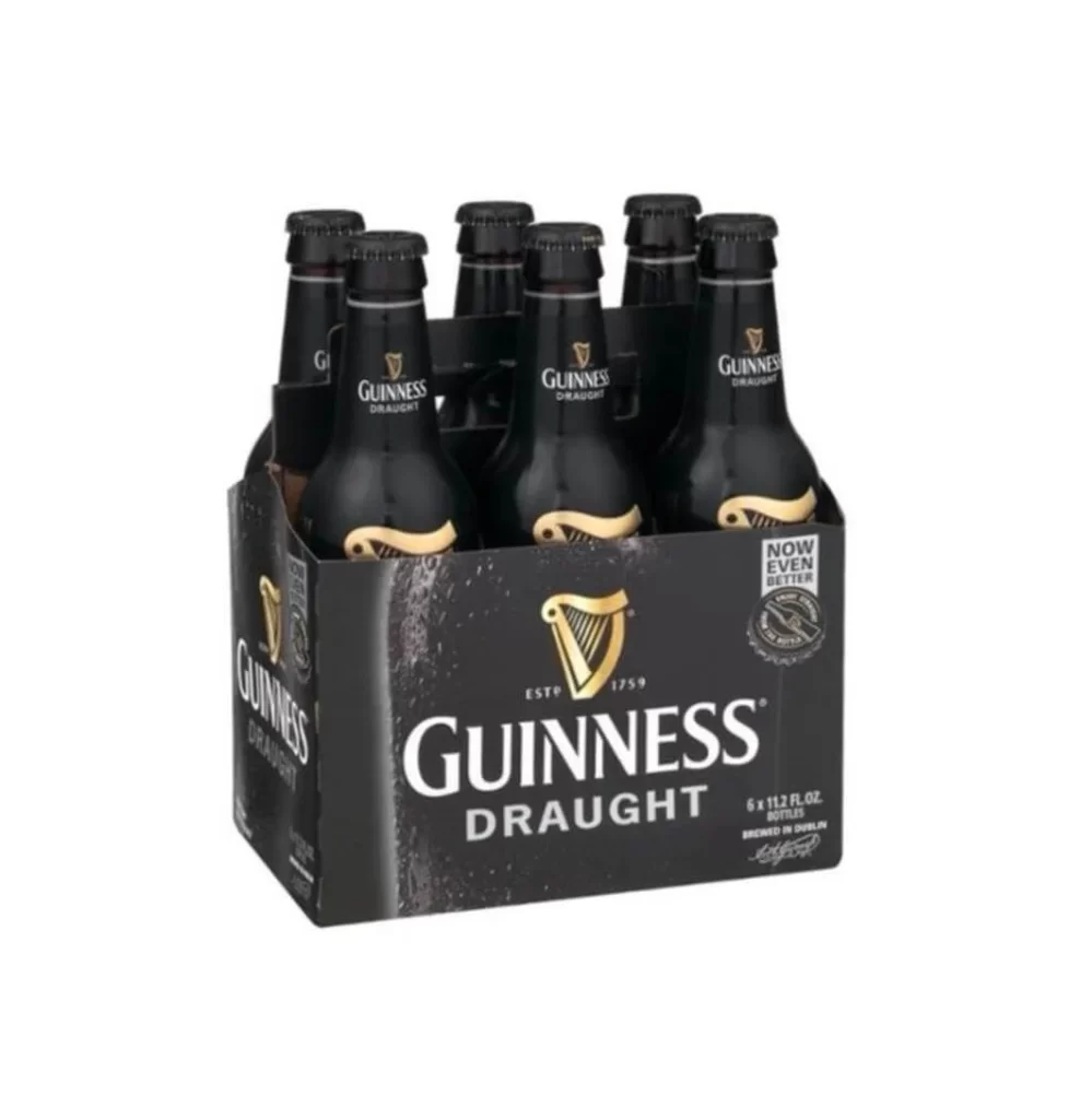
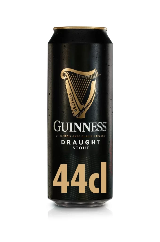
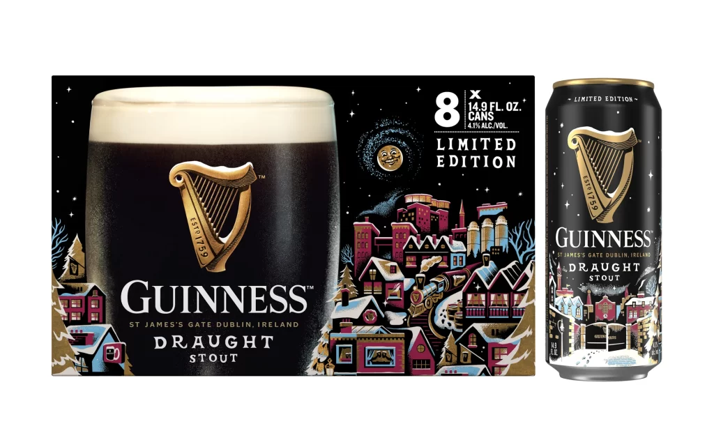
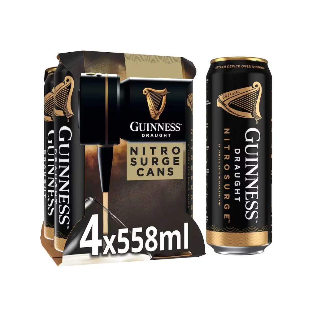
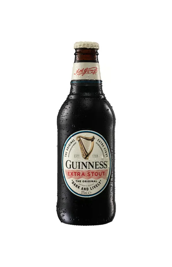
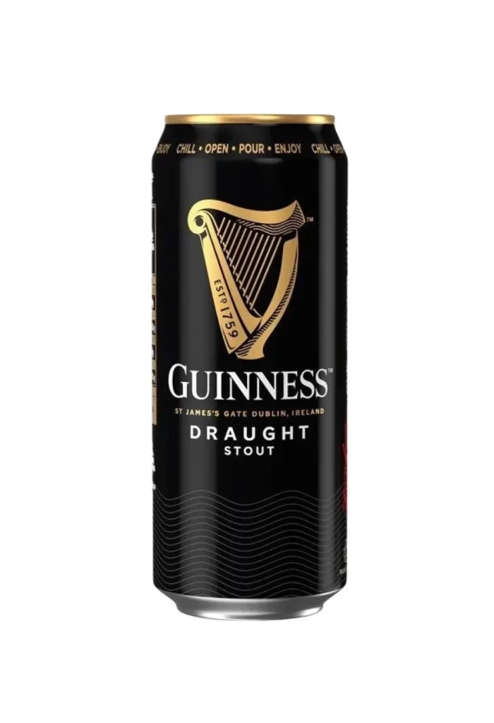
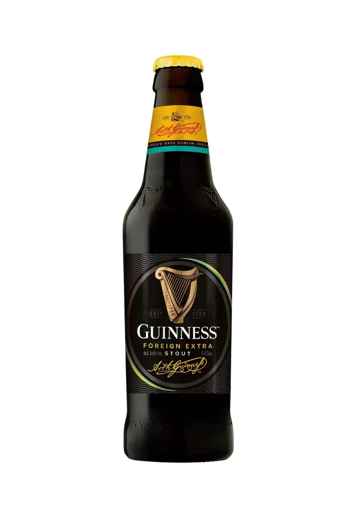
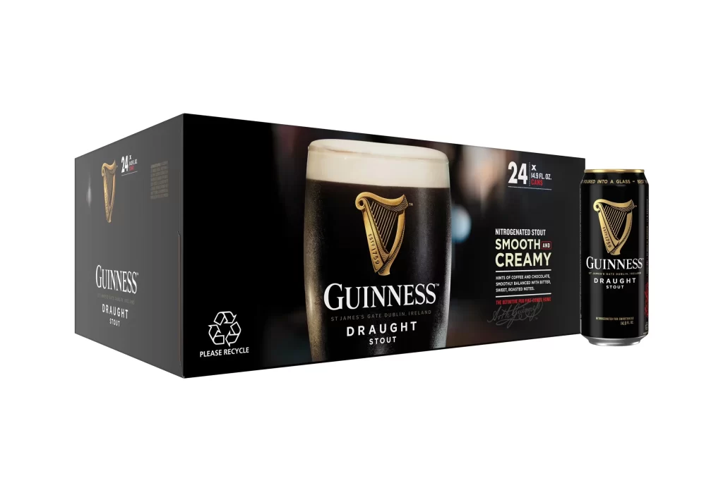
The packaging features a twenty four can case box resting beside a single can. A prominent pint graphic decorates the front, paired with Smooth and Creamy text. A standard recycling logo is present. The entire scene is shot on a clean white background, highlighting the dark beer cans and the iconic harp logo.
Guinness uses this design to merge tradition with modern convenience. The pint graphic instantly signals the classic pour, while the Smooth and Creamy text highlights the famous nitro widget experience. The bright white background creates strong visual contrast, allowing the black and gold branding to pop and grab attention.
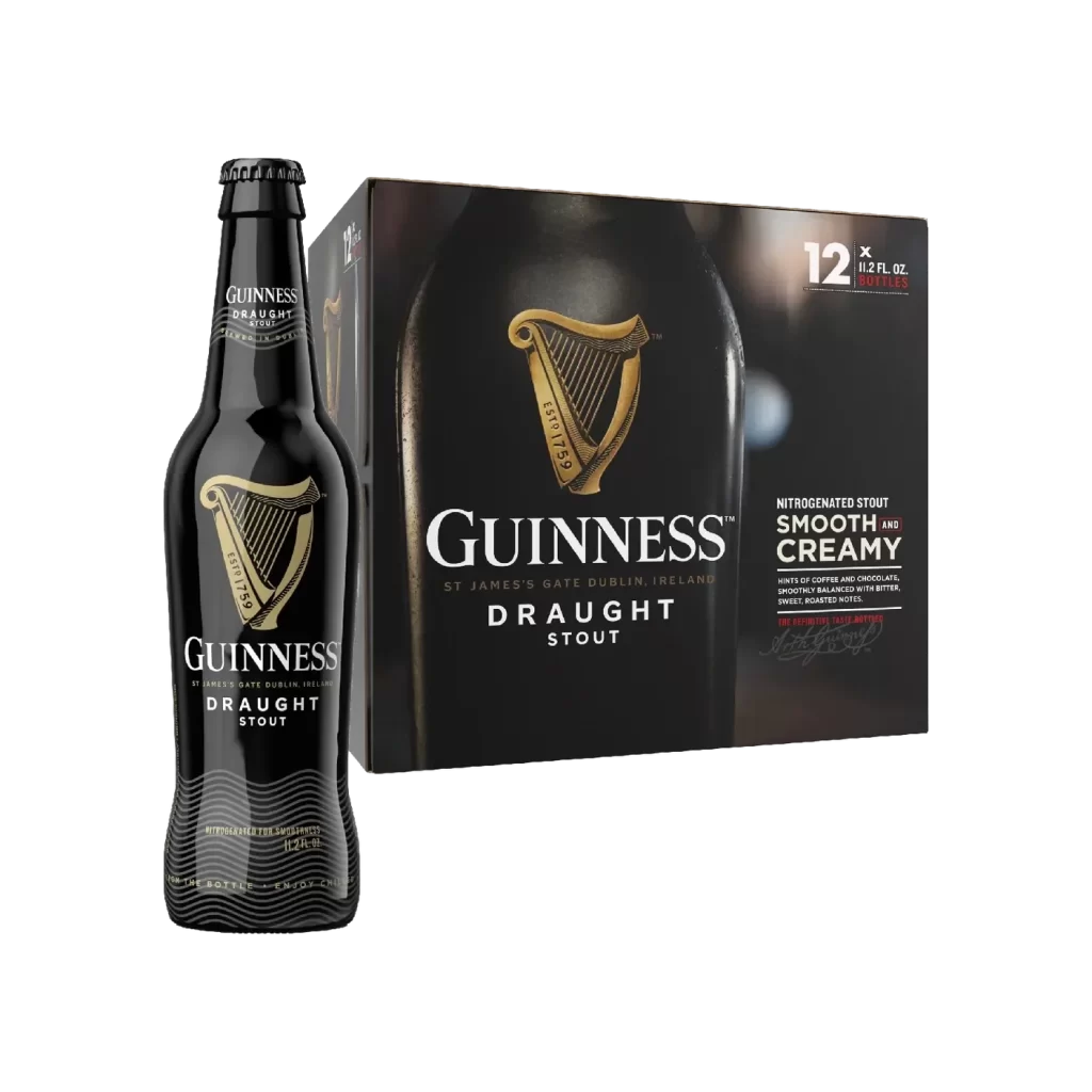
Designers and marketers will find this resource valuable. It serves as a great reference for beverage packaging, specifically multipack formats. Graphic design students studying commercial product photography or brand consistency can analyze how Guinness balances text, iconography, and structural layout to maintain identity across different container sizes.