Guinness Draught Stout Two Pack Cans Packaging
Topics
Details
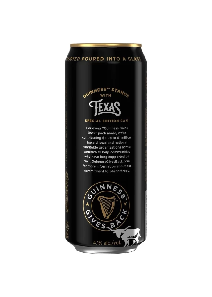
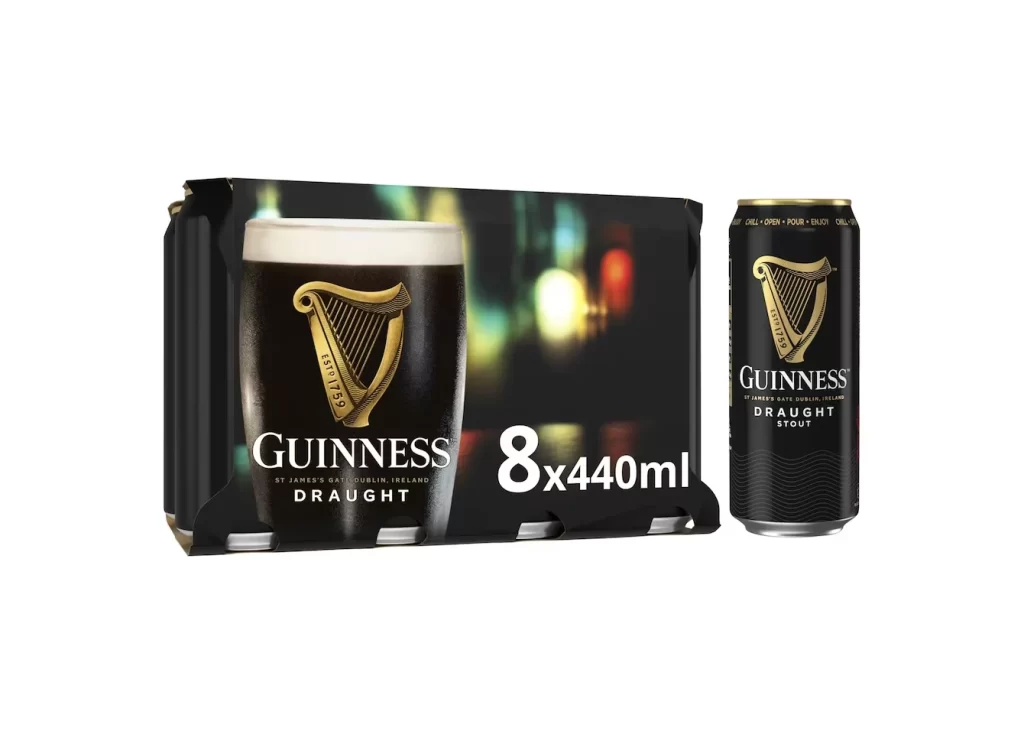
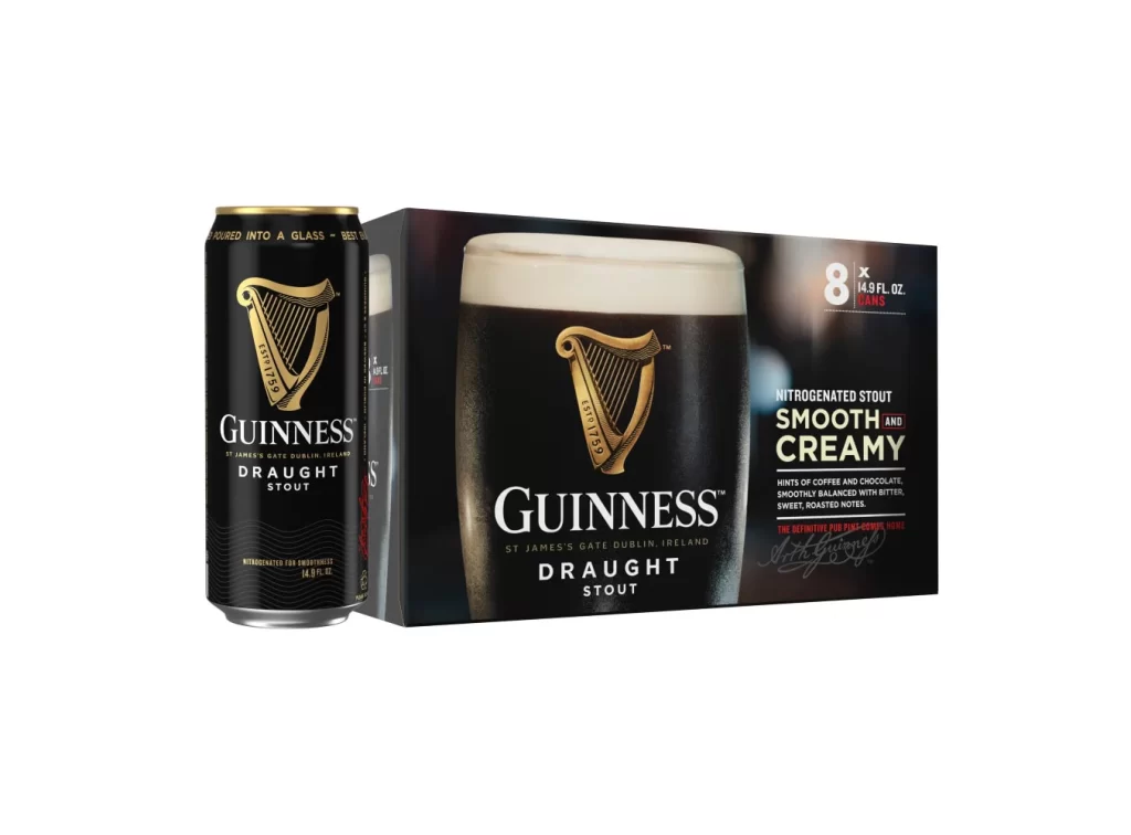
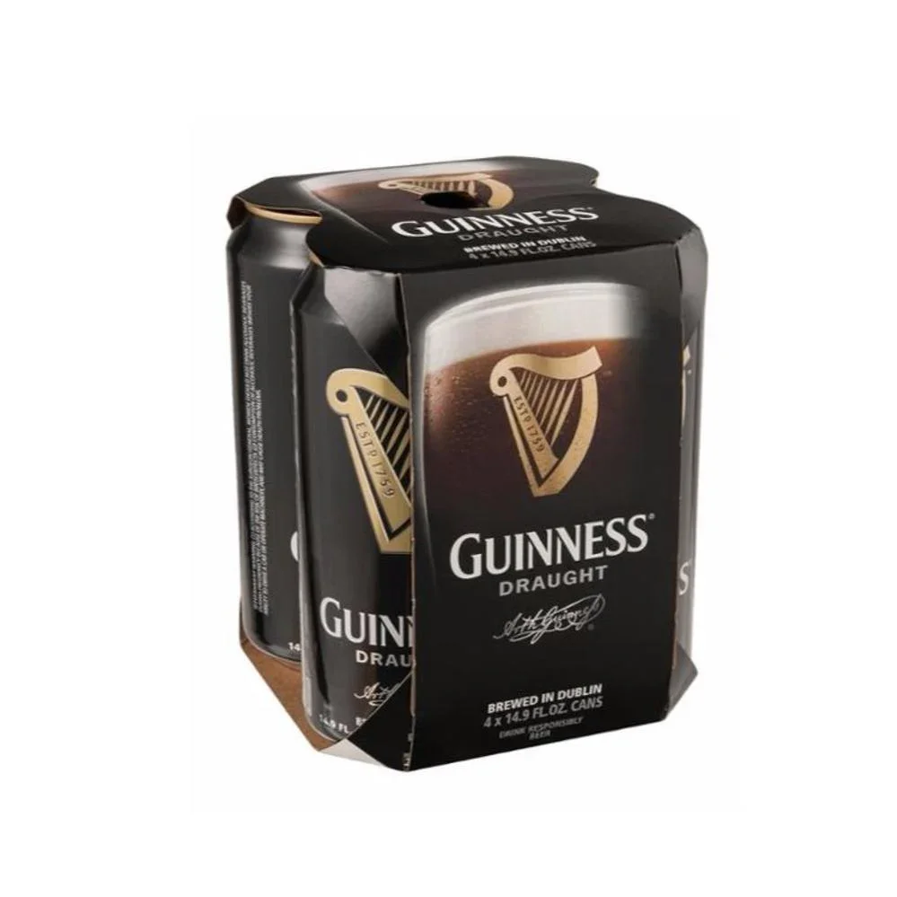
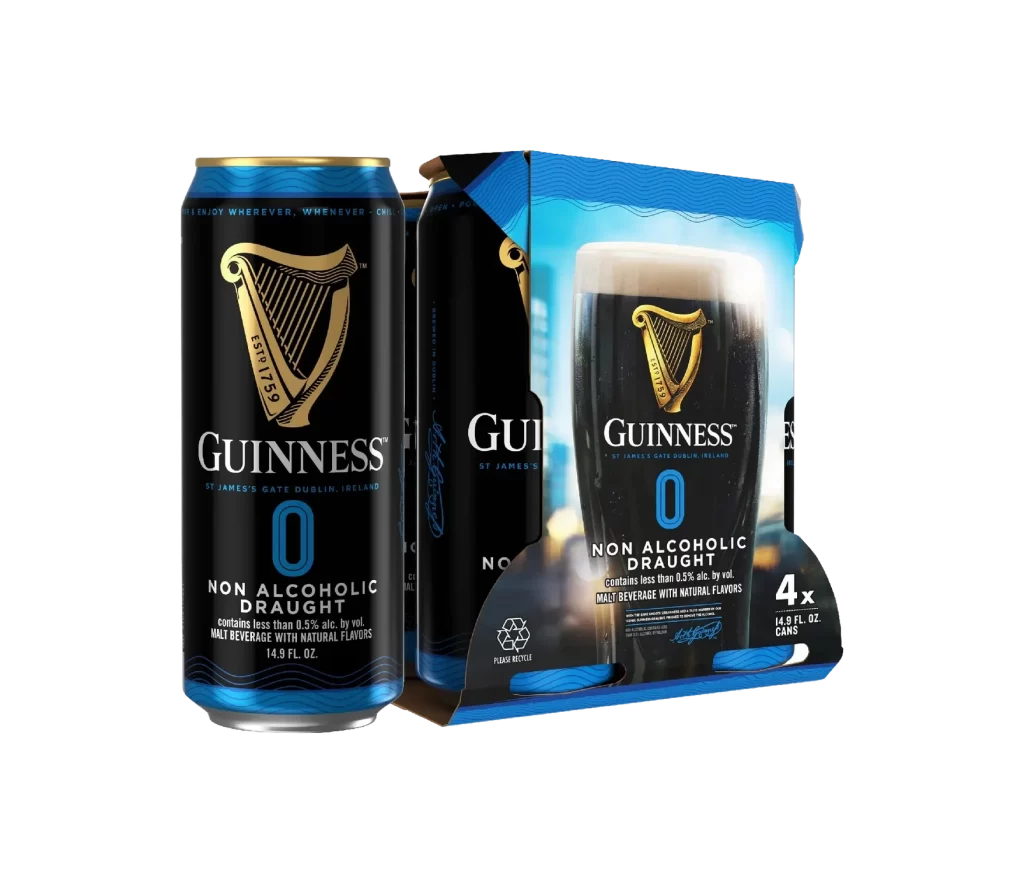
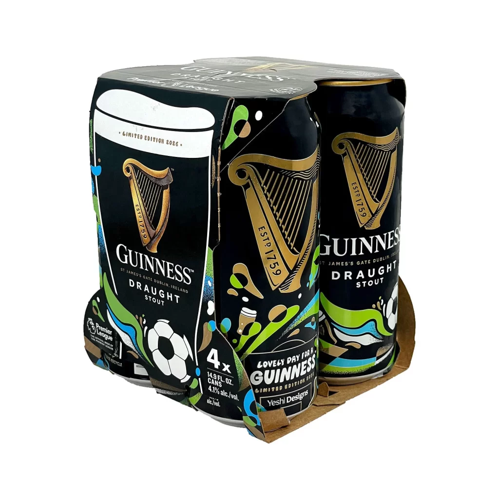
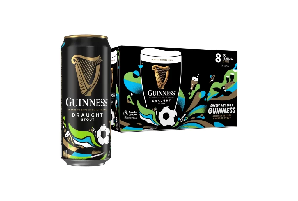
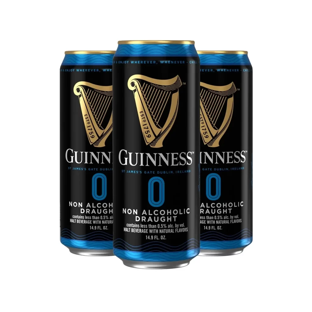
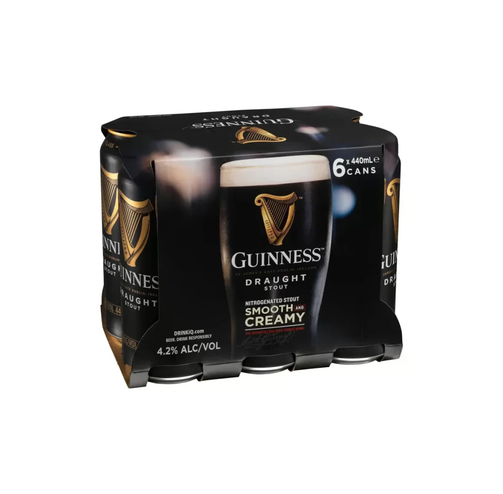
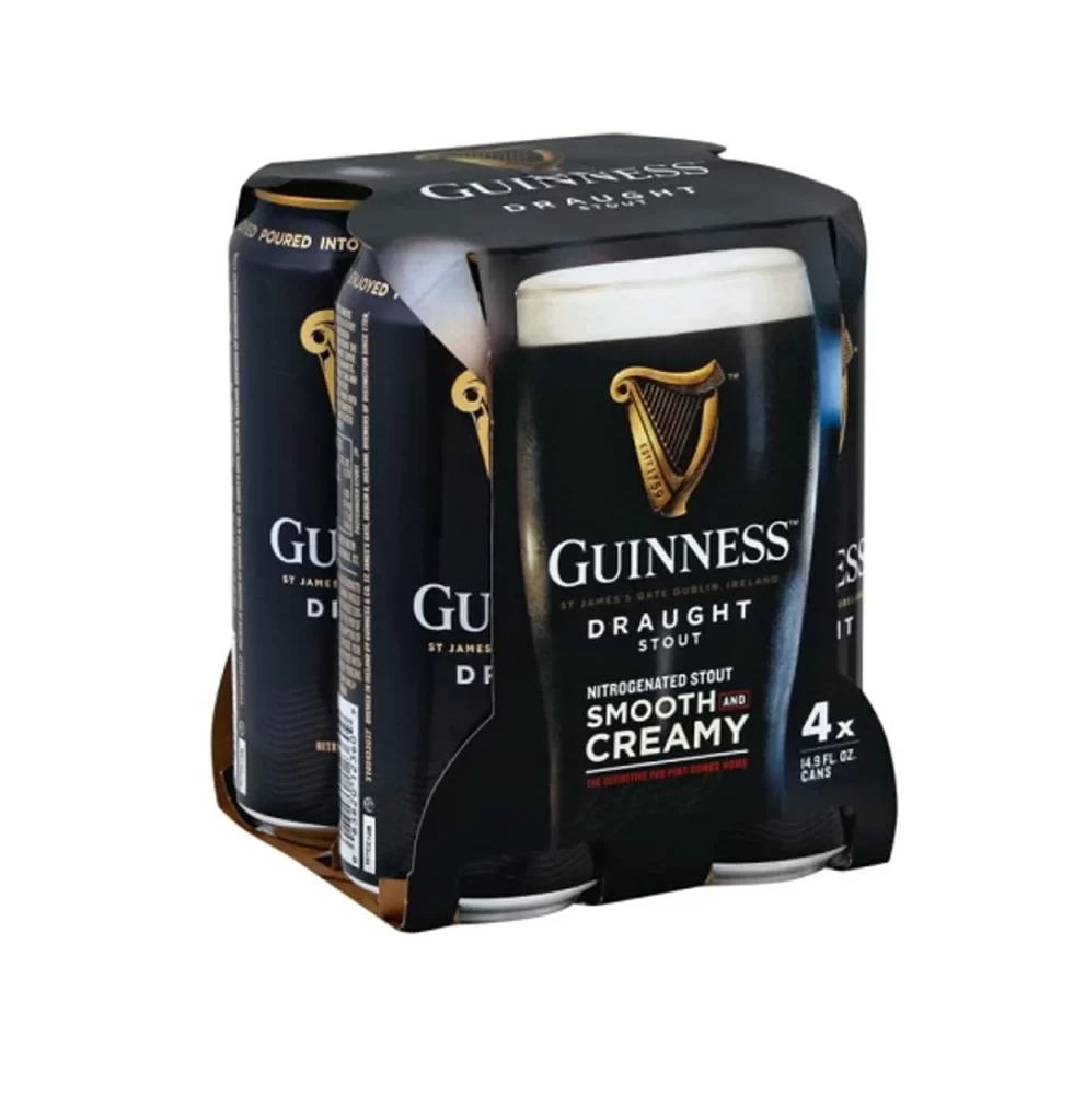
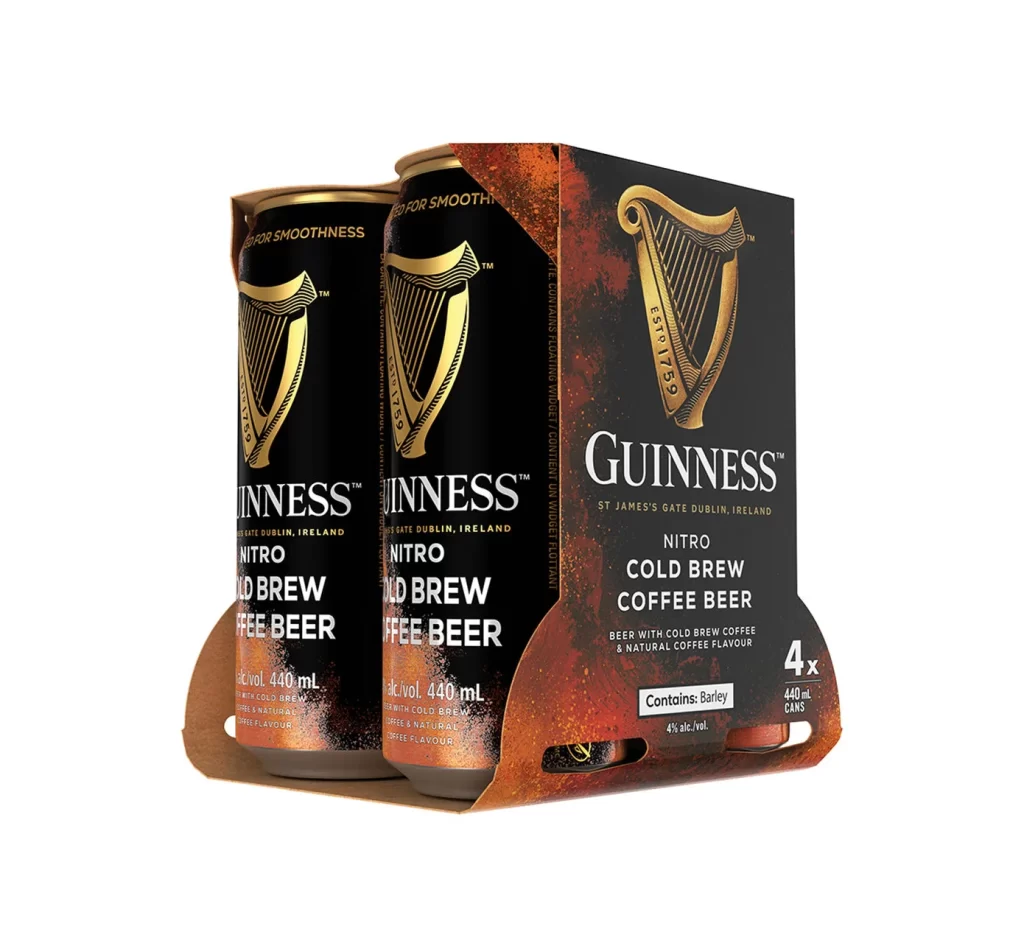
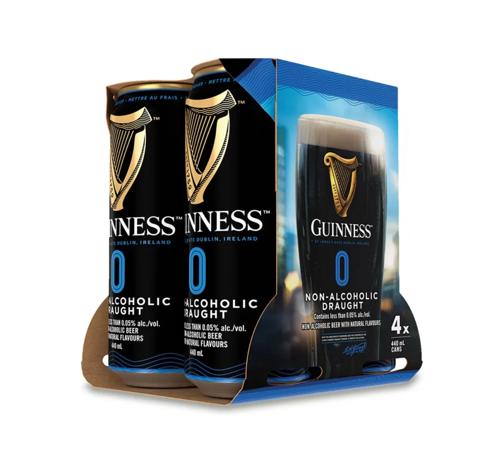
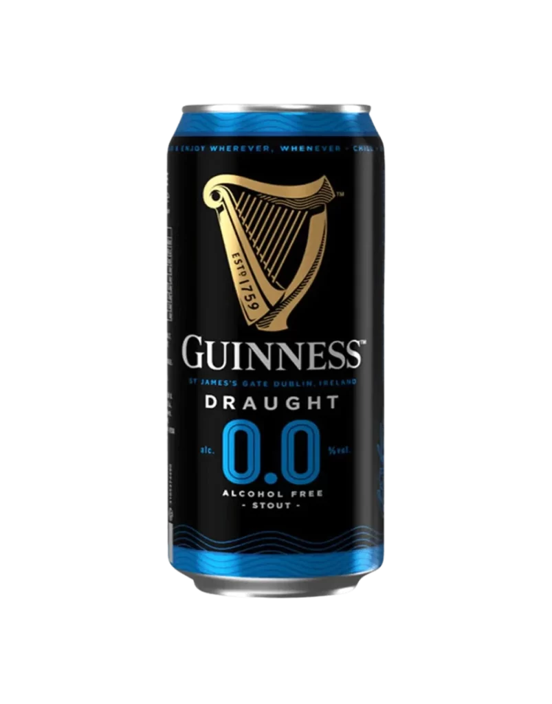
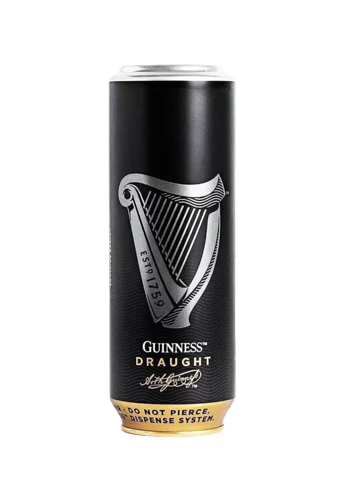
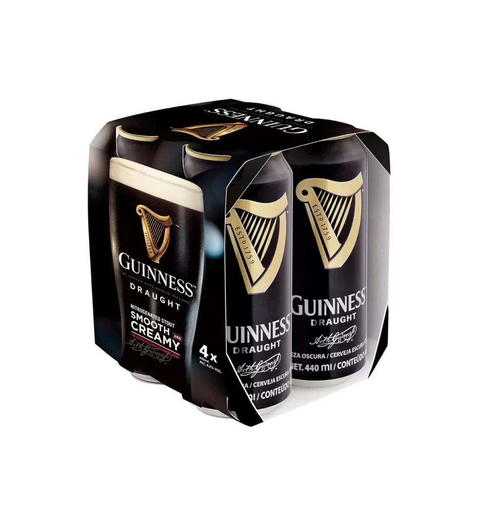
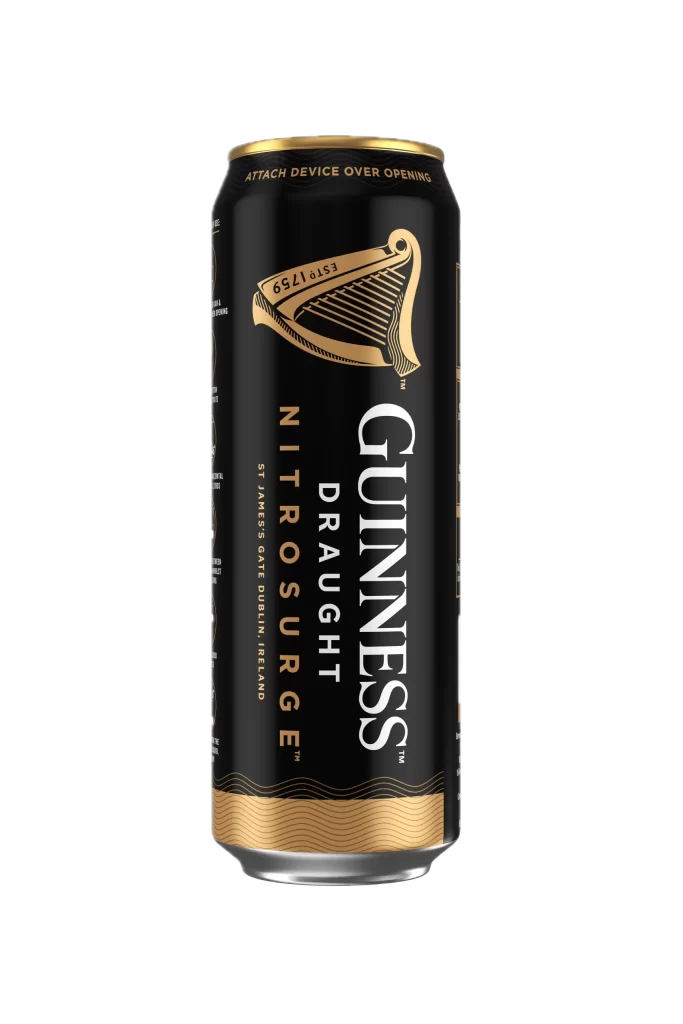
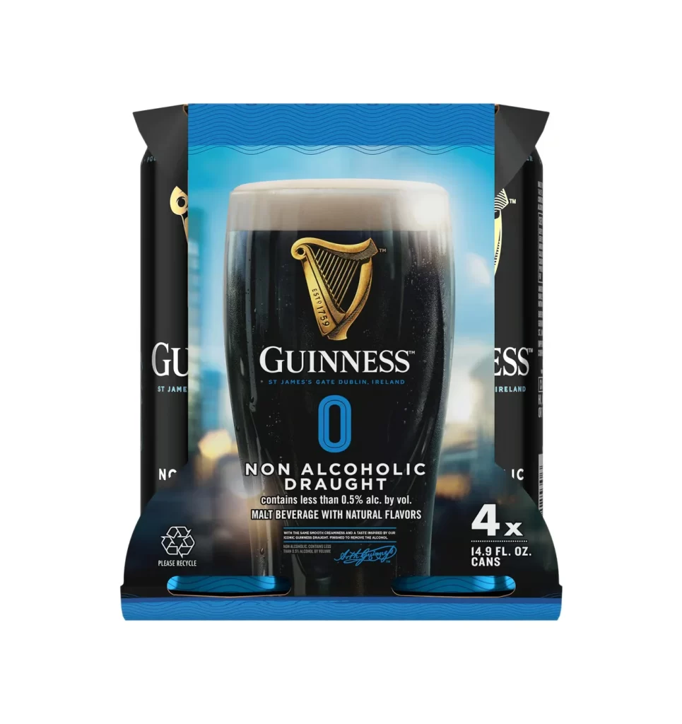
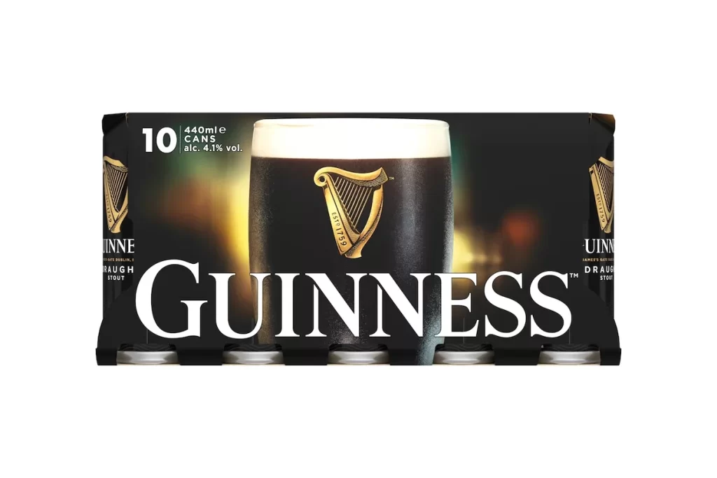
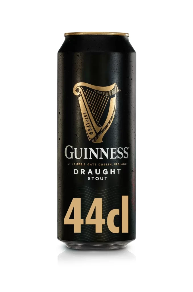
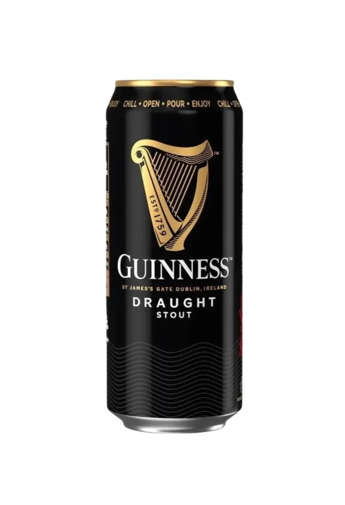
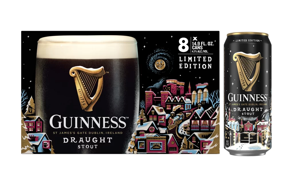
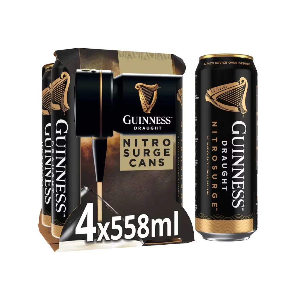
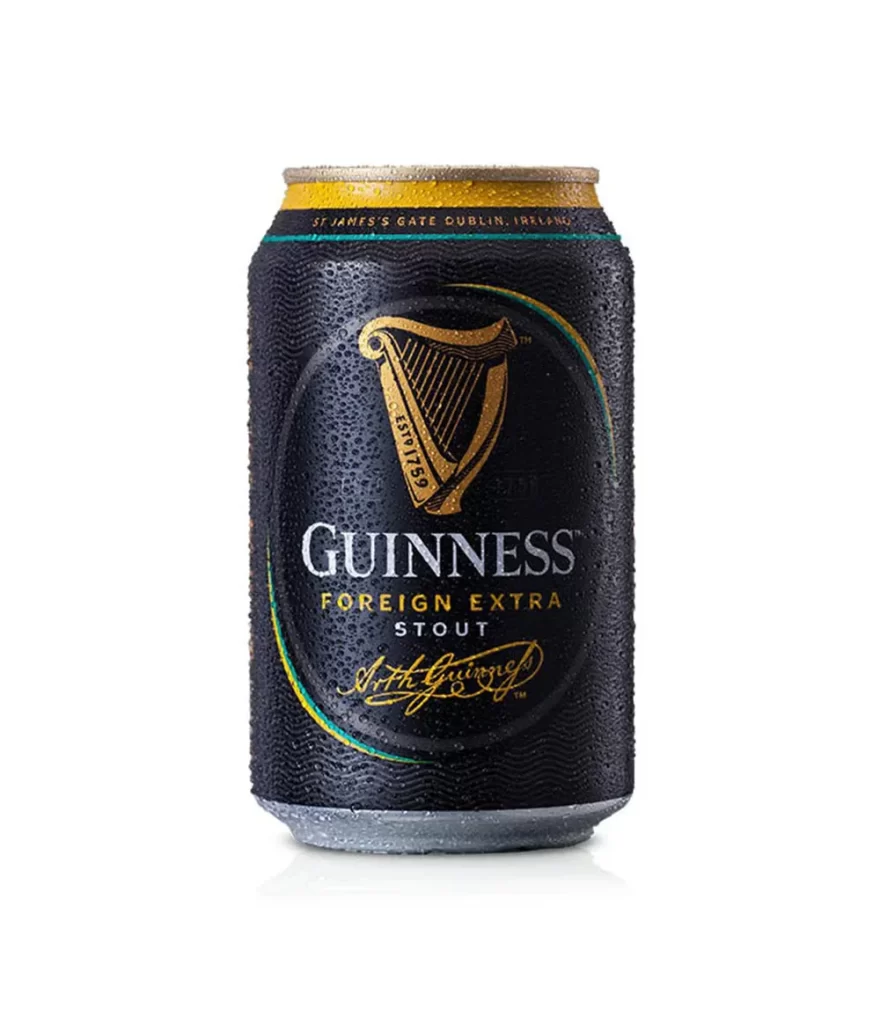
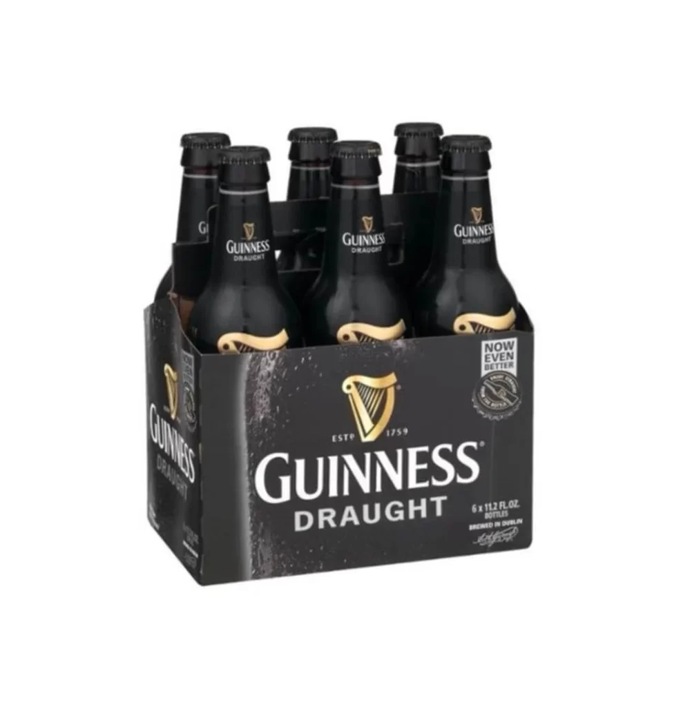
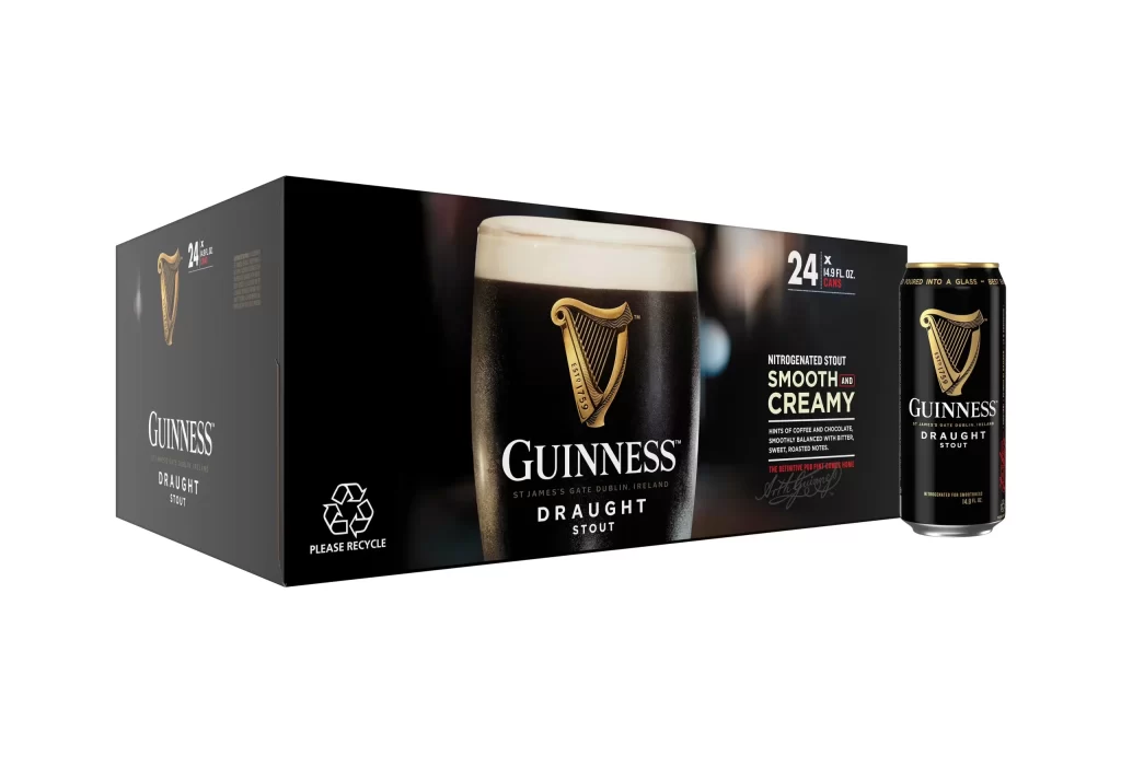
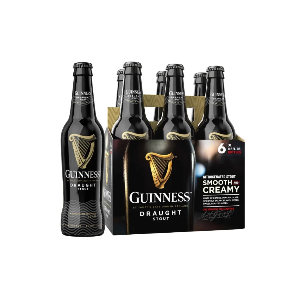
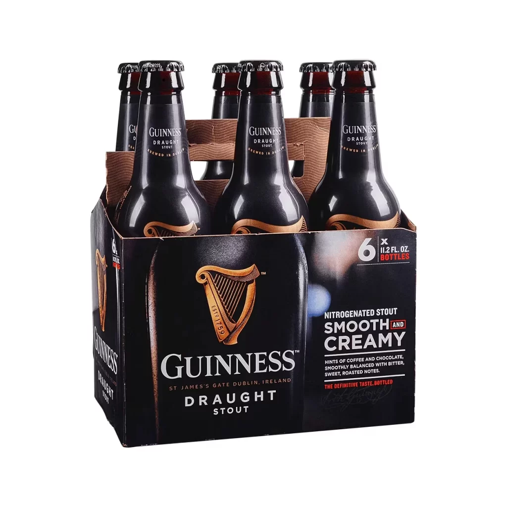
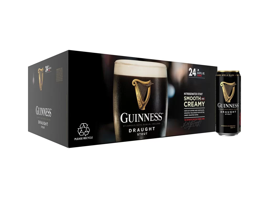
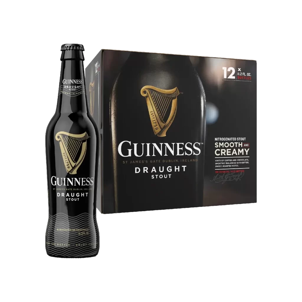
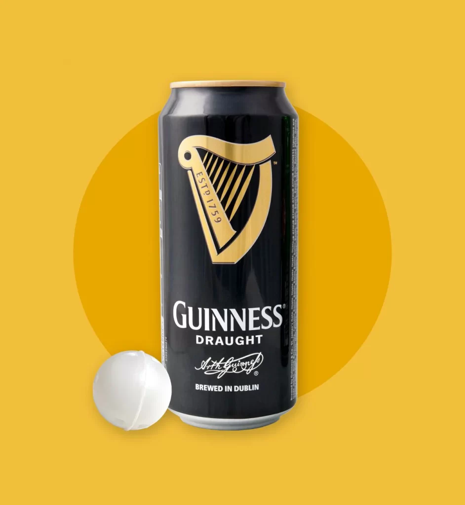
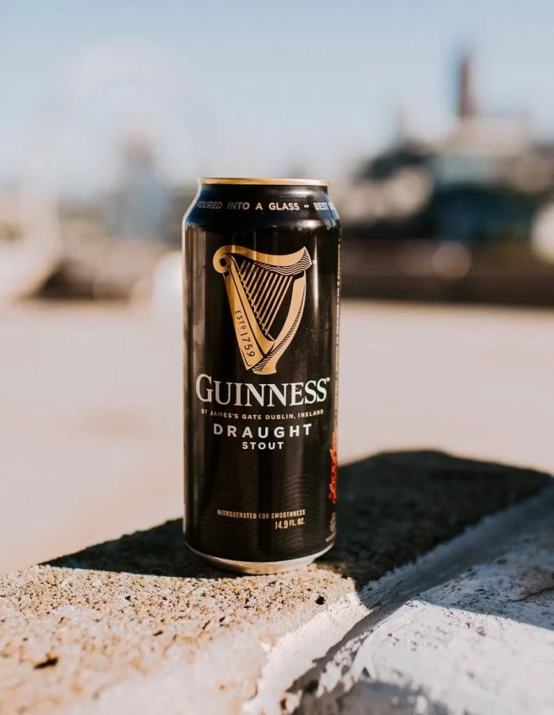
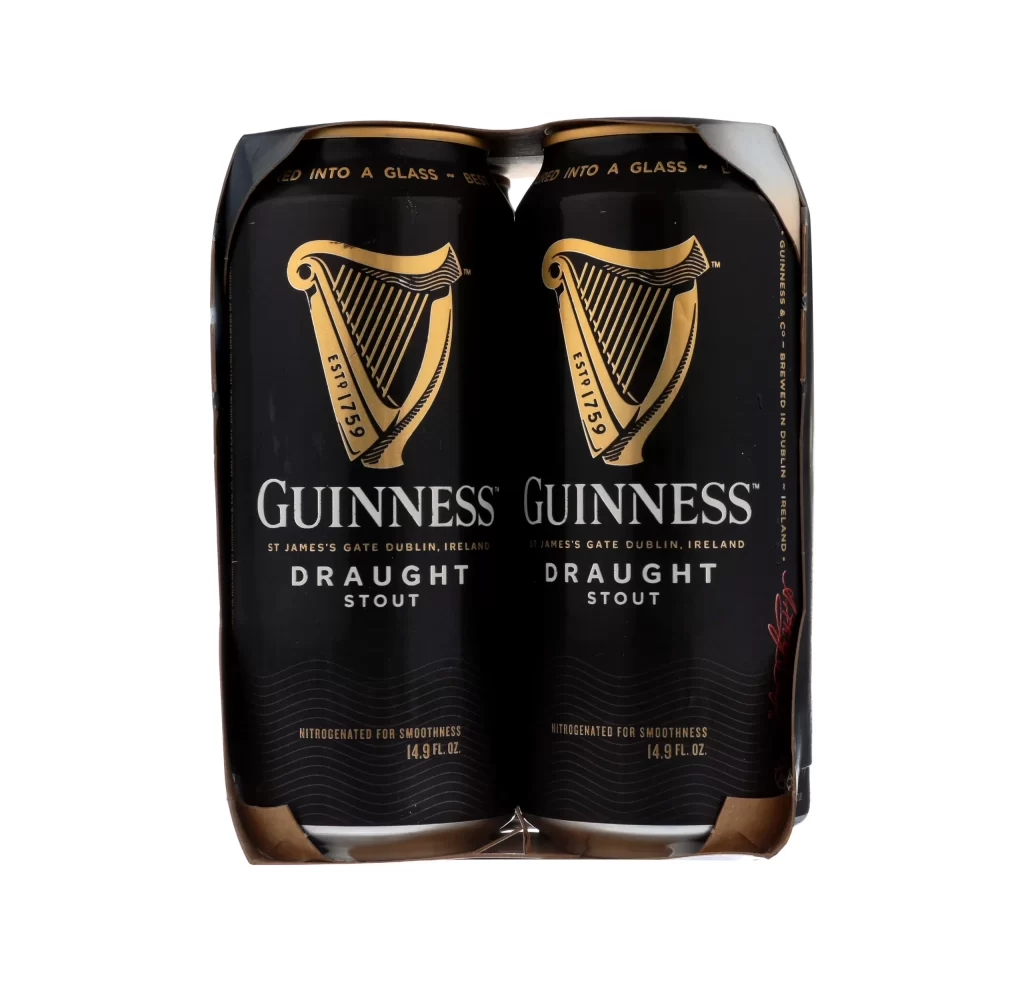
The packaging features a straight frontal view of a wrap around carrier holding two cans. Prominent gold rim text encircles the dark design, catching the light against the classic black backdrop. This clear, symmetrical presentation highlights the iconic harp logo and tactile can details, making the physical structure easy to study.
Guinness leverages its heritage through stark contrast and minimal layout. The gold rim text adds premium elegance, while the wrap around carrier emphasizes shared enjoyment. By using a straight frontal view, the brand ensures instant shelf recognition, reinforcing consumer trust through bold, familiar visual cues.
Graphic designers and packaging students analyzing beverage multipacks will find this reference invaluable. It is ideal for those studying carrier structural design, typography, and brand consistency. Marketing professionals seeking inspiration for premium product merchandising can also use this straight frontal view to understand effective visual communication.