Guinness Extra Stout Bottle Cream Label Packaging
Topics
Details
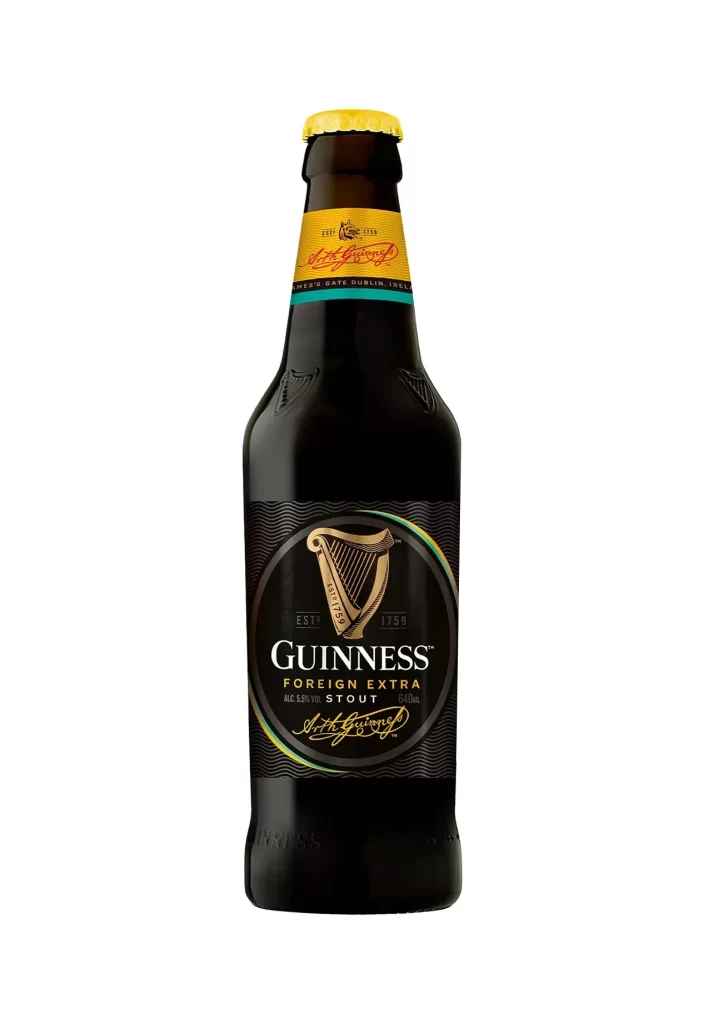
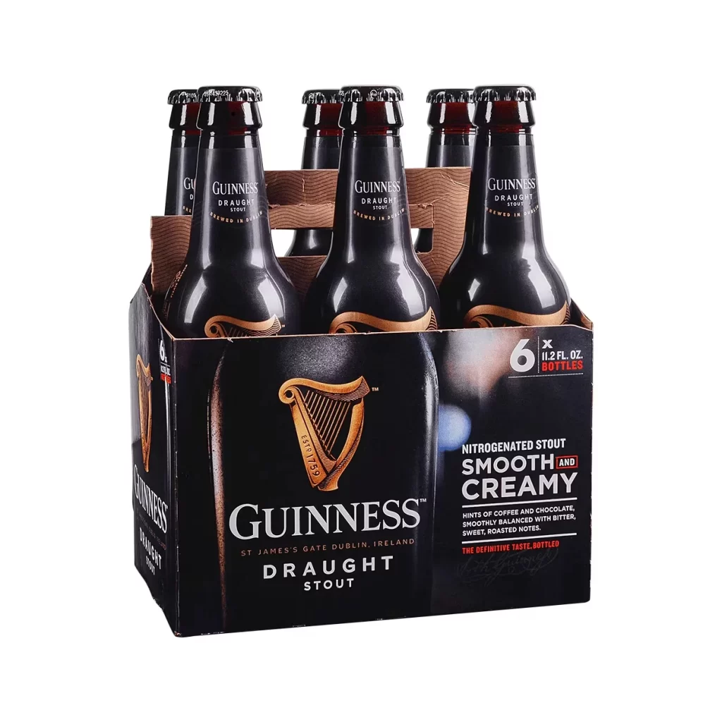
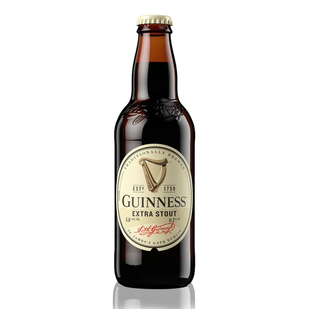
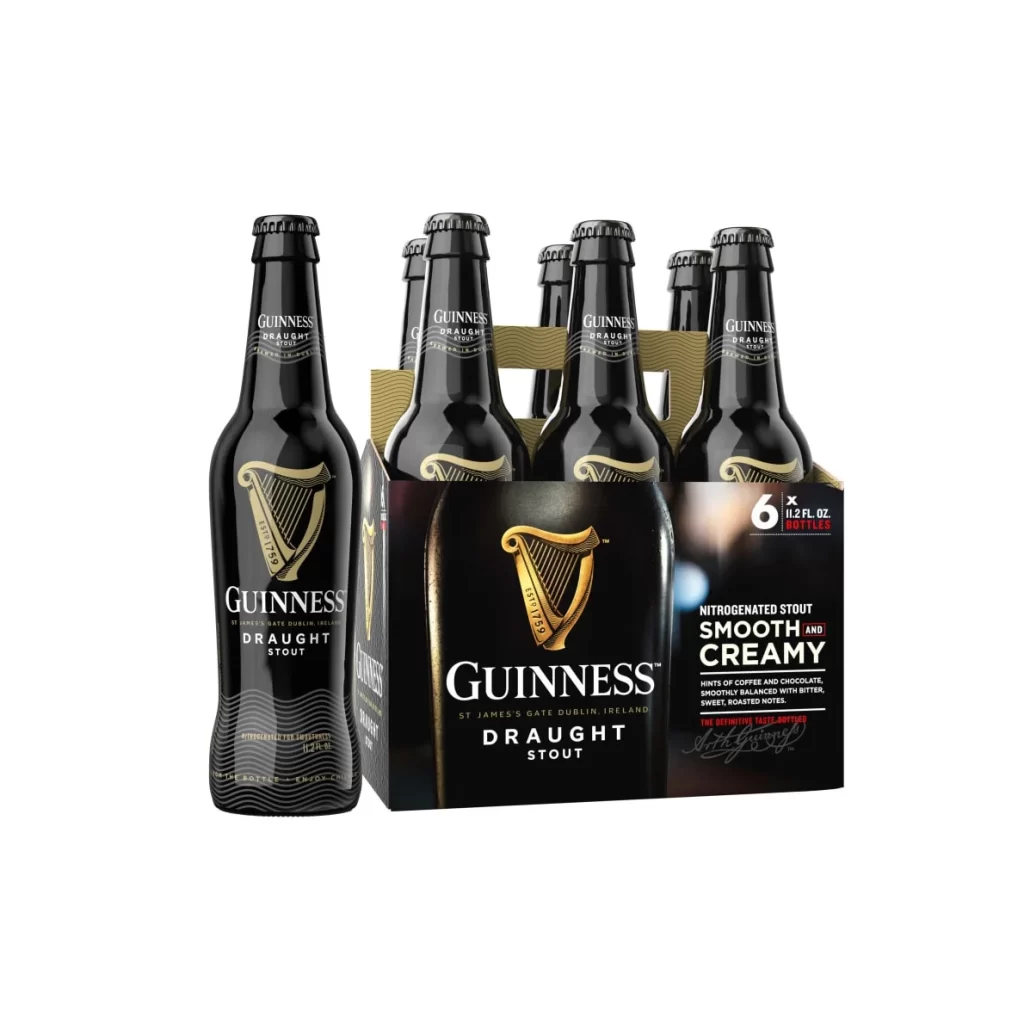
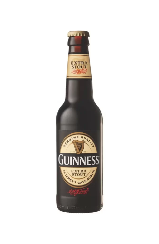
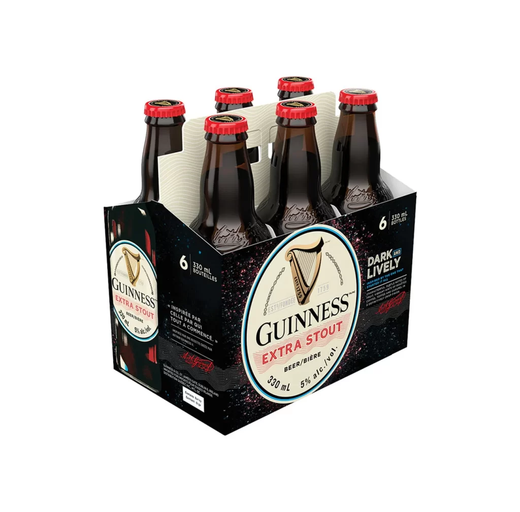
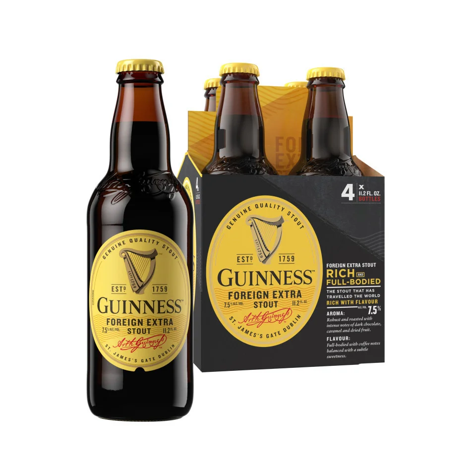
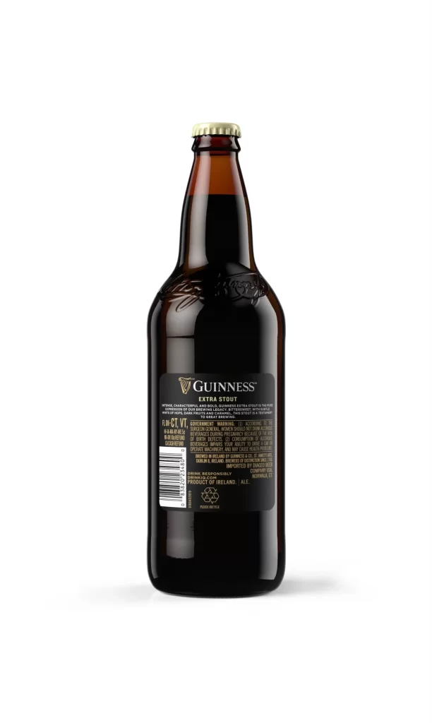
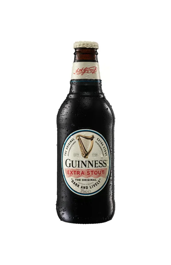
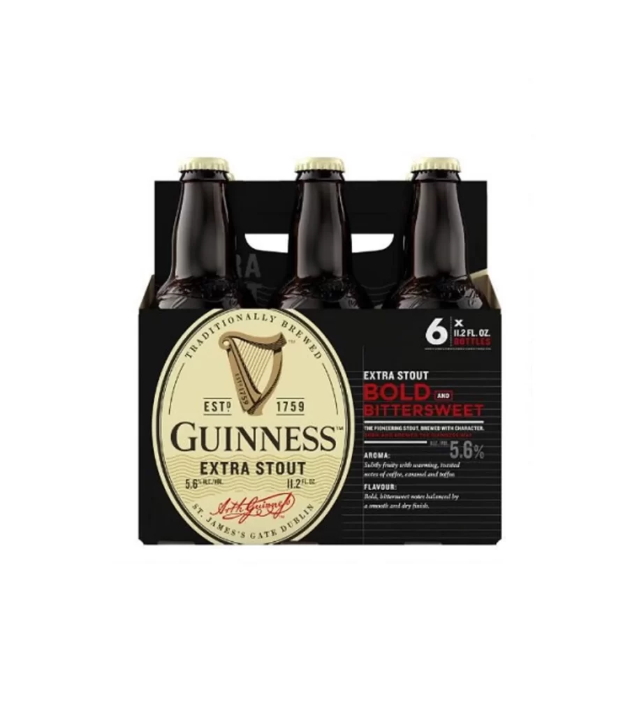
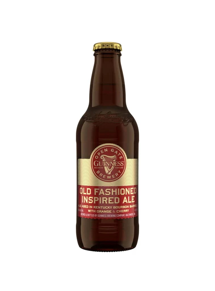
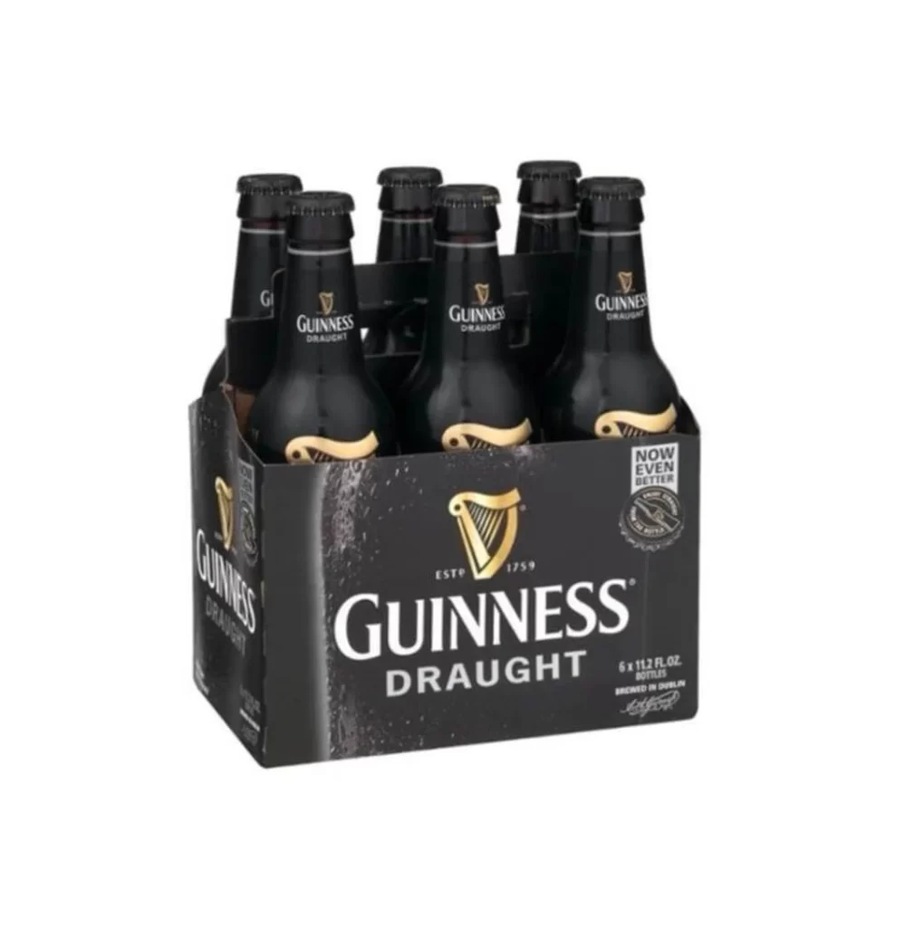
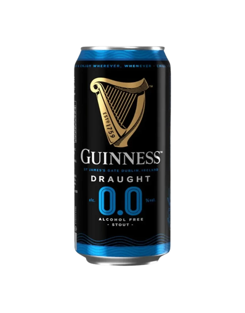
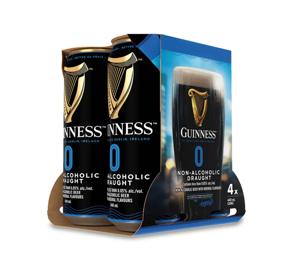
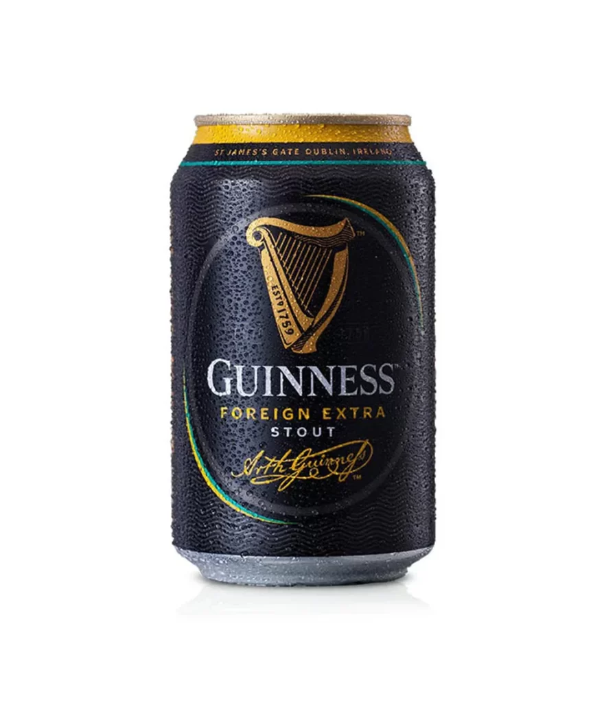
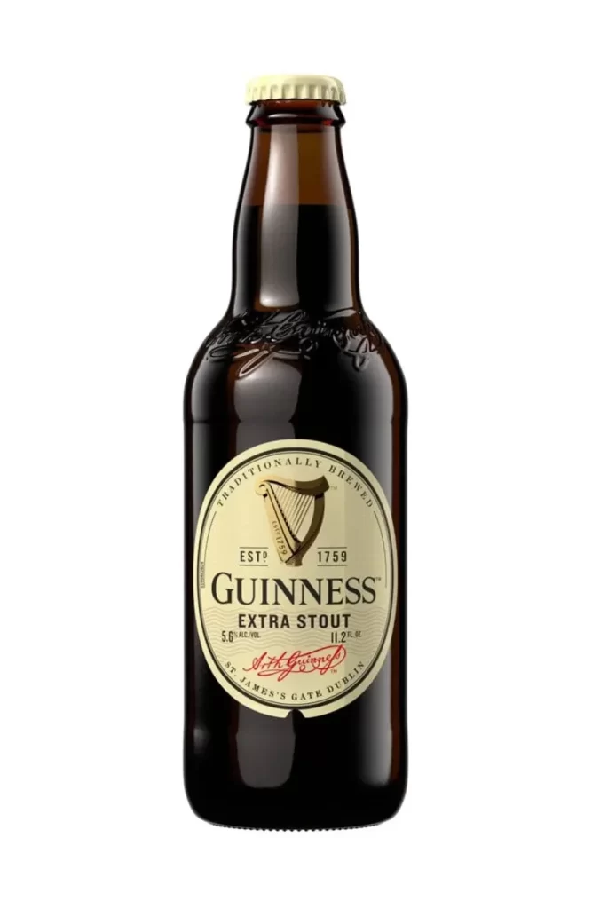
The image shows a straight frontal view of the Guinness Extra Stout bottle. It features a prominent cream beige oval label. The classic Arthur Guinness signature script is clearly visible across the center. This specific packaging represents the US import version, showcasing the iconic dark beer bottle against a clean background for maximum clarity and visual focus.
This packaging design leverages historical authenticity to build consumer trust. The cream beige oval provides a soft contrast against the dark glass, drawing the eye directly to the Arthur Guinness script. By using this recognizable signature, the US import version maintains a strong connection to its Irish heritage while delivering a straightforward, timeless aesthetic that commands attention on retail shelves.
Graphic designers and packaging students need this reference for studying classic beverage branding. Marketing professionals can use it to analyze how imported products maintain heritage cues. Additionally, 3D artists and mockup creators will find the straight frontal view highly useful for extracting accurate typography, color palettes, and layout proportions for their own digital product visualization projects.