Guinness Extra Stout Bottle Packaging
Topics
Details
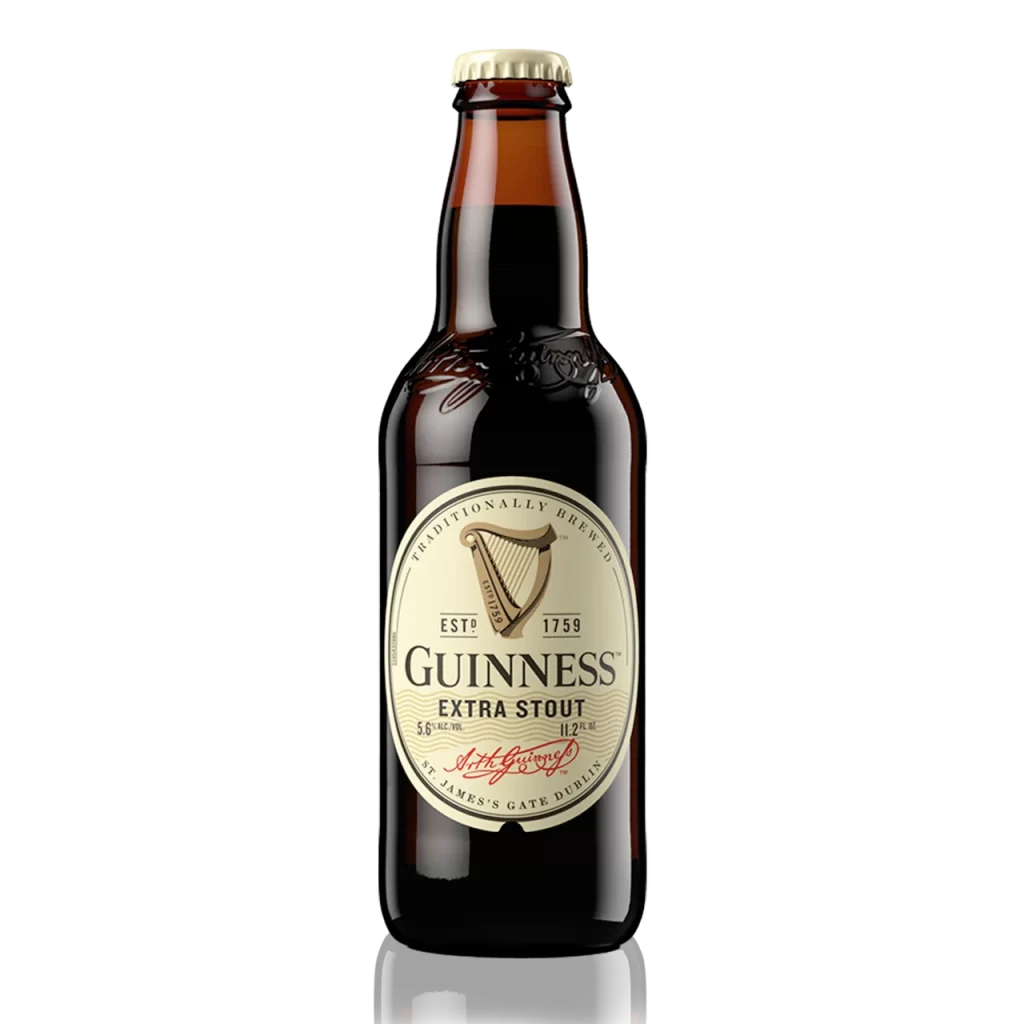
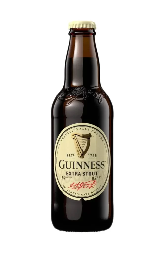
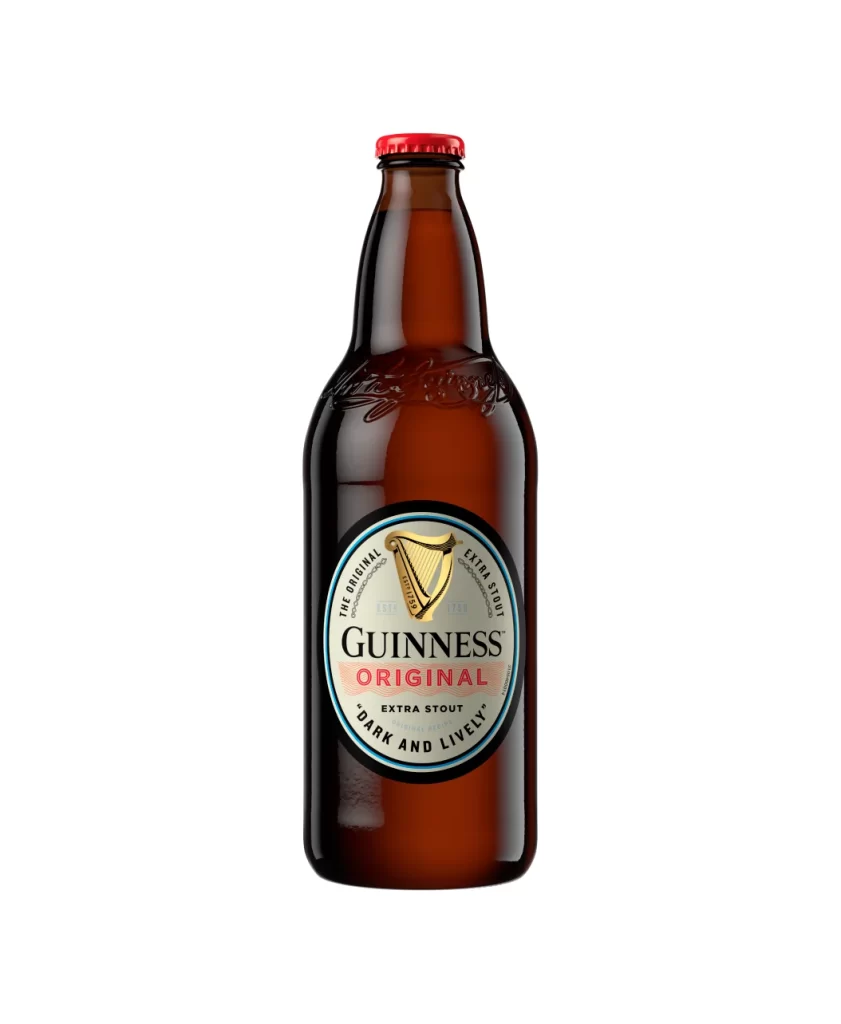
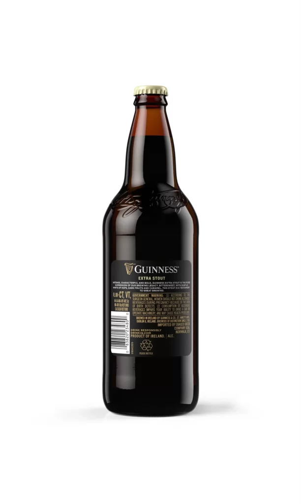
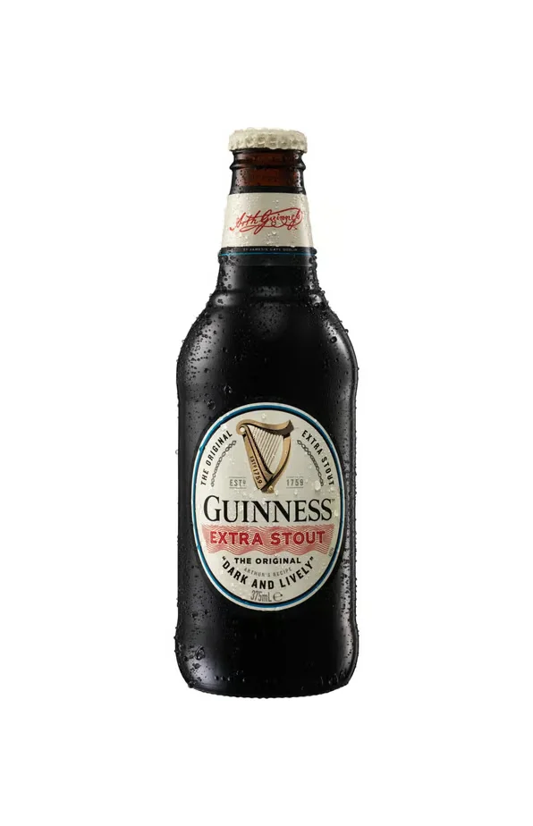
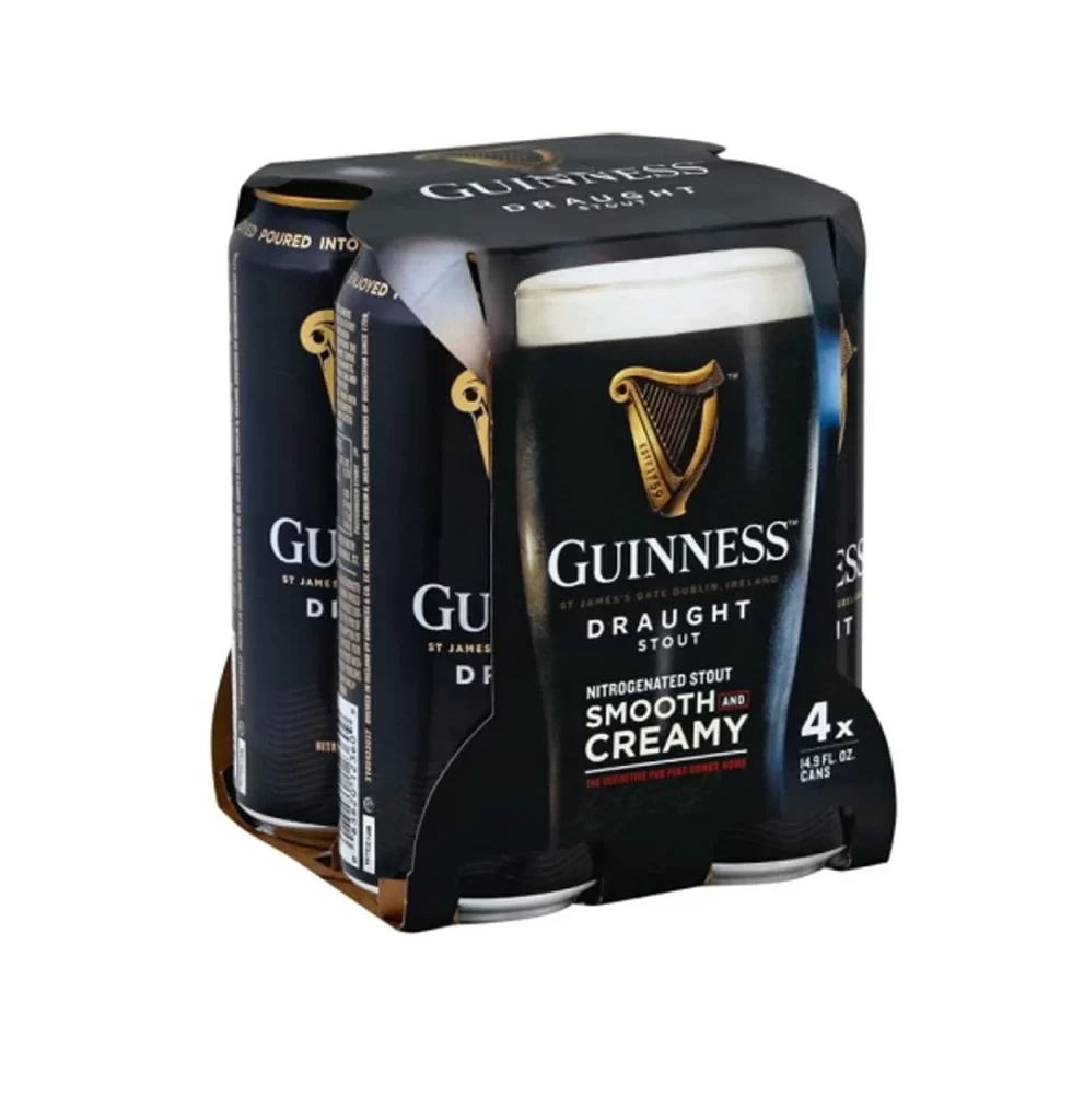
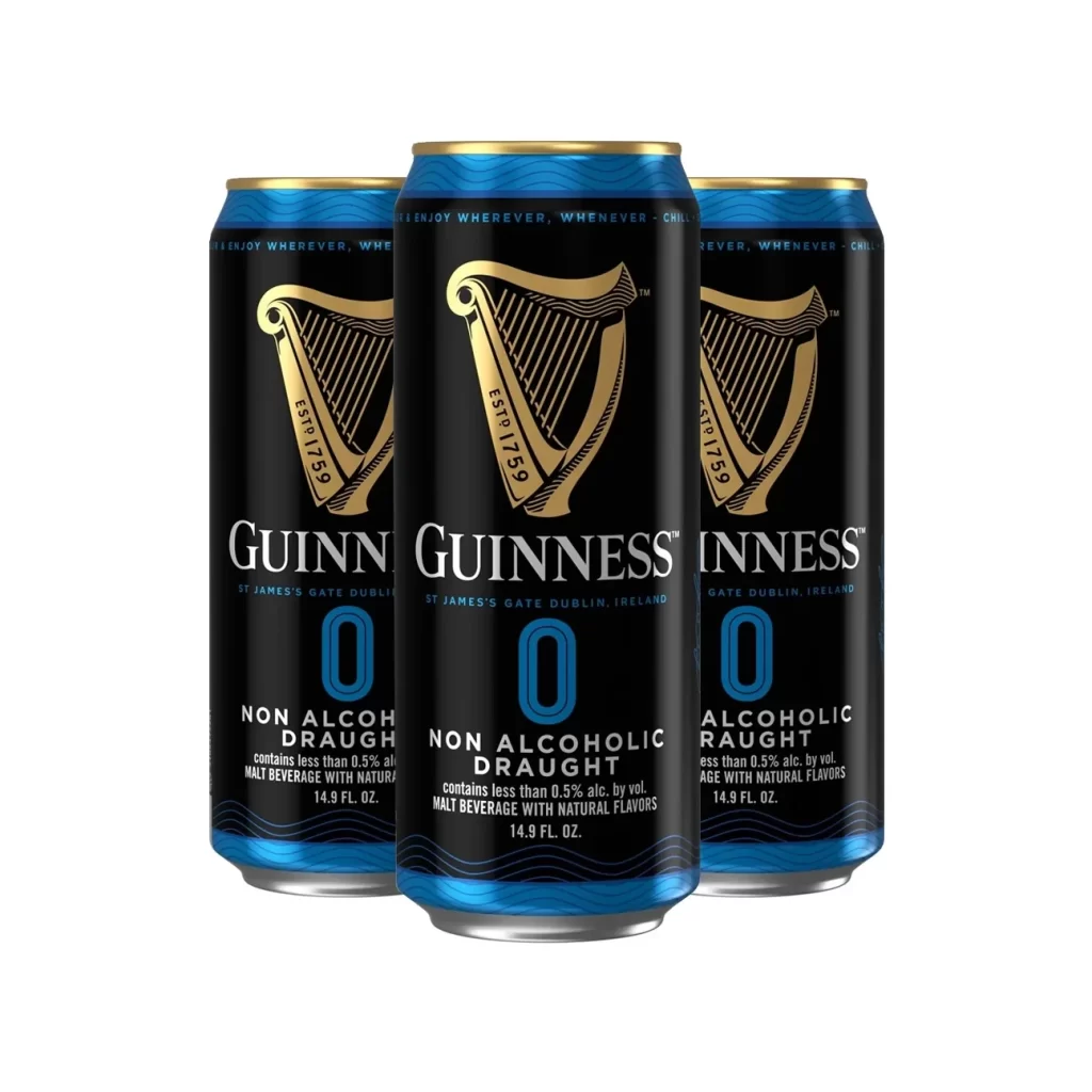
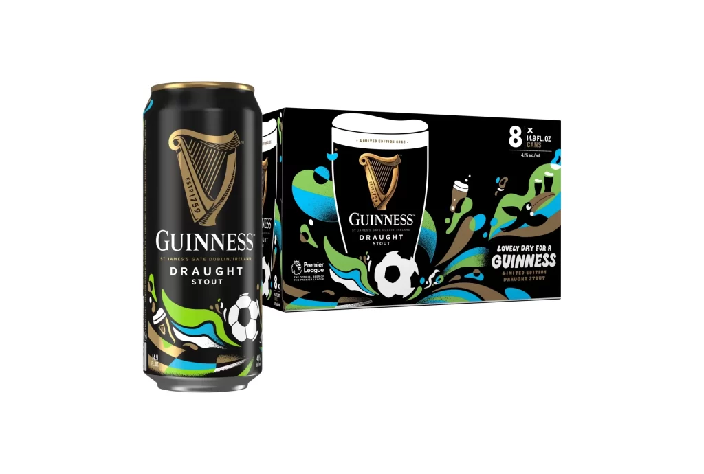
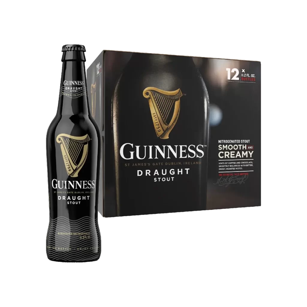
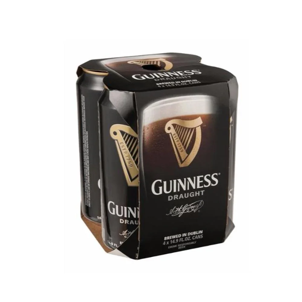
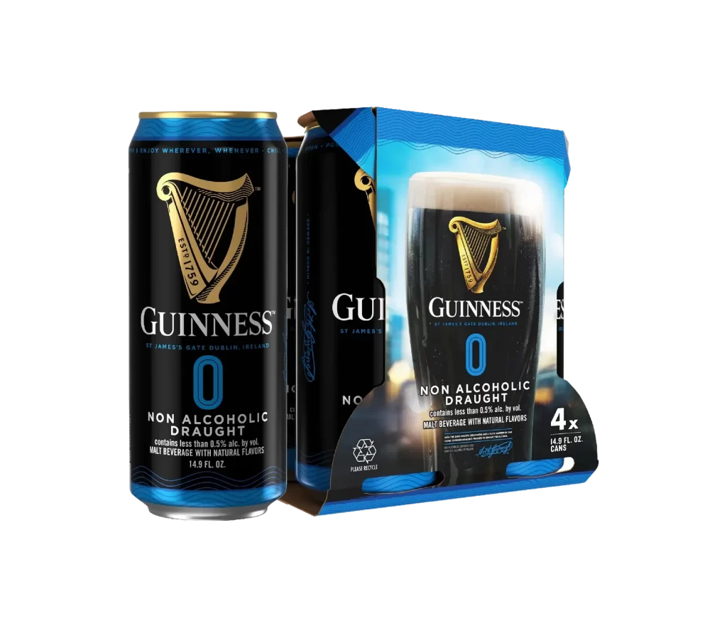
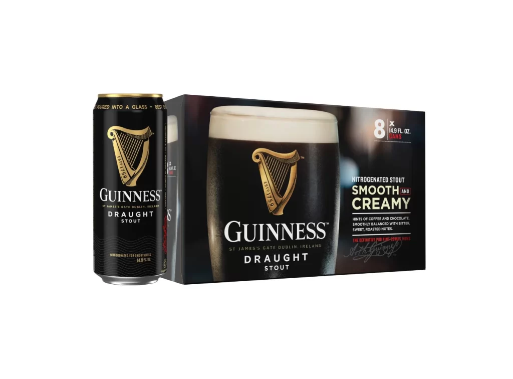
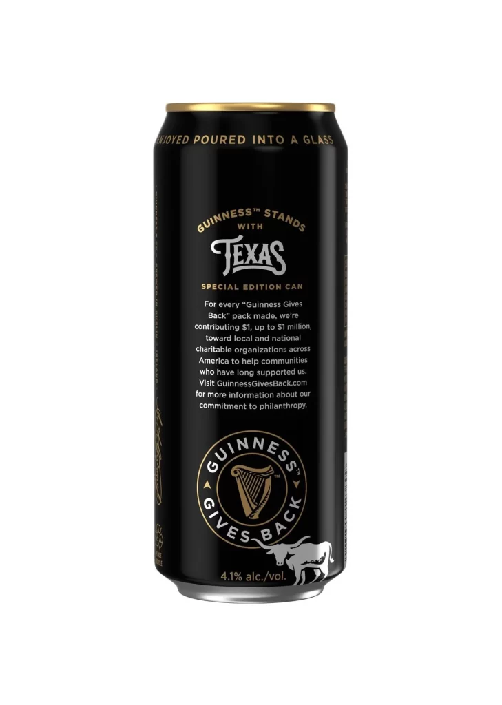
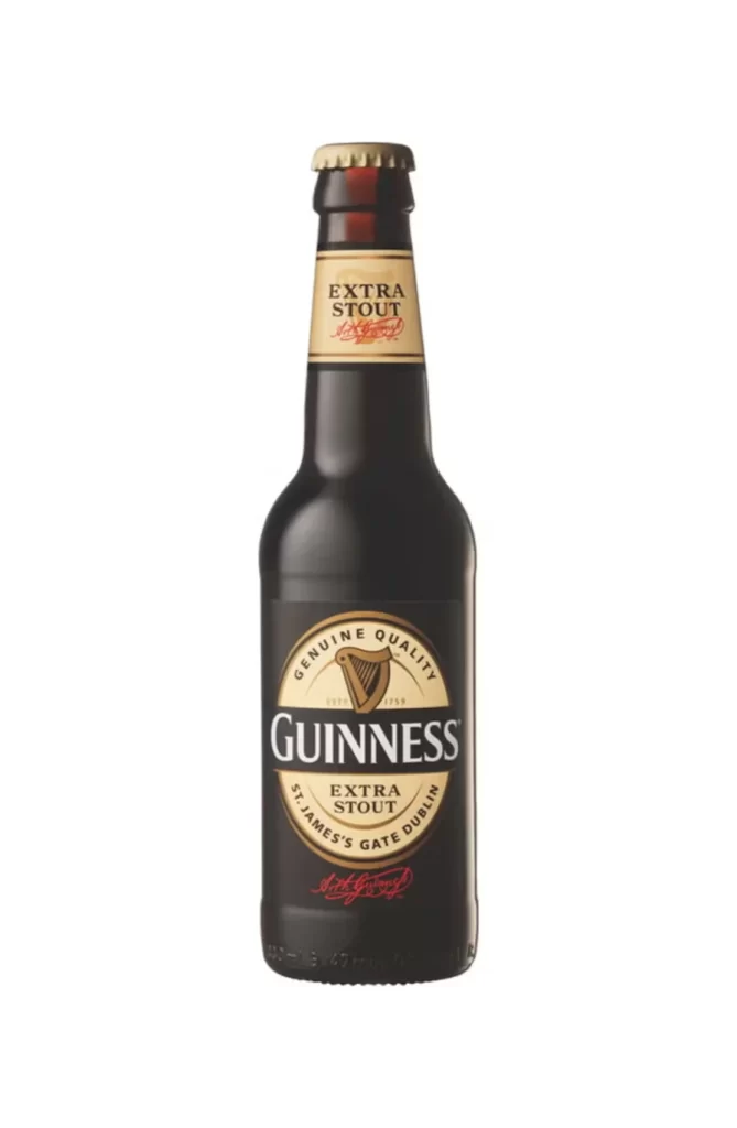
The image features a single Guinness Extra Stout bottle standing upright against a pure white background. It is topped with a gold cap and displays a classic cream oval label. The bottle is perfectly dry, with no condensation, allowing every detail of the dark glass and crisp label to be clearly visible without any distracting reflections.
This packaging relies on stark contrast and heritage cues. The dark bottle paired with a bright cream label and metallic gold cap communicates premium quality and tradition. By keeping the design clean and free of condensation, the focus remains entirely on the iconic typography and harp emblem, reinforcing brand recognition through minimalist yet powerful visual storytelling.
Graphic designers and packaging students will find this asset invaluable. It serves as a perfect reference for product rendering, label mockups, or advertising layouts. Brands aiming to study classic beverage aesthetics can analyze the balance of text and color here. It is ideal for anyone needing a clean, high fidelity visual of a stout bottle.