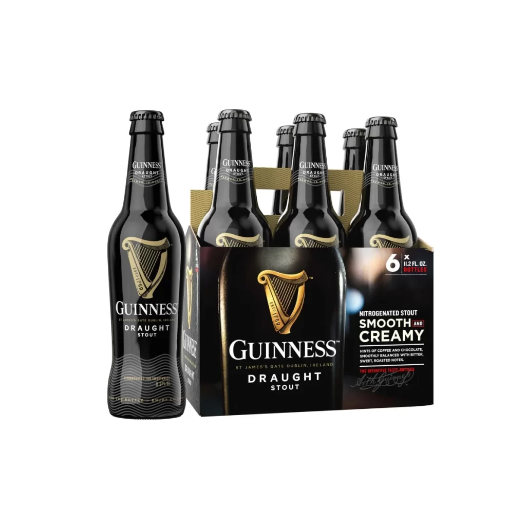
Guinness Draught Stout Six Pack Bottles Packaging
Topics
Details
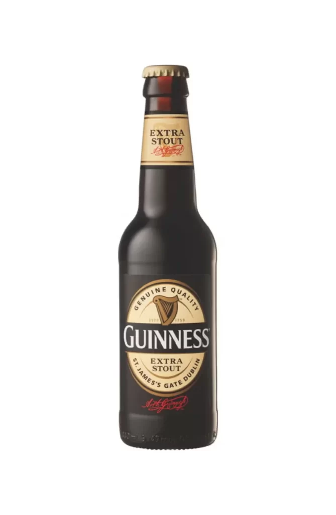
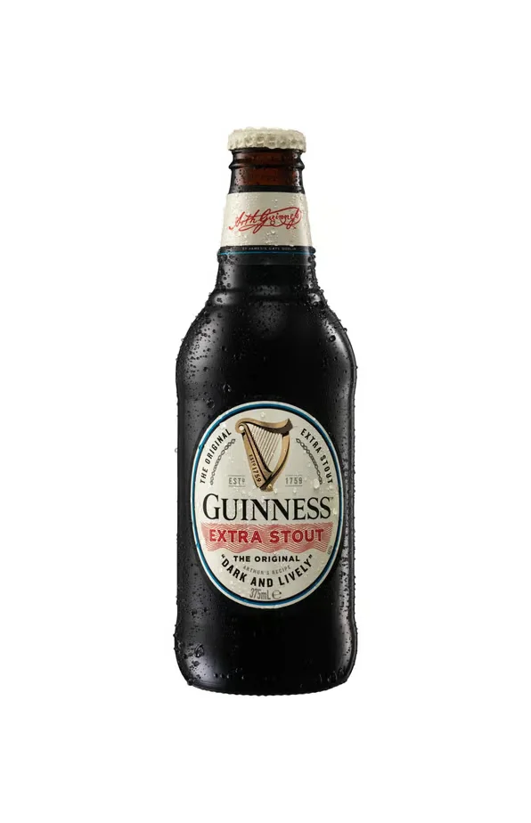
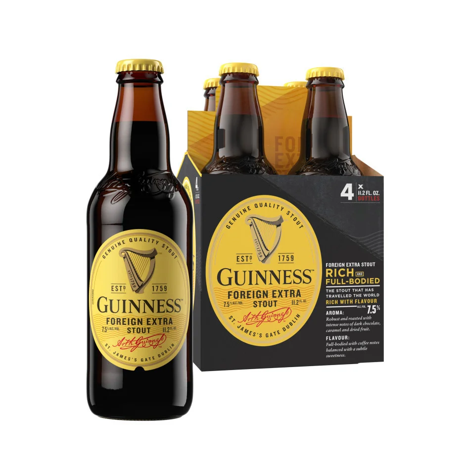
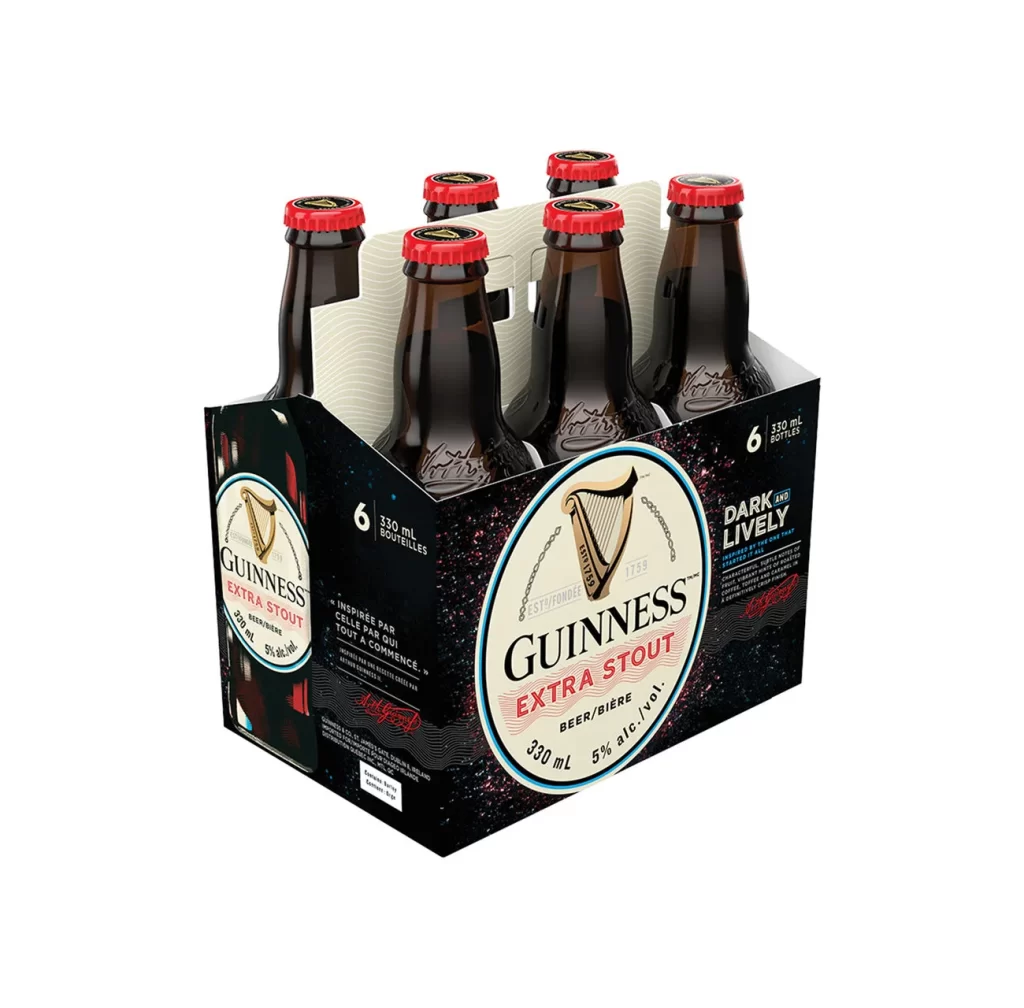
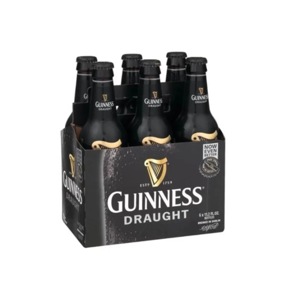
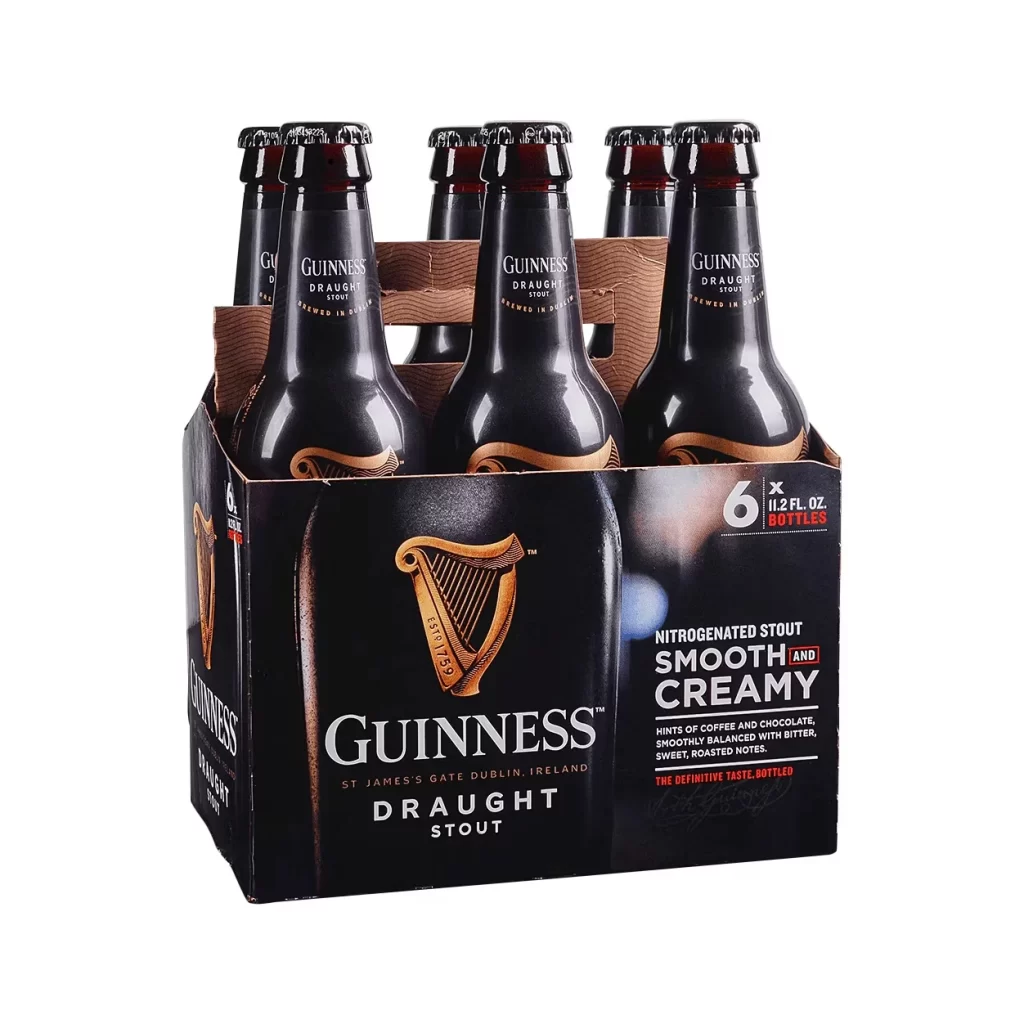
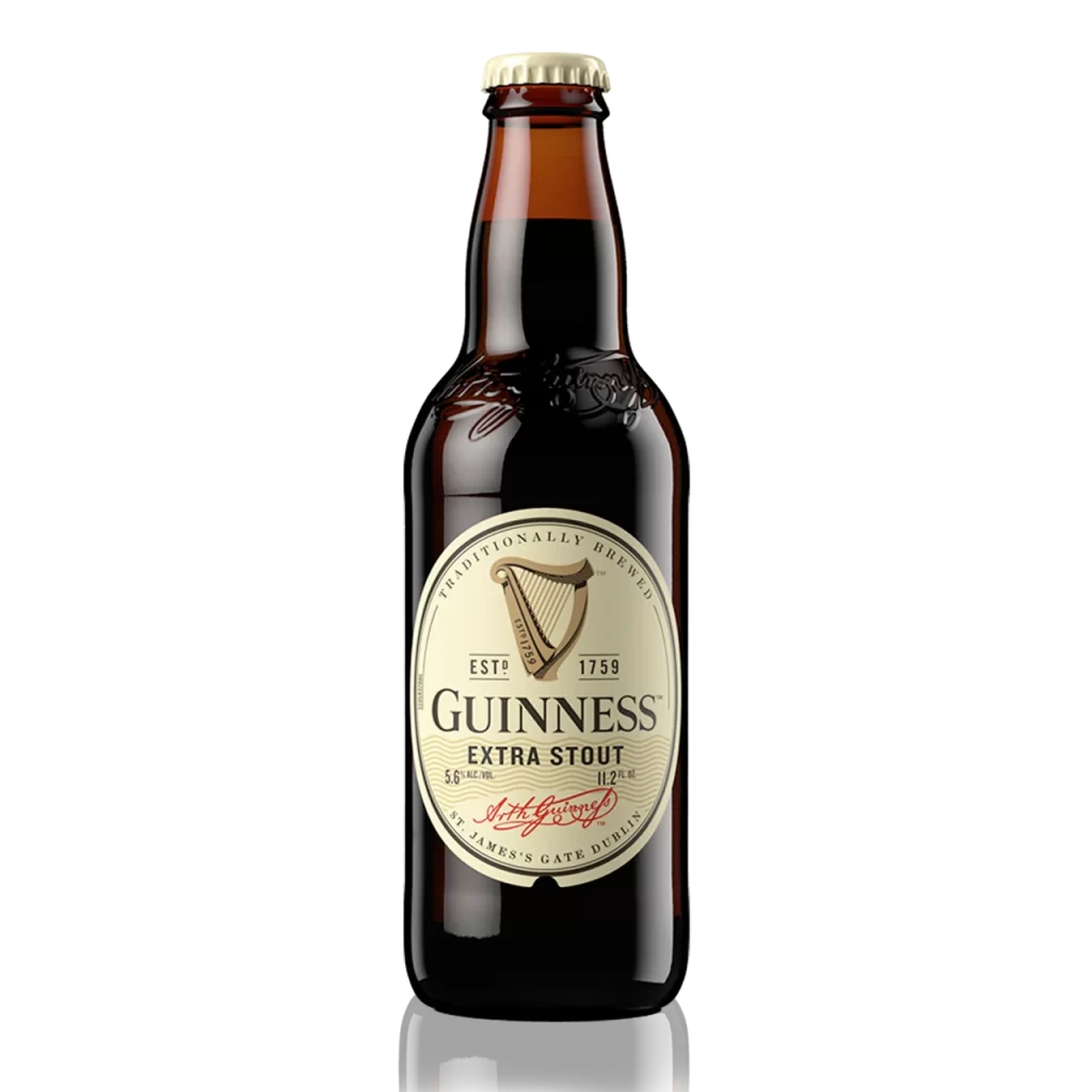
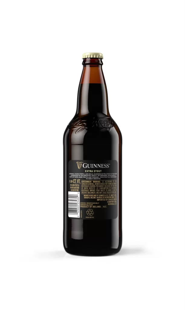
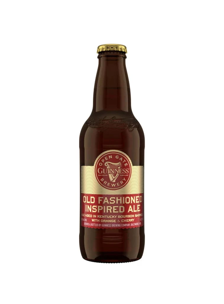
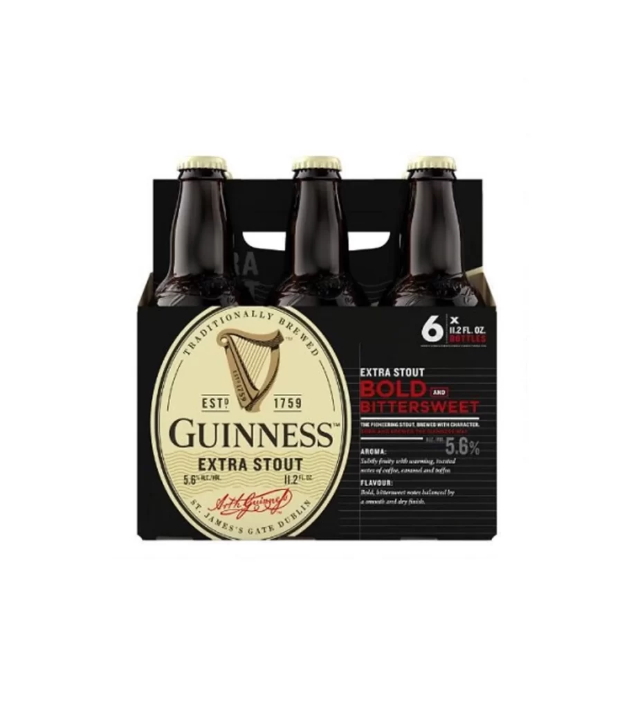
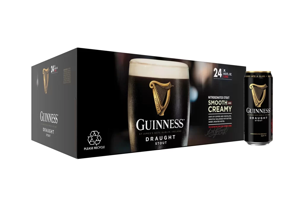
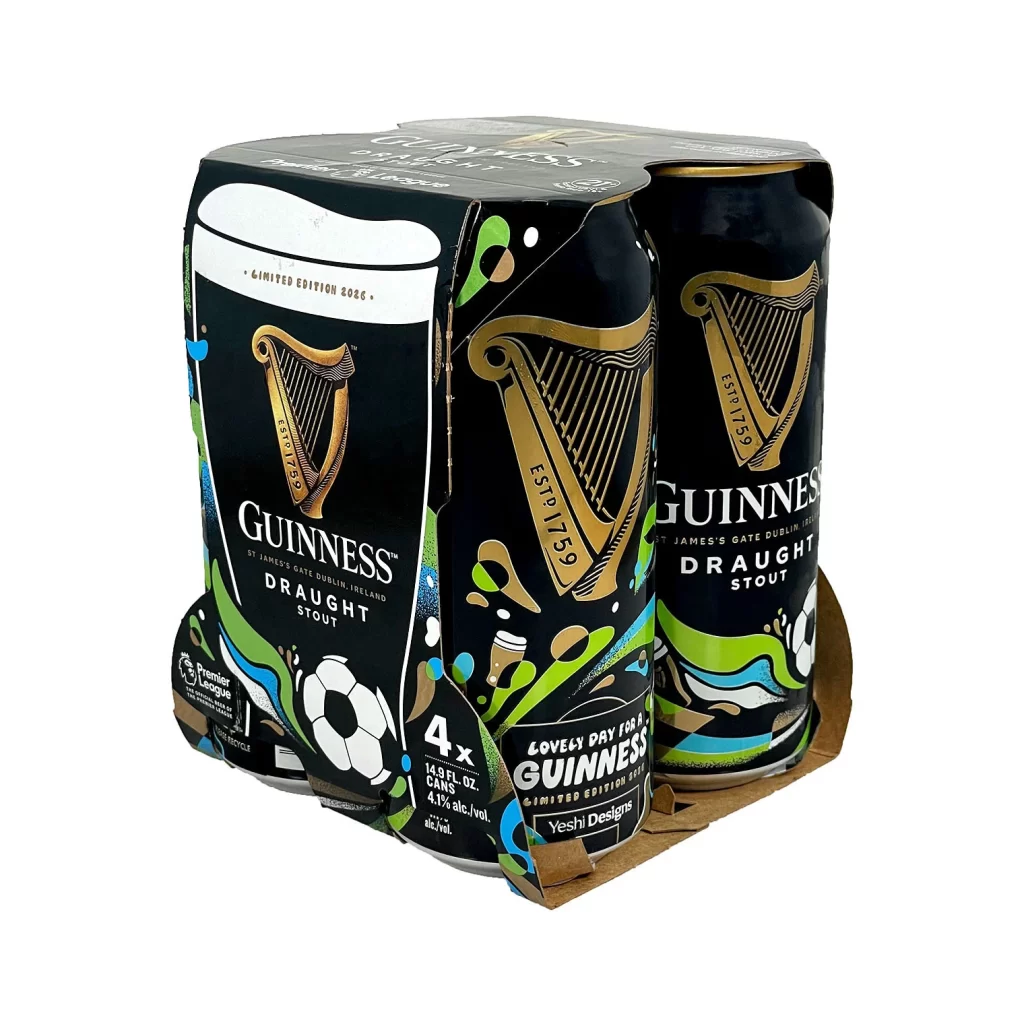
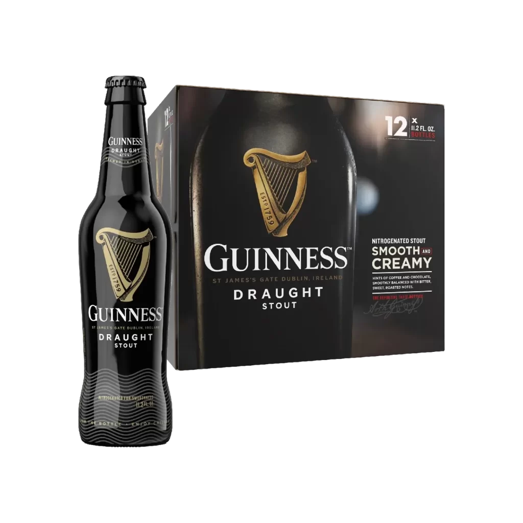
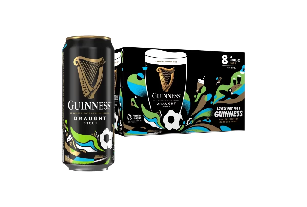
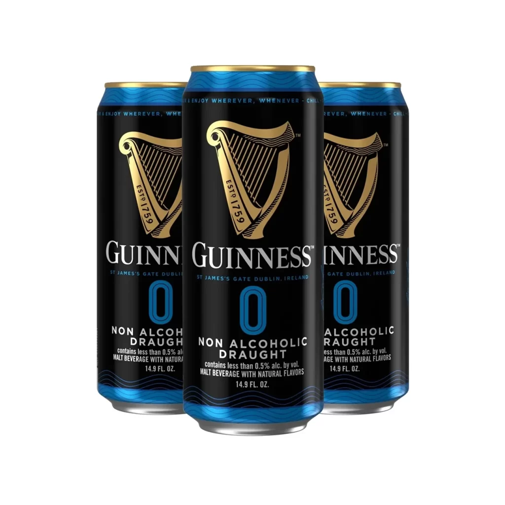
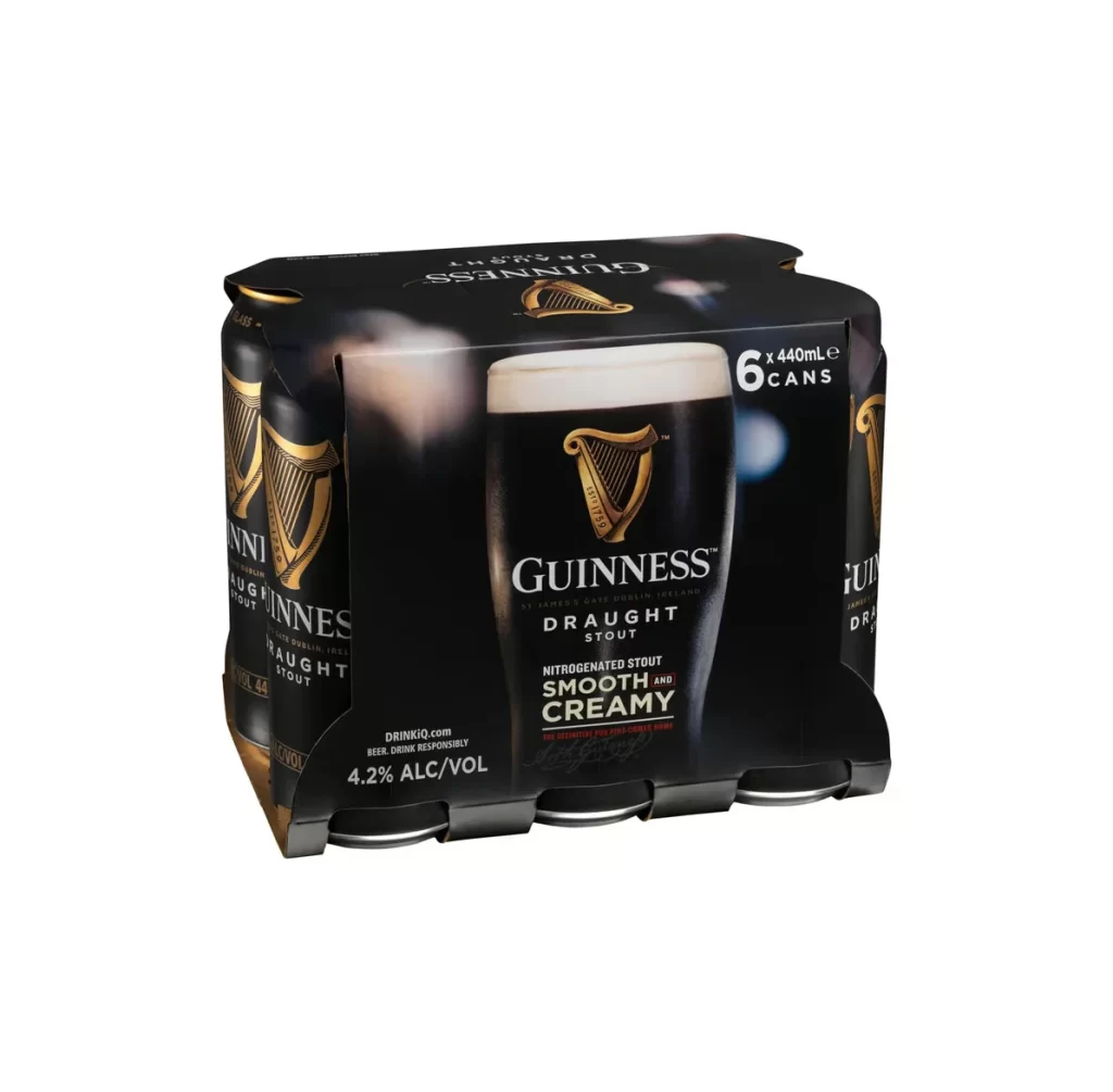
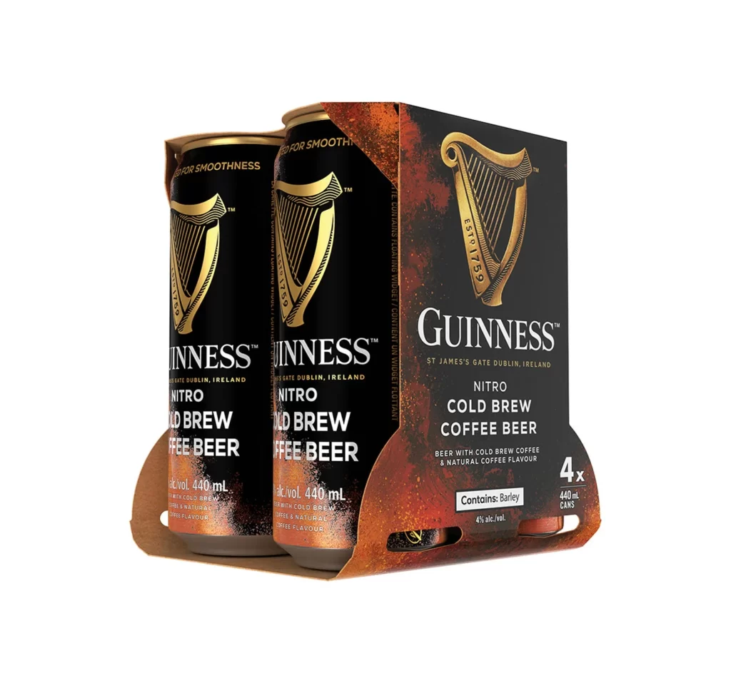
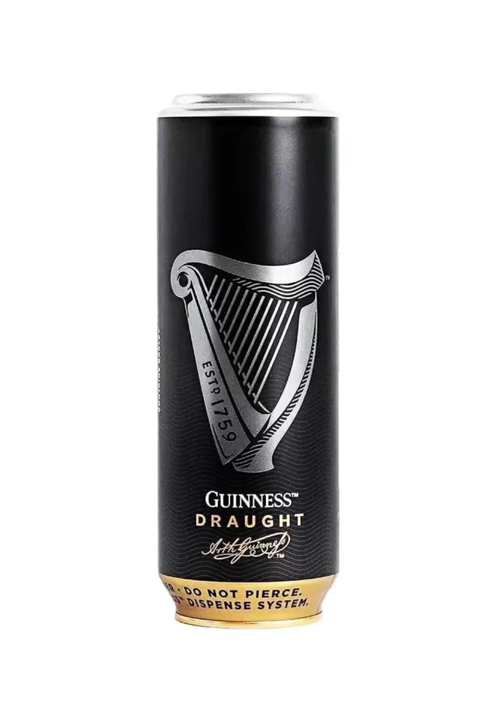
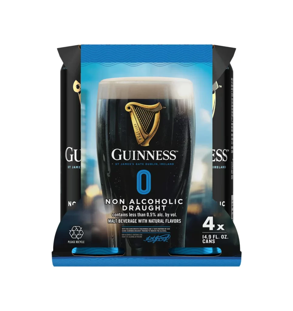
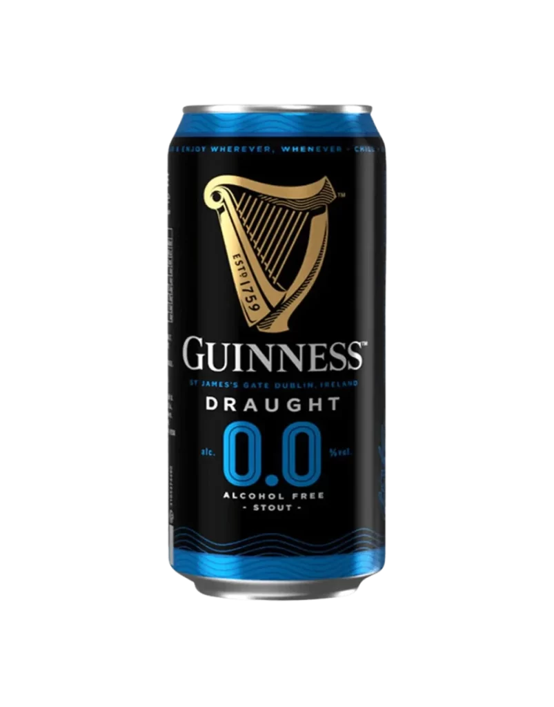
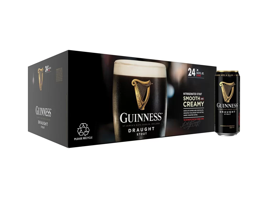
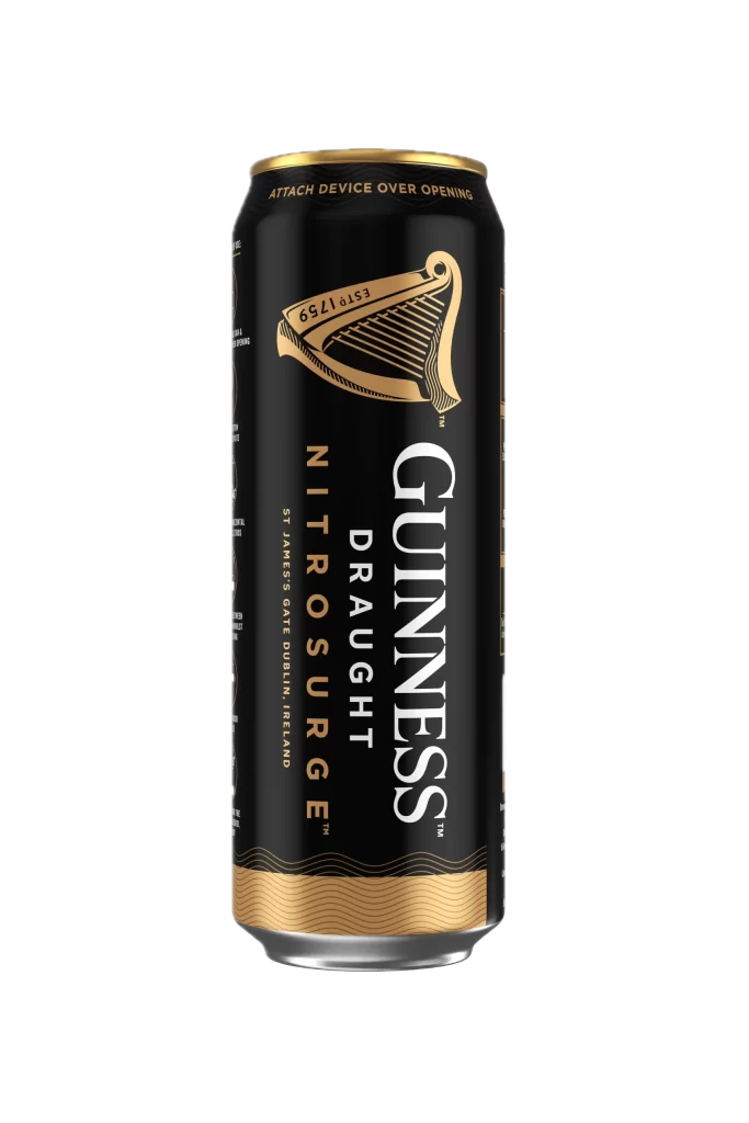
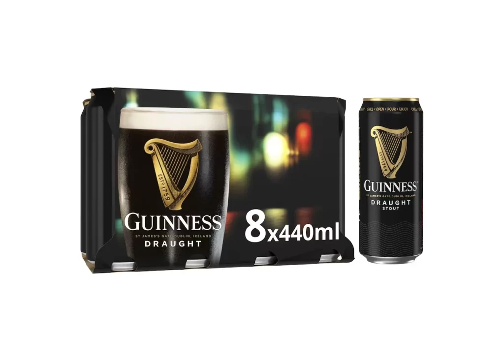
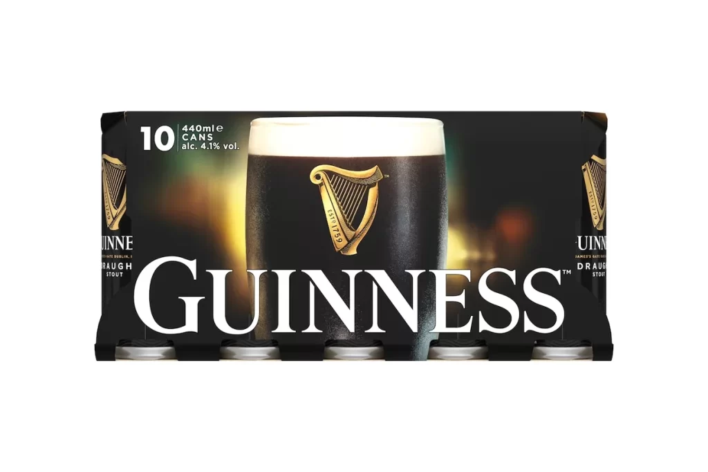
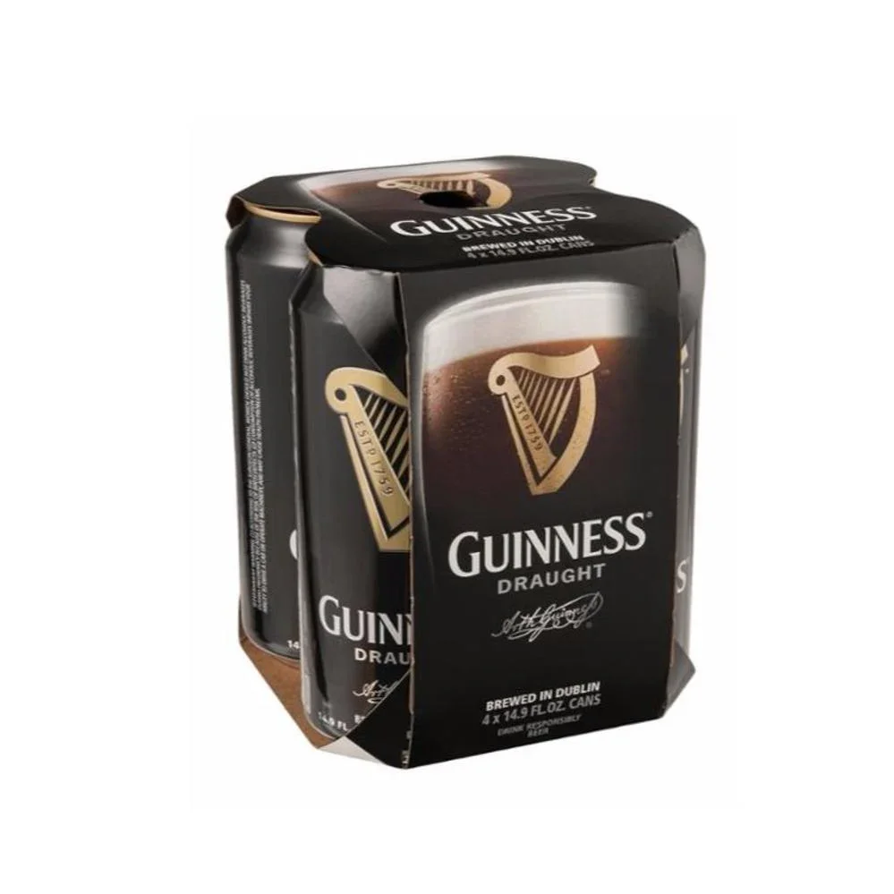
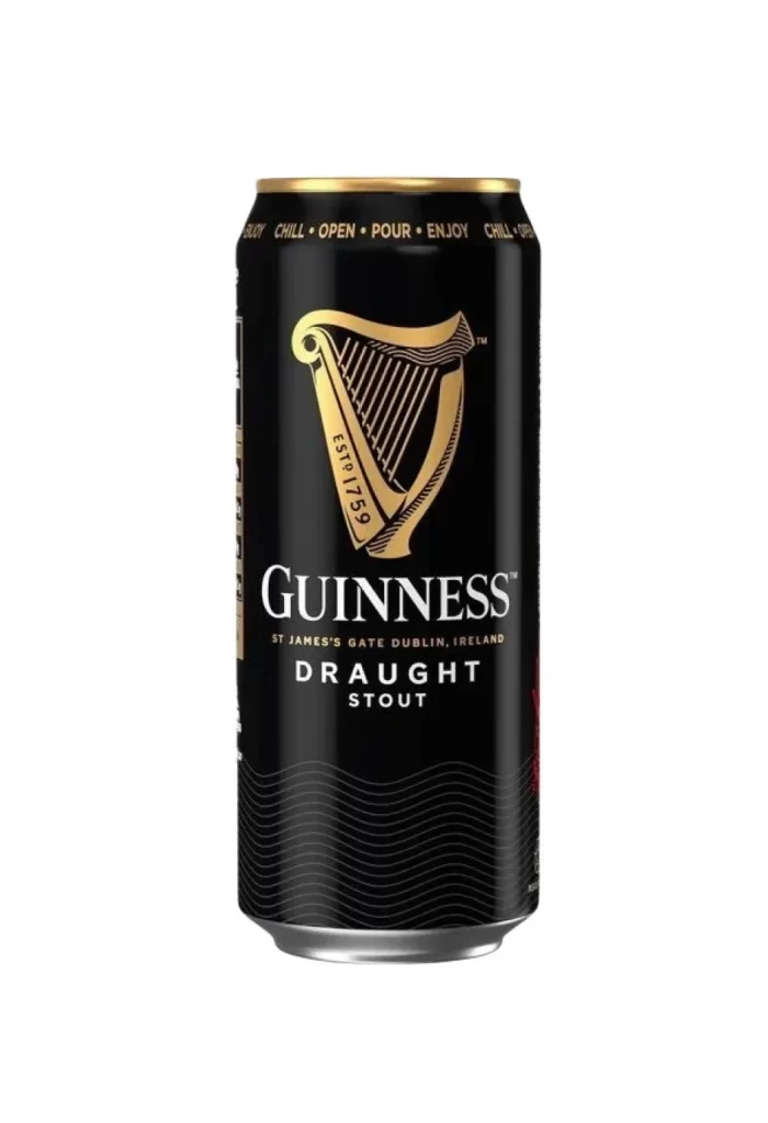
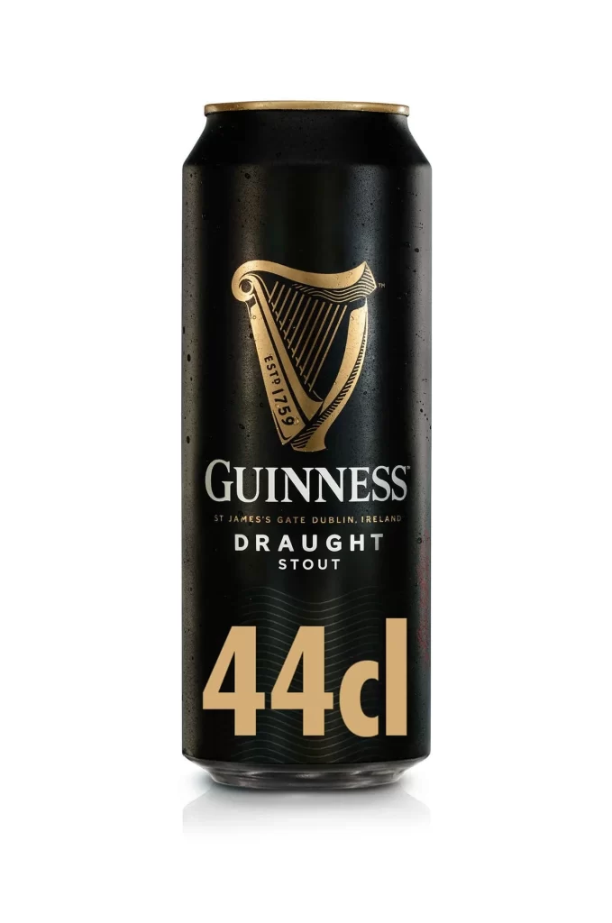
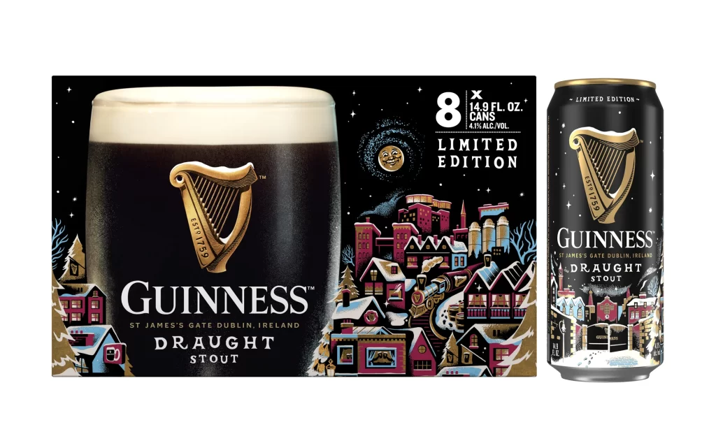
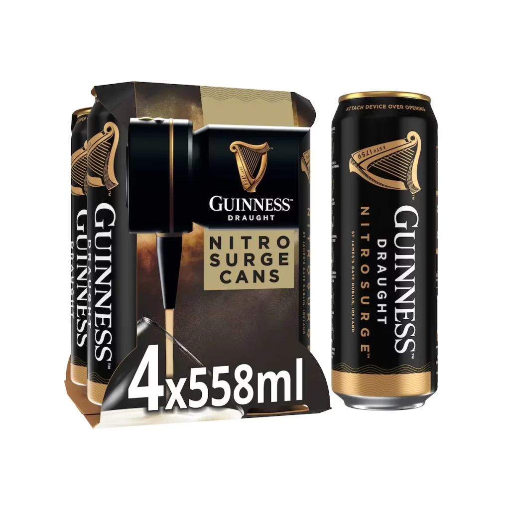
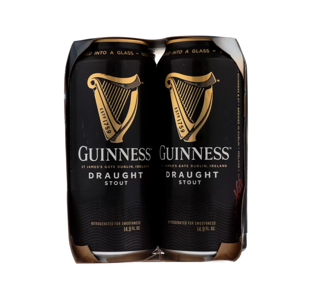
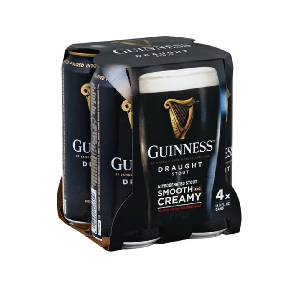
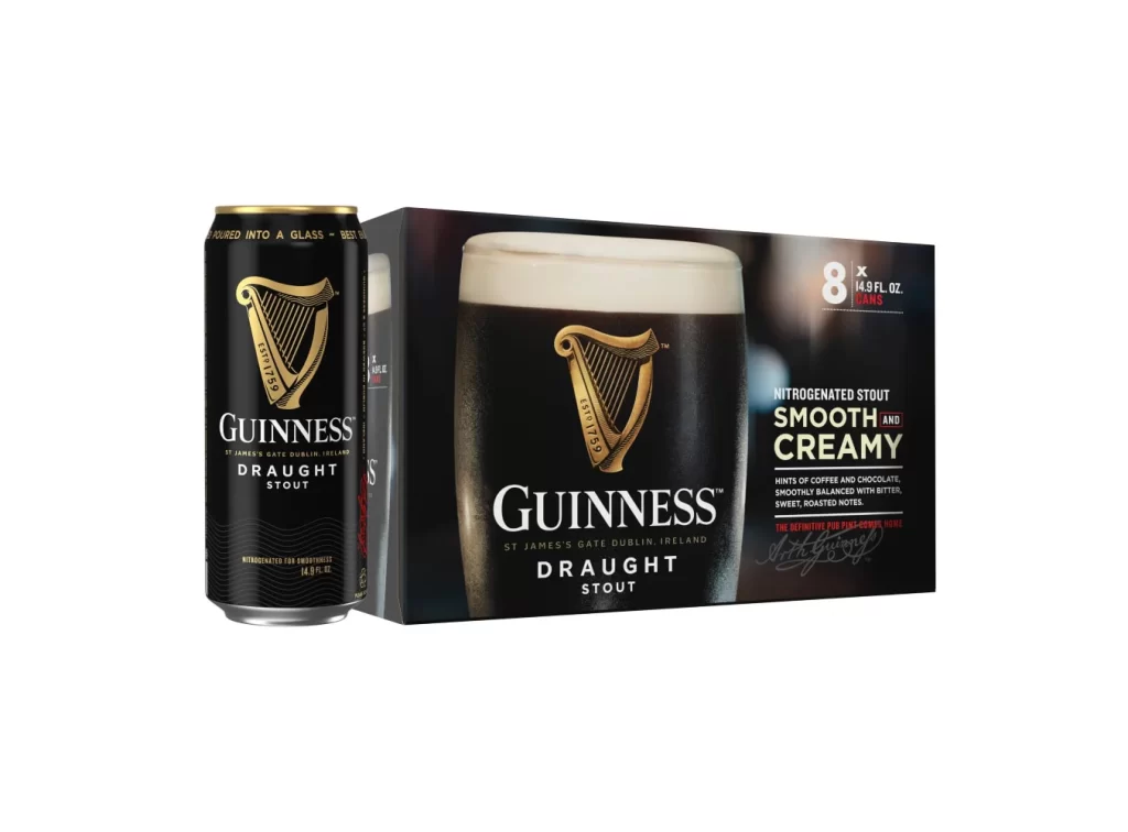
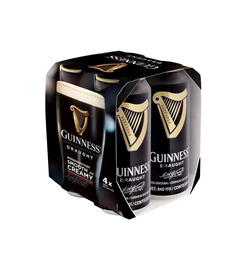
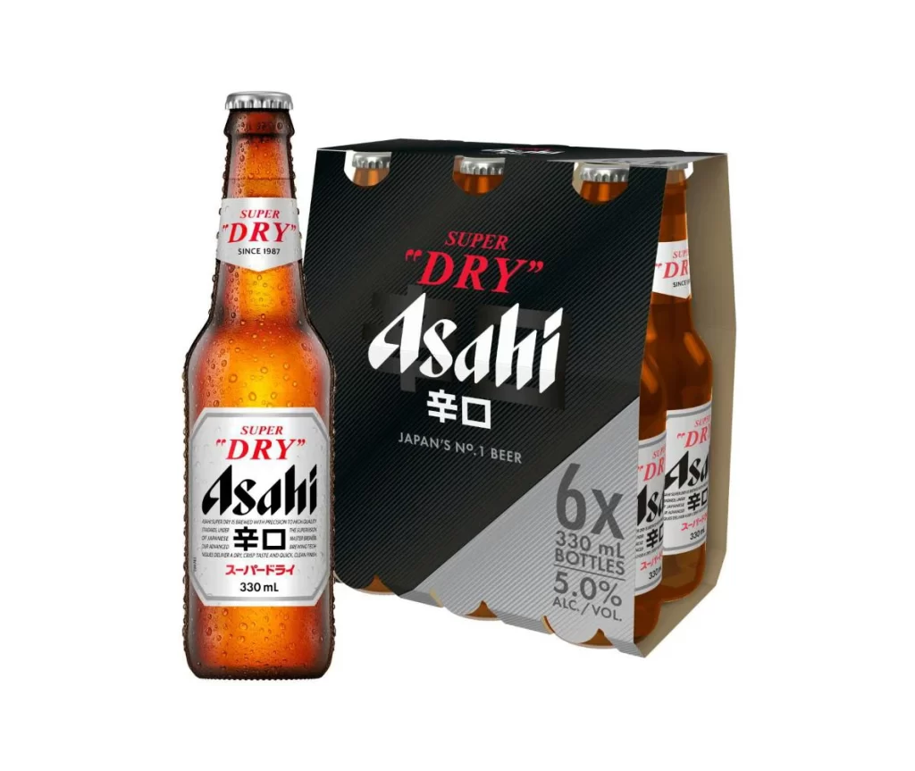
The packaging features a black six bottle carrier prominently displaying the classic gold harp logo. Presented from a three-quarter view against a stark white background, the arrangement includes one extra bottle standing beside the carrier on the left. This clear presentation highlights the bold contrast between the dark carrier and the illuminated gold branding.
This visual setup effectively leverages high contrast and minimalist staging to emphasize brand heritage. The black and gold palette communicates premium quality, while the iconic harp reinforces longstanding Irish traditions. The strategic placement of the extra bottle adds dynamic asymmetry, subtly breaking the rigid grid of the carrier to create visual interest.
Graphic designers and packaging students will find this resource invaluable for studying beverage container presentation. Marketing professionals analyzing beer branding strategies can also benefit from examining how negative space and asymmetry enhance product appeal. Additionally, 3D artists seeking accurate reference material for bottle modeling and carrier construction will appreciate the clear three-quarter perspective.