Guinness Pint Glasses Lineup
Topics
Details
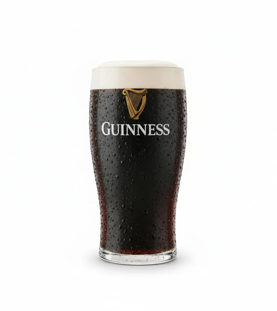
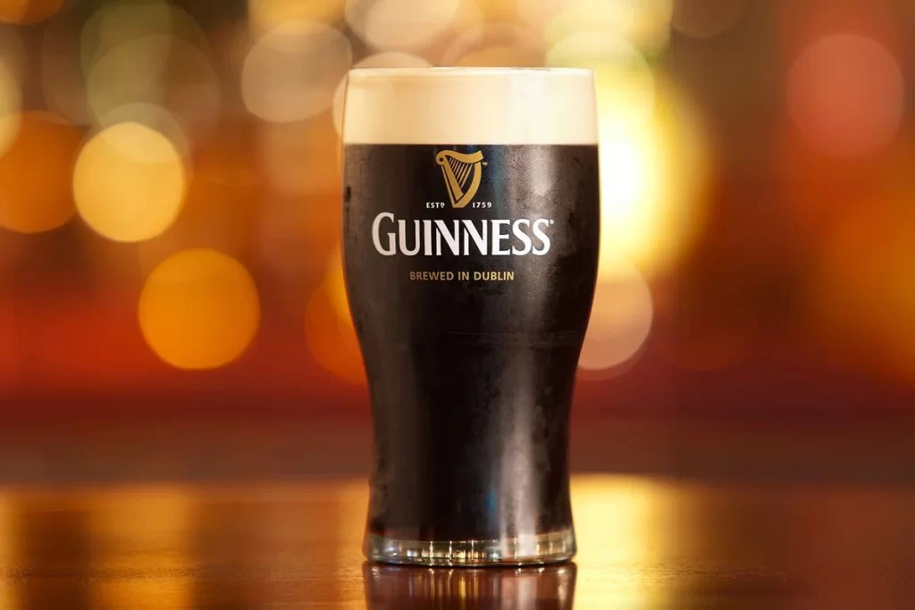
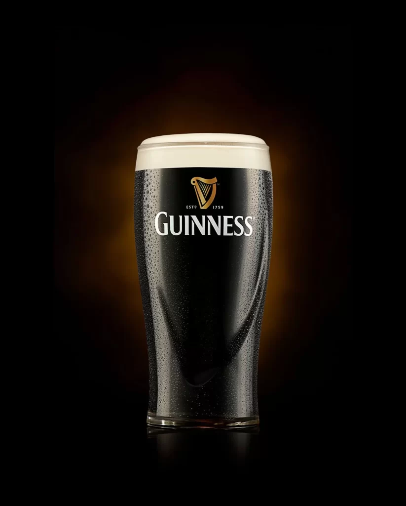
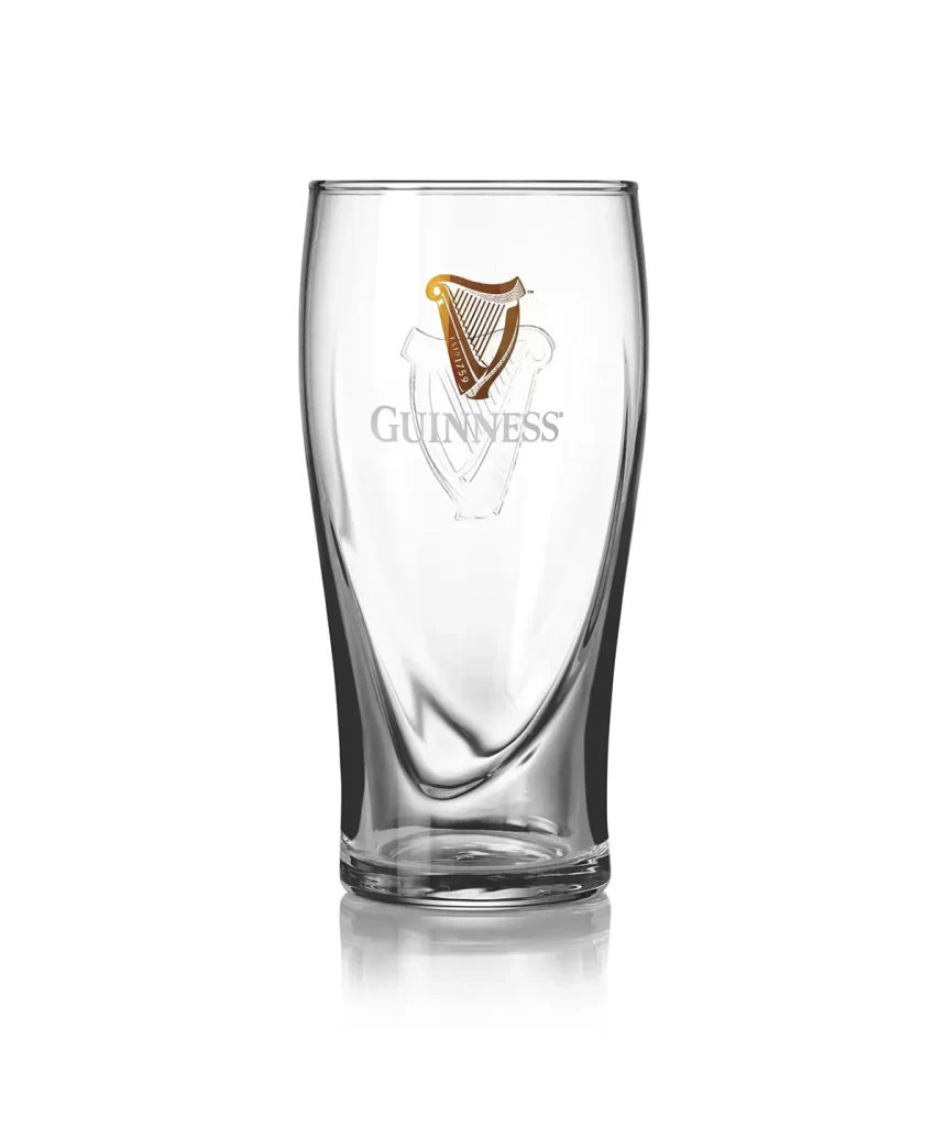
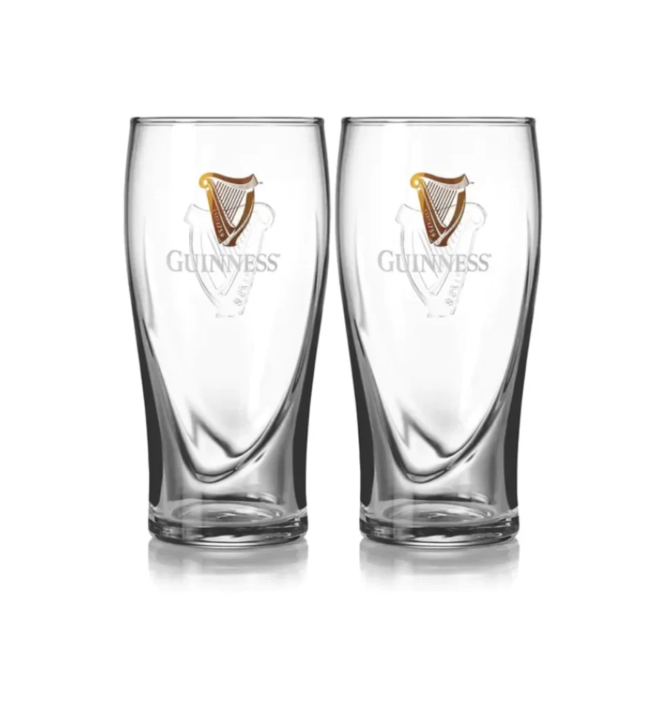
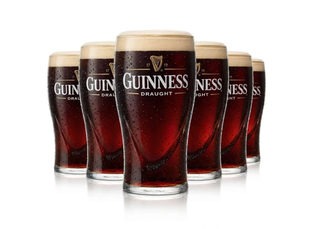
Six branded Guinness pint glasses stand in a staggered single row, each filled to the brim with dark stout. A frontal view captures the heavy condensation coating the glass exteriors. Droplets glisten under the lighting, contrasting beautifully against the deep, ruby-black liquid. The iconic harp logos align unevenly, creating a dynamic visual rhythm across the composition.
This lineup brilliantly leverages negative space and repetition to reinforce brand identity. The staggered arrangement prevents the composition from feeling static, guiding the eye naturally across the frame. Heavy condensation adds tactile realism, evoking a chilled, refreshing experience. The dark stout contrasts sharply with the pale background, ensuring the iconic branding remains the undeniable focal point of the shot.
Graphic designers and beverage marketers will find this reference invaluable. It is perfect for anyone crafting pub menus, promotional posters, or social media campaigns for stout brands. Illustrators seeking accurate lighting and condensation details on glassware will also benefit. Anyone needing to communicate the crisp, cold refreshment of a poured stout should study this specific visual arrangement.