Watercolor Purple Blue
Topics
Details
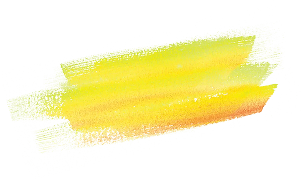
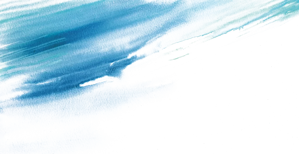
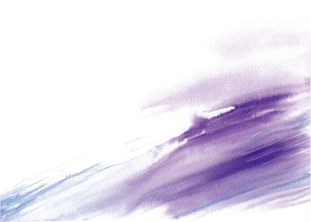
Diagonal bands of violet and periwinkle wash across textured paper, their edges bleeding into one another with the organic irregularity of wet-on-wet technique. The composition tilts upward from the lower left, where pale cerulean streaks anchor the base, toward a concentrated mass of deep plum in the upper right that gradually dissolves into the surrounding negative space. Visible grain from the watercolor surface catches the pigment unevenly, creating subtle variations in saturation where the medium has pooled and dried.
What distinguishes this particular wash is its asymmetrical weight distribution, which lends an inherent sense of momentum without depicting any literal subject. The interplay between translucent lavender layers and opaque white reserves demonstrates how water behaves on sized paper, offering a masterclass in value gradation that feels both spontaneous and controlled. Such restrained chromatic intensity allows the texture itself to become the focal point rather than competing with bold hues or complex imagery.
Illustrators studying atmospheric perspective might employ this as a guide for rendering distant storm clouds or twilight horizons with minimal brushwork. Brand designers seeking sophisticated background treatments for luxury packaging could adapt these tonal transitions to evoke calm sophistication. Motion graphics artists might reference the directional flow when animating particle systems that require fluid, non-mechanical movement patterns.