Yogooddy Protein Snack Pouch
Topics
Details
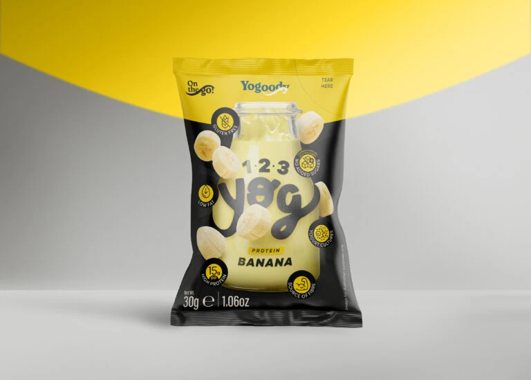
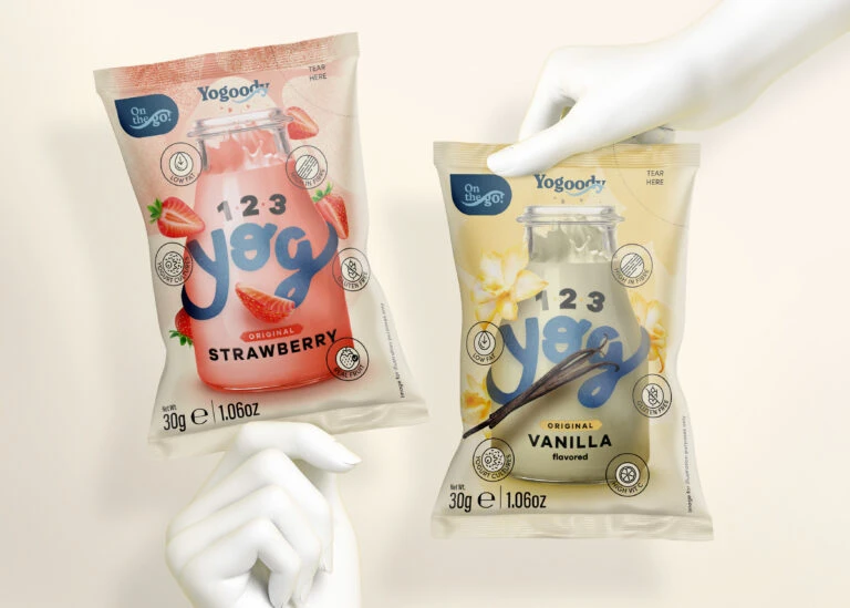
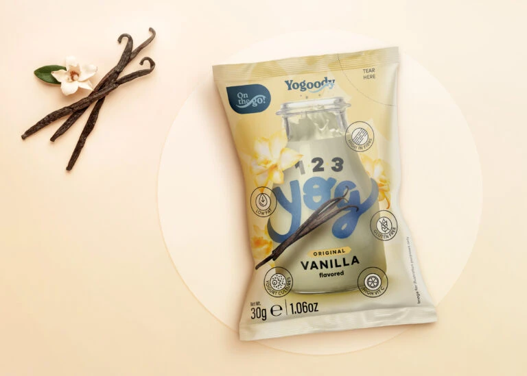
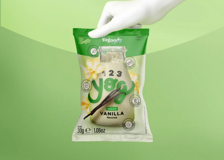
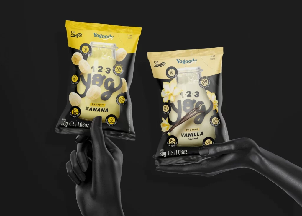
Two matte black mannequin hands present Yogooddy protein snack pouches against a void-like dark background, with the left hand gripping a banana-flavored package and the right palm supporting a vanilla variant. The banana pouch features a bright yellow header transitioning into black, while the vanilla version uses a softer cream tone at the top; both display central bottle graphics surrounded by sliced fruit or flower imagery. Visible text includes 'On the Go!', '1:2:3 Yøg', flavor designations, and nutritional callouts such as '15g PROTEIN' and 'LOW FAT', with each bag marked as 30g or 1.06oz net weight.
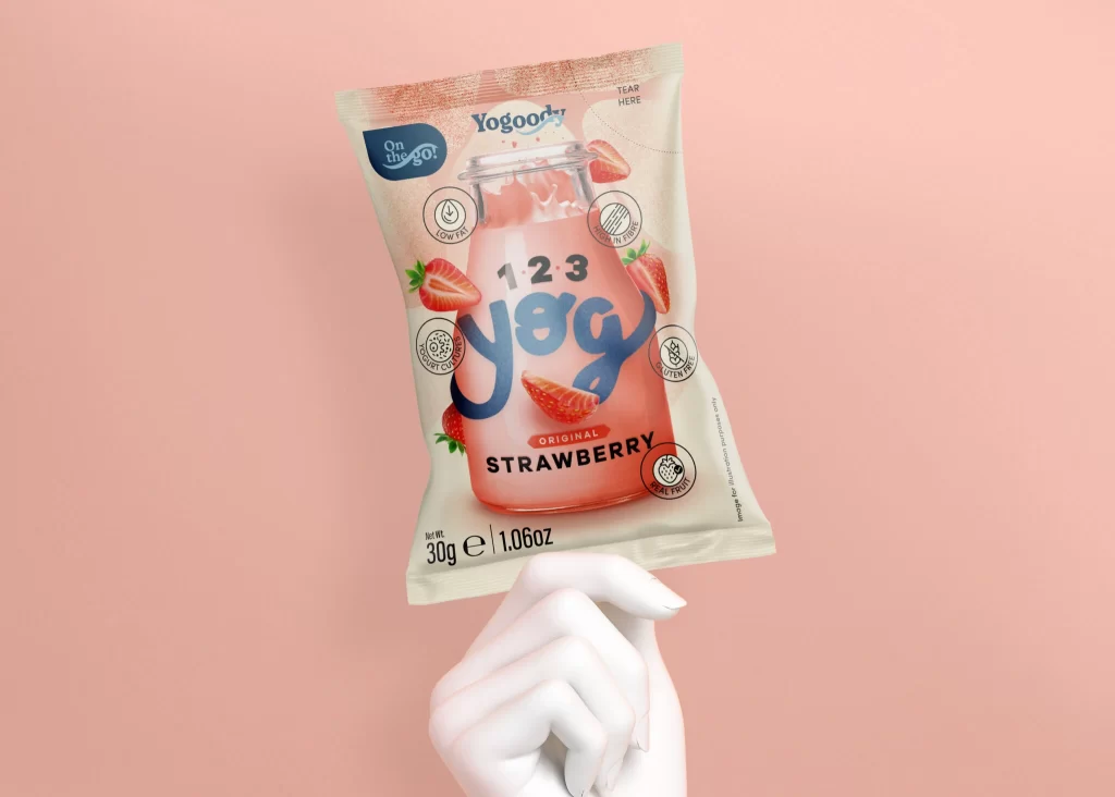
Visual distinction emerges from the bold typographic hierarchy where oversized, rounded numerals and letters dominate the center of each pouch, creating immediate brand recognition through scale contrast against smaller circular attribute badges. The color-coded flavor system—vibrant citrus yellow versus muted ivory—allows for rapid shelf differentiation while maintaining consistent structural elements like the tear-here indicators and gluten-free symbols. Photorealistic ingredient illustrations, whether floating banana slices or orchid blossoms with vanilla beans, provide tactile texture that contrasts sharply with the sleek, glossy finish of the packaging material itself.
Product photographers might study this composition to understand how artificial hands can simulate natural holding positions without distracting from the merchandise being showcased. Packaging designers could analyze the information architecture to see how nutritional claims are balanced against flavor photography within a constrained vertical format. Marketing teams evaluating snack branding would find this useful for comparing how color psychology applies to different flavor profiles within a unified product line.