Snack Minimalist White Green Yellow
DownloadTopics
Details
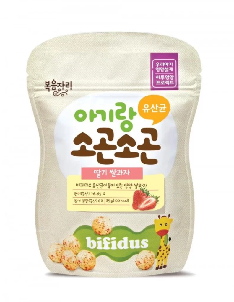
A matte, cream-colored stand-up pouch with a subtle woven texture dominates the frame, its curved silhouette suggesting a soft, flexible material. The central label features bold Korean typography in forest green and deep brown, surrounded by accents of bubblegum pink and sunny yellow that draw the eye toward the strawberry flavor indicator. At the base, a cheerful giraffe illustration stands beside realistic depictions of speckled puffed snacks and fresh strawberries, all set against a clean, neutral backdrop that emphasizes the packaging's tactile quality.
Visual hierarchy here relies on a playful yet disciplined color palette where earthy browns anchor the composition while vibrant secondary hues create focal points for key product information. The juxtaposition of rounded, organic letterforms against the structured rectangular badge in the upper corner establishes a balance between approachability and nutritional authority. Designers studying this layout will note how the green bifidus banner at the bottom anchors the entire visual weight without competing with the main title. You can access the full-resolution source file for closer inspection of these typographic and illustrative details.
Packaging engineers and brand identity specialists might reference this example when developing snack lines targeting health-conscious parents or young children. The specific combination of probiotic messaging with whimsical animal imagery offers a template for functional foods that need to communicate both scientific benefit and emotional appeal. Marketing teams could also analyze the spatial distribution of elements to understand how premium positioning is achieved through generous whitespace and strategic color blocking.