Yogooddy Yogurt Snack Pouch View
Topics
Details
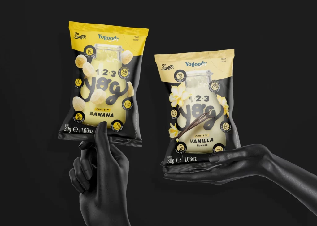
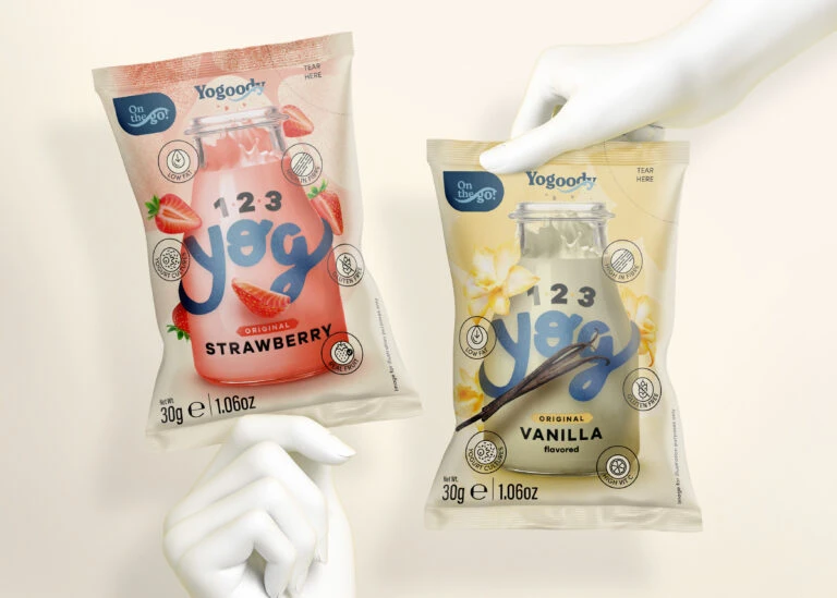
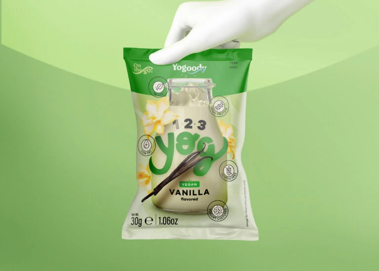
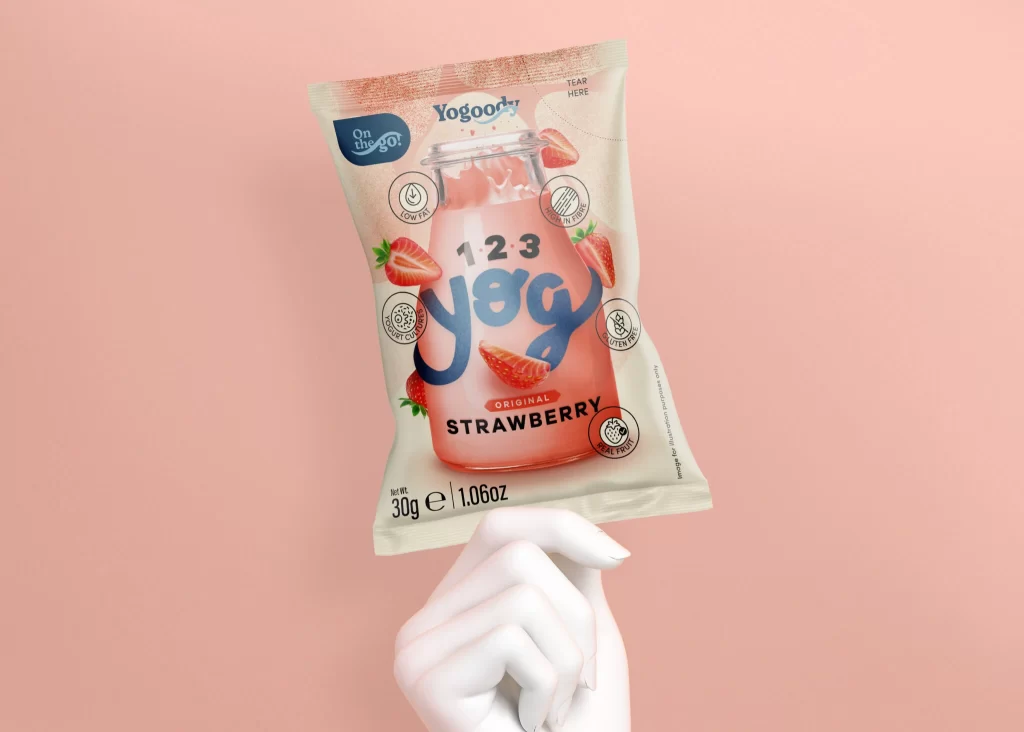
Against a soft peach backdrop, a white mannequin hand grips the lower edge of a crinkled foil pouch, presenting the product at a slight three-quarter angle. The packaging features a central illustration of a glass bottle filled with pink liquid, surrounded by fresh strawberry slices and green leaves. Prominent typography displays '123 Yog' in a bold, rounded blue font, with 'Original Strawberry' printed below in stark black lettering, while circular icons indicating low fat and probiotic content orbit the central imagery.
Visual interest is generated through the clever juxtaposition of realistic food photography against a clean, illustrative bottle graphic, creating a playful yet appetizing aesthetic. The color palette relies on the contrast between the creamy off-white of the pouch material and the vibrant reds of the fruit, anchored by the deep navy blue of the brand name. Subtle textural details, such as the metallic sheen at the top seal and the specific 'Tear Here' instruction, add a layer of functional realism to the overall composition.
Product photographers might study this arrangement to understand how to effectively use neutral props like mannequin hands to suggest scale without distracting from the label art. Branding specialists could analyze the hierarchy of information, noting how nutritional benefits are integrated into the layout via small icons rather than cluttered text blocks. Packaging engineers may also find value in observing how the physical creases of the flexible material interact with the printed graphics under studio lighting.