72H Bread Flour Bag
Topics
Details
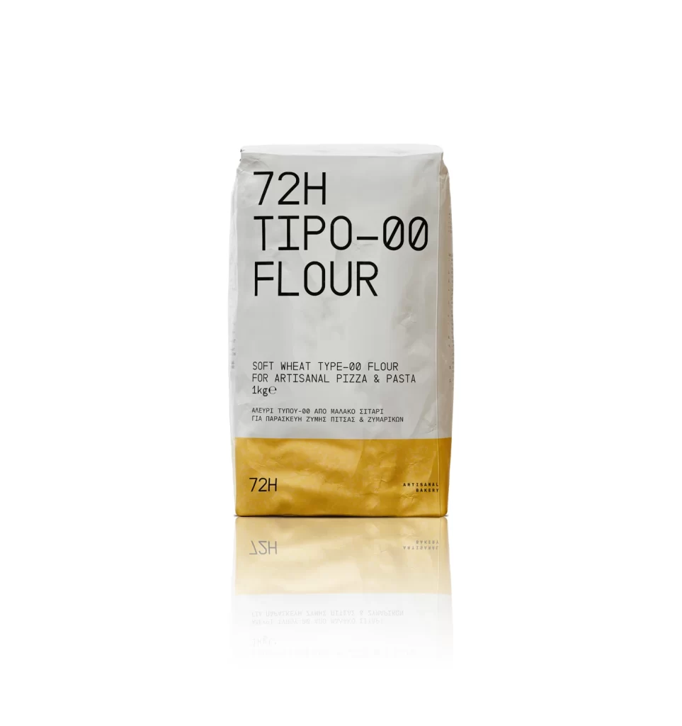
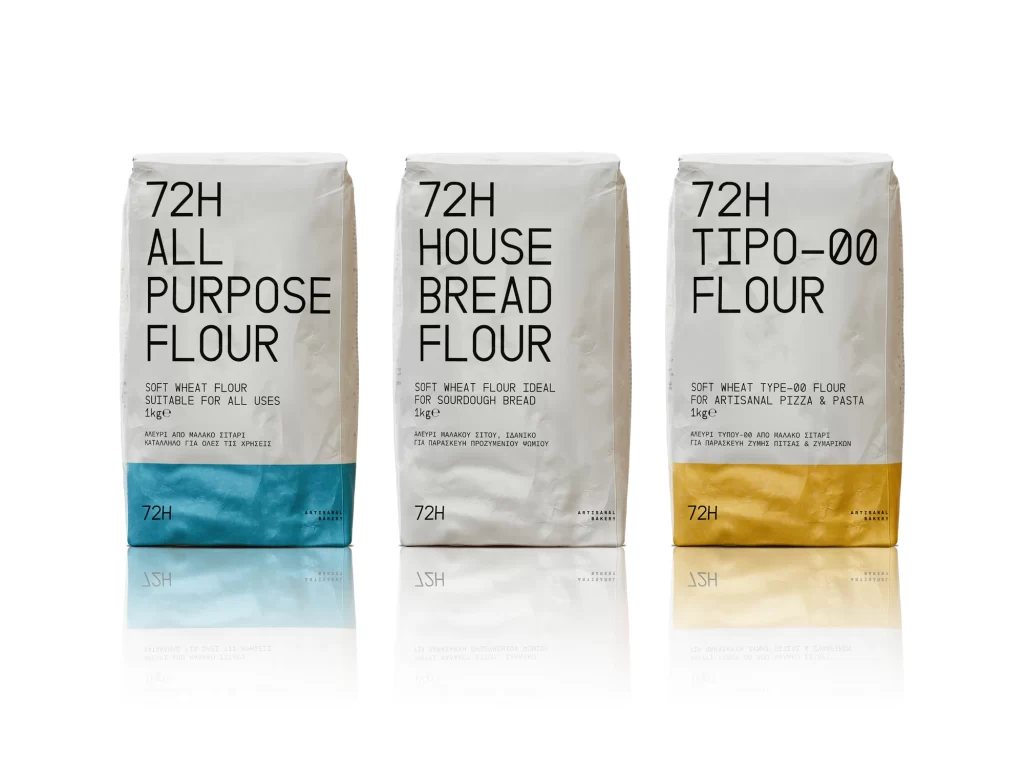
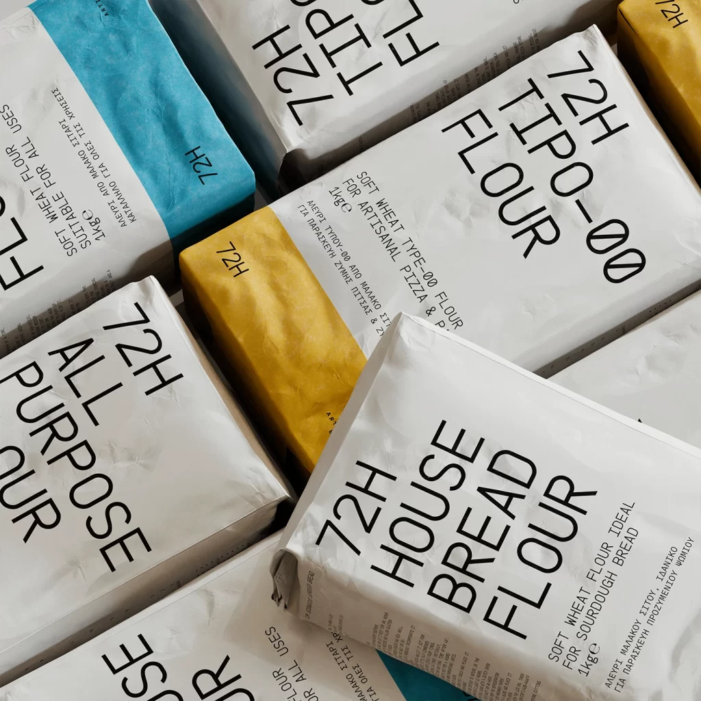
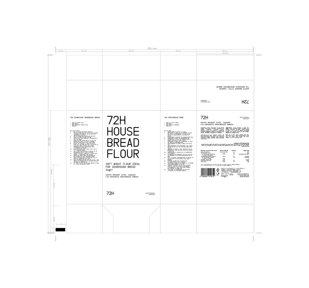
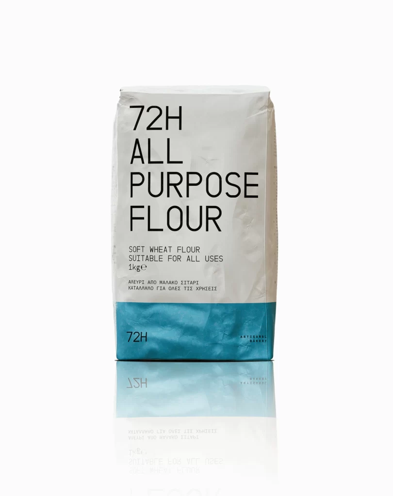
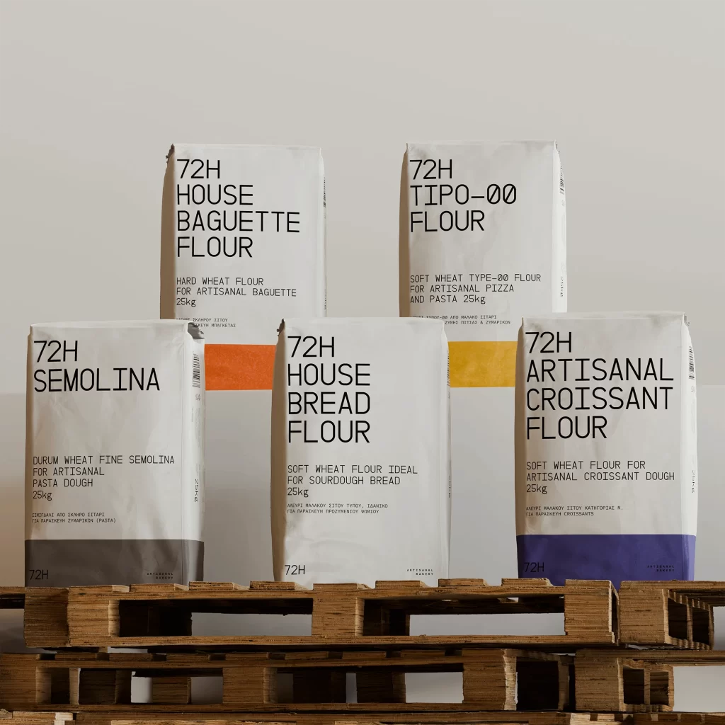
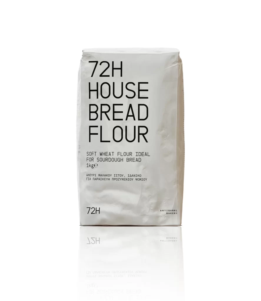
A matte white paper flour bag stands upright against a pure white background, its surface showing subtle creases and a natural paper texture. Bold black sans-serif typography dominates the front face, with '72H HOUSE BREAD FLOUR' stacked in large capital letters above smaller descriptive text reading 'SOFT WHEAT FLOUR IDEAL FOR SOURDOUGH BREAD 1kg' and Greek translation below. The minimalist design includes '72H' printed at the bottom left corner and 'ARTISANAL BAKERY' at the bottom right, while soft studio lighting creates a faint reflection beneath the bag's base.
Minimalist restraint defines this packaging concept, where the absence of imagery or decorative elements allows typography to carry the entire visual identity. The stark contrast between the off-white paper texture and jet-black lettering creates immediate legibility while conveying an artisanal, no-nonsense aesthetic suited to premium baking ingredients. Such deliberate simplicity suggests confidence in product quality, letting the material honesty of unbleached paper speak to natural, traditional bread-making methods.
Brand designers developing organic food packaging might study this example to understand how typographic hierarchy can replace complex graphics in retail contexts. Packaging engineers could reference the structural folds and material choices when prototyping sustainable flour sacks for boutique bakeries. Art directors planning editorial shoots for culinary magazines might utilize similar styling approaches to highlight artisanal products through pure form and typography rather than elaborate prop arrangements.