72H Flour Bag
Topics
Details
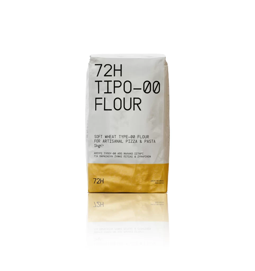
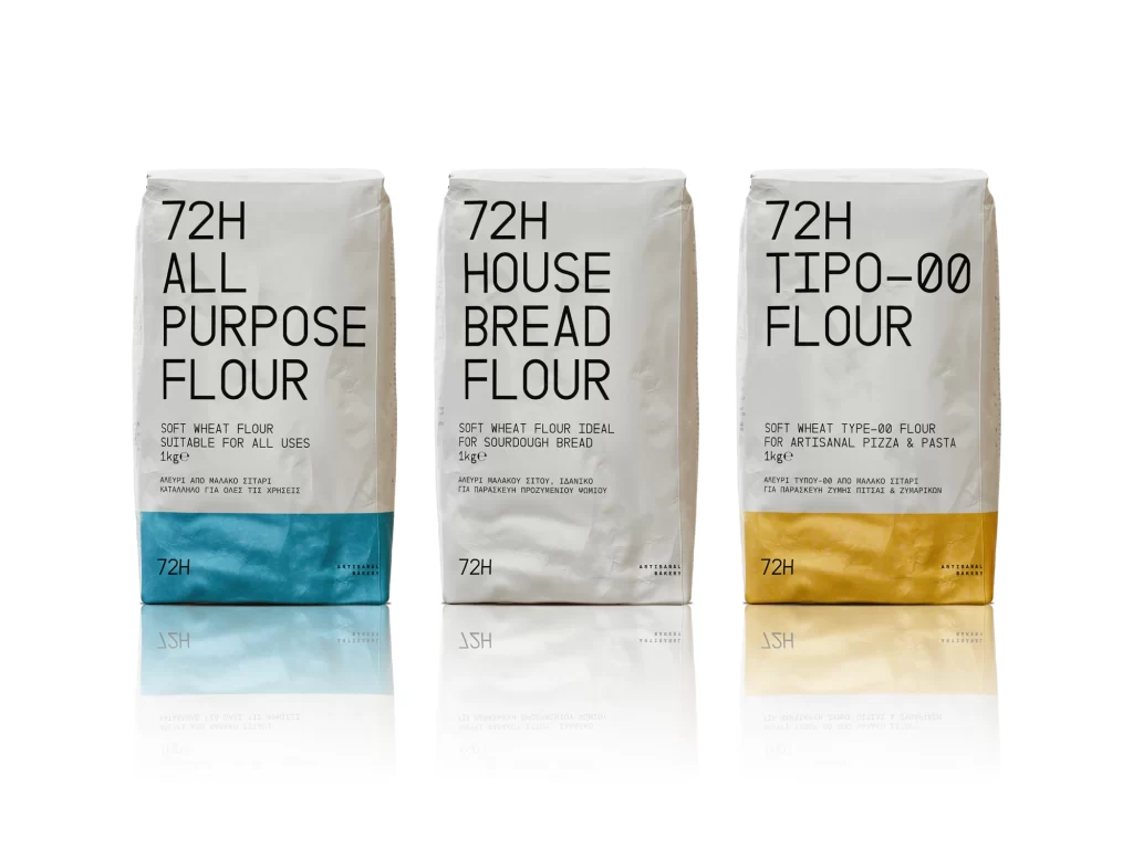
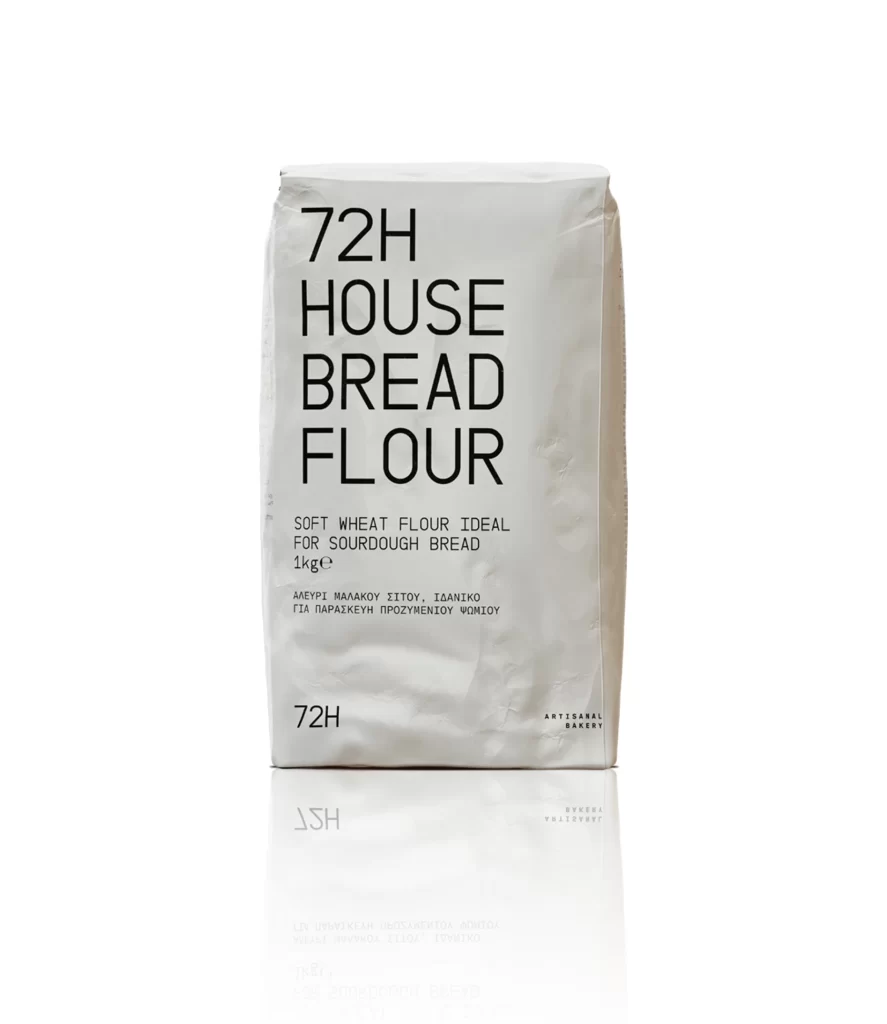
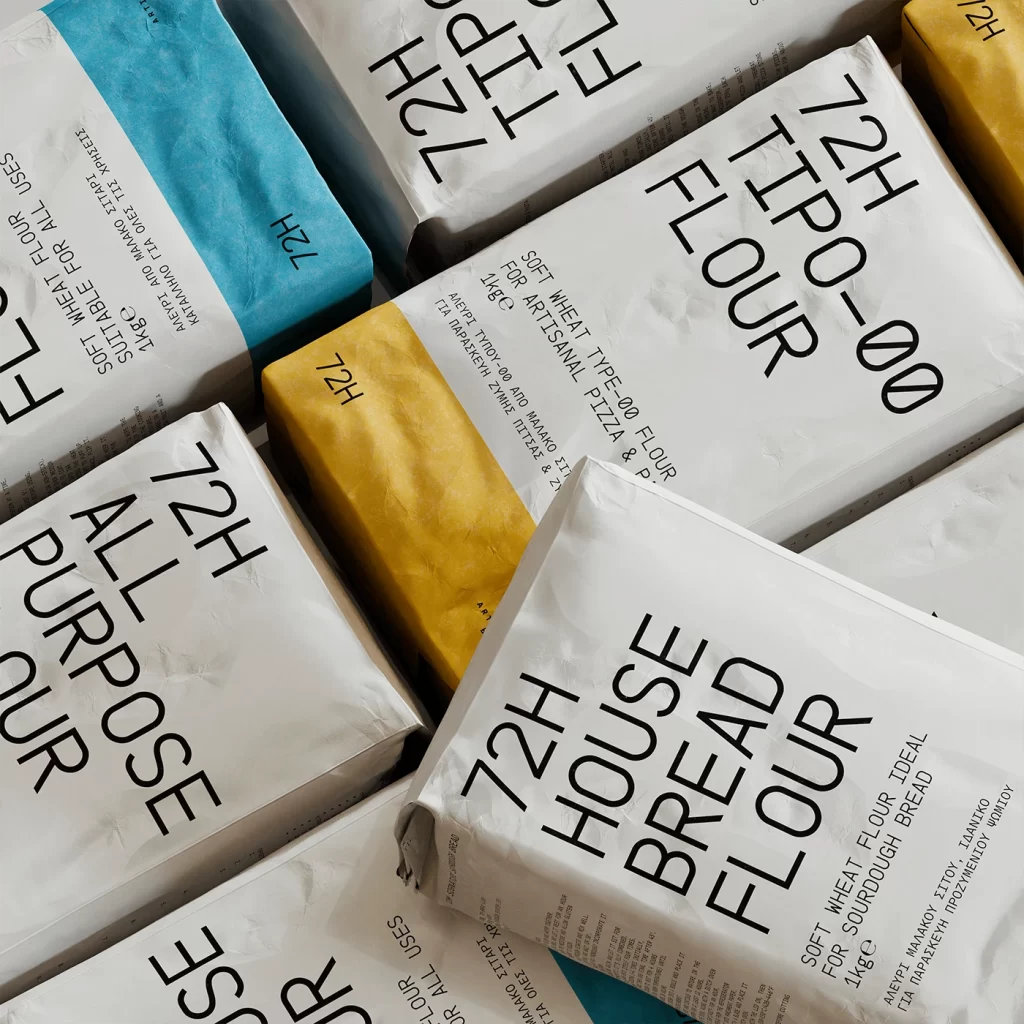
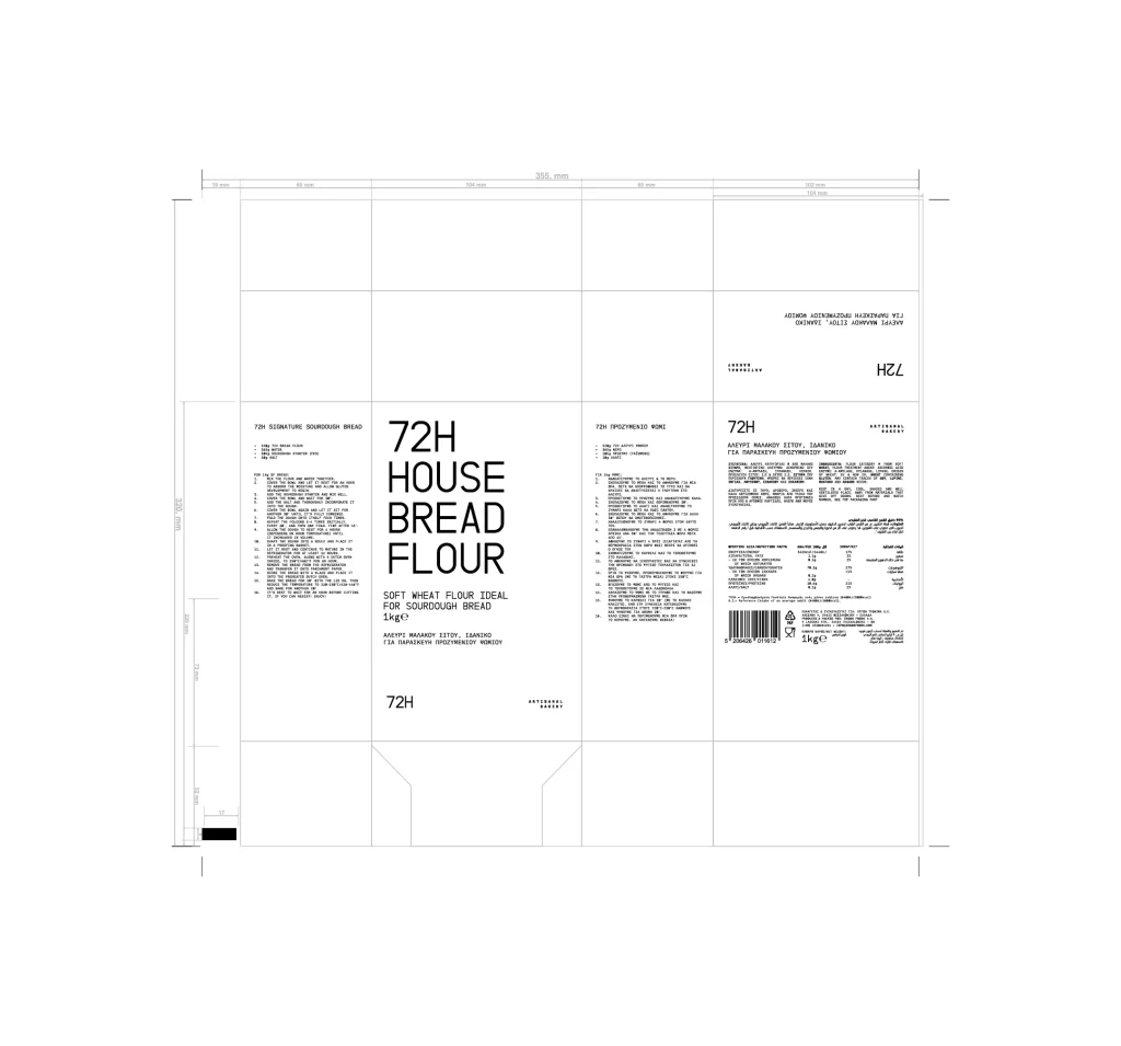
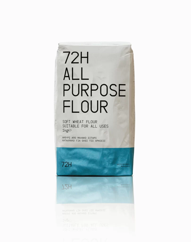
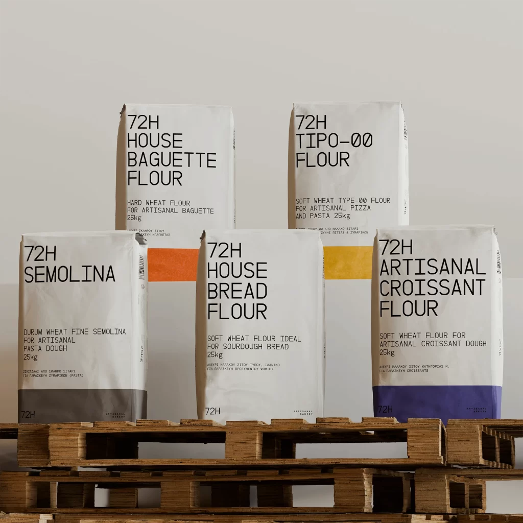
Five white paper flour sacks stand in a staggered formation atop stacked wooden pallets, each displaying bold black typography against a neutral off-white backdrop. The packaging features the '72H' brand name prominently at the top, followed by product names like House Baguette Flour, Tipo-00 Flour, Semolina, House Bread Flour, and Artisanal Croissant Flour. Subtle color accents appear at the bottom of each bag—grey, orange, white, yellow, and deep blue—while soft studio lighting casts gentle shadows that emphasize the matte texture of the paper material.
What sets this packaging apart is its stark typographic hierarchy combined with minimalist industrial aesthetics that feel both professional and approachable. The monospaced font choices create a technical, almost laboratory-grade impression that suggests precision baking, while the limited color palette keeps the visual field clean despite multiple SKUs being displayed simultaneously. Each bag's layout follows a strict grid system where weight specifications and wheat varieties sit comfortably below the main headers without cluttering the composition.
Brand designers working on artisanal food packaging could study this arrangement to understand how to organize complex product information across a cohesive line. Photographers specializing in commercial product shots might reference the lighting setup and pallet staging when planning their own bulk-goods compositions. Even interior designers creating bakery retail spaces could draw from this color-coded system to develop intuitive shelving strategies for different flour types.