72H Flour Bag View
Topics
Details
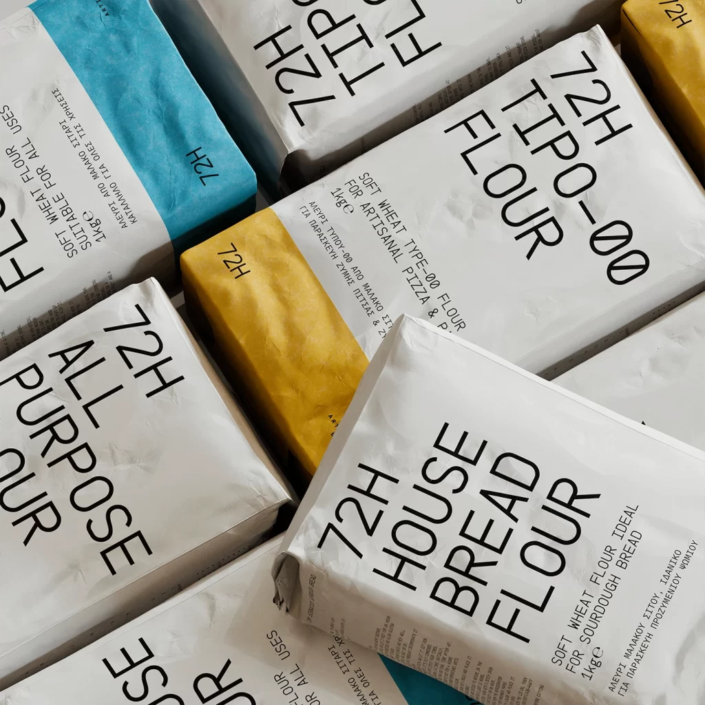
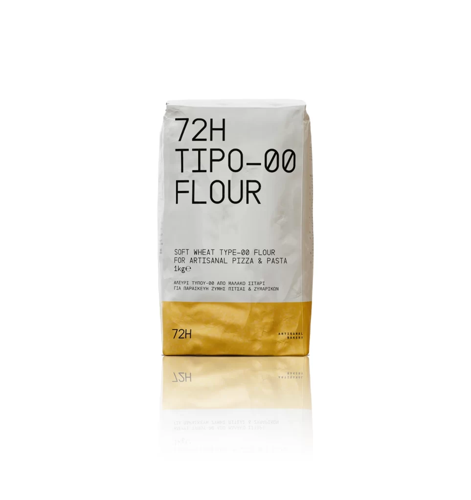
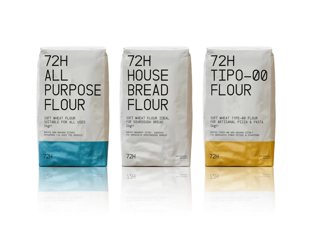
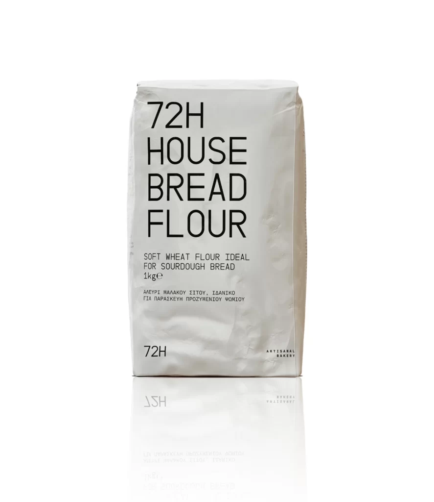
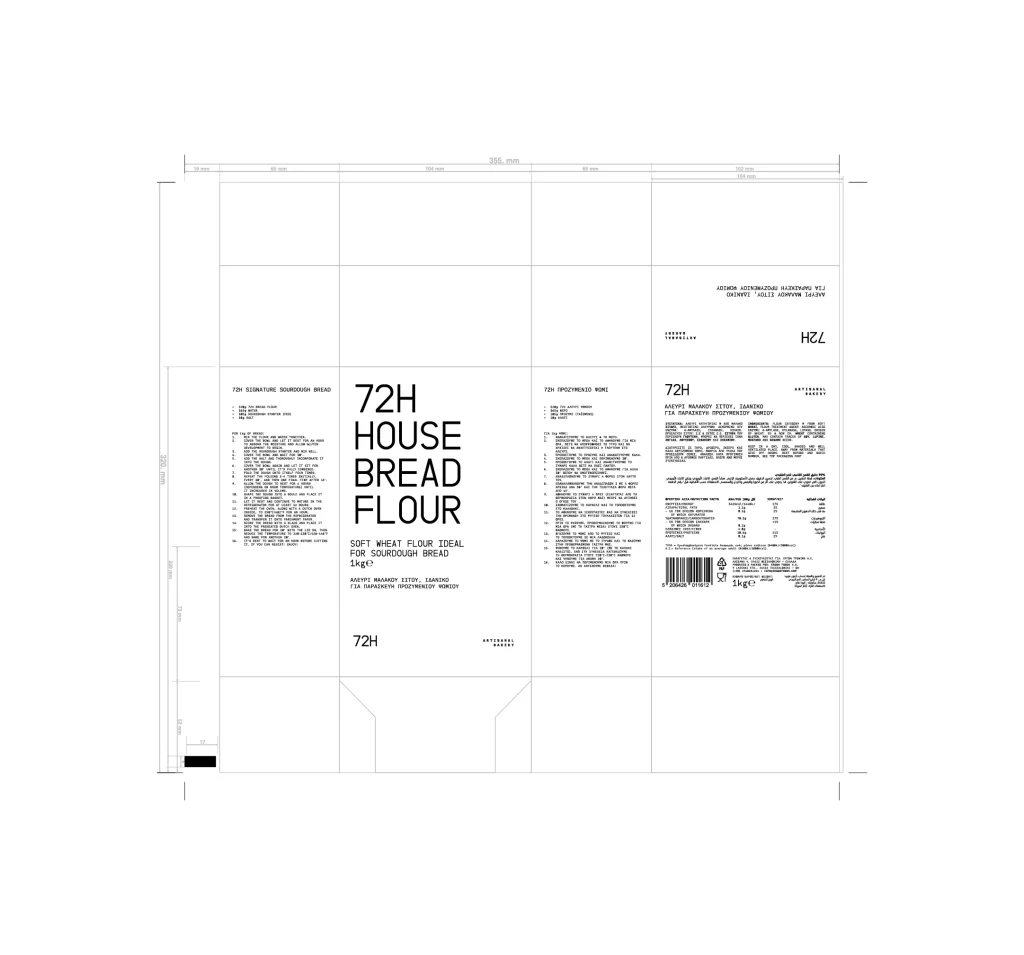
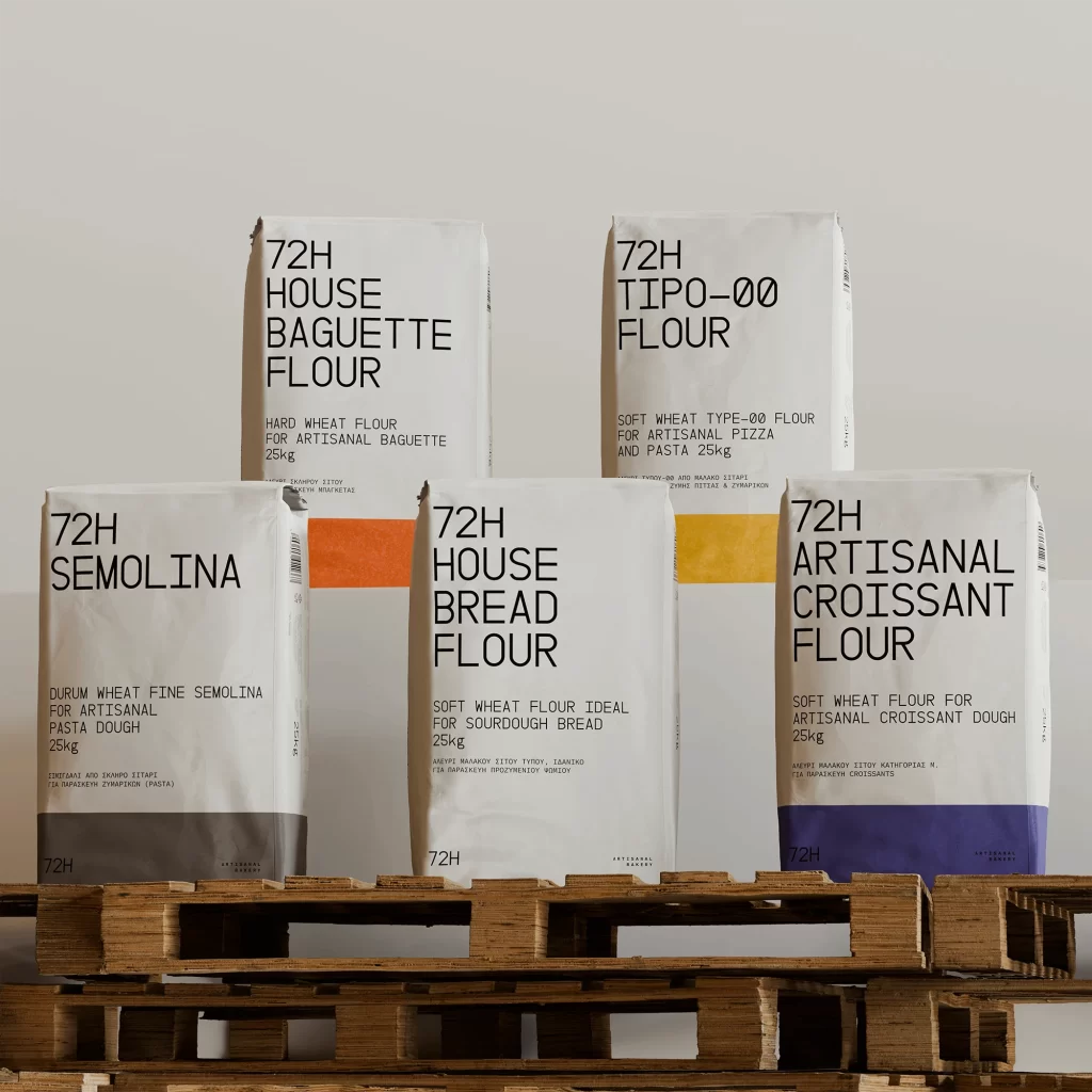
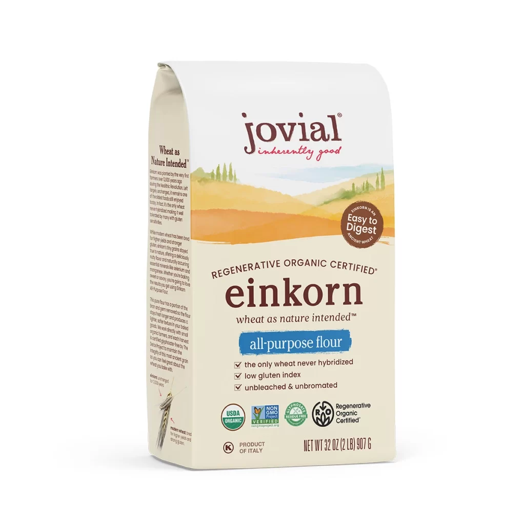
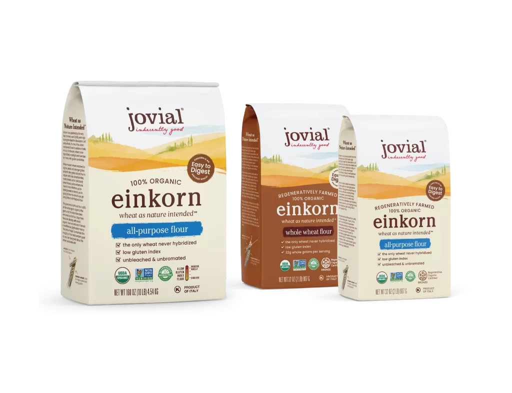
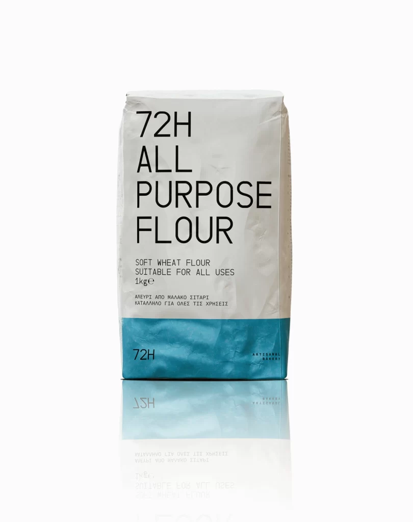
A white paper flour bag dominates the frame, featuring bold black typography that reads '72H ALL PURPOSE FLOUR' across its upper portion. The lower third is wrapped in a solid teal-blue band displaying the '72H' logo in smaller text, while the bag's matte surface catches soft, even lighting from the front. A subtle reflection of the package appears on the glossy white surface beneath it, mirroring the clean minimalist composition and straight-on camera angle.
Visual distinction emerges from the stark geometric division between the organic white paper and the vibrant, unmodulated blue block at the bottom. The typographic layout eschews traditional grocery clutter for an almost architectural precision, where the oversized ’72H’ branding functions as both a logo and a structural element. This specific iteration balances utilitarian packaging with a contemporary aesthetic sensibility, making the mundane object appear like a piece of curated modern art rather than a standard kitchen staple.
Brand strategists examining this reference might analyze how color blocking can elevate commodity products into premium market positions. Packaging engineers could utilize the proportions shown here to study how vertical text alignment affects shelf readability and consumer perception. Art directors working on editorial still-life shoots would find value in the lighting setup, which creates soft shadows that define the bag’s crinkled texture without losing detail in the highlights or shadows.