72H Flour Bag Design
Topics
Details
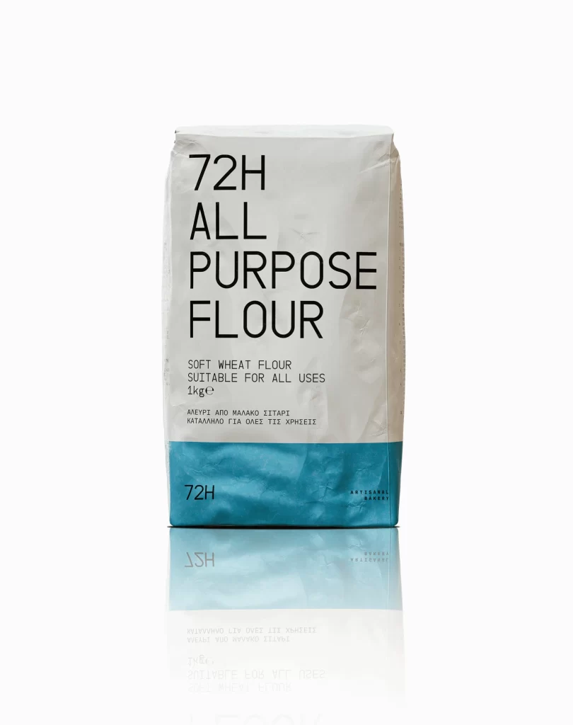
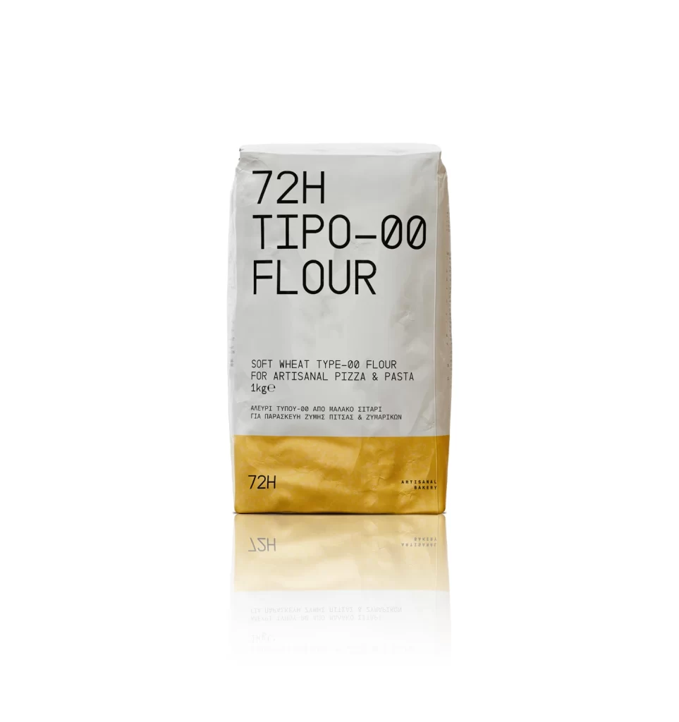
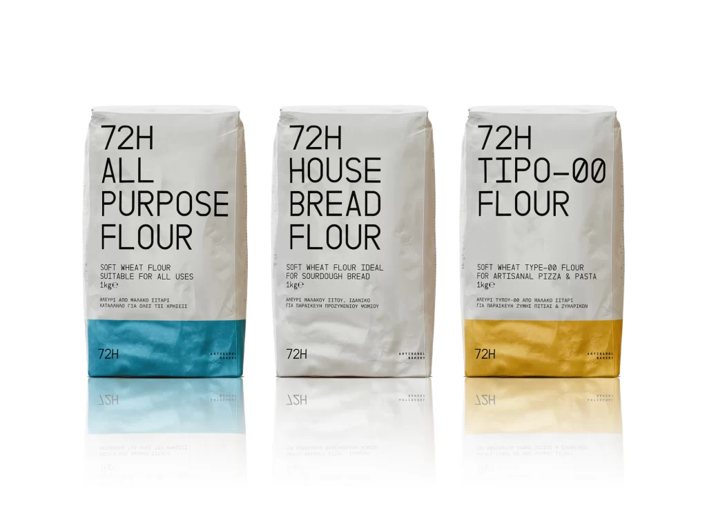
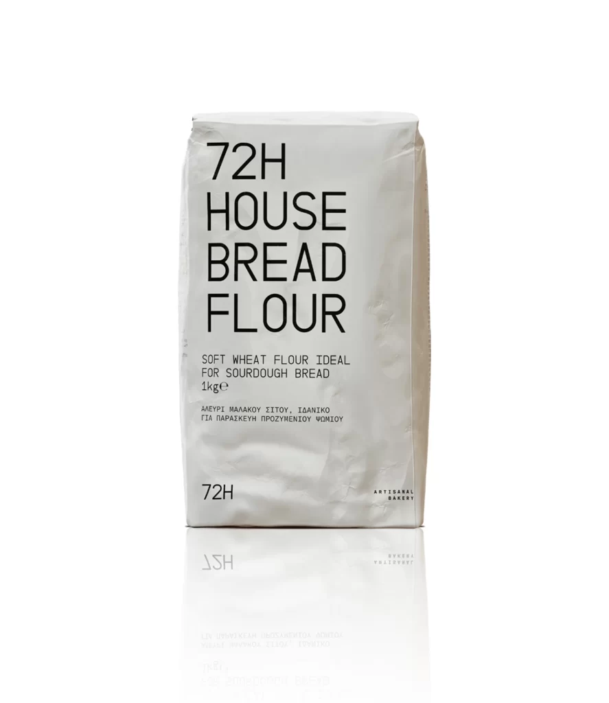
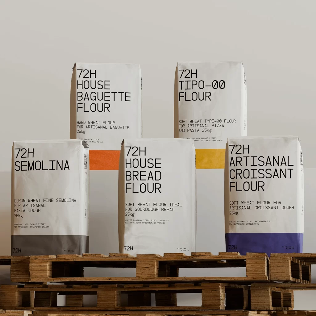
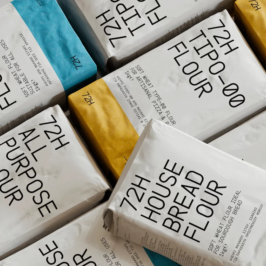
Crumpled white paper sacks with bold black sans-serif typography dominate the frame, arranged in a dense diagonal grid that fills the entire view. Vibrant blue and mustard-yellow bands accent the upper edges of select bags, while the brand identifier '72H' appears in varying orientations across the surfaces. Soft directional lighting casts subtle shadows into the textured creases of the packaging material, emphasizing the tactile quality of the paper and the dimensional depth between overlapping items.
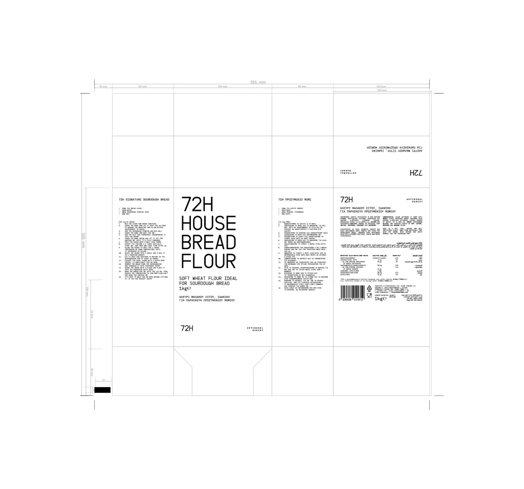
Visual hierarchy relies on extreme typographic scale, with 'FLOUR', 'ALL PURPOSE', and 'HOUSE BREAD FLOUR' rendered in massive lettering that commands immediate attention. The deliberate rotation of text elements—some reading vertically, others at forty-five-degree angles—creates a dynamic, almost architectural composition within the confined space. Restricting the palette to neutral paper tones punctuated by two saturated accent colors ensures legibility while maintaining a cohesive, modernist aesthetic across the product line.
Packaging designers studying minimalist branding strategies will find value in analyzing the interplay between oversized typography and limited color fields. Art directors developing artisanal food product lines could reference this layout when balancing informational density with visual breathing room. Photographers specializing in still-life compositions might examine how the arrangement transforms mundane grocery staples into an abstract study of form, texture, and negative space.