72H Flour Bag View View
Topics
Details
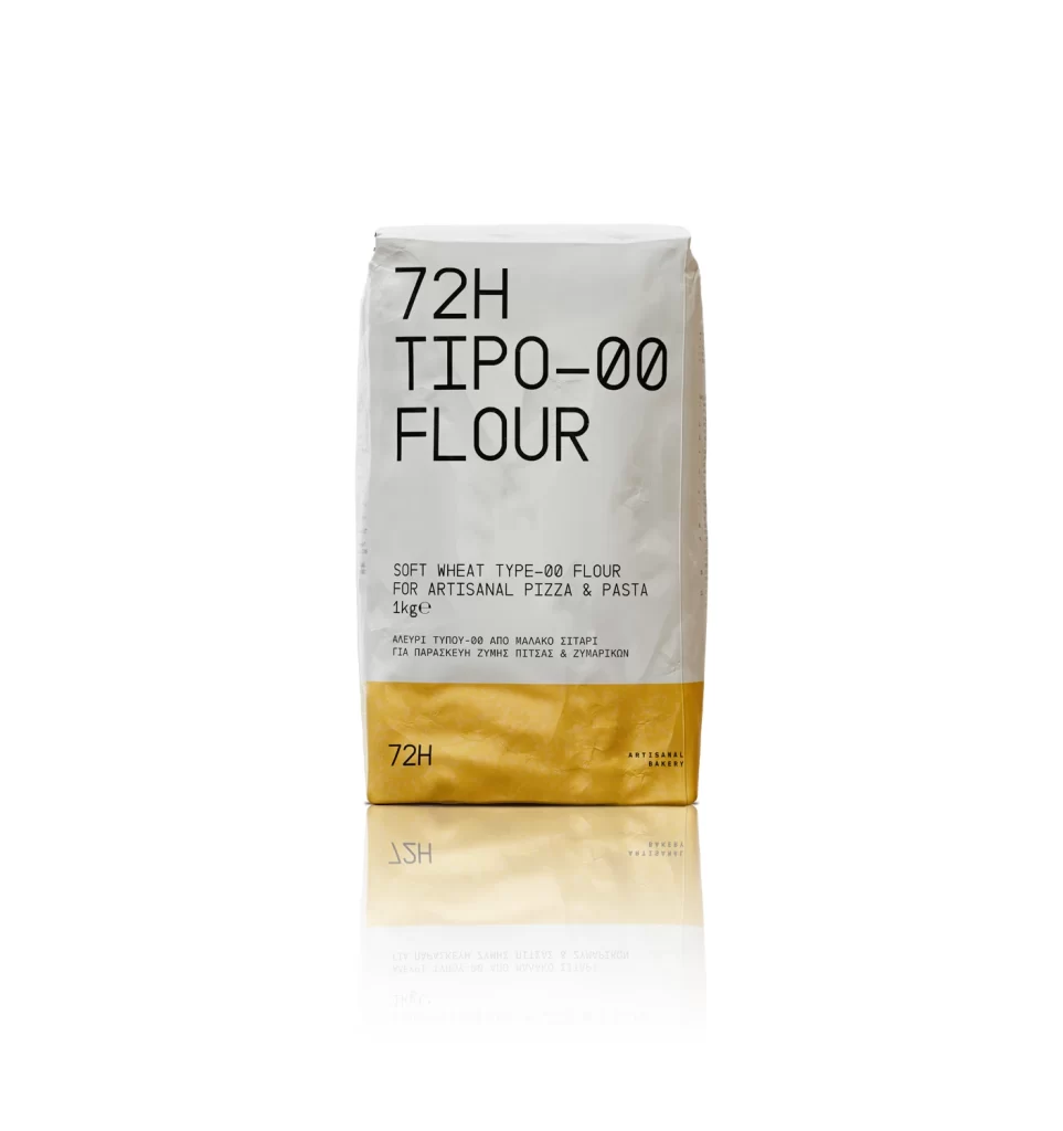
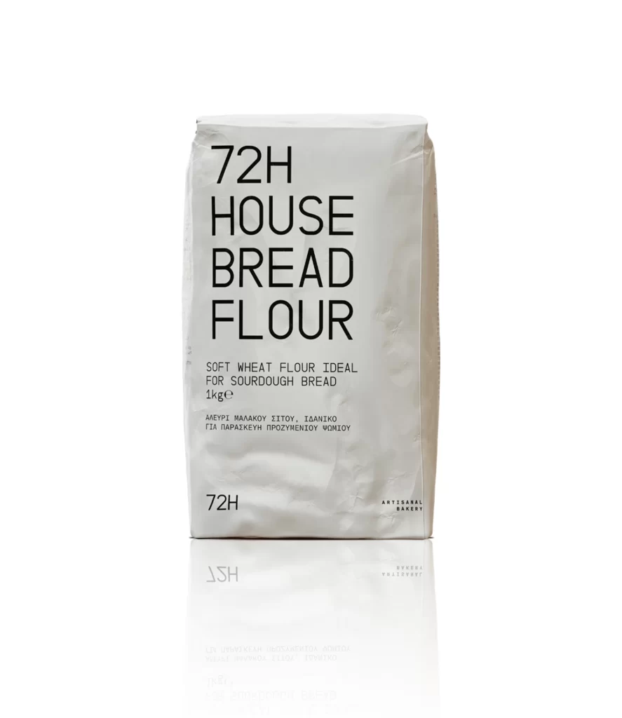
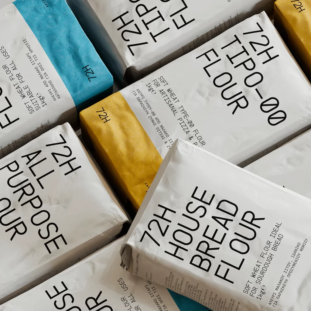
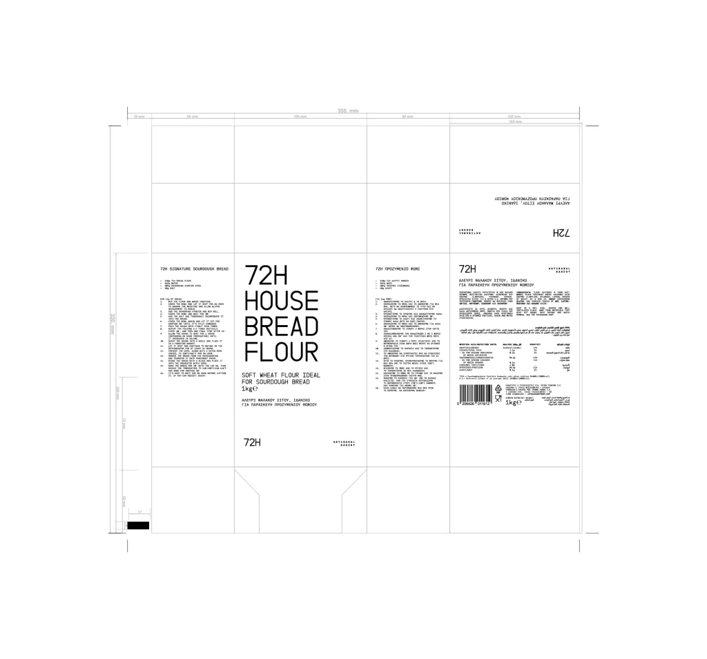
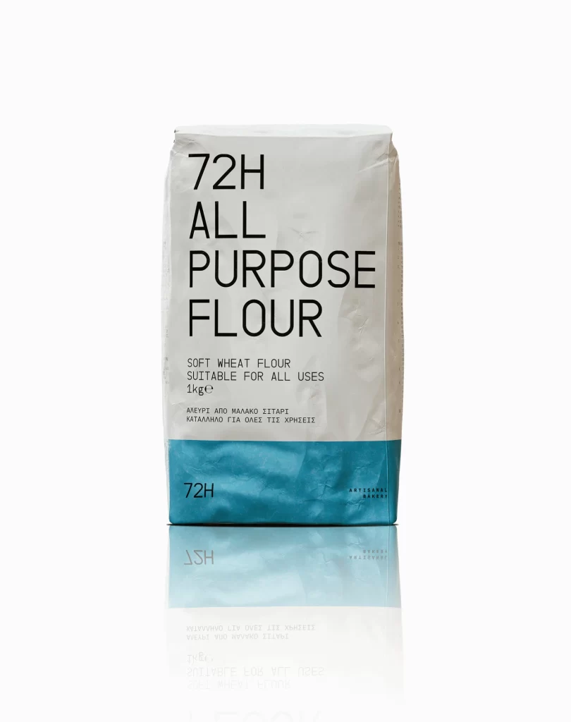
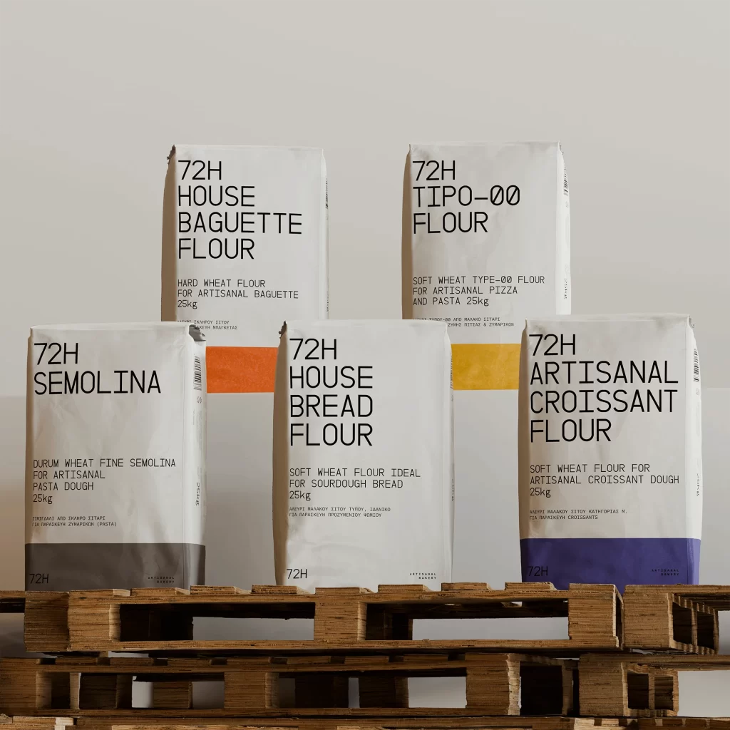
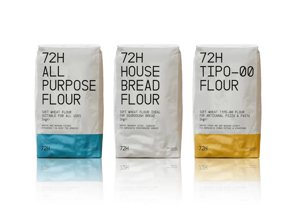
Three upright flour sacks stand in a row against a pure white background, each featuring a matte white paper body with a bold color band at the bottom. The left bag displays a cyan blue stripe, the middle one remains solid white, and the right bag shows a golden yellow accent. Large black sans-serif typography dominates the upper portion of each package, reading '72H ALL PURPOSE FLOUR', '72H HOUSE BREAD FLOUR', and '72H TIPO-00 FLOUR' respectively, with smaller descriptive text and Greek translations printed beneath the main titles.
Visual hierarchy relies on typographic scale rather than decorative graphics, creating a clinical yet approachable aesthetic that emphasizes product information. The color-coded bottom bands serve as the primary differentiator between flour types, offering an immediate visual cue for categorization while maintaining overall brand consistency across the line. Subtle reflections beneath each bag suggest a glossy surface placement, adding depth to the otherwise minimalist composition without distracting from the packaging details.
Packaging designers studying minimalist food branding would examine this layout to understand how limited color palettes can effectively distinguish product variants within a single line. Art directors planning commercial photography shoots might reference the lighting setup and object arrangement to achieve similar clean product presentations for their own clients. Typography enthusiasts could analyze the font weight distribution and spacing decisions to inform their own label design projects requiring clear information architecture.