5MAN IPA beer Can
Topics
Details
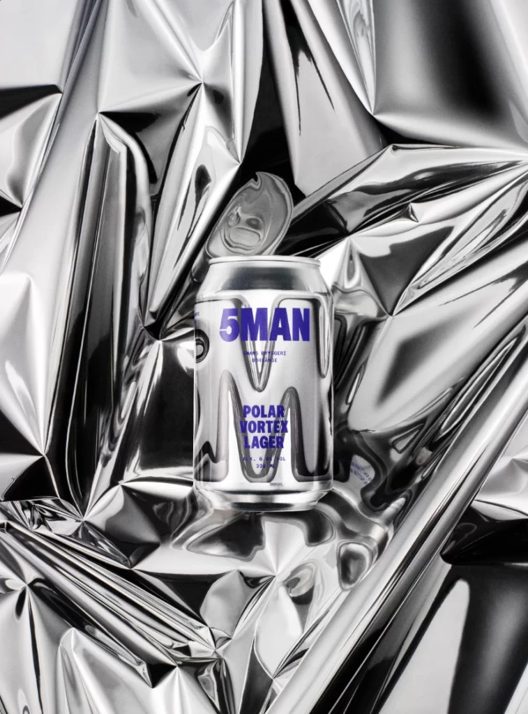
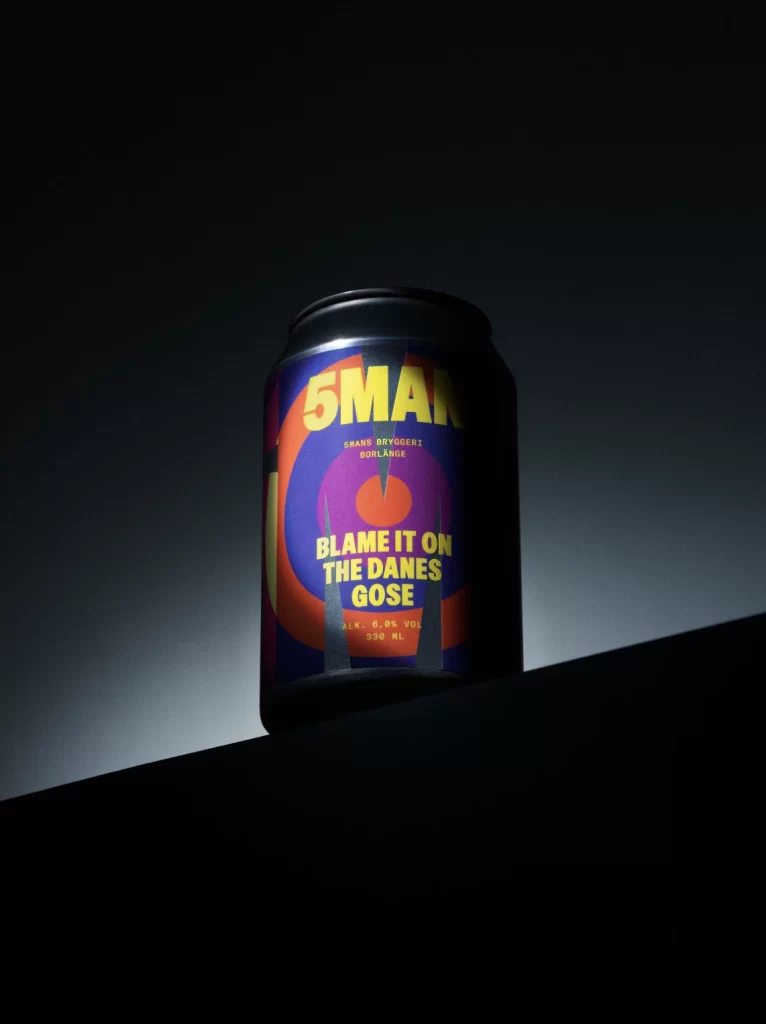
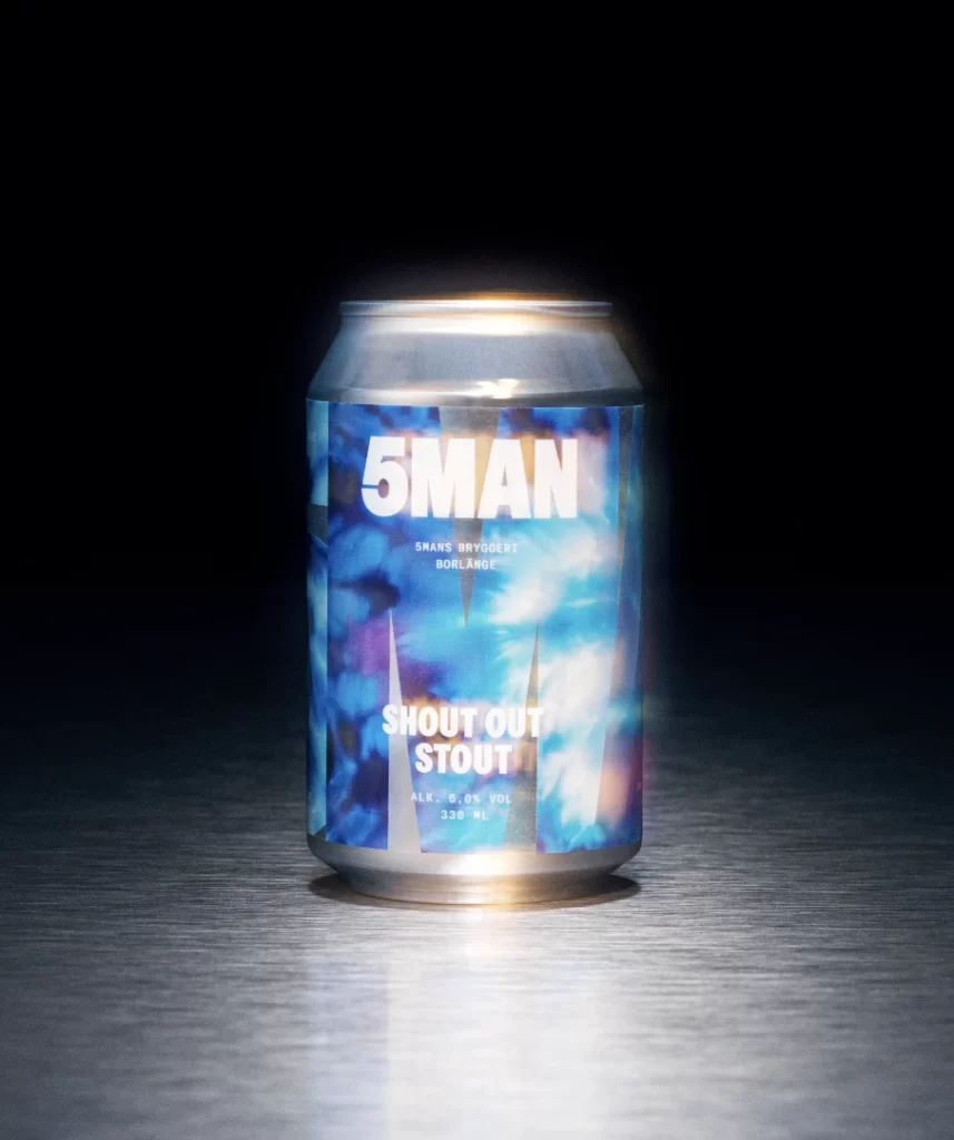
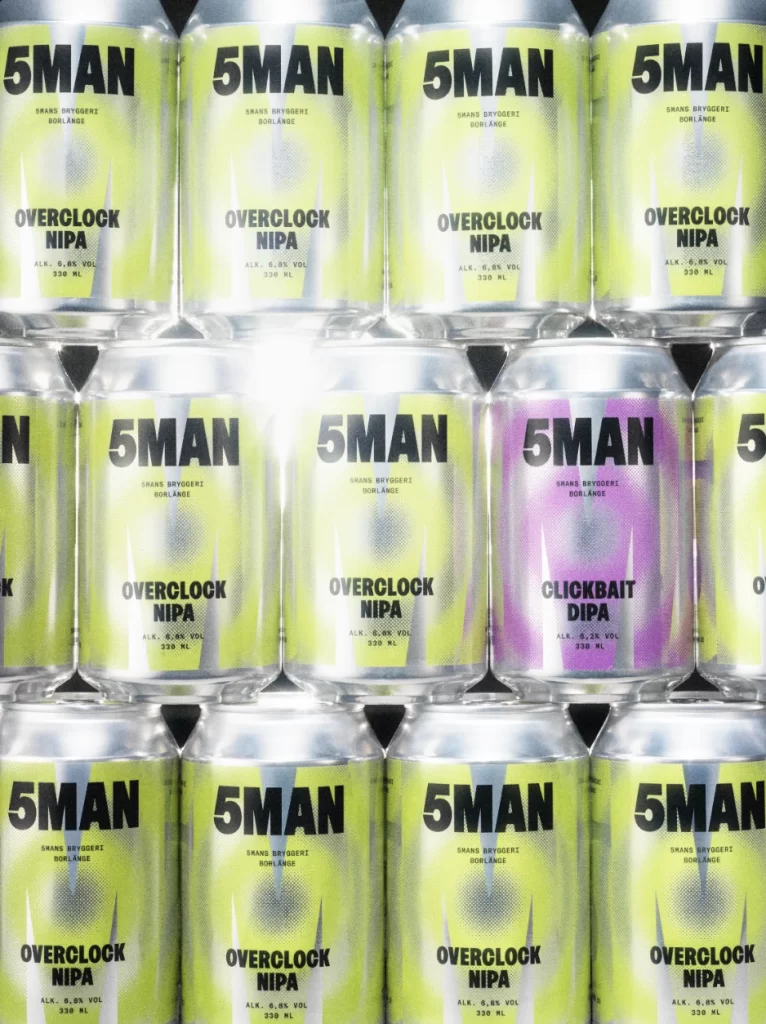
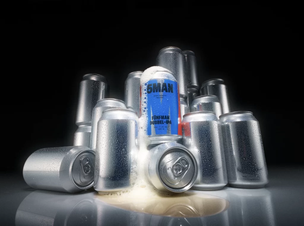
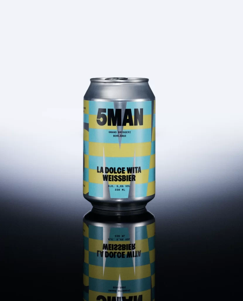
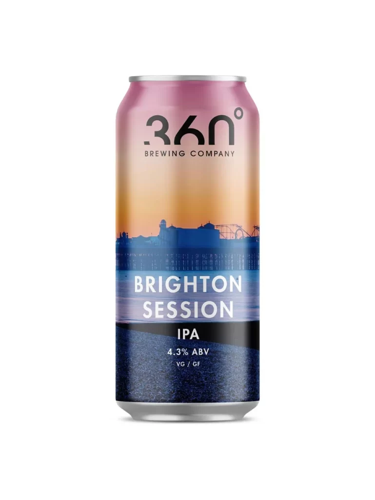
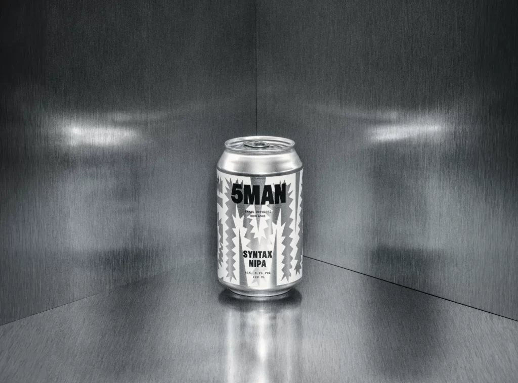
Against a brushed metallic surface that reflects light in soft horizontal gradients, a single aluminum beverage can stands centered in the frame. The container features a stark white label dominated by bold black typography reading '5MAN' at the top, with 'SYNTAX NIPA' positioned below in a smaller but equally weighted font. Zigzagging geometric patterns flank the text vertically, creating a rhythmic visual texture that contrasts sharply with the smooth, industrial background and the subtle sheen of the can's silver rim.
Visual tension emerges from the deliberate monochrome palette, which strips away distraction to emphasize typographic hierarchy and graphic pattern work. The angular, almost aggressive line motifs suggest a modernist or brutalist influence, while the generous negative space around the lettering ensures legibility even from a distance. Such restrained color usage forces attention onto structural composition rather than decorative flourish, marking this as a study in minimalist branding.
Packaging designers examining contemporary beverage trends would find value in analyzing how geometric abstraction integrates with bold wordmarks here. Art directors scouting for metallic surface interactions could reference the way ambient light scatters across both the can's curvature and the surrounding environment. Additionally, illustrators seeking to understand high-contrast label layouts might deconstruct the balance between the jagged side graphics and the central textual block.