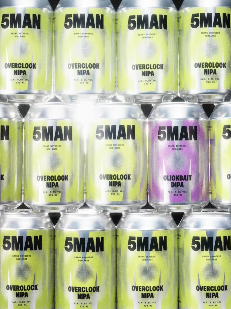
5MAN NIPA Can
Topics
Details
Rows of aluminum beverage cans display a striking visual rhythm, with the majority featuring a vibrant lime-green gradient that fades to pale yellow at their centers. Bold black typography dominates each cylindrical surface, spelling out '5MAN' in heavy sans-serif lettering above secondary text reading either 'OVERCLOCK NIPA' or 'CLICKBAIT DIPA' on a single magenta-hued can that breaks the pattern. The metallic silver tops catch bright highlights from overhead lighting, creating sharp reflections across the tightly packed grid formation viewed from a straight-on perspective.
Visual distinction emerges from the deliberate color-coding system that separates product variants within an otherwise uniform lineup. The halftone dot pattern underlying the yellow-green gradient adds tactile depth to the flat printed surface, while the singular purple can breaks the rhythm to signal a different beer style. This systematic approach to packaging allows for instant SKU recognition even when products are densely packed together in retail environments.
Brand managers studying beverage packaging trends would examine this layout to understand how color variants function within a cohesive family design. Packaging engineers might reference the specific curvature reflections to plan how their own artwork will distort around similar container geometries. Retail merchandisers could use this arrangement as a case study for optimizing shelf presence through consistent typographic hierarchy and strategic use of accent colors.