5MAN Polar Vortex Lager Can
Topics
Details
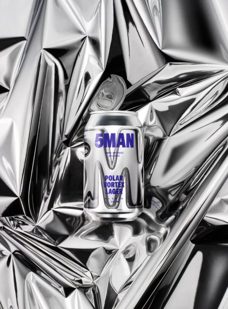
Cradled within a landscape of crinkled silver foil, a cylindrical aluminum can stands as the central focal point of this composition. The vessel features a brushed metallic finish that mirrors its surroundings, overlaid with bold, sans-serif typography in a deep violet hue. Visible text includes the brand name '5MAN' at the top, followed by smaller secondary text and the product title 'POLAR VORTEX LAGER' in stacked capital letters. A direct overhead camera angle flattens the perspective, while sharp studio lighting creates high-contrast highlights across the reflective surfaces.
Visual interest derives from the interplay between the rigid geometry of the container and the chaotic, organic folds of the background material. The monochromatic silver palette is punctuated strategically by the purple lettering, creating a stark chromatic contrast that draws the eye immediately to the branding elements. This specific iteration emphasizes materiality through the way light fractures across both the smooth aluminum skin and the textured foil environment.
Product photographers might study this arrangement to understand how to stage reflective packaging without losing legibility of surface graphics. Industrial designers could analyze the typographic hierarchy and color choices for cold-climate beverage branding concepts. Art directors working on campaigns for metallic consumer goods would find the lighting setup particularly instructive for controlling specular reflections in commercial photography.