5MAN Beer Can
Topics
Details
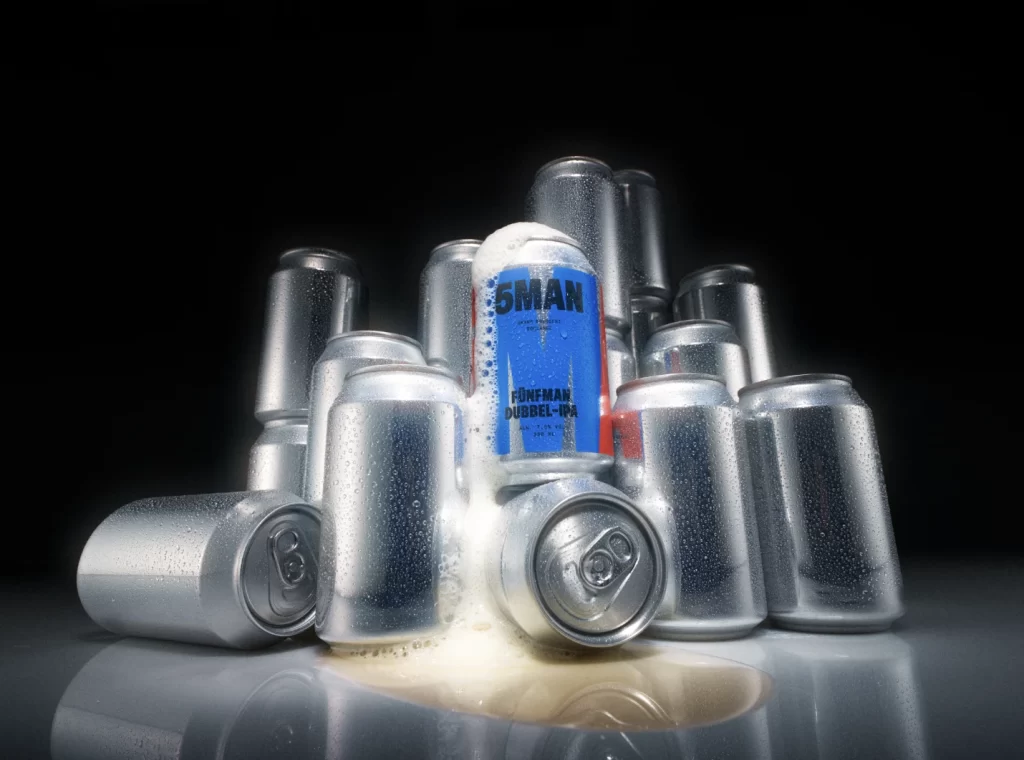
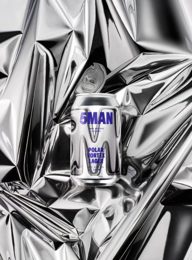
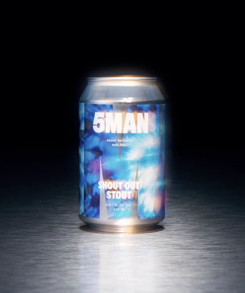
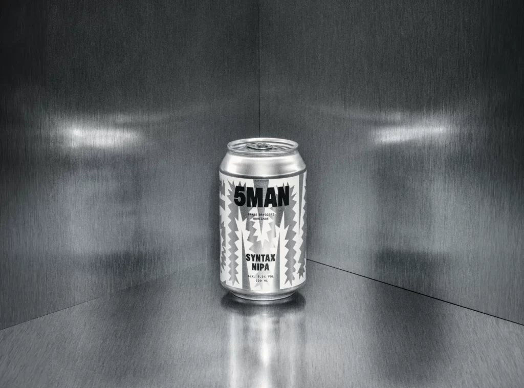
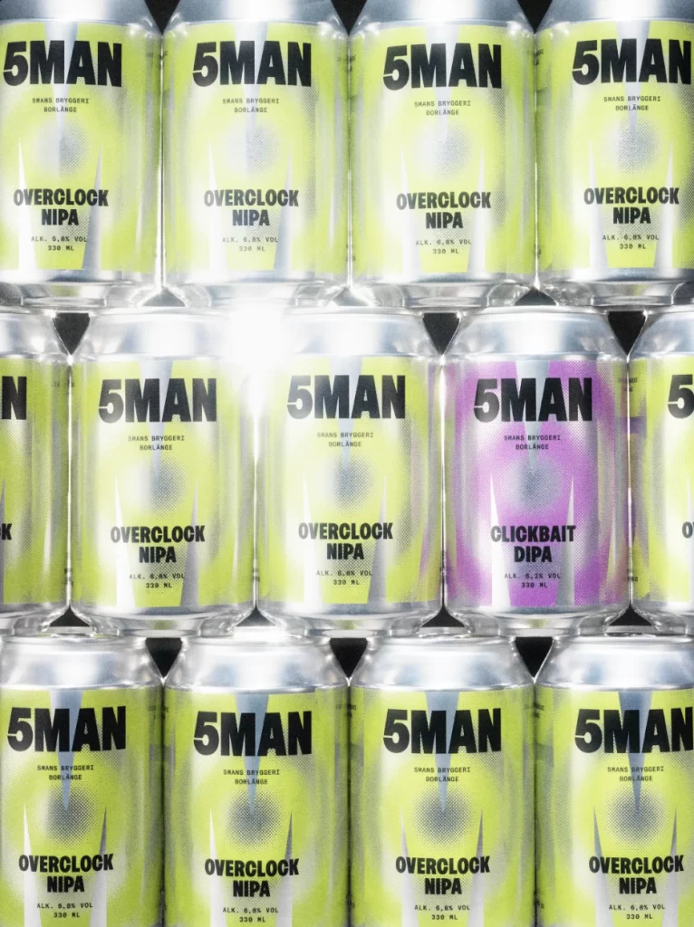
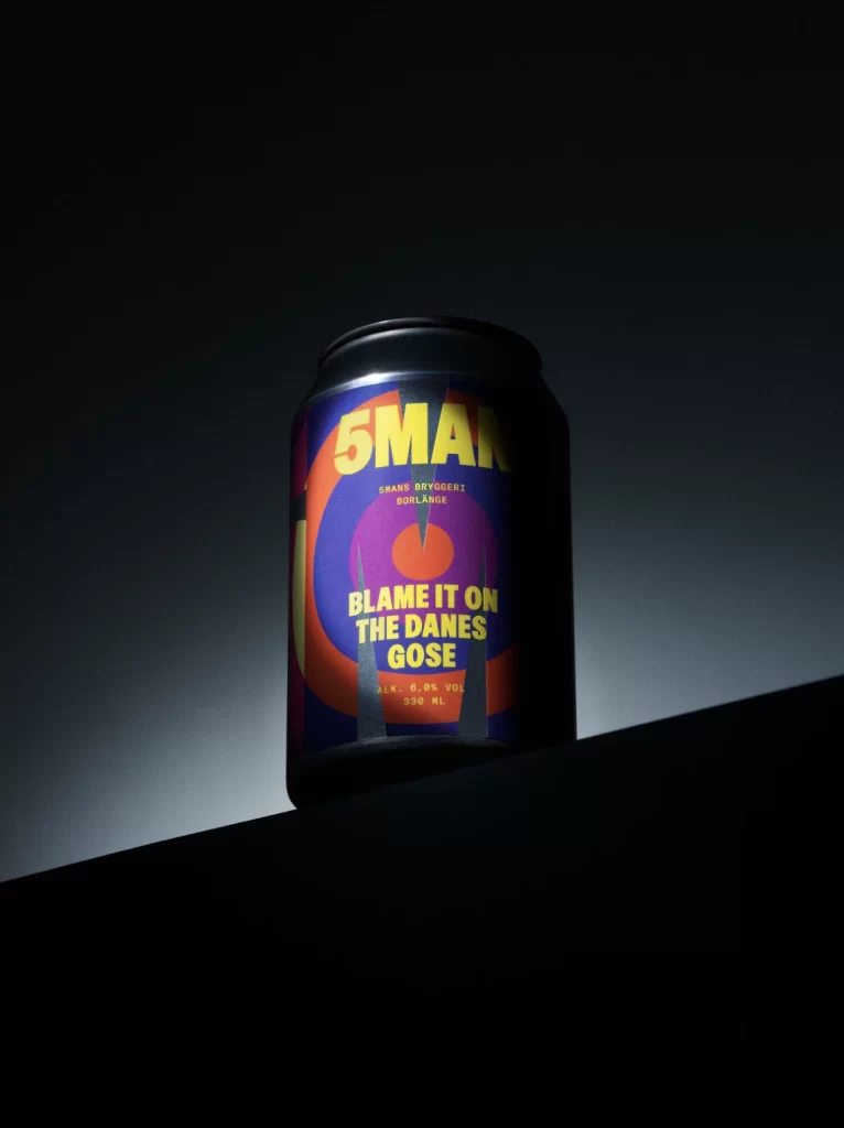
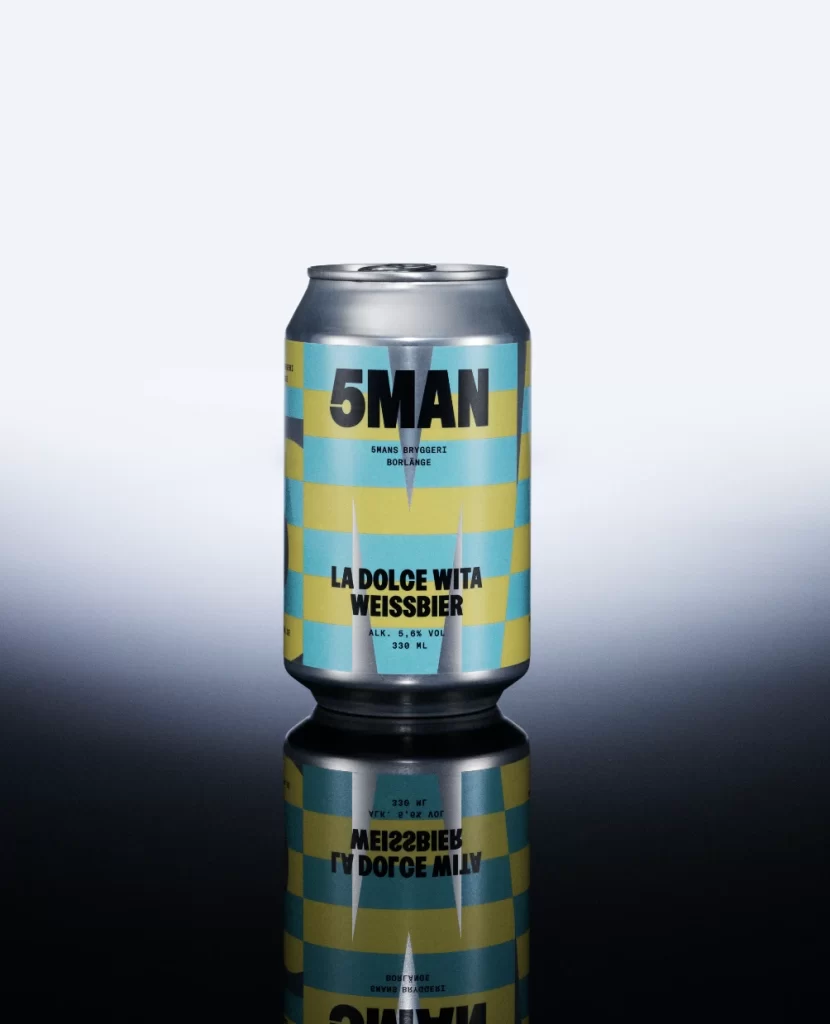
Standing on a reflective black surface, an aluminum beverage can displays a striking pattern of alternating cyan and pale yellow horizontal bands. Bold black sans-serif type spells out '5MAN' across the upper portion, with smaller text identifying the brewery as 'SHANS BRYGGERI BORLANGE' and the product name as 'LA DOLCE VITA WEISSBIER' below. Technical specifications indicating 5.0% alcohol volume and 330ml capacity appear in fine print near the bottom, while the background transitions from pure white at the top to deep shadow beneath the can, creating a clean studio-lit presentation from a straight-on camera perspective.
Visual interest stems primarily from the high-contrast color blocking that divides the cylindrical surface into distinct geometric zones without gradients or photographic imagery. The typography employs a heavy, condensed font weight that commands attention against the bright background colors, establishing a clear hierarchy between the brand name and descriptive text. Metallic silver sections at the can's top and bottom provide structural framing that separates the graphic area from the functional edges of the container.
Packaging designers studying beverage branding might examine this example to understand how limited color palettes and bold typographic choices create shelf presence in competitive retail environments. 3D artists requiring reference for metallic material properties could analyze the specular highlights and reflections visible on the curved aluminum surface. Marketing teams evaluating contemporary craft beer aesthetics would find this useful for comparing label layout strategies and color psychology applications in alcoholic beverage packaging.