Orion Draft Beer Can Detail
Topics
Details
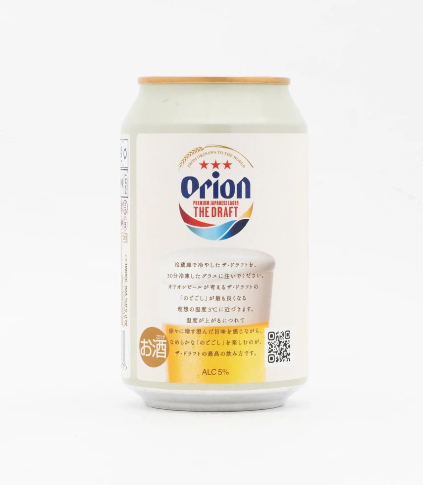
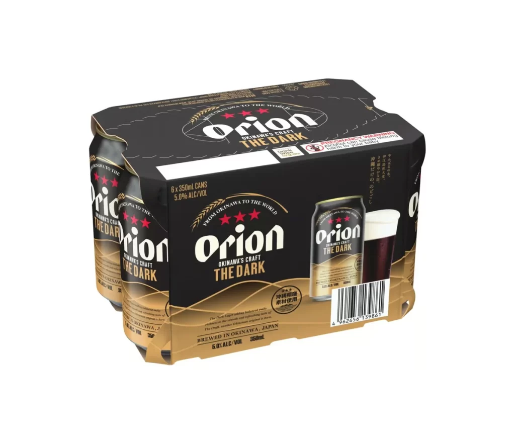
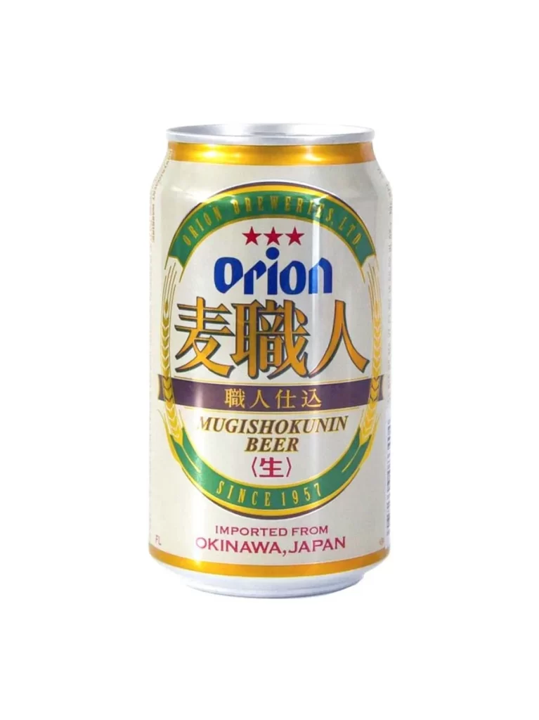
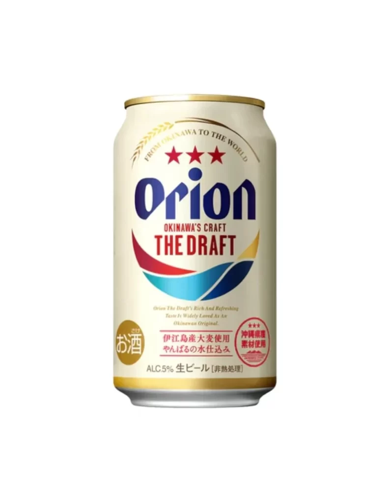
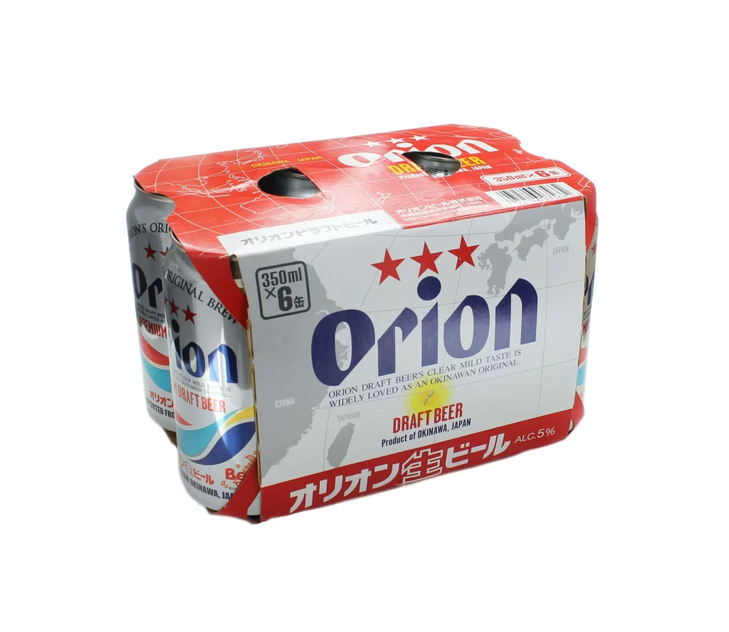
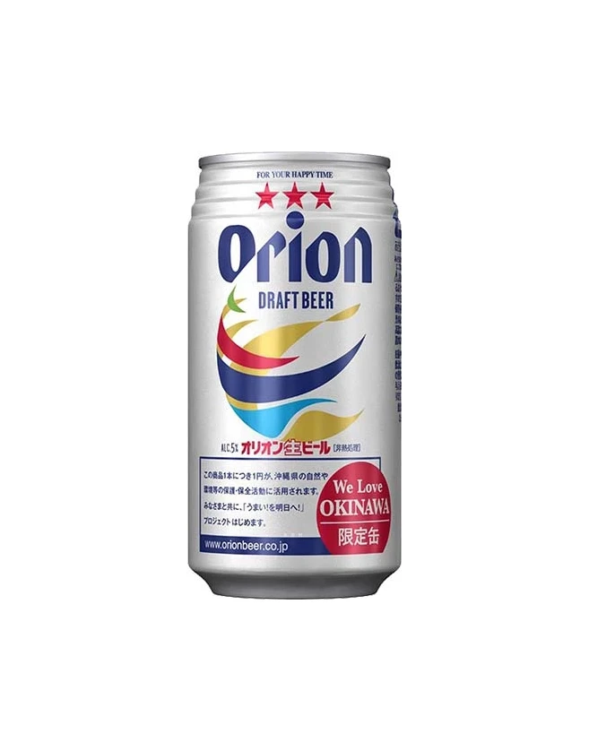
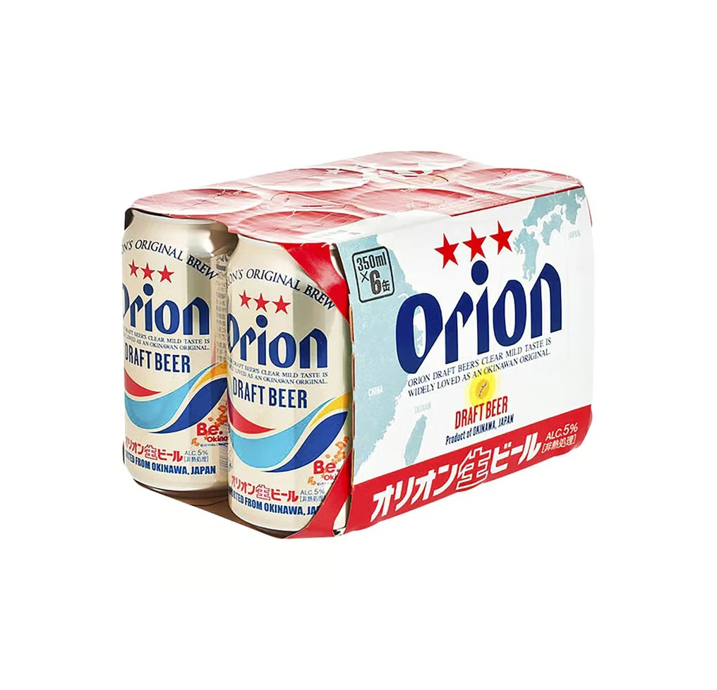
Orion Draft Beer appears in a six-pack of 350ml aluminum cans, wrapped in a white cardboard carrier featuring the brand name in bold navy blue script above three red stars. The silver can bodies display a colorful wave graphic in blue, red, and yellow, with 'DRAFT BEER' printed in dark blue beneath the logo and a red band at the bottom containing Japanese text.
Visual interest is generated through the juxtaposition of bold typography and delicate cartographic elements, specifically the faint outline of the Okinawan islands that anchors the background of the main panel. The design successfully balances international legibility with local identity by integrating Japanese characters into the lower red banner without disrupting the overall Western-style layout. Furthermore, the rhythmic repetition of the star motif across both the individual cans and the multipack creates a cohesive branding system that remains legible even from a distance.
Product photographers and packaging engineers might utilize this specific angle to study how light interacts with curved metallic surfaces versus flat paper substrates. Brand strategists could also analyze the hierarchy of information here to understand how to effectively communicate origin and alcohol content within a constrained vertical space. Additionally, illustrators looking to render realistic consumer goods will find the subtle reflections on the can tops and the precise registration of the printed waves particularly instructive for their own technical studies.