Orion Draft Beer Can Design
Topics
Details
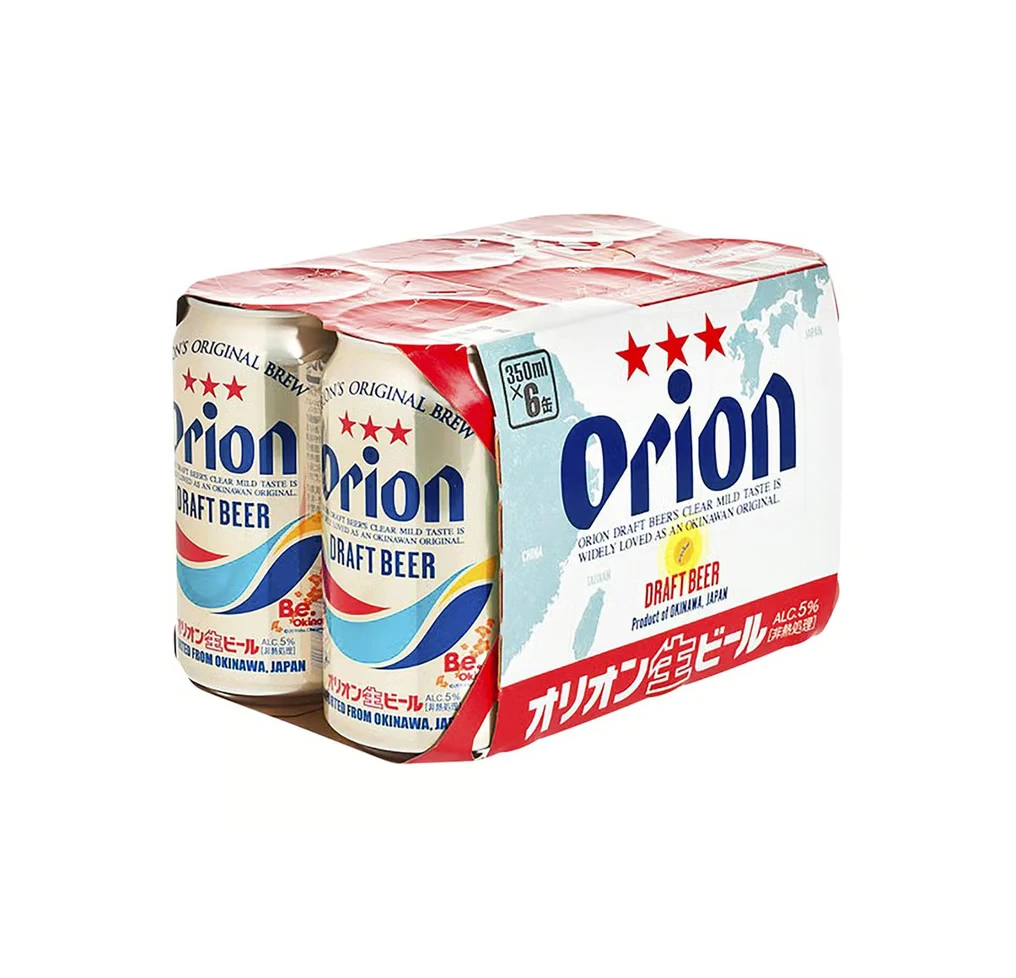
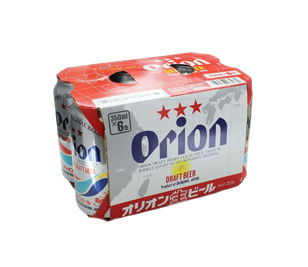
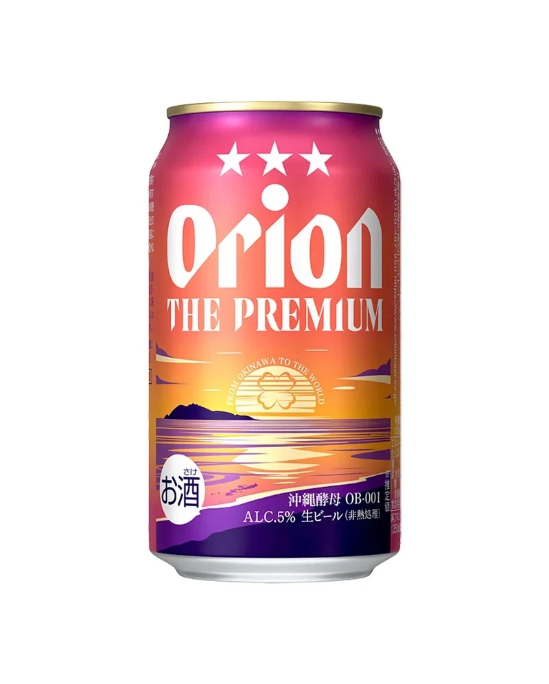
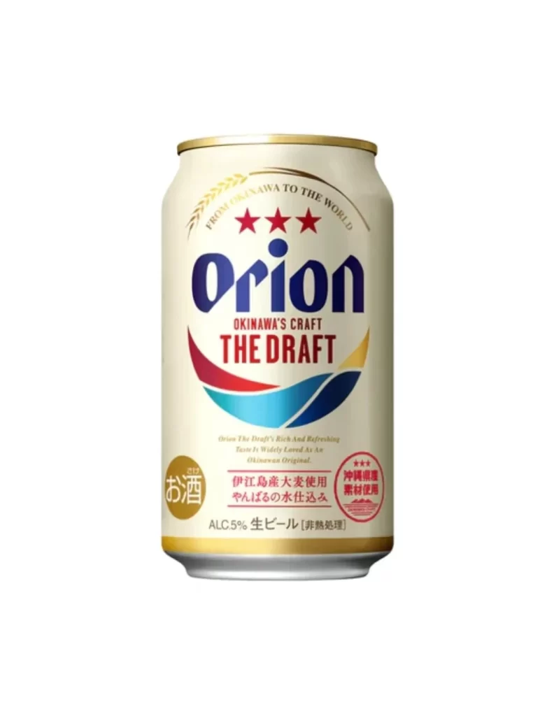
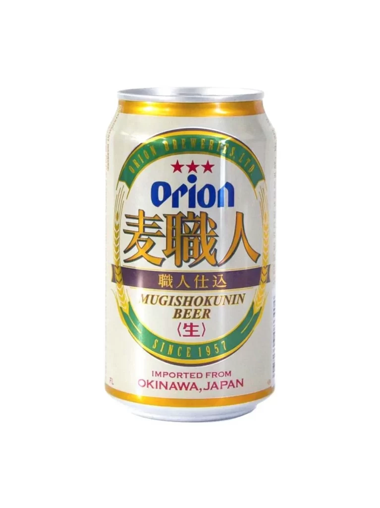
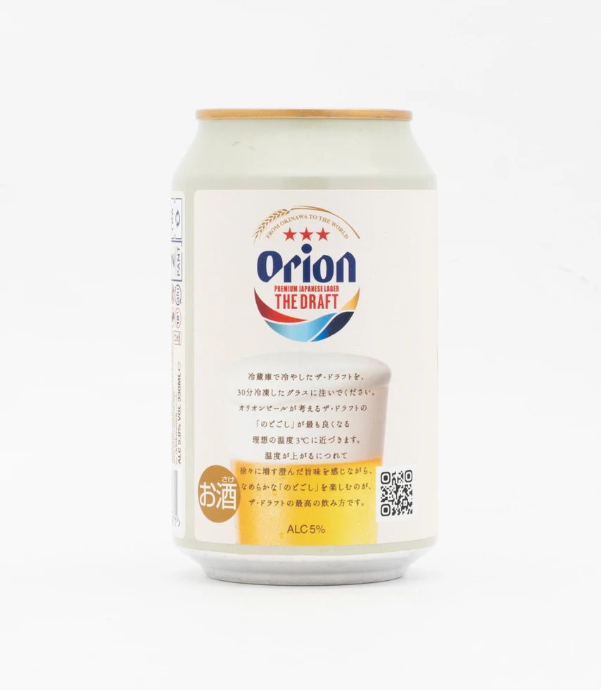
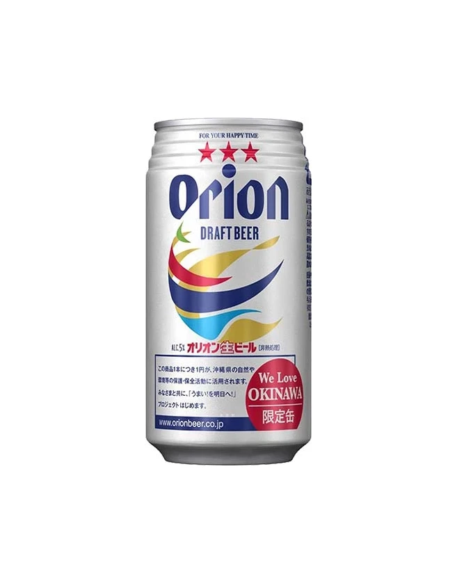
A silver aluminum beverage can displays the Orion Draft Beer branding in bold navy blue typography, accompanied by three red stars above the logo and a dynamic swoosh graphic incorporating red, yellow, and blue curved bands. The cylindrical container features Japanese text detailing the product specifications alongside a circular red badge reading 'We Love OKINAWA' on the lower right quadrant, all photographed under even studio lighting that highlights the metallic surface texture.
Visual interest is generated through the specific regional branding elements that distinguish this as a specialty Okinawan product rather than a standard mass-market beverage. The inclusion of the tricolor swoosh adds a sense of tropical movement and energy that contrasts with the rigid verticality of the can’s form. Furthermore, the placement of the red ‘limited edition’ stamp creates a focal point that draws the eye away from the central logo, effectively communicating scarcity and cultural pride through its layout.
Product photographers might utilize this composition to study how metallic textures reflect light under studio conditions without creating harsh glare. Packaging analysts could examine the hierarchy of information to understand how bilingual text is balanced within a confined circular space. Additionally, color theorists may reference the specific palette to analyze how primary colors interact with neutral metallic backgrounds in commercial branding.