Orion Beer Can Closeup
Topics
Details
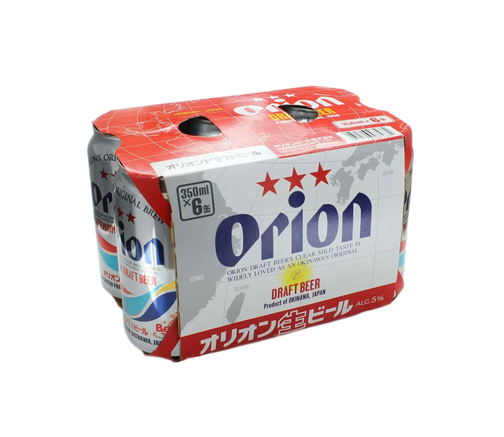
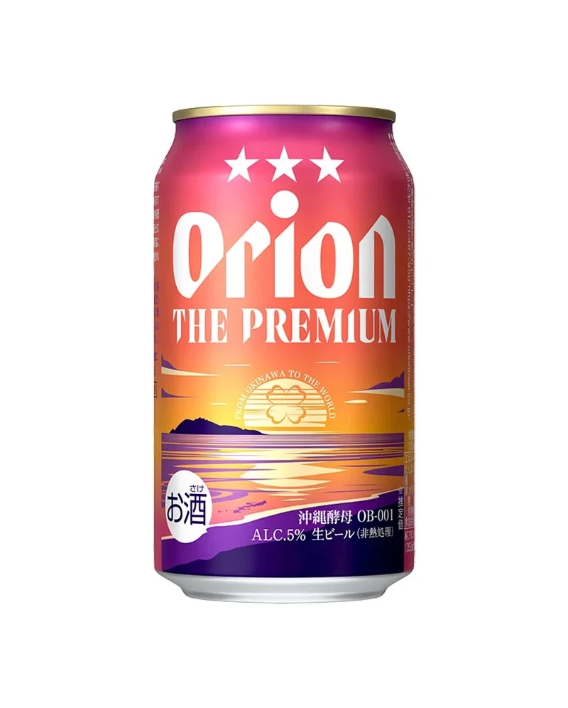
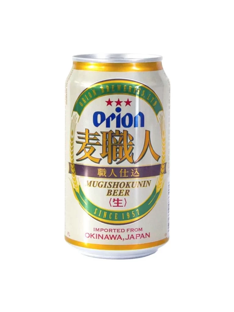
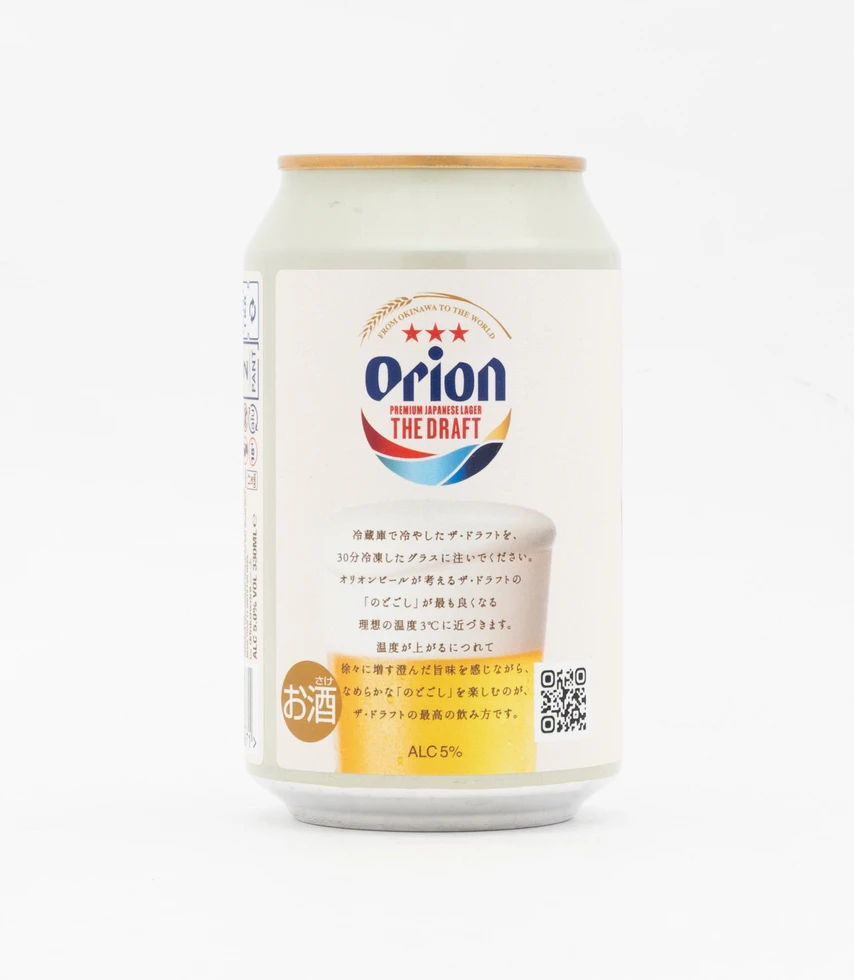
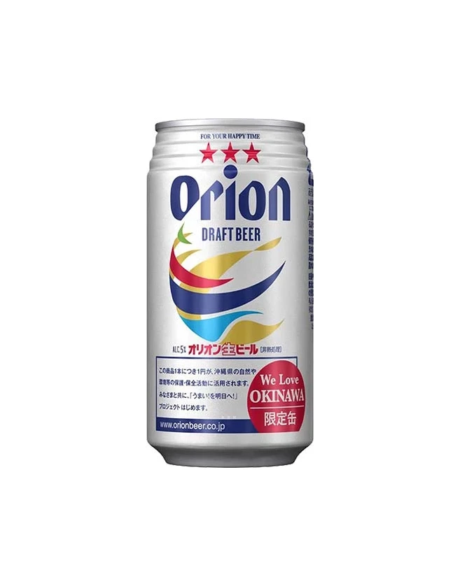
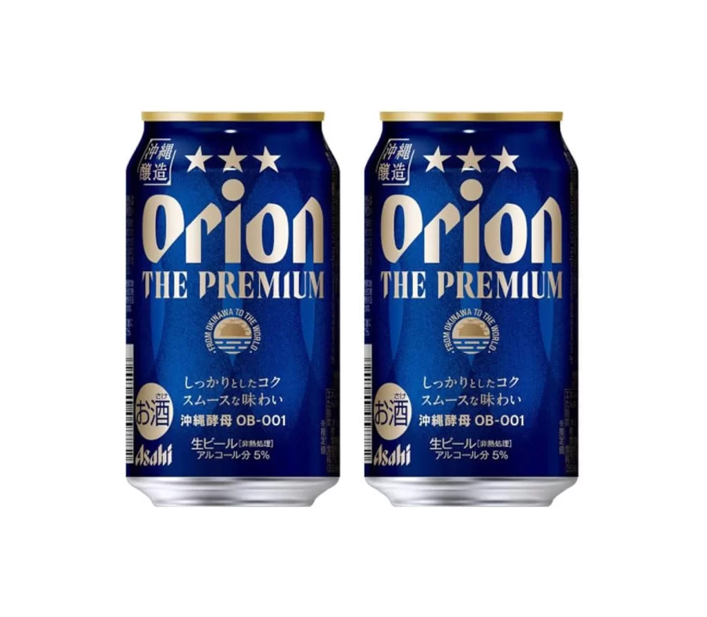
Two identical aluminum cans of Orion The Premium beer stand side by side against a pure white background, captured from a direct frontal perspective. The containers feature a deep navy blue body with metallic gold and white typography, topped with gold-colored rims that catch the light. Prominent text includes the brand name 'Orion' in large serif lettering, three stars above it, Japanese characters indicating Okinawa brewing, and the Asahi logo at the bottom left of each can.
Visual distinction emerges from the sophisticated color palette combining royal blue with champagne-gold accents, creating a premium aesthetic that differs from standard beer packaging. The circular emblem containing a sunset over water motif adds regional specificity, while the bilingual text layout balances Western branding with Japanese market conventions. Subtle gradients on the cylindrical surfaces suggest a matte-to-satin finish transition that enhances the three-dimensional quality of the metal packaging.
Product photographers studying beverage packaging will find the symmetrical arrangement useful for understanding how to present paired items in commercial shoots. Brand designers analyzing Japanese alcohol markets can examine the hierarchy between English and Japanese typography, as well as the placement of regulatory information like alcohol content percentages. Packaging engineers might reference the specific proportions of the label area relative to the total can surface when developing similar premium beverage containers.