5MAN Gose Beer Can
Topics
Details
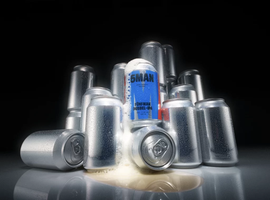
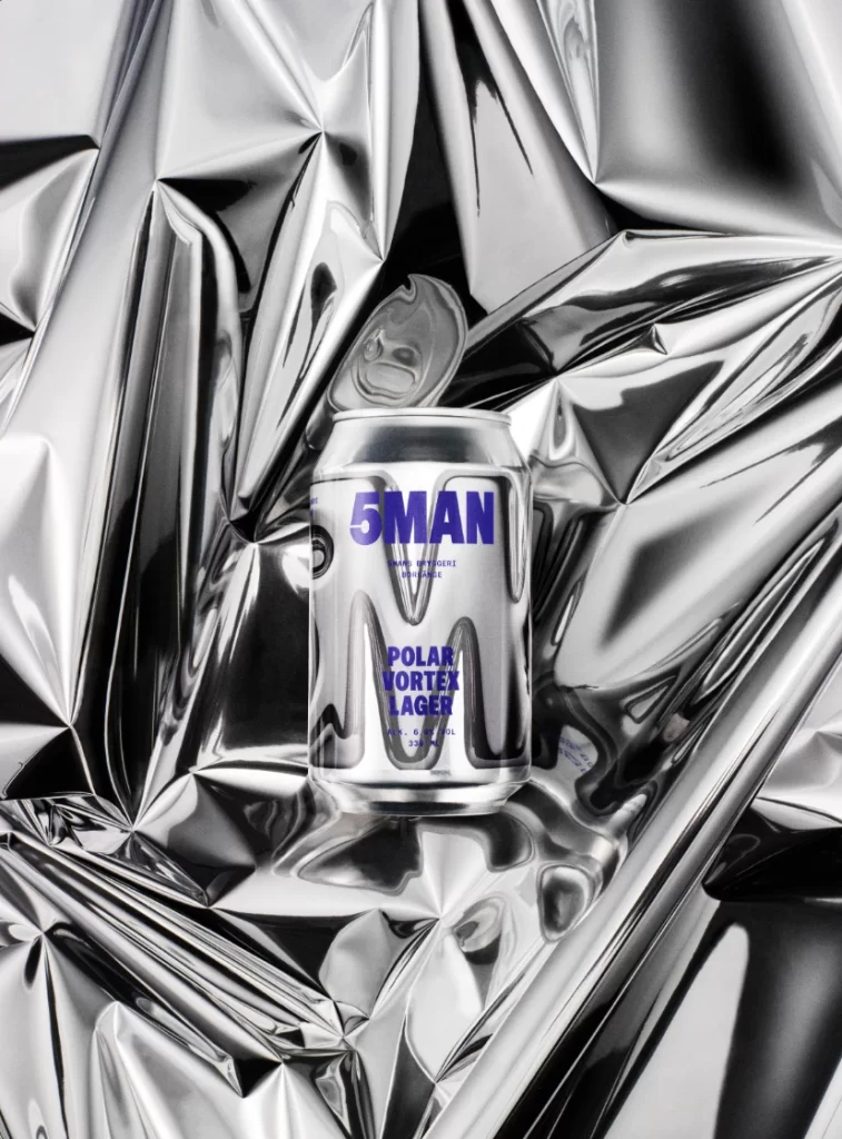
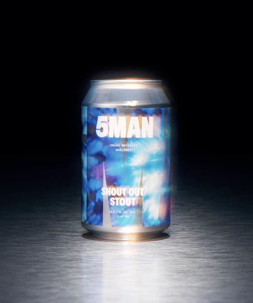
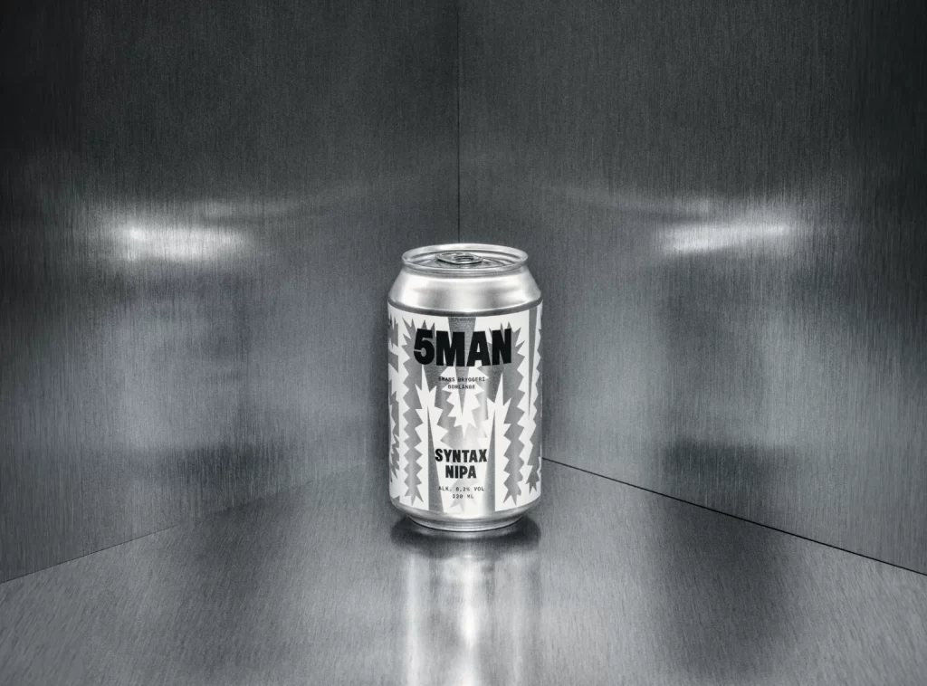
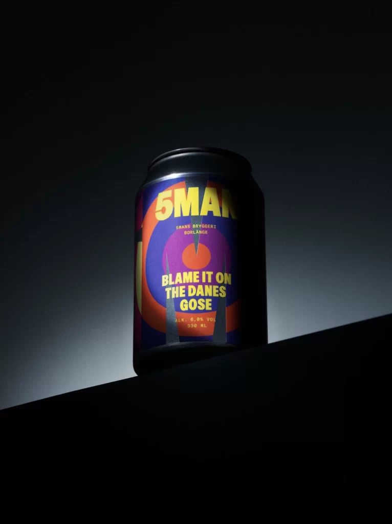
A matte black aluminum can stands at a slight three-quarter angle, its surface wrapped in bold graphic artwork featuring concentric circles of deep indigo and vibrant orange. Bold yellow typography dominates the label, with '5MAN' emblazoned across the upper portion in heavy block letters above the phrase 'BLAME IT ON THE DANES GOSE'. Dramatic side lighting carves out the cylindrical form while casting the right edge into shadow, creating high contrast against the dark background that fades from charcoal to pure black.
Visual tension arises from the collision of retro psychedelic geometry with modern craft-beer minimalism, creating an aesthetic that feels both nostalgic and aggressively contemporary. The high-contrast palette—electric purple against fiery orange—ensures immediate shelf presence, while the unapologetic typographic hierarchy commands attention without relying on traditional imagery or photography. Such deliberate color blocking transforms a standard industrial cylinder into a statement piece that challenges conventional beverage packaging norms.
Brand strategists examining this reference might analyze how limited-edition naming conventions and regional identity cues can elevate niche products into cultural conversation starters. Packaging engineers could study the interplay between matte metallic substrates and vibrant offset printing to understand how surface texture affects color perception under varied lighting conditions. Art directors working on music festival merchandise or boutique distillery launches would find valuable lessons here in balancing irreverent copy with disciplined geometric layouts to maintain premium positioning despite playful messaging.