Book White Books With Purple Numbers And Text On A Dark Background
Topics
Details
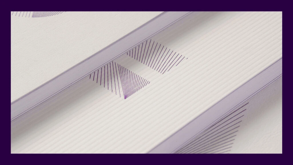
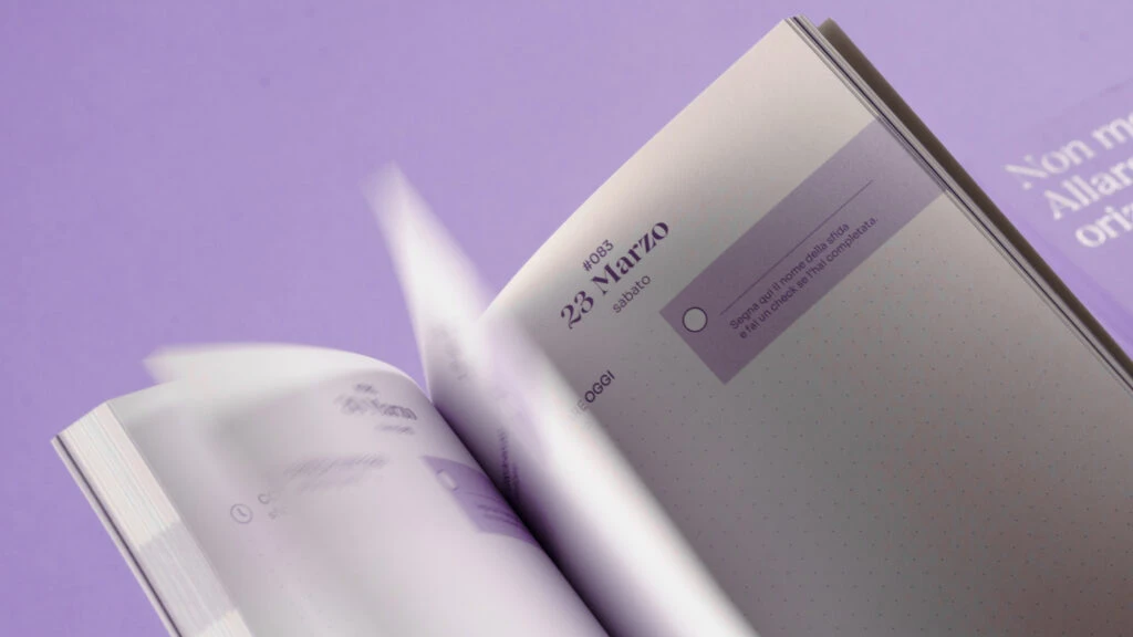
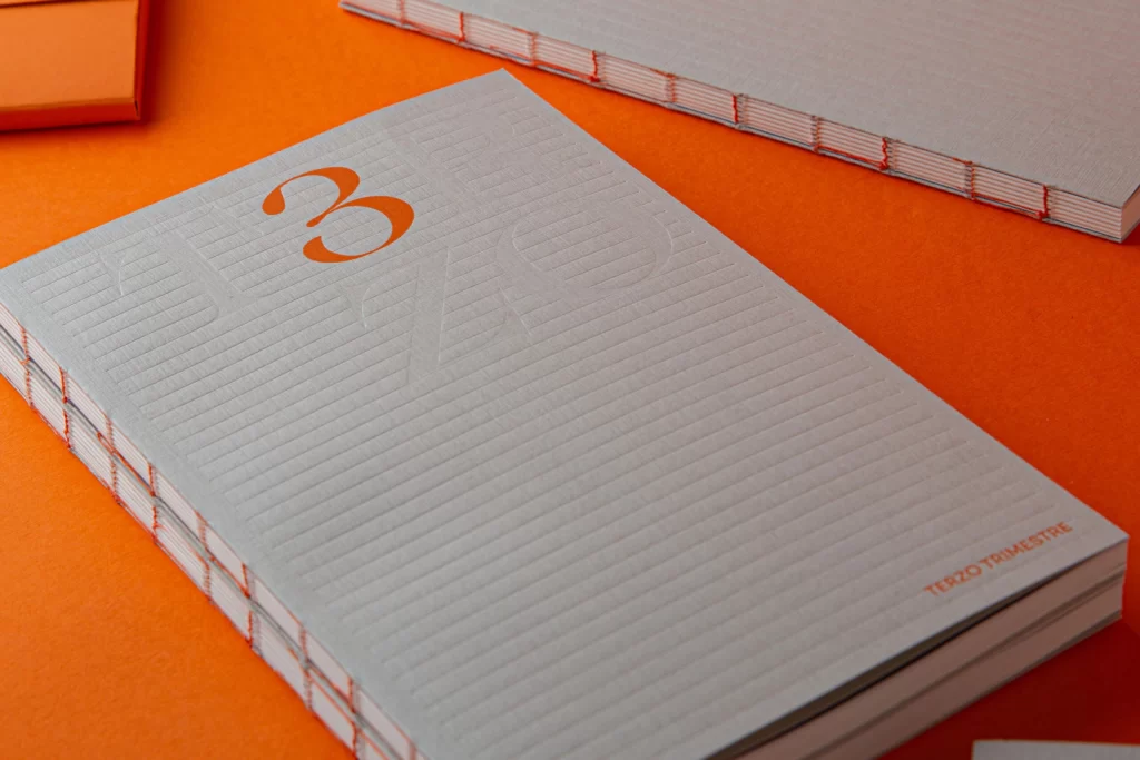
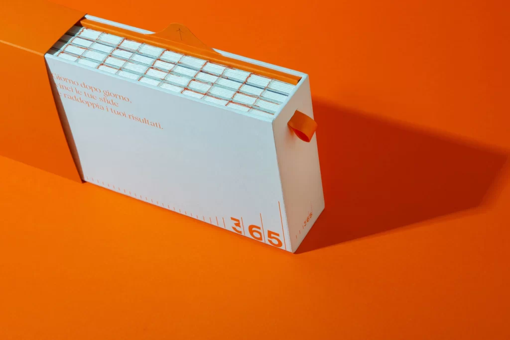
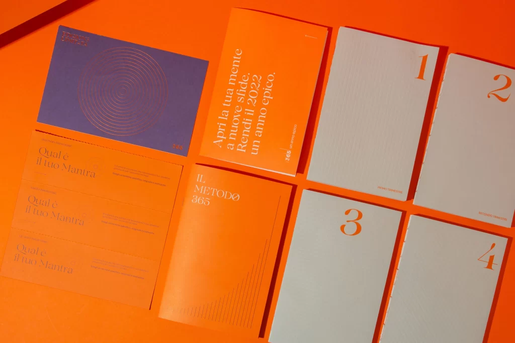
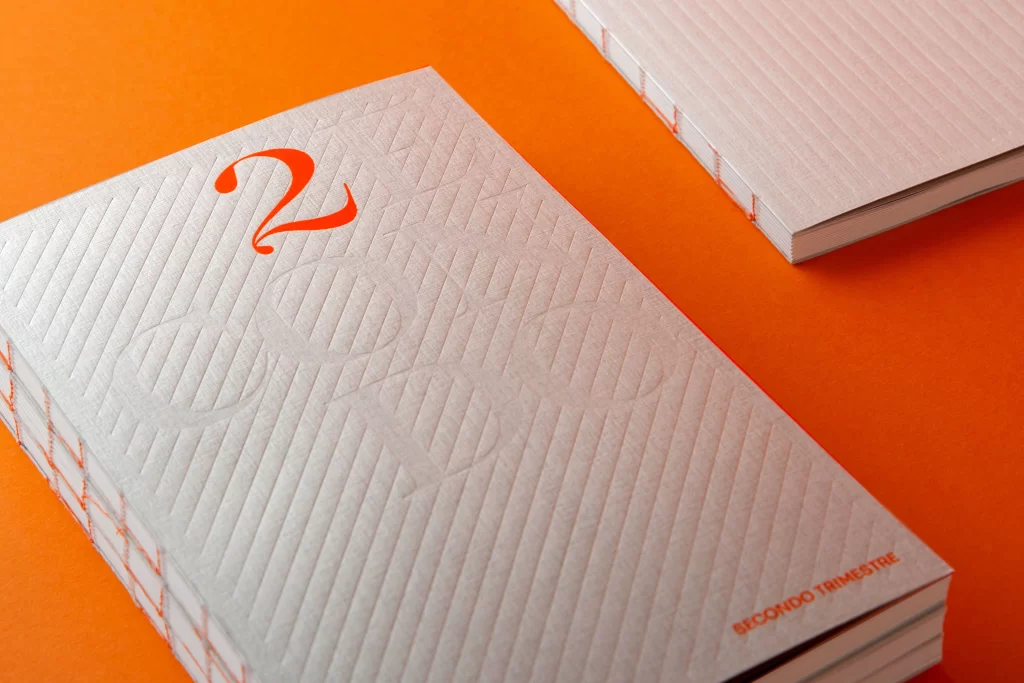
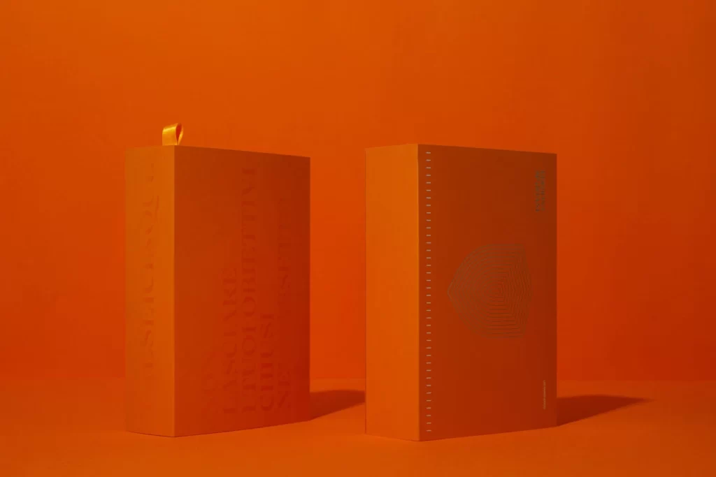
Deep violet numerals stand out sharply against the cream-colored covers of these staggered notebooks, creating a rhythmic visual progression from one to four. The left panel reveals the textured, off-white paper stock under soft directional lighting that casts subtle shadows between each volume. On the right, a single book rests on a lavender surface, displaying elegant Italian typography that reads 'tredici cinque / un anno epico' followed by the months luglio, agosto, and settembre in a refined serif font.
What makes this composition particularly striking is the sophisticated interplay between the dark purple ink and the warm ivory substrate, which lends an almost tactile quality to the minimalist design. The deliberate choice of a classic typeface for both the bold numbers and the delicate month names establishes a clear hierarchy while maintaining visual cohesion across different text scales. Such restrained color palettes often signal premium print production, where the materiality of the paper becomes as important as the graphic elements printed upon it.
Editorial designers studying typographic systems for serialized publications would find this arrangement useful for understanding how sequential numbering can function as a primary navigational tool. Brand identity specialists working on luxury stationery lines might reference the specific contrast ratios between the purple ink and cream stock to inform their own material selections. Anyone developing calendar systems or annual report layouts could draw inspiration from how the Italian text integrates with the numerical sequence to create a cohesive seasonal narrative.