TERZO TRIMESTRE Notebook Box
Topics
Details
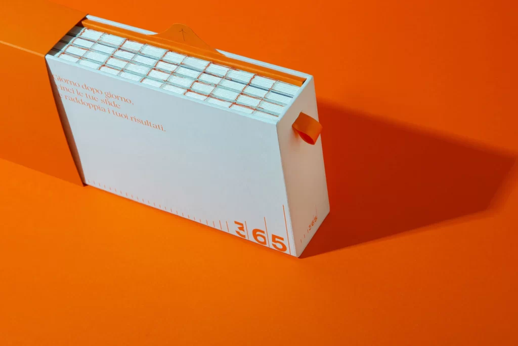
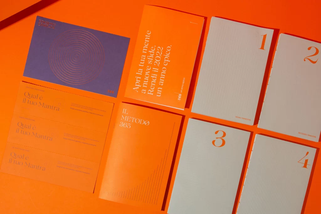
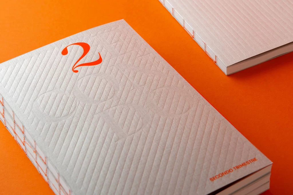
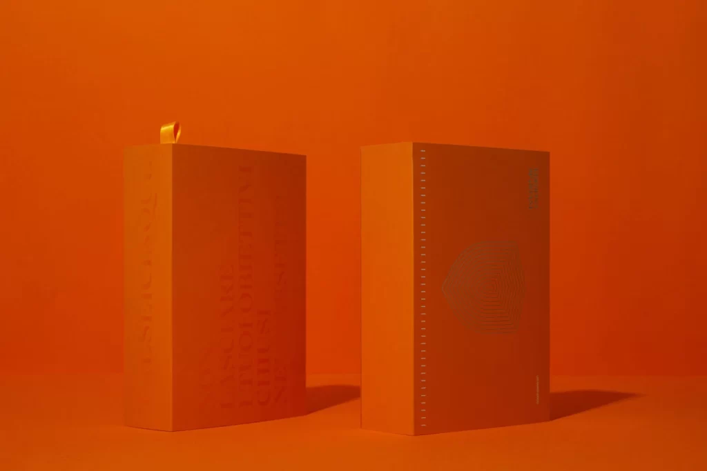
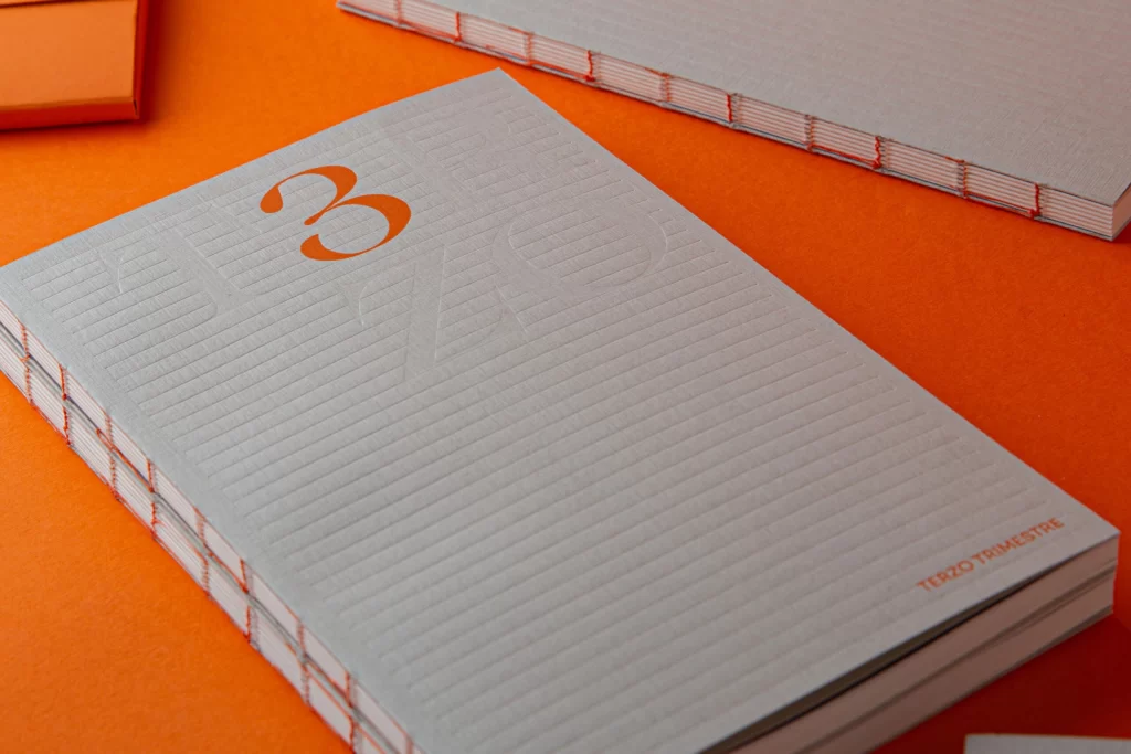
Against a vibrant, saturated orange surface that fills the entire frame, a stack of light gray notebooks rests at a slight diagonal angle. The top cover features a large, bold orange numeral '3' in the upper left quadrant and the text 'TERZO TRIMESTRE' printed in smaller orange capitals near the bottom right corner. Visible along the left edge is an exposed coptic-style binding with white thread stitching, while the paper itself displays a subtle horizontal ribbed texture. Soft directional lighting from the upper left casts gentle shadows beneath the stack, emphasizing the physical depth of the pages.
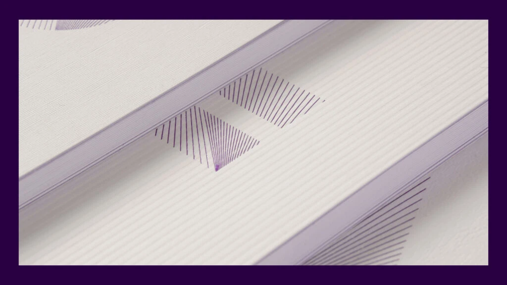
What distinguishes this particular notebook design is the sophisticated interplay between the cool gray cover material and the warm orange typography, creating a high-contrast yet harmonious visual palette. The embossed linear texture across the cover adds a tactile dimension that catches light differently depending on the viewing angle, while the exposed spine construction reveals the book's structural integrity as a design feature rather than just a functional necessity. This combination of minimalist color blocking with traditional binding techniques results in an object that feels both contemporary and artisanal.
Print production specialists might examine this reference to study how thread-bound spines interact with cover materials when planning limited-edition stationery runs. Brand identity designers could analyze the typographic hierarchy between the oversized numeral and the smaller descriptive text to inform quarterly report or periodical layouts. Additionally, product photographers may use this composition as a technical guide for lighting textured paper surfaces against bold background colors without losing detail in the shadows.